Sometimes you just have to gut the place and start again. Pull out all the windows and demolish the inside. It’s not pretty, but if the job’s worth doing, it’s worth doing well. B-architecten, the architectural studio behind this success story, started out with the end in mind. They were going to bring the building back to its original grandeur and if that meant starting from scratch, so be it.
The house, located just outside Antwerp in Belgium, was originally designed by the architect Nachman Kaplansky in 1934. It was then dramatically rebuilt in 1962. Fast forward to the 2000’s and it’s been given the B-architecten treatment. They turfed out all remnants of the 60’s hotchpot design and brought the house back to it’s former 1930’s grandeur, reinforcing if you will the original vision Kaplansky had for the Bauhaus villa.
Essentially nothing remained of the original interior that Kaplanksy designed. So the big job was to restore the original volume that would have been found within the villa and that meant gutting everything within. It was that sense of scale and space that gave the home its 1930’s grandeur.
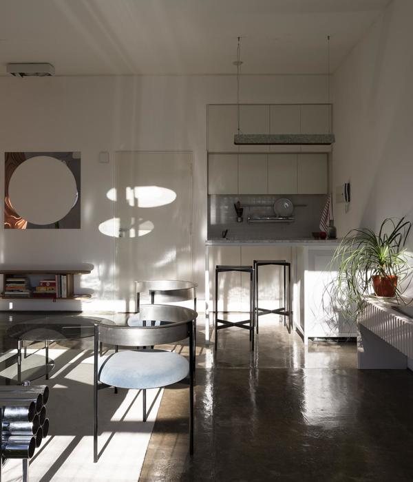
The architects reconstructed the original steel, window frames mocking them up from original photographs and building references. Whilst the design of the interior is new, they specifically selected materials reminiscent of the 1930’s, such as travertine and terrazzo.
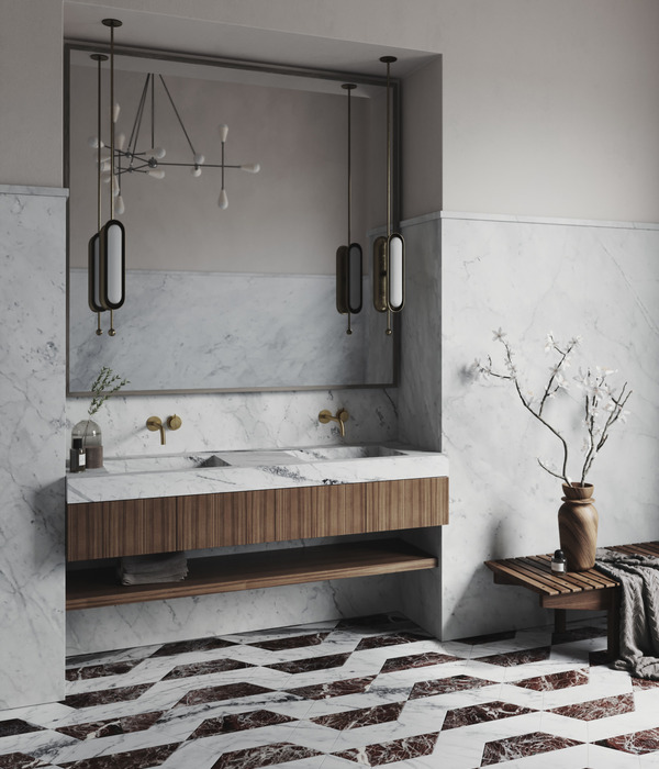
There are elements in this design that seduce. The stunning circular, fine black steel window frames, that classic 30’s shape that is echoed in other areas of the design. Take the circular mirrors in the plush, purple hued bathroom, elegantly suspended from a circular basin. Or the deliciously detailed curved timber panelled wall. It’s all so meticulously thought through.
Every fit out has its hero and one would struggle to find which moment here wins, but the curved, white staircase, like a white, satin ribbon uncurling, is simply stunning.
At the back of the garden there is a contemporary addition, a modern day pavilion. Resplendent in concrete, it initially appears like a long rectilinear building but peak inside and you’ll find the same reference to the 1930’s circle of the interior. Large, circular skylights bring light into what otherwise might feel like a concrete bunker. A circular, concrete cylinder within, containing the amenities, hovers just short of the matching diameter skylight above. There are echoes of the circle theme all the way through the garden too, like a stone being skipped across a lake, little echoes continue on and on… And here we see the charming garden pond, also concrete, also circular. And the raised circular stepping stones leading to the studio, like toadstools that have been flattened with age. Nothing here has been left to chance, everything is perfectly considered.
Is it a redesign or a rebirth? Whichever it is, the soul of Kaplansky has had a reincarnation in this beautiful and thoughtfully executed design.
[Images © Frederik Vercruysse.]
{{item.text_origin}}

