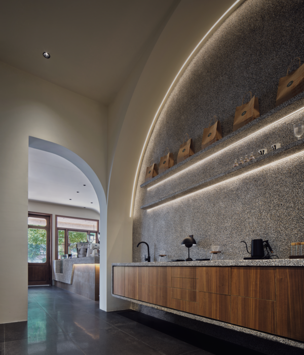
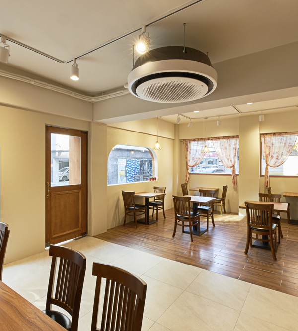
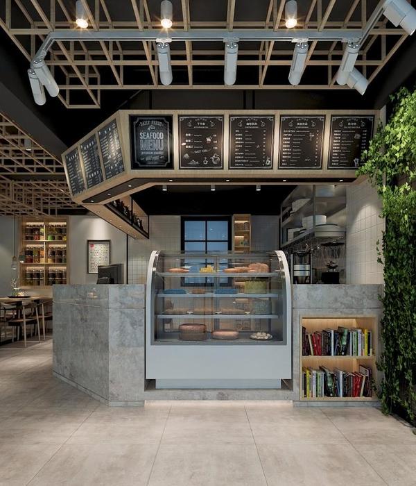
这间餐厅是由一家面包店改造而来,新的设计为原有空间赋予了两个特征:一是明确的功能划分,二是瓷砖内饰中蕴含的时间痕迹。
Formerly a bakery, the shop was characterized by two distinctive features that influenced the new design: the clear functional division of the space, and the traces of time visible within the tiled interior.
▼餐厅外观,exterior view ©Maarten Willemstein
新旧元素的联系在立面部分已经得到了很好的体现:入口处的蓝色瓷砖汲取了原有空间的格调,与Otto’s餐厅的logo形成视觉上的连接。形状简单的字母将外部空间与室内联系起来,内部空间也通过相同的设计语言得到统一。
The link with the past is already visible within the façade: blue tiles inspired by the old interior embrace the entrance and visually connect with Otto’s logo. The lettering, built of simple shapes and profiles, connects the outside with the inside, where the space is unified by the same design language.
▼蓝色瓷砖与Otto’s餐厅的logo形成视觉上的连接,blue tiles embrace the entrance and visually connect with Otto’s logo ©Maarten Willemstein
▼朝向街道的用餐区,dining area facing the street ©Maarten Willemstein
▼细部,detailed view ©Maarten Willemstein
从街道进入建筑时,入口环境呈现出一种层次丰富且吸引人的感觉。木质元素从地面延伸至吧台和墙面,带来温暖的氛围。木饰面上方的瓷砖按照原始图案铺设,回应了旧面包店的历史。带斑点的瓷砖和水平放置的条形镜面朝着餐厅的中心延伸,自然地将客人引向空间深处。
▼从内部用餐区望向入口方向,view from the internal dining area towards the entrance ©Maarten Willemstein
When walking into the building from the main street, a layered and inviting environment unfolds. Wood runs on the floor and climbs up on the bar and walls, giving a sense of warmth. Above the wood, a set of tiles, laid in the original pattern used from the bakery, pays homage to the history of the space. Speckled tiles and horizontal mirror slabs on the wall extend towards the center of the restaurant, inviting the visitor to walk further.
▼带斑点的瓷砖和水平放置的条形镜面将客人引向空间深处,speckled tiles and horizontal mirror slabs on the wall invite the visitor to walk further ©Maarten Willemstein
▼座位区细部,seating area detailed view ©Maarten Willemstein
▼瓷砖墙面和灯具细部,the tiled wall and lighting fixture ©Maarten Willemstein
吧台区的地面材料发生了一个明显的变化:旧面包店曾经重新铺设地板的位置特别采用了黄色的瓷砖,并延续到吧台侧面,从而形成空间中的亮点。悬挂在天花板上的灯具造型源自Otto’s中的T字母,兼具了菜单和玻璃置架的功能。
Halfway down the bar a sudden change in the floor is visible: exactly where the owners of the old bakery had re-tiled the floor there are now yellow tiles. These, just like the wood, continue on the bar and visually extend on the yellow concrete counter, giving the space a strong accent point. Hanging from the ceiling, and inspired by the letter T in Otto’s, is a light element which also functions as a menu display and glass rack.
▼黄色的地砖延续到吧台侧面,yellow tiles continue on the bar ©Maarten Willemstein
再往内是原本作为露台的区域,木质家具、绿色墙壁、瓷砖地面和精心放置的绿色植物重新唤回了该空间的户外特征。在平衡而充足的光线下,这些元素给人以一种置身于露台的错觉。
A bit further, the bar opens onto what used to be an open-air space. The memory of the outdoor character lives in the use of wooden furniture, the green color of the walls, the tiled floor and the accurate placement of plants. These elements, carefully balanced with a sapient use of light, create the illusion of a patio.
▼绿色墙壁和灯牌设计,the green wall and sign ©Maarten Willemstein
从露台到厨房的空间氛围也有所变化:温暖的木地板柔化了空间,厨房周围的座位区带来家一般的气息。瓷砖的米色调使人联想到用来做面包的面粉和水的颜色。
Continuing further from the patio, walking towards the kitchen, the atmosphere changes: the warmth of the wooden floor softens the space, the long sitting areas encircling the kitchen give a sense of home and the beige tones of the tiles remind us of the flour and water used to make the bread.
▼厨房,kitchen ©Maarten Willemstein
▼厨房周围的座位区带来家一般的气息,the long sitting areas encircling the kitchen give a sense of home ©Maarten Willemstein
▼入口座位区,seating area near the entrance ©Maarten Willemstein
▼店面细部,store front detail ©Maarten Willemstein
▼首层平面图,ground floor plan ©Studio Modijefsky
Project: Otto’s Burger Location: Cologne, Germany Program: Burger Restaurant and Bar Assignment: Interior Design and Graphic Design Status: Realized September 2019 Size: 330m² Client: Otto’s Burger Design: Studio Modijefsky; Esther Stam, Zahra Rajaei, Moene van Werven, Sophie van Heijningen, Karen Man Lai Cheng Photography: Maarten Willemstein
{{item.text_origin}}

