- 项目名称:Chido Santa Engracia 餐厅
- 设计方:MOCA estudio
- 项目面积:3230 平方英尺
- 项目地点:西班牙马德里
- 设计时间:2022 年
- 主要材料:Hisbalit,RCR decoHisbalit
- 项目类型:餐厅
Architects:MOCA estudio
Area :3230 ft²
Year :2022
Photographs :Asier Rua
Manufacturers : Hisbalit, RCR decoHisbalit
Lead Architects :Carlos Moles Romero + Adrián Sánchez Castellano
Program : Restaurante
City : Madrid
Country : Spain
@media (max-width: 767px) { :root { --mobile-product-width: calc((100vw - 92px) / 2); } .loading-products-container { grid-template-columns: repeat(auto-fill, var(--mobile-product-width)) !important; } .product-placeholder__image { height: var(--mobile-product-width) !important; width: var(--mobile-product-width) !important; } }
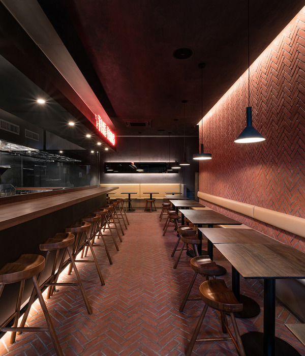
Chido restaurant is located in Madrid, in Chamberí neighborhood. The project is developed in a 300m2 venue, with 180 m2 on the ground floor of a protected building from 1925. This level is developed on a longitudinal axis that creates a path through the project
Concatenation of spacesThe intervention inserts an organizational system based on the concatenation of spaces. The restaurant is segmented into 5 consecutive atmospheres, alternating two types of volumes with distinctive qualities.
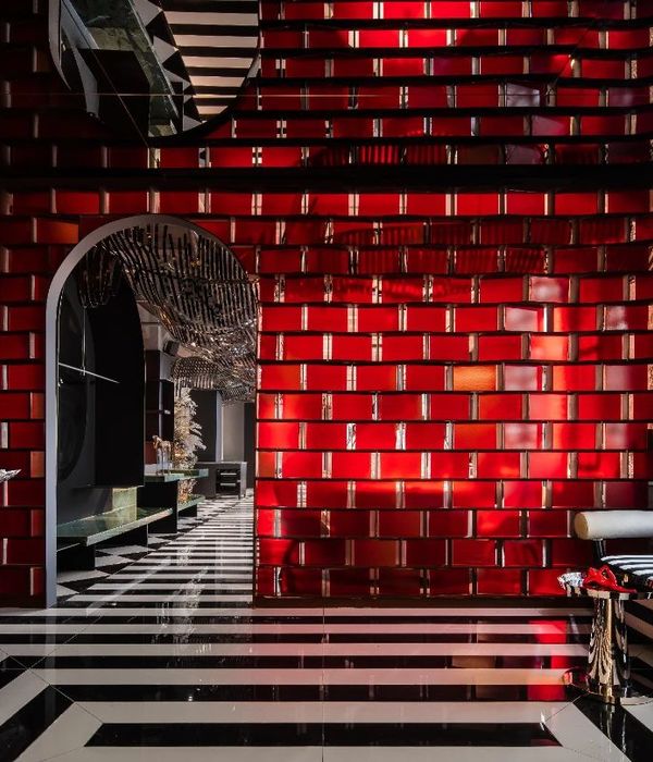
The first type of space are compressed. The maximum impact is achieved by using 10x10 tiling and sets of mirrors that dilute the limits of the rooms.
The second type are expanded. These salons are covered with cement resins and cutouts on top to reveal a black technical ceiling that enhances contrast.
The transitions between them originate passages. These intersections are characterized by their curved lines and rough texture.
Qualification by contrastContinuity between the spaces is highlighted by constant +2,50 elevation. Above and below that limit, there is a connection between upper and lower parts by opposition.
On the longitudinal axis, the sequence and contrast between compressed reflective spaces and larger matte ones also evidences the division of uses.
In the compressed spaces, the choice of vertical elements and mirrored ceilings distort the perception of the real height in the space. Vertical neons, floor-to-ceiling mirrors and gloss-finished tiling also support the z-axis.
In the larger spaces, cutouts reveal an inherited technical ceiling which is covered with a black-painted vermiculite texture. This ceiling contrasts with the beige-toned cement resin salons. All the installations are collected and suspended under the black technical ceiling. The salons furniture breaks the beige tone with oak wood, marble surfaces and patterned upholstery.
Singular mechanismsA series of ironworked objects are distributed transversally to the spaces. These mechanisms are recognizable by common characteristics.
A bar counter and two large tables, one for the private dining room and the other as a link between salons, emphasize the horizontal plane. These surfaces are carved in black marble, while their vertical planes are covered with mirror plates to stay unnoticed. The joints between horizontal and vertical surfaces are filled with a hidden LED that points out its importance on salons.
▼项目更多图片
{{item.text_origin}}

