"Hello Gorgeous"美容沙龙 | 打破传统,打造女性、时尚与现代相结合的空间
Architect:Hamid Nicola Katrib - HNK interior architecture
Project Year:2021
Category:Shops
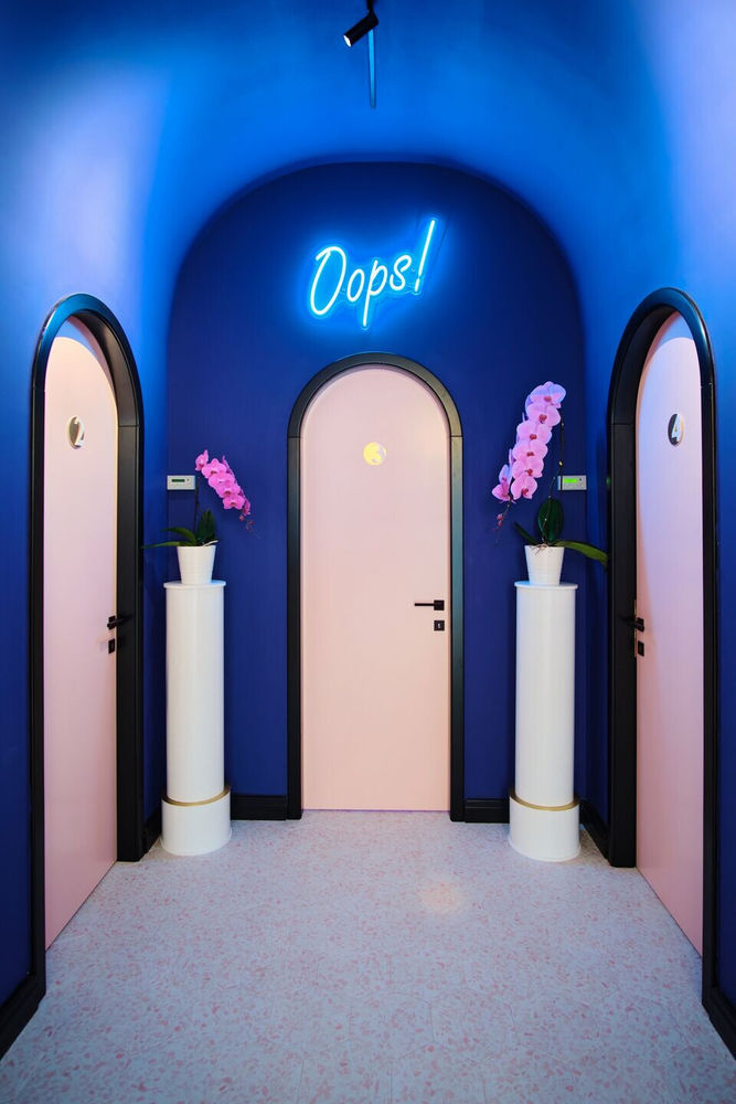
It’s never too late to make a change of perspective and switch from designing the elegance of a house to creating the classy ambience of a beauty salon. We have to admit that the most rewarding part when working at this project was the complete freedom we had to create custom-made elements that exceeded anyone’s expectations. One of those elements are the doors in the shape of an arcade, which break the monotony and integrate perfectly with the other rounded shapes in the salon.
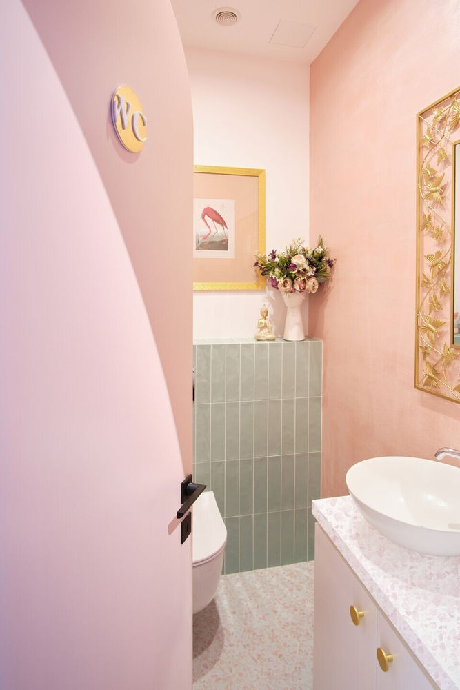
The salon includes many separated rooms: the reception, 2 rooms for indoor tanning, 2 rooms for skin care & body treatments, 1 toilet and 1 kitchenette.
The leading design idea of this project popped up into my head in the very first moment I saw the space - it had to be three things: feminine, chic and modern.
We knew from the start that the reception area - the first thing people see when entering the space - should stand out and create the WOW effect. We live in a time when the things that impress us visually end up being published on Instagram, therefore we went with the flow and built a highly instagrammable spot near the reception.
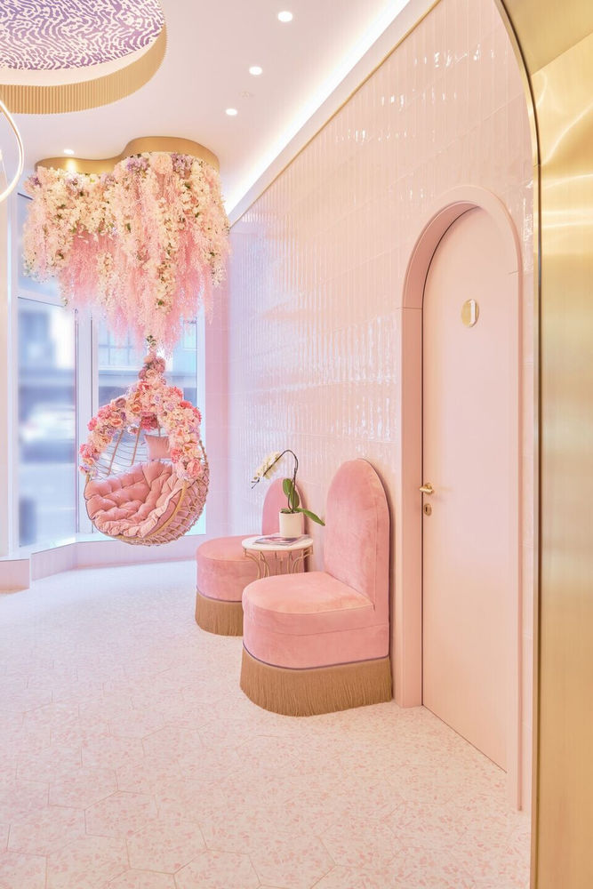
The comfortable, suspended chair covered in febric flowers that fall from the ceiling looks like a special photo corner inspired by a Fragonard painting. The chromatic of the whole place revolves around dusty pink tones, which gives a sweet and mellow vibe. We chose to cover the reception walls in glossy tiles that brighten the space and add their own elegance.
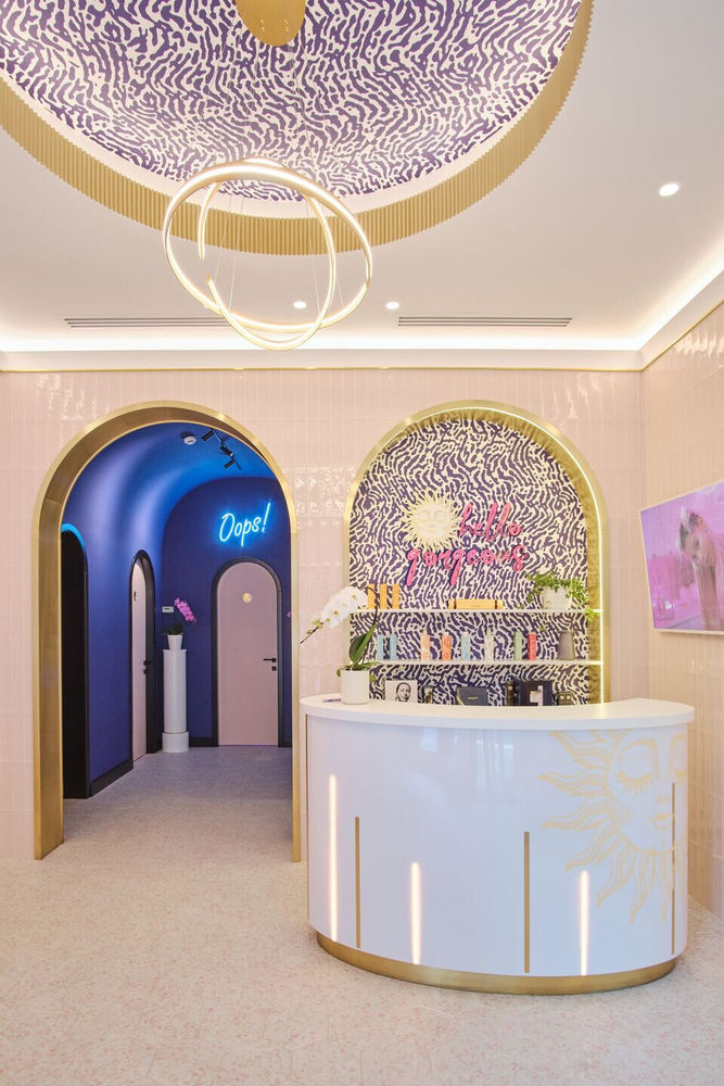
The high ceiling of this space counted as one of the main advantages because it allowed us to come up with an impactful design. We created two arcades perfectly symmetrical on the frontal wall of the reception area. The one on the left is actually the hallway to the treatment rooms, while the other is located behind the reception and works like a window to showcase products. The need for more space for products to be exhibited led to a third showcase with an arcade, perpendicular to the reception area.
Since the rounded shapes dominate this beauty salon, we chose a cylindric reception desk, like a half-moon, that easily integrates with the arcades and the rounded cornice on the ceiling, which is made of MDF and decorated with the salon logo.
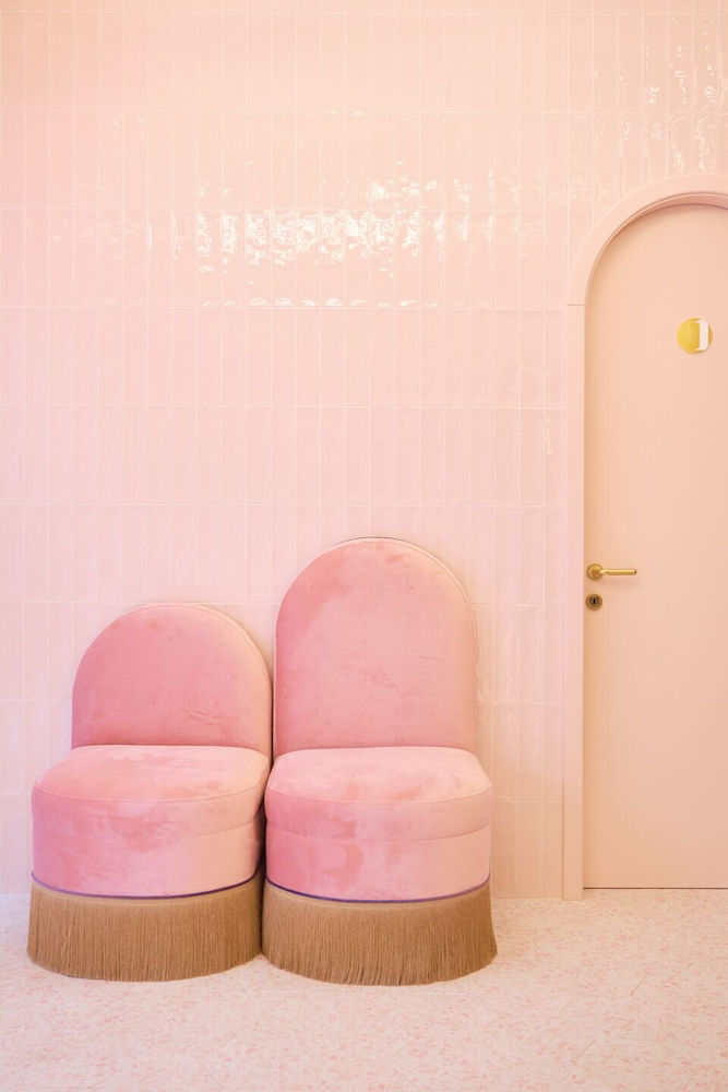
Another area that draws attention are the elegant chairs near the reception. We designed these two unique chairs covered with dusty pink velvet and golden tassels to look the same, except of the height of the backrest which is an unexpected element that creates surprise.
For the reception area we designed a special pattern of wallpaper in a dark tone of purple, which provides a nice contrast and balances the splash of pink that dominates the salon.
When used thoughtfully and in moderation, golden elements can work wonders. This project is a great example - we created discrete accents made of brass and placed in the contours of the arcades and as insertions on the reception desk.
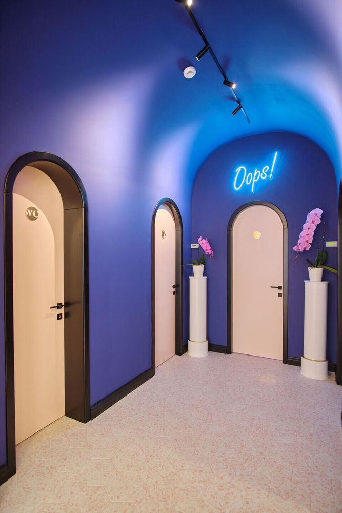
Passing through the reception, we get to my favorite area of the salon - the hall, also known as the “blue tunnel”. The space here is quite tight, but it has a high ceiling, so I built a generous arch that gives more room and tones down the color on the walls. Nevertheless, the violet-blueish walls have their own purpose - they create the element of separation between the radiant, feminine entrance, and the darken, mysterious area of the treatment rooms, where all the magic happens.
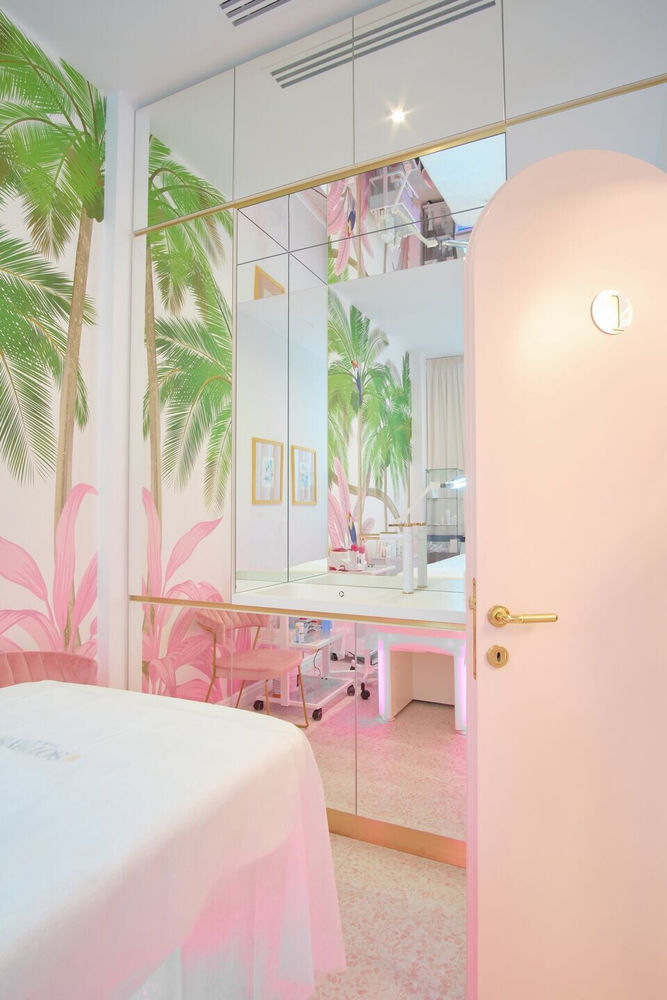
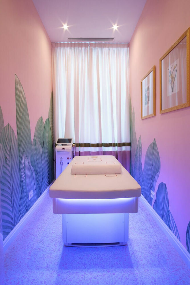
Each treatment room has a distinct approach. We covered the walls of the body treatment rooms in a tropical, custom-made wallpaper in the same colors as the rest of the design. The next-generation equipment has LED lights that change their colors and, therefore, the whole ambience of the rooms.
The two special rooms for indoor tanning include top-notch tanning beds brought from Italy and a colorful space, to make people feel good in their skin. Moreover, we also added a playful element: large mirrors with Mickey Mouse ears that we created custom-made for these rooms.
To sum up, working on this project flexed our creativity muscle and we succeeded in building a consistent, yet elegant and practical design for a beauty salon, and we would definitely do it all over again anytime!
The leading design idea of this project was obvious and clear - it had to be three things: feminine, chic and modern.
1. Flooring and wall ceramic tiles: APARICI
2. Doors: Bespoke doors designed by hnk, realised by meranty studio.
3. Interior furniture: Bespoke furniture designed by HNK, realised at meranty studio and kreatique
▼项目更多图片
