TT TO THE TEA | 传统与现代交融的茶寮设计
- 项目名称:TT TO THE TEA商业街上的湖畔茶寮
- 设计方:JK DESIGN STUDIO(杭州边界建筑设计有限公司)
- 主创及设计团队:主创:周俊凯JK 设计团队:张晓文 盛禹航
- 项目地址:杭州市西湖区武林路39号音乐街区
- 建筑面积:50㎡
设计的价值绝不拘泥于”独创一隅景观”,而应运用智慧与技巧将内外空间整合为有机整体,赋予其”生命力”,使其不再只是一处装饰或零件,更是作为街区不可或缺的组成细胞,与城市共生共荣。 The value of design is not limited to “creating a phenomenal corner landscape”, but should have wisdom and skills to integrate the internal and external spaces into an organic whole, giving the “vitality” to the city. So a good design is no longer just a decoration or a component, but also an indispensable cell of the urban, should co-exist and prosper with the city.
项目位于杭州市西湖区武林路39号音乐街区,西子湖畔,毗邻海华。音乐街区是杭城最具特色的民国风商业街,生动还原了杭城的历史风貌:青砖黛瓦,古巷长街。TT TO THE THE TEA作为一家新式奶茶店,自喧闹中取静,自历史中图新,实现了潮流感、人文性与在地化的深度融合,让建筑完美根植于城市的发展肌理之中。 The project is located at 39th Wulin Road in West Lake district. It is a music street adjacent to the beautiful West Lake and Haihua. The music street is the most characteristic traditional commercial street of the Republic of China era in Hangzhou, which vividly restores the historical features of Hangzhou: gray bricks and black tiles, ancient alleys and long streets. TT TO THE THE TEA, as a new-style bubble tea store, keeps quiet moments in the noisy street, brings a new picture in the historic location, and realizes the in-depth integration of trend, humanity, and localization, allowing the building to be perfectly rooted in the development texture of the city.

▲轴测图
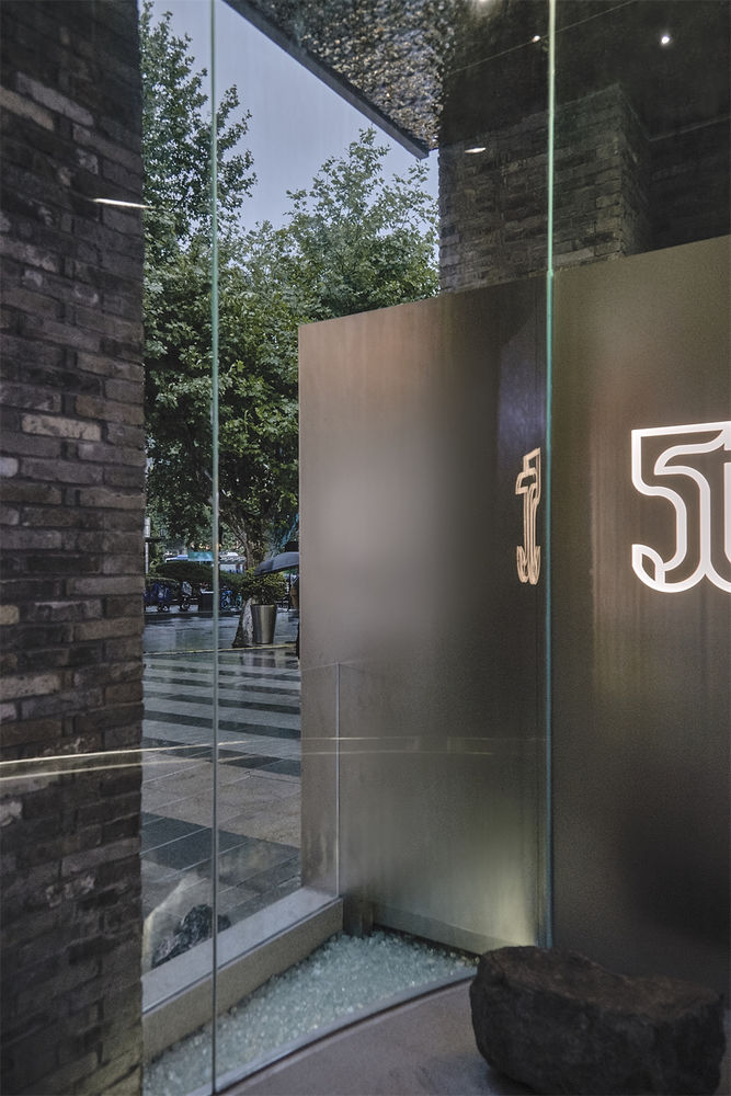
外立面的构建独具妙想,以通透的U字型玻璃将室内外空间重新定义,打破了传统空间的墙体桎梏,使内外场域贯通一体。设计师通过自然光线与人造光源的碰撞形成视觉上的内退,让室内的场景无须隔绝就自有距离感,既与街景交织,又超然于喧嚣之外。 The composition of the exterior facade is unique. It redefines the indoor and outdoor spaces through a transparent U-shaped glass, breaking the constraints of the wall in conventional spaces, and connecting the interior with the exterior. The designer creates a visual setback through the contraction of natural light and artificial light sources, allowing the indoor scene to have a sense of distance without isolation, which is intertwined with the street scene and also detached from the hustle and bustle.
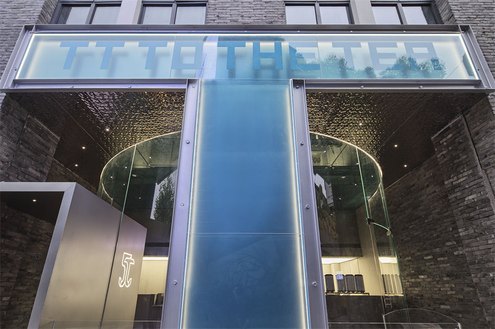
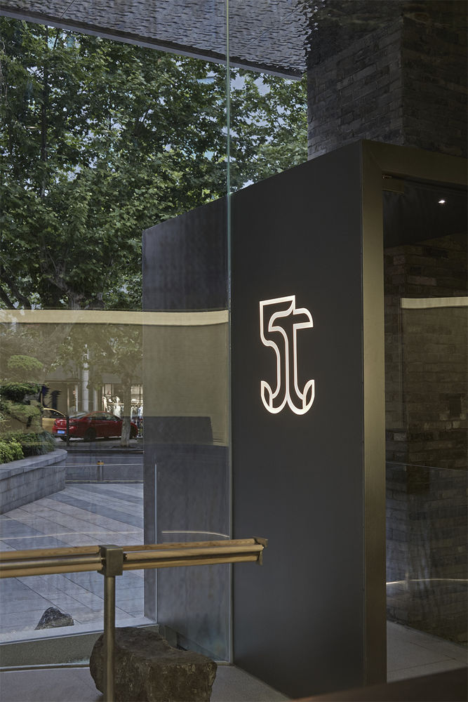
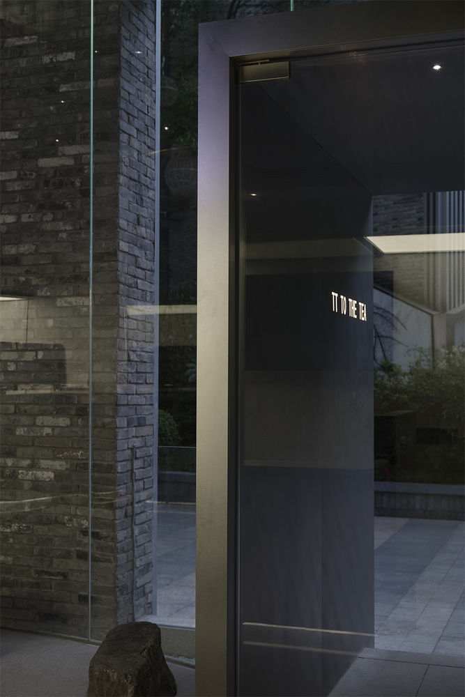
门头造型灵感源于品牌的主视觉”T”,蓝色夹胶钢化玻璃与金属槽钢形成一个灯箱,简洁锐利的造型凸显出品牌的个性与气场,也使品牌Logo「TT TO THE THE TEA」更加醒目。独到的设计创意使得艺术造型与原有梁柱结构体完美结合,让设计融入原有建筑的框线体块之中。
The storefront look is from the “T” of the brand. The blue laminated tempered glass and metal channel steel generated a lightbox. The simple and bold shape highlights the brand’s character and identification, and also makes the brand Logo “TT TO THE THE TEA” stands out on the street. The unique design makes the artistic modeling perfectly fits in the original beam and column structure, allowing the design to be integrated into the frame of the original building.
“画桥闻笛,亭台听雨”正是西湖最具诗情的景致,本案把”亭”与”桥”的意象融入门头造型之中,用极富现代感的物材演绎出一幅西湖缩绘,地面上一半为水,一半为石,剔透的碎玻璃细密地铺陈其上,在自然光线下闪烁如粼粼水波。 “Painting the bridge and listening to the flute, listening to the rain in the pavilion” is the most poetic view of the West Lake. The storefront includes the concept of the poetic scene of “pavilion” and “bridge”. The ground is half of water and half of stone, with the aggregates of transparent glass fragments, gleaming like sparkling waves under natural light.
TT TO THE THE TEA主打茶类饮品,”茶”即为自然精粹,亦寄托文人之心。为了让山水人文、商业气息与城市记忆同频共振,设计者将自然意向压入城市的起居生活,以石为几为案,构建文人的生活方式。 TT TO THE THE TEA mainly provides tea beverages. “Tea” is the essence of nature and reveals the hearts of the literati. In order to make the landscape, humanities and commercial atmosphere resonate with the memory of the city at the same pace, the designer presses nature into the daily life of the city and uses the stone as the seat and table to construct the lifestyle of the traditional literati.
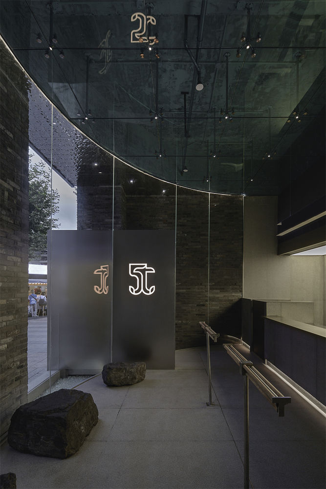
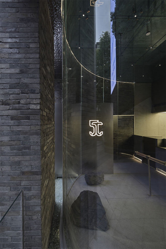
玻璃外墙包裹着青砖石材,前卫的手段构建起古典庭园,动与静、新与旧、光与影在此交织碰撞,形成巨大的视觉张力。别出心裁的跨界混搭完美地将西湖之钟灵毓秀融入现代都市生活,让现代设计氤氲古朴茶香。 The glass exterior wall is wrapping the brick wall, so the traditional garden is built by modern elements. Dynamic and static, new and old, light and shadow are intertwined and collided, generating a huge visual tension. The ingenious cross-border mix and match perfectly integrate the beauty of the West Lake into modern urban life, and let the modern design diffuses the scent of ancient tea.
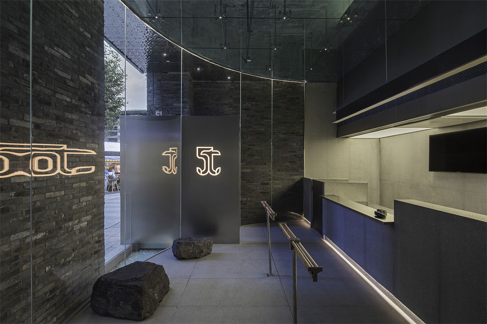
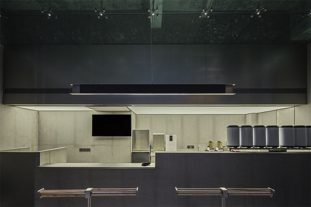
室内空间极为有限,除操作与点单区外,还可容纳一个落座等候区。区域间凭借装置靠杆划分空间,靠杆以品牌主视觉Logo”T”为原型,自带的万向轮可随腰部的滑动循环滚动,为站立者提供趣味的等待方式。 The indoor space is extremely limited. In addition to the operation and ordering area, it can also accommodate a sit waiting area. The space between the areas is divided by a leaning handrail. The handrail is based on the brand’s main visual logo “T”. The built-in universal wheels can roll with the sliding movement of the waist, providing an interesting way for standing people to wait.
落座等待区摒弃了常规的桌椅布局,采用天然石材,不事雕琢的外形如湖中岛礁,独有一番野趣。室内墙面使用了与外立面一致的石材,既能让店铺整体观感协调一致,又能将店内顾客的视线延伸出去,让梧桐乔木、日照灯影、熙攘人群都成为等候区景观的一部分,在有限的场域内展示无边的风光。 The sitting and waiting area doesn’t have the conventional layout of tables and chairs, uses natural stone, and has an unsculpted shape like an island in a lake, which is uniquely wild. The interior walls have the same stone as the exterior facade, which not only creates a harmonious look and feeling, but also extends the view out to the street, so that the phoenix trees, the sunlight and the shadow of the lights, and the bustling people all become parts of the waiting area landscape. Show broad scenery in a limited field.
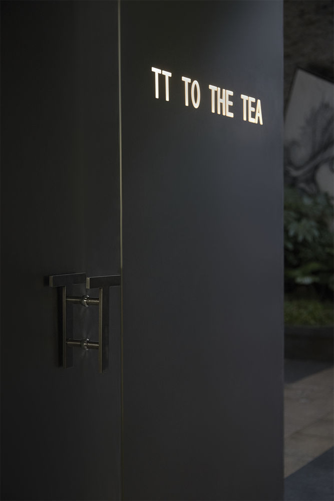

区别于天然造物的随性写意,空间内的现代元素都极为考究:操作台与把手、灯饰均选用精细平整的不锈钢材质,与天然石材砖瓦的粗砺质感构成鲜明反差。为追求照明灯饰的简约美观,设计师专程定制驳抓手及金属构件,以更为繁复的工艺将灯光系统与结构系统相结合。 Different from the casual freehand brushwork of natural creations, the modern elements in the space are deliberately placed: the console, handles, and lighting are all made of fine and flat stainless steel, which contrasts sharply with the rough texture of natural stone bricks. In order to pursue the simplicity and beauty of the lighting, the designer customized the handle and metal components, and combined the lighting system with the structural system in a complex installation.
空外四周使用超白钢化玻璃,而顶面则选用蓝色夹胶钢化玻璃,幽光明灭的蓝与超白玻璃晶莹的质感相映衬,营造出一个水面下的世界,整个场域犹如水中升腾的气泡,浮动在现实浪潮之外,乐享一方安逸天地。 Ultra-white tempered glass is used around the space, and blue laminated tempered glass is used on the ceiling. The faint blue and the crystal texture of the ultra-white glass contrast with each other, creating an underwater world, and the whole field is like rising in the water. The bubble floats outside the wave of reality, and enjoys a peaceful world.
近年来,”老商业街改造”与”重塑历史风貌”项目于各城市相继展开,如何在拉动消费经济发展的同时留存城市的历史记忆成为城市规划与建设的难点和痛点。TT TO THE THE TEA项目的落成既保证了老街风格的整齐划一,又在青砖素瓦之间畅叙了品牌的态度和主张,让设计成为有机的生命体,在城市中扎根生长。 In recent years, the projects of “reconstruction of old commercial streets” and “remodeling of historical features” have been successively launched in various cities. How to preserve the historical memory of the city while stimulating the development of the consumer economy has become a difficult and painful point for urban planning and construction. The completion of the TT TO THE THE TEA project not only ensures the uniformity of the old street character, but also narrates the brand’s attitude between the gray bricks and black tiles, making the design an organic life that takes root and grows in the city.
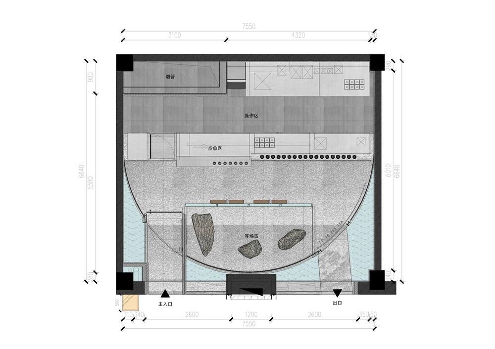
▲平面图
项目信息——
项目名称:TT TO THE TEA商业街上的湖畔茶寮
设计方:JK DESIGN STUDIO(杭州边界建筑设计有限公司)
项目设计 & 完成年份:设计:2021年3月 完成:2021年7月
主创及设计团队:主创:周俊凯JK 设计团队:张晓文 盛禹航
项目地址:杭州市杭州市西湖区武林路39号音乐街区
建筑面积:50㎡
摄影版权:雷徐君
翻译:宋云帆
合作方:杭州芝麻装饰
客户:TT TO THE TEA
品牌:项目主材:天然石材、老青砖、蓝色夹胶玻璃、不锈钢板。
Project name:TT TO THE TEA:Teahouse by the lake on the traditional commercial street
Design:JK DESIGN STUDIO
Design year & Completion Year:DESIGN: March 2021; COMPLETION: July 2021
Leader designer & Team:DESIGN LEADER: Junkai Zhou; DESIGN TEAM: Xiaowen Zhang, Yuhang Sheng
Project location:Music Street on 39th Wulin Road, West Lake district, Hangzhou, Zhejiang Province
Gross Built Area (square meters):50㎡
Photo credits (needs to credit each):Xujun Lei
Translate:Yunfan Song
Construction :Hangzhou Sesame Interior Construction
Clients:TT TO THE TEA
Brands / Products used in the project:Natural Stone; Old Gray Brick, blue laminated tempered glass, Stainless Steel Panel

