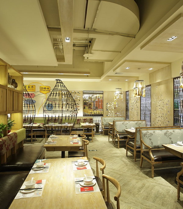
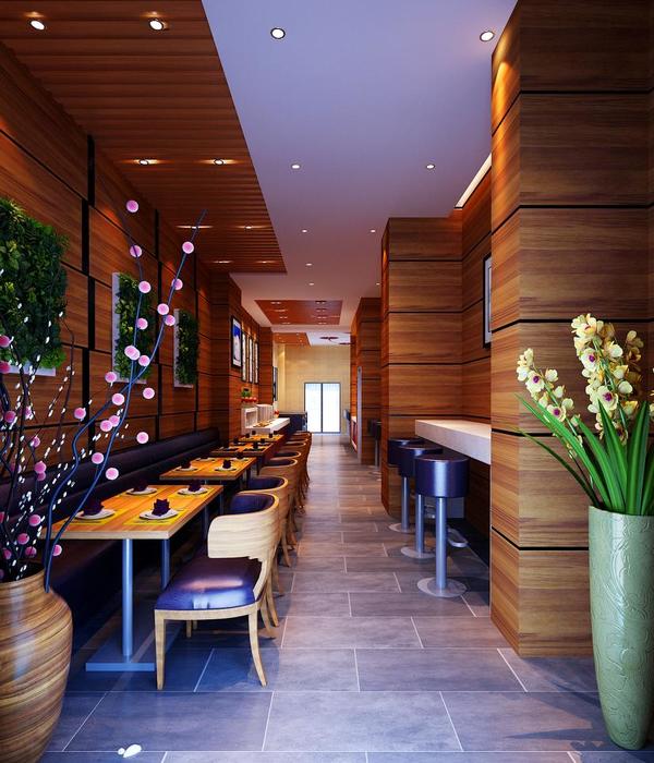
Atelier Cho Thompson was tasked with marrying multiple needs and desires of the B-Natural Kitchen to create a relaxed, functional, and welcoming environment.
Atelier Cho Thompson was approached by a restaurateur with an intriguing multi-pronged design challenge: how could we create a restaurant that conveyed the fresh and seasonal flair of its menu and appeal to the college-age clientele of the nearby campus, all on a shoestring budget?
We approached this challenge by seeing this as a multi-disciplinary design problem; from logo to signage to interiors, we designed all aspects of the restaurant with a cohesive conceptual vision. We began with the restaurant’s mission: to serve fresh, seasonal food to a youthful clientele. We approached branding and interiors in parallel, each taking cues from the motifs of a farmer’s market: an unorthodox color palette was drawn from natural colors, including beet purple and kale green, and patterns of linear wood elements were drawn from wood crates, taking the form of slatted wall panels and tambour surfaces. The total design aesthetic of the restaurant became a juxtaposition between crisp forms and gentle curves, between handmade materials like terrazzo and industrial materials like powder-coated steel, and between neutrals like concrete tile and bright hues like pink cushions.
By using common materials in uncommon ways, we devised an innovative space on a limited budget. Plywood is used for furniture, millwork, and a pegboard displaying menus and merchandise. Simple off-the-shelf table bases were powder-coated in fresh colors to contrast with brightly colored low-cost outdoor furniture. We created a major cost savings by maintaining existing wall and ceiling surfaces and relying on paint and graphics for dramatic transformations.
Design: Atelier Cho Thompson Photography: Samara Vise
6 Images | expand images for additional detail
{{item.text_origin}}


