Architects:Dhanie & Sal
Area :117 m²
Year :2021
Photographs :KIE, Salman Rimaldhi
Manufacturers : Toto, Bardi, Dekkson Lock, Himalaya Abadi, Rafes, Santai Furniture, Tegel Panjen, Valentino GressToto
Contractor :Lion Earth Construction
Lighting Design :ErreLUCE
Principle Architects : Salman Rimaldhi, Dhanie Syawalia
Project Architect : Ferdio Ariatama
Identity & Environmental Graphic Design : Nusae
Artwork : Toni Al
City : Bandung
Country : Indonesia
Sawo Rontgen occupies the front yard of an existing house in a residential area with a strong tie to medical facilities. Searching for a unique identity for the second home of Sawo Coffee, we took the location’s rontgen street name as an identity generator and play around with the visual quality of rontgen.
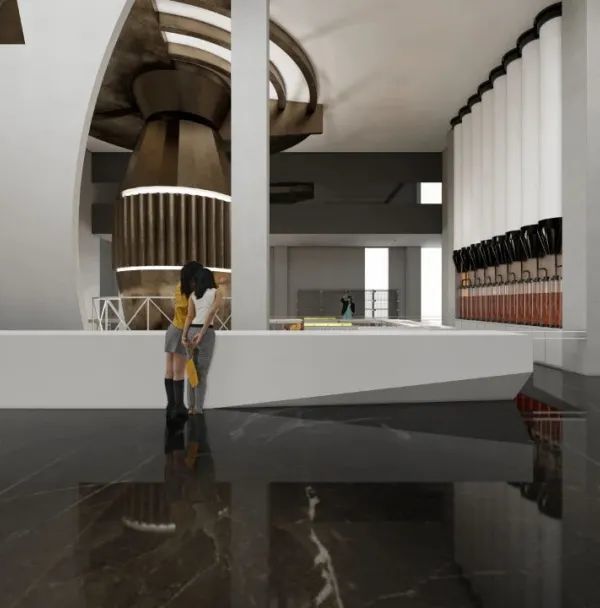
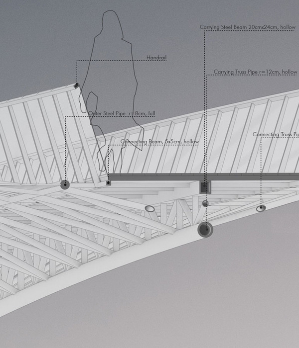
Exploring different modes of transparency to achieve rontgen-like character, glass brick and acid glass were used as the main materials. The glass bricks arranged as a floating box demarcating the front yard effectively as a space for the cafe, forming a pseudo-boundary. Acid glass was used as the skin of the pavilion and covered elements from the existing house, adding an extra layer to the existing house without making significant changes. The two materials juxtaposed with both the structural and natural elements, resulting in a broad spectrum of visual transparency we wanted to achieve. The structure uses exposed H-beam steel in a hot-dip galvanized finish. The bare structural elements along with the blurred transparency of the glass brick and the acid glass meant to resemble the skin and bone quality of the rontgen visual.
The glass pavilion contains a stark white coffee bar, a signature of Sawo Coffee, serving customers before they enter the cafe area. Hidden inside the box, is an outdoor seating of a circular shape, taking cues from the logo. Its strong form invokes a calming atmosphere, an informal space in dialogue with the architecture. Beside the pavilion a steel staircase is placed, giving access to the acquired room on the upper floor which serves as the indoor seating area.
The glass bricks are arranged in a zig-zag manner to ensure a stronger connection and more even weight distribution. Later the bricks were stretched, creating vertical gaps between the bricks, allowing airflow in and out the glass brick wall and saving the material usage by twenty percent.
The pattern that was a result of a pragmatic approach then becomes a set of rules that are carried out throughout the space. The repercussion could be found in the circular outdoor seating and the tiles flooring on the indoor seating. The environmental graphic design system applied following said rules by inserting the graphic design elements which form is in harmony with the architectural pattern.
▼项目更多图片
{{item.text_origin}}

