Vivienda B&N
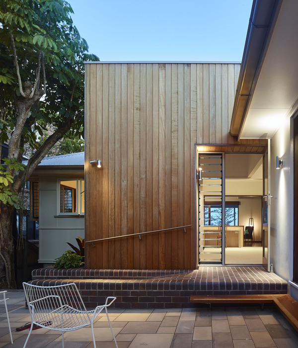
A-cero presents one of its latest projects of single – family detached house.It is a comprehensive reform of existing home whose owners found the need to reform both externally and internally to update its image.This is a magnificent home originally, but had charged over time both aesthetically and functionally needed a change.The work focuses on two points. Providing housing for renewed external image and create a modern interior full of light.
Courtesy Of A-cero
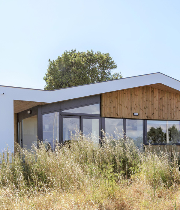
The property is situated on a generously sized plot with a slight slope to the south and heavily wooded with mature garden to have been conserved in the project.Outside intervention is more apparent on the south side, since it is the most visible, clear elevation of the house because in large part it is covered with ivy that has wanted to maintain the property and an adjacent building that houses the garage. In this south facade forms are obtained with aluminum foil. This new look is more modern, more organic following a line with the guidelines undulating forms A-cero studio.In addition to this formal review, also made structural improvements in housing as the expansion of the area of the room and extend the porch leveraging the volumes of the new projections.
Courtesy Of A-cero
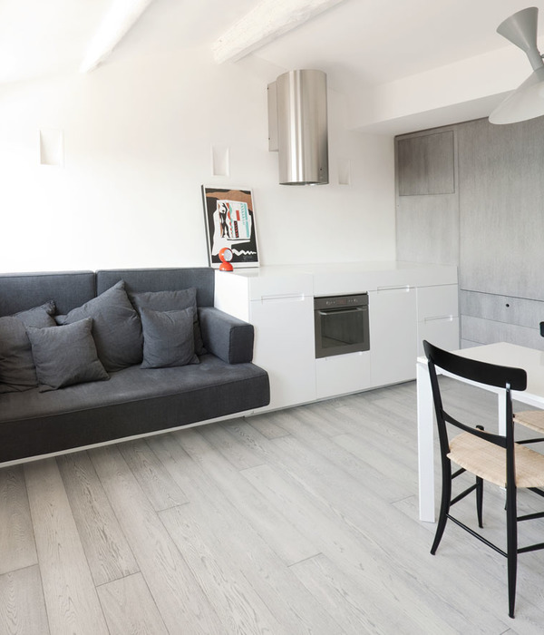
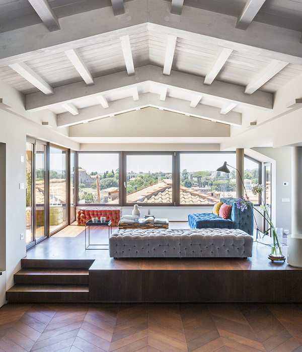
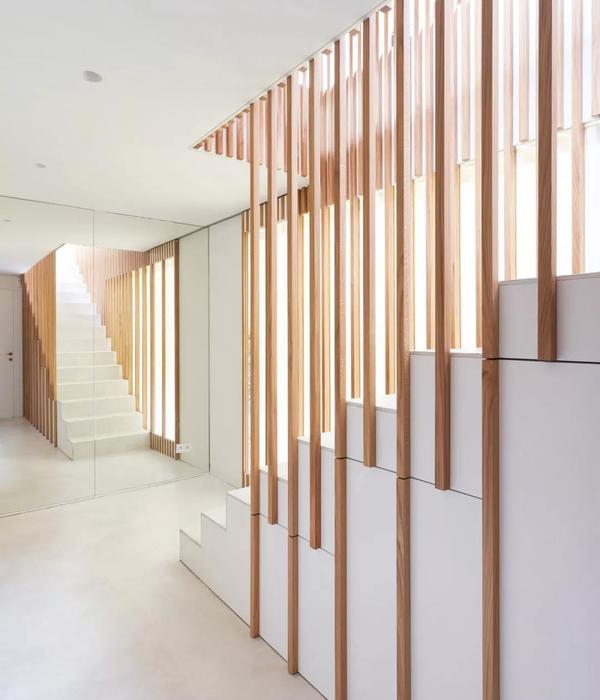
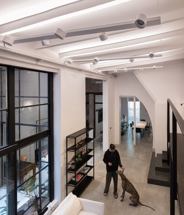
Inside the change is more substantial and obvious. It is part of a dilapidated housing lacking of light. The access occurs on the top floor where a hall distributes the communication of the stays. This top floor are the bedrooms. A large master bedroom with dressing room and bathroom, and two bedroom suites, one child and one guest. There is also space for an office area open to the hall itself. Also from here down to the ground floor by stairs to which they have been endowed with a sculptural railing turns directly to large living – dining room. In this light large space invaded by the predominance of white on walls and floor, and large windows that lead to the garden, various environments differ. A dining area, another area to watch TV and a reading area with fireplace. Completing this floor the kitchen and service area.All new furniture has been designed by A-cero, except items that already belonged to the property.
Courtesy Of A-cero
The proposed white like guiding thread of the interior design project that breaks with some tone brown paint. In the furniture color to follow this guideline chromatic. The bedrooms are designed instead warmer without losing the modern concept.Besides the obvious change resulting from the project can optimize the performance of the result, quality and a very tight budget.
Courtesy Of A-cero
Project Info Architects: A-cero Location: Madrid, Spain Year: 2012 Type: Residential
Courtesy Of A-cero
Courtesy Of A-cero
Courtesy Of A-cero
Courtesy Of A-cero
Courtesy Of A-cero
Courtesy Of A-cero
Courtesy Of A-cero
Courtesy Of A-cero
Courtesy Of A-cero
Courtesy Of A-cero
Courtesy Of A-cero
Courtesy Of A-cero
Courtesy Of A-cero
Courtesy Of A-cero
Courtesy Of A-cero
Courtesy Of A-cero
Courtesy Of A-cero
Plan
Plan
Plan
Plan
Plan
Section
Section
Section
Elevation
Elevation
Elevation
Elevation
{{item.text_origin}}

