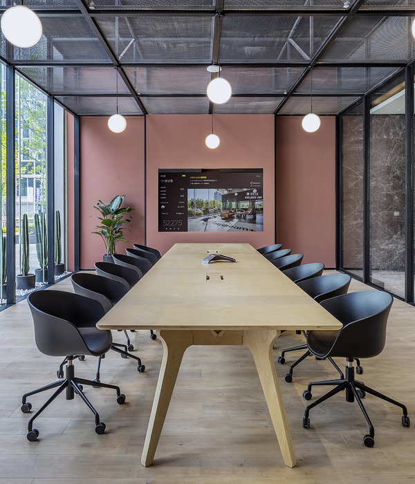
Publicis 印度办公室-- 现代生态办公空间的典范
The old office of Publicis was located at Todi mills compound in Lower Parel. They occupied four floors of a commercial office building with each floor dedicated to one company of the Publicis Groupe. The design of the office was very formal, uninspiring and did not represent the kind of company they are nor the kind of outstanding work they do. Spaces packed with work stations and large partitions without any break-out spaces or discussion areas did not seem conducive for collaborative and team work. Working areas were dark as the cabins were built along the east and west window sides of the building which blocked all the natural light.
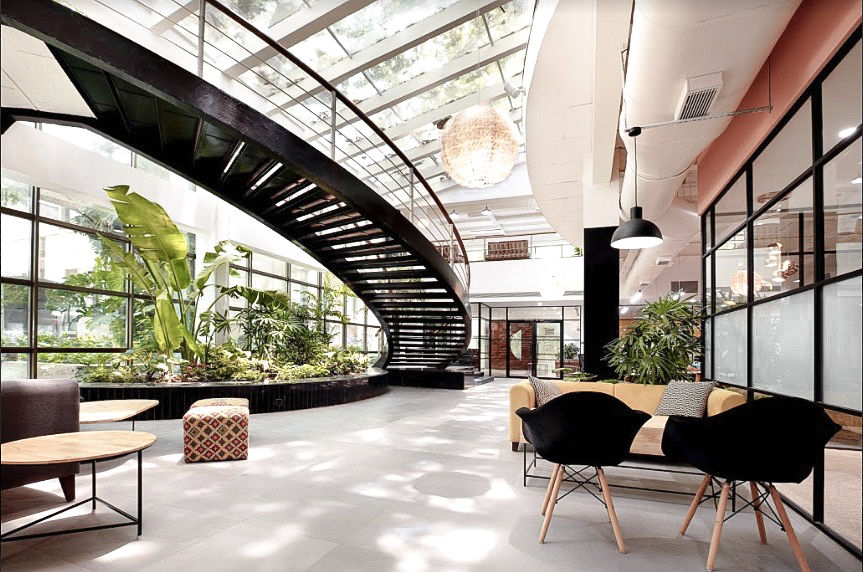
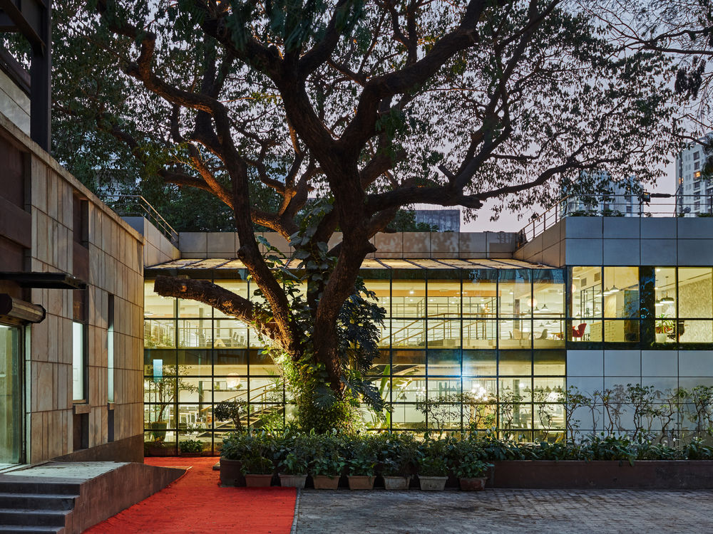
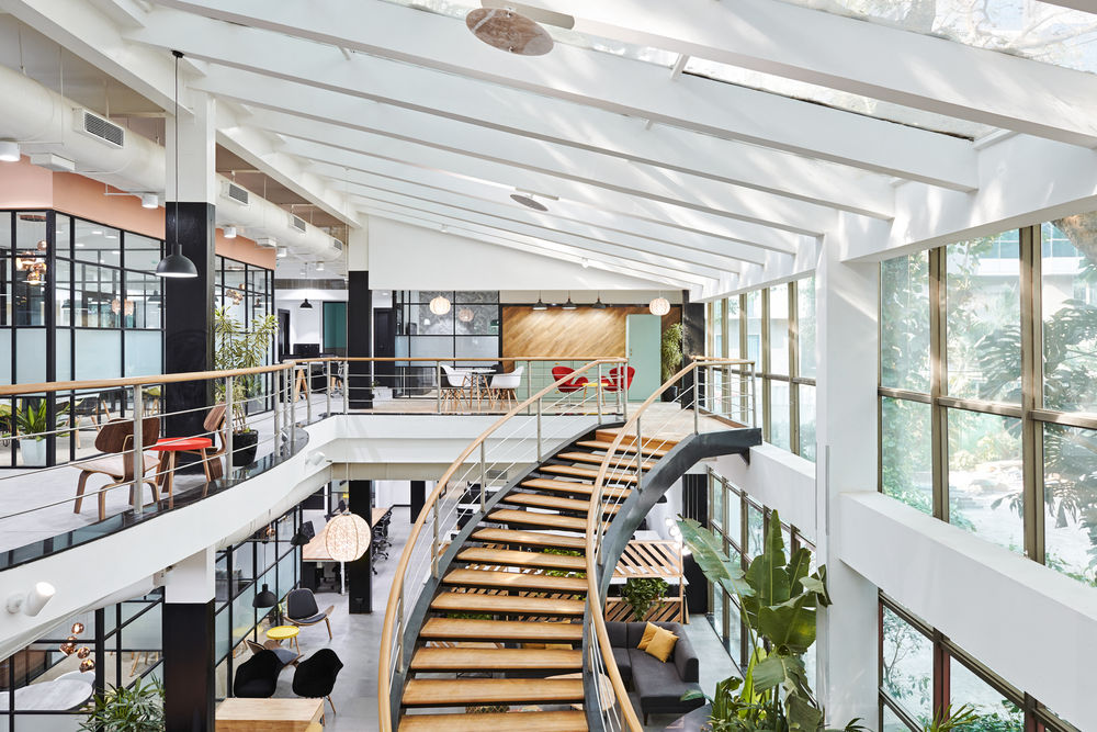
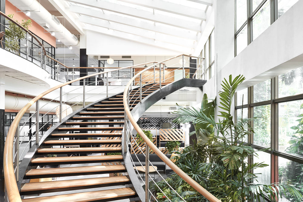
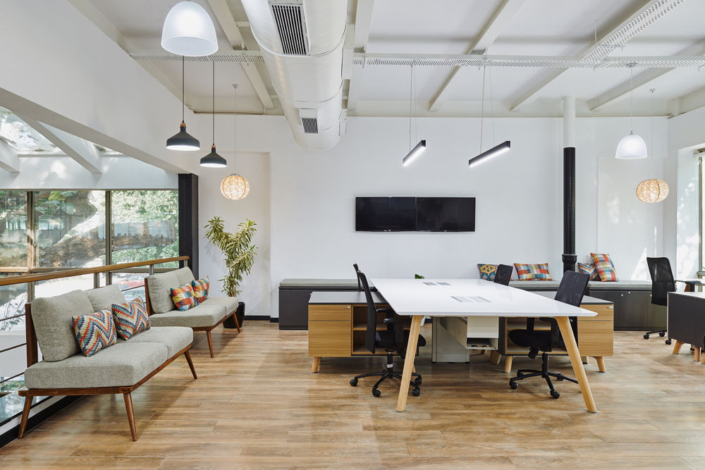
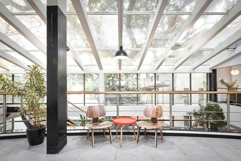
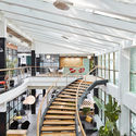
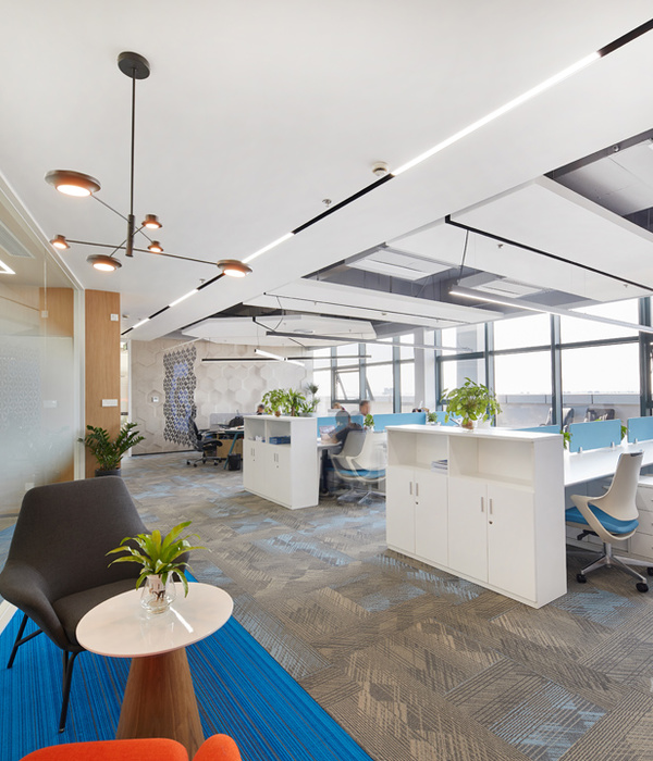
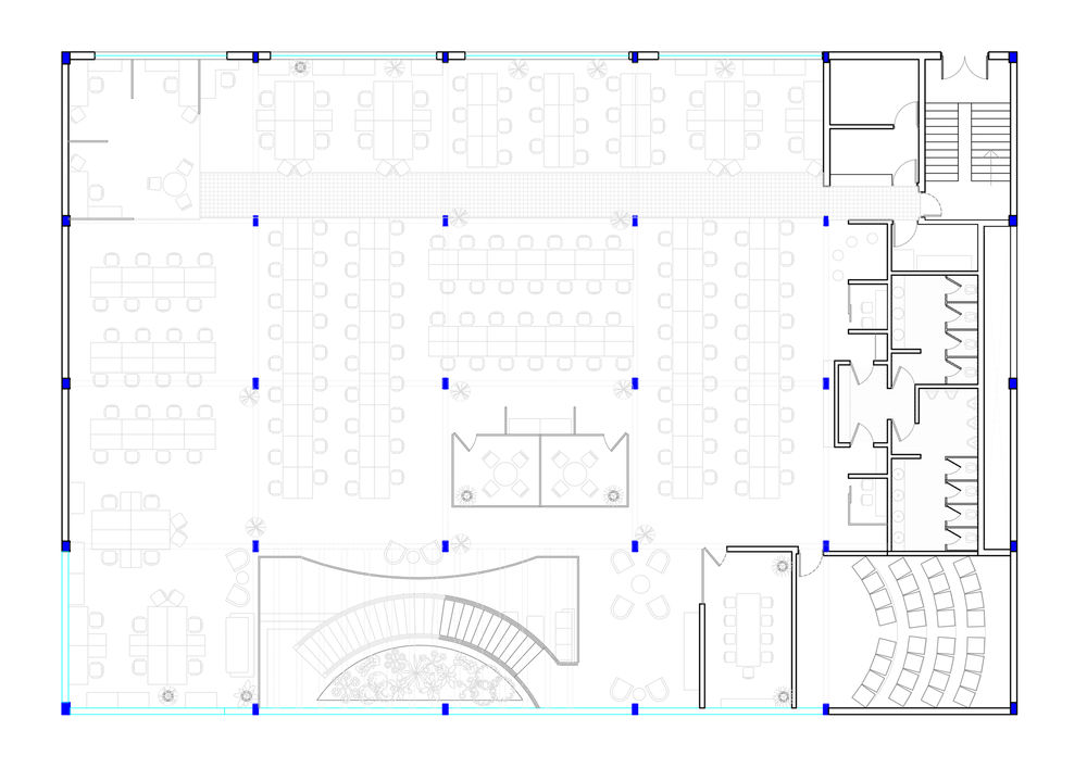
The new space is a Ground plus one stand alone structure of 20,000 sqft. with an 8,000 sqft. terrace garden. It is a glass box with an all metal structure oriented on a north-south axis having maximum glazing along it's east and west facades. Capped with a large glass roof over its atrium, flooding it with natural light making for a bright and airy space to work in. Work stations of the various companies under the Publicis Groupe make up most of the floor area with strategically placed desks for team leaders, centrally located meeting rooms and break-out areas designed to maximise interaction between the various companies, making for a vibrant and lively work environment.

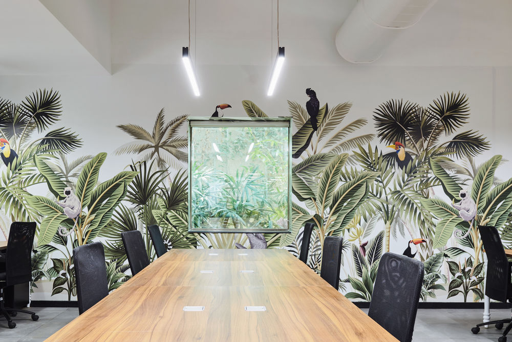
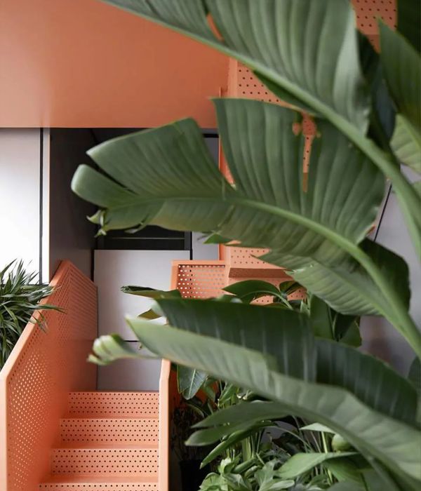
The first thing I noticed on my visit to the site from the parking lot was the majestic tree reflecting off of the glass box behind it. On entering the space flooded with natural light, looking upwards to the glass sky light of the atrium I understood the grandeur of this tree, how beautiful it is and it's impact on the space. This to me had to be the focal point of the office. We had to create a space that was transparent and permeable for all this beauty to be felt and experienced from every part of the office. In order to reflect this natural beauty through out the space we built an indoor garden using tropical plants under this gigantic tree almost giving the feeling of nature slowly creeping into the building, blurring the lines between the inside and outside. Elements of nature like potted plants and a specially designed rain forest themed wallpaper framing small windows over looking the thick foliage outside set the mood for a calm and comfortable work space.

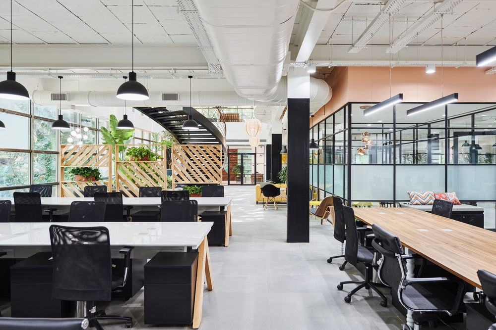
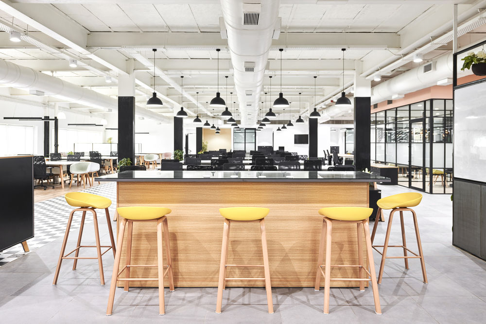
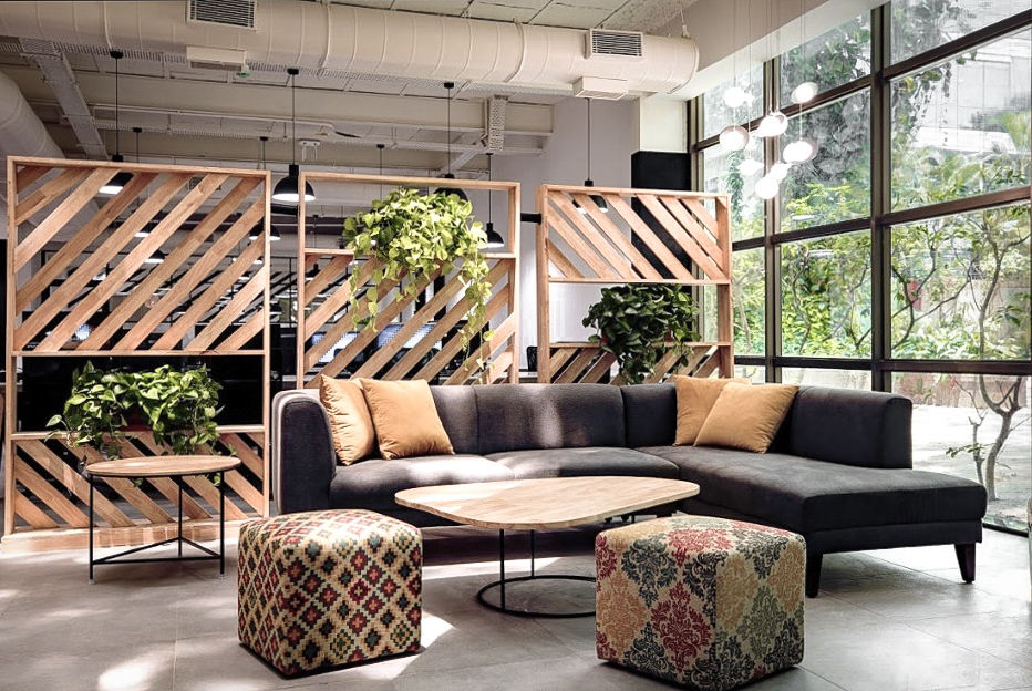
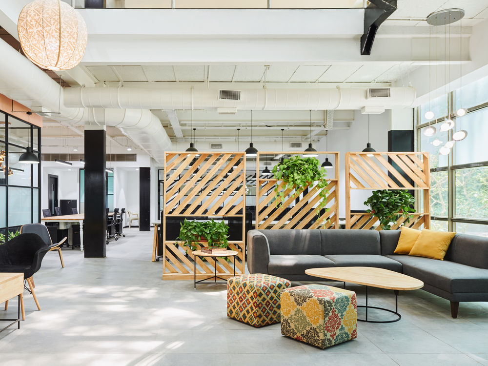
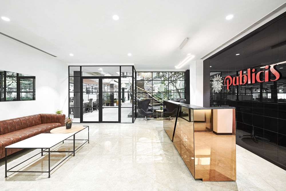
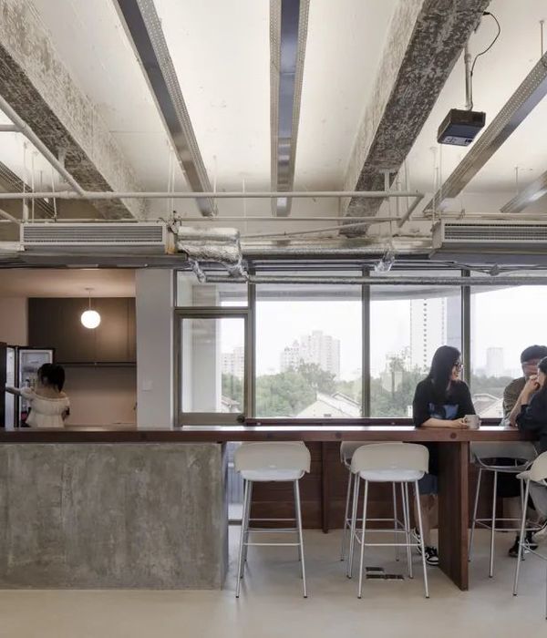
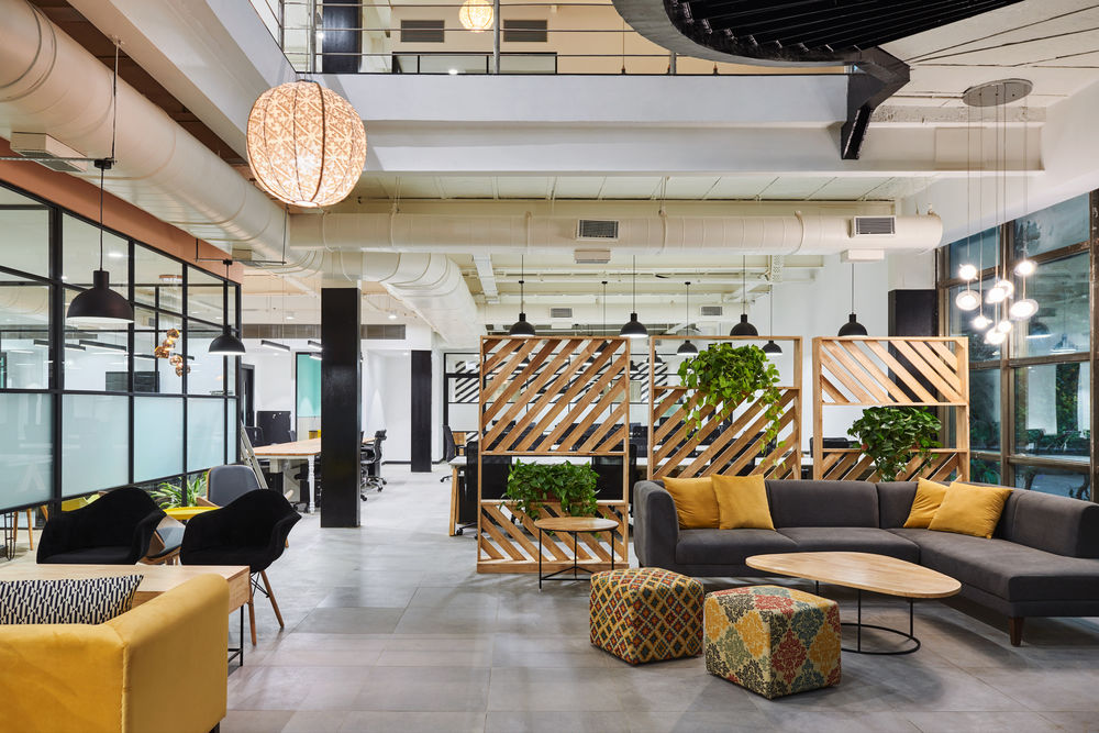
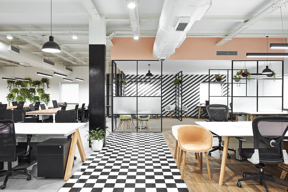
The prime focus for the design was to stay away from a very commercial and formal office design. We did this by eliminating all the frills of false ceiling and cladding, instead showcasing the raw steel structure and rough limestone slabs with all it's imperfections and blemishes intact, a tell tale sign of it's age and past life. Using high contrast black and white tiles to demarcate the spine of the space along with bright pastel shades, colourful break out spaces and custom built workstations inspired from farm house tables create a space that is warm and engaging, effortless and inspiring. A home away from home for many, where creativity can be nurtured and cultured through collaboration and shared experiences.
The clients brief was very simple they wanted a fun and vibrant space that encouraged collaboration and team work with dedicated seating for 350 employees. The rest was completely up to us, making it a very important project for the practice as it gave us an opportunity to express our architectural values and identity. With an open brief like this we had the chance to let the unique features of the space dictate the design direction.
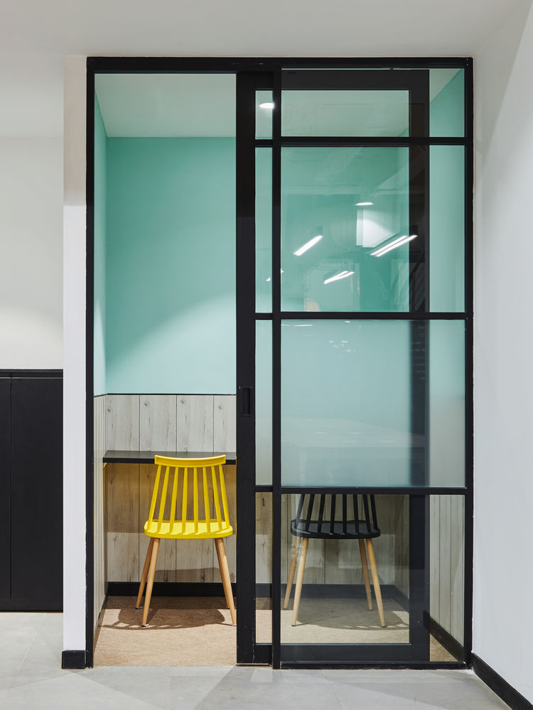
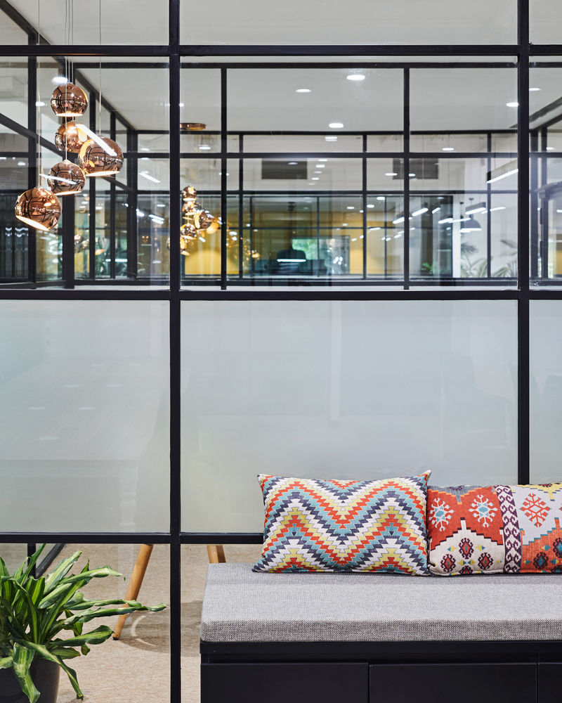
Bright pastel shades, high contrast black and white flooring, bold wall paper patterns, homely and nostalgic tables associated with old colonial furniture and old farm houses, simple but bold lamp shades over the desks, raw wood and an indoor rainforest make a strong statement for a space with the perfect balance between the old and new.

Breaking boundaries and and creating our idea of a new age office. An 8,000 sqft. terrace garden provides a perfect time out space for employees giving them a chance to escape the indoors and air-conditioning for a breath of fresh air, to work out, practice yoga or simply kick around a ball. The terrace garden is equipped with a community table for people to eat lunch at or to host parties.
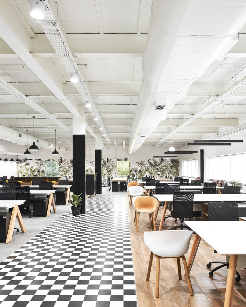
The plants for the indoor rainforest were sourced for a quaint nursery called 'Plants World' hidden inside the confines of a Parsi Atash Behram opposite Charni Road Station. Plants selected were of an indoor variety that thrive in the shade without too much sunlight like different species of palms including Areka palms and Traveller palms, creepers like Monstera, Money plants and other big leaf plants that grow in the shade of the big trees. This created a landscape composition of different colours, hues, sizes and shapes.
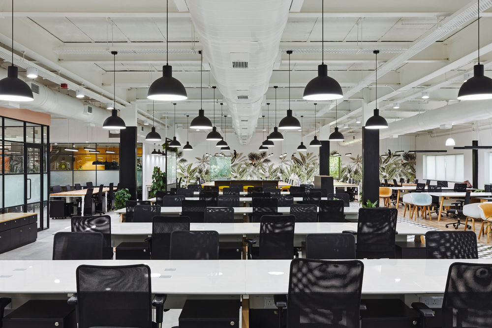
Most of the materials were locally sourced and manufactured by Indian companies. The lighting was hand selected from local distributers, for a homey feel we selected the fabric lamps from Fab India. All the floor tiles were sourced from our regular local vendor who supports Indian companies around the country. High quality wall paper was imported from Belgium and the custom printed rainforest themed wall paper was printed by Marshalls Wallcoverings. All the glass and aluminium partitions were made from locally sources raw materials and fabricated on site. The workstations were designed by us and built by Spacewood. They ingeniously adapted their existing systems to our challenging design of farmhouse inspired tables, paving a new way of furniture design for themselves through testing and prototypes. Furniture pieces comprising of benches, sofas, lounge chairs, coffee tables, end tables and meeting tables were designed and fabricated by us through local fabricators and tailors. Some famous statement pieces were purchased from importers of famous to add a touch of luxury.
We at Shiraz Jamali Architects enjoy the unique challenges that come with every project, treating each project as an opportunity to explore new ideas and concepts that maximise the unique potential of each site and client that comes along with it. Creating spaces with excellent liveability and experience. Taking each project as a new challenge to develop and grow as a practice and individuals, questioning everything and always looking to learn.

The freedom to explore and develop a space with a free hand from the Publicis Groupe while working on this project gave us a chance to execute your vision for this revolutionary office space. Their support and hands on approach made it easy for us to ensure all their needs were catered to, resulting in a work space that is boosts their energy and enthusiasm at work.
