The house is in Palio, a former resort near Kavala which is now a suburb. Like Kavala city itself, until the 1970s Palio Tsifliki featured many outstanding modernist dwellings. Thatmemoryinspiredthedesignofthishouse.
The house is built on the far side of a sloping corner lot with dense vegetation. Facing east and south, it is shielded from the suburb’s main road by high ivy hedges.
A view of the sea, towards the east, is possible only from a height. This consideration led to the design of a two-story building.
The main residence is on the ground floor, which is raised on the east façade, and is organized along three axes of movement in three different zones: the public spaces of the residence on the south, the private on the north and the central entrance and offices.
On the first floor, above the living room and kitchen, a transitional area operates on occasion as a guest room. From there one reaches the terrace via an open hallway that passes through a double-height interior with a southern orientation, and ends in a semi-sheltered space. This is intended to become a second living room with a sea view.
The double-height area is the dwelling’s centre. Its entire southern side is made of glass, which collects the warmth of the winter sun’s rays and distributes it throughout the residence, to impressive effect.
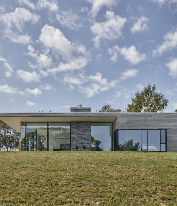
On the eastern façade, large floor-to-ceiling window panes connect the interior with the courtyard and greenery. A Π-shaped pane in the living room offers sightlines toward the verandah, the courtyard and a small raised garden. The corner window of the bedroom and the centrally-located office offer similar sightlines.
The living room leads to a verandah emerging from the main building. It is covered by a metallic arbour with moveable wings, which allows for adaptable shading but also ensures complete protection on rainy days.
The terrace, offering an unobstructred view of the sea, includes semi-sheltered and open seating and leisure areas, offering various options for outdoor living.
The architectural choices made for this house reflect the general principles with which our office deals with private residence issues:
- designing spaces with multiple sightlines and orientations, in order to achieve natural cross- ventilation, natural light and protection from the sun.
- designing several outdoor or semi-sheltered areas which, in combination with the transparency of the openings, create an open and outward-looking living space.
- Visual communication between the various spaces of the residence, outdoors and indoors. Unobstructed sightlines allow the building to be appreciated as a whole.
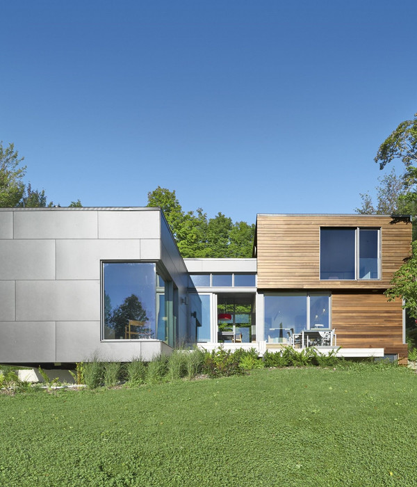
The exterior of the building was designed as a single mass featuring recesses, projections and transparencies. A continuous surface /a white line moving around it brings elements together, frames them, or on occasion projects strongly from the building, creating convex panels which will, in the future, be used for awning placement.
Exterior surfaces are painted in similar hues, allowing natural light to highlight the body of the building. However, a few small surfaces in bright sienna red provide small surprises, breaking the monotony of the single colour and operating as reference points on each façade.
Grey hues were chosen for walls and floors in the interior public spaces, while in private spaces the warm tones of oak predominate.
The architectural designed interior, with its spare and simple materials, provides a background that highlights the owners’ beloved objects and furniture.
{{item.text_origin}}


