A Monologic Discourse in an Architectural Entity Telling of its Existentialism in the Undisturbed Tranquility
Brief Introduction
The studio is a tailor-made construction at the service of Xu Lei, a renowned artist in China. With a site area of 550 square meters, the studio separates different levels to serve accordingly multiple purposes - Main level is served as a showroom to showcase artworks of Xu’s; Level 2, a living room to conduct a private conversation, and basement, a space to give Xu free rein to unleash the creativity.
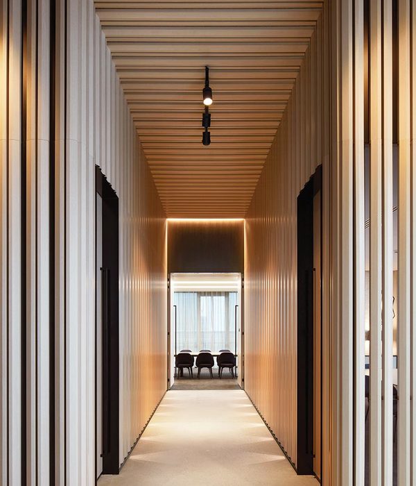
Previously, before the renovation set in, the studio, though outwardly definable and clean, was not as impeccable when it came to the interior - visually monotonous and uninteresting - so dull to lull someone into sleep. The lack of integration necessitates a flexible tactic to blend the spaces into a unified whole : the design team adopts the technique of modular coordination (MC) in the whole space in the desired size of 1400 (columns) * 1400 (rows), hence the need for customising the coffered ceiling to ease access to defining the absolute erectness and verticality of walls. In addition, the coffered ceiling is also instrumental in offering the track for the spotlights.
Setting a foot into the entrance, you would be supposed to be wrapped up in a space of artworks. Level 1 is a spacious showroom of Xu’s notable works. Bright and quiet, it creates a fitting atmosphere for guests being engrossed in the artworks.
Upstairs to the level 2, there appears a bit dimmer and quieter living room for Xu Lei. The space is used for displaying his bountiful collections of paintings, photos, sculptures, pieces of furniture, to just name a few.
Downstairs to the basement would you see a private underground studio. The design team adopts the stretch ceiling, whose colour temperature is of 5000 Kelvin, providing the equivalence of natural light suitable for painting underneath. There is a lightwell in the basement, in a bright day would sunlight be through diffusing in; a breezy day, fresh air surely.
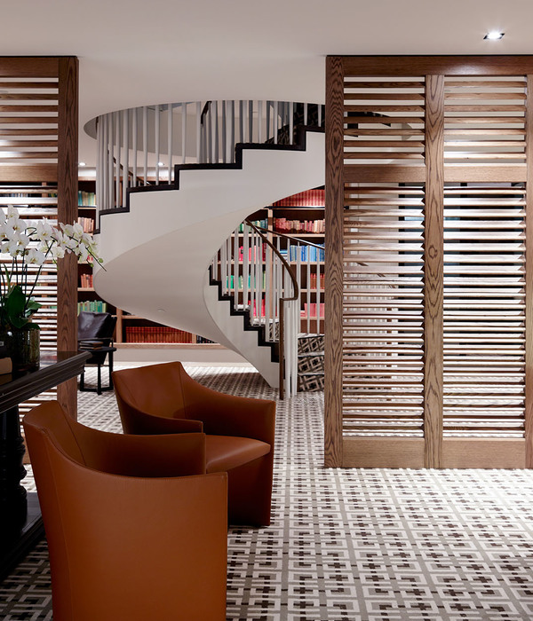
Staircase, imbuing three levels with cohesive connection, can not be disregarded yet. Follow the lead of the staircase, you would naturally compare this space to an upright spinal column for the studio in its entirety. The function of the staircase bears a conceptual resemblance to how the spine works. The design team conceives the idea of empowering the staircase to double up as both a secret ‘hideout’ up to Xu’s discretion and a spiritual place. Staircase relies on its solitary concealment for an element of tranquil spirituality because, at the very initial phase of designing, it is perceived to be an independent entity, neither slavish to the internal nor subordinate to the external.
The staircase is esteemed to be assigned with the responsibility for falling into contentment of monologic self-expressions. To achieve the conversion of conceptual abstractness to visible concreteness, the design team opts for the operation of fenestration on the wall to let the natural light sneak in, thereby curbing the hindrance of window frames. The design team also makes a reference to René Magritte (1898-1967) because the light and shadow alter during a day, evoking a subtle mood that defies description and triggering an associative bearing on his surrealism as if the staircase pulled out its individuality through an undisturbed mono-drama.
Shape, to be specific, the triangle, is an integral portion interlaced throughout the designing process. The design team deems it geometrically to be sharing overlapping identities with Xu’s works, therefore, as a metaphorical emblem, the door at the entrance is comprised of some well-organised isosceles triangles. These triangles filters the light favourably through into the hallway and creates an optical illusion of changing a supposedly stereoscopic vision into a flat 2-D image.
Incidentally, these triangles are the end result of joint forces of Xu Lei and the design team - not only making pragmatic and functional sense in warding off burglaries and providing a door handle but putting a 3-D-to-2-D concept into aesthetic practice as well - they attribute the triangular patterns to the imitation of the facade of the Bank of China Tower in Hong Kong.
Overall, the project features the utility of neutral hues: gray and white. Gray is the concrete slates of the ceilings; white, the wall. The texture and grayness of the concrete set a calm and neat tone to the expression of space, and, white bulky screen-like walls run through the space, partitioning a roomy space into multiple smaller areas. The design team does not overdo the tones, with matte-surfaced resinous terrazzos to pave the floor, a palpably pleasing and interesting match to the gray ceiling is wanted.
Xu Lei believes that art and the realities of life are separate from each other, or rather, the parallel existences, and individuals’ mind might be a virtual reflection of certain much more complicated realities. Granted that it is stated by Xu, the team determines to disperse some artistic trinkets to the space for Xu’s sake to artificially force the interaction of art and space, thereof creating something of mental experiences.
The team would much care to exhibit a vacant room, by implications, to relate to Xu’s philosophies about his art. The designers are inspired by the exhibition of his in 2013, ‘Veneer of the World’, to shed light on a brand-new understanding of his work, namely, ‘a solitary world void of humans’. Quite different from the cold impersonality of some modern studios, the vacant rooms and tranquil atmosphere are credited with their own manner to self-express.
They are imbued with a certain degree of autonomy barely inflicted upon the subjective point of view of human’s, then not a single moving silhouette will be appearing on the photos thereupon due to their own stories to unfold in an undisturbed way. Put it simple, Xu Lei’s art studio is designed to be an architectural metaphor to refer to a monologist telling of its existentialism in the undisturbed tranquility.
Project credits Name: Xu Lei Art studio Location: Beijing, China Completion year: 2020 Site area: 550 sqm Gross floor area: 550 sqm Interior area: 550 sqm Chief architects: Wan Shuyan & Sun Dayong Interior design: Wan Shuyan & Sun Dayong Principle designer: Wan Shuyan & Sun Dayong Design team: Penda China Construction team: Dai Hechi etc Structural engineer: Penda China FF&E design team: Penda China MEP consultant: Penda China Lighting consultant: Penda China Materials: Emulsion, Plaster slab, Concrete slab, Terrazzo, Self-leveling concrete Total cost: 1,000,000 RMB Image © Xia Zhi
{{item.text_origin}}

