Rosenberg Restaurant, Maskit 32 Herzliya Pituach
Interior Design: Nitzan Horovitz
Photography: Oded Smadar
Area Size: 200 SQM
Rosenberg's design began with the definition by the restaurant's owners, Manor Dana and Avi Rosenberg, for the number of diners who could populate the place.
Other than that, Nitzan Horovitz the designer was given a free hand in planning and building the idea that led him to the design.
He drew inspiration from the restaurant's menu, dishes and the raw materials that they contain. What guided him was mainly greenery and a lot of it, so the restaurant is highlighted in green as a color and as a local product that represents freshness.
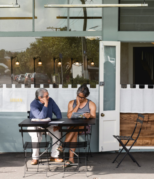
Since restaurants in Herzliya Pituach, where Rosenberg is located, usually open from noon until late hours of the night, the diners arriving at different hours is of a different nature. The designer created an atmosphere of a patio for daytime and a bar atmosphere for an evening out.
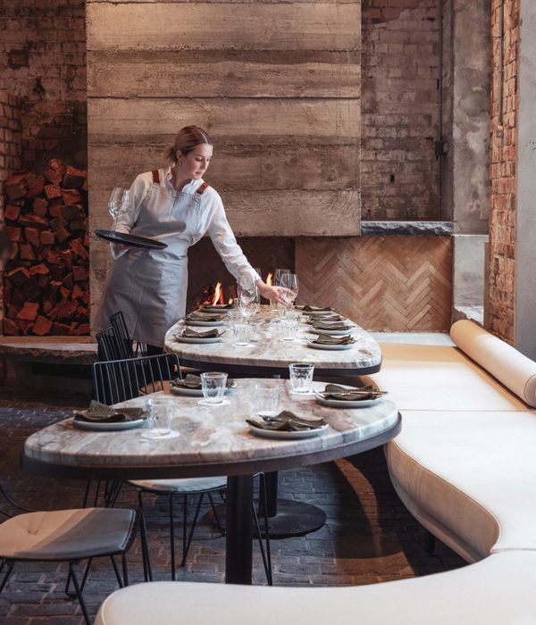
To emphasize the noon atmosphere, the freshness and humorous feel, the designer used a non-local flavored tile - granite porcelain parquet like, in four different shades using the Fishbone layer method, aimed to a young audience of high-tech employees.
For the evening vibe, the designer carefully chose a nonchalant and less tight atmosphere that creates an urban vibe, which appeal to a crowd who wants to drink cocktails and looks for a pleasant place, more casual and less demanding, without fashionable pressure.
The restaurant consists of 3 floors: a basement with a bathroom and a kitchen of about 100 square meters, which combines several departments - from the restaurant's feeding area to deliveries. In addition, an entrance floor and a gallery floor, consisting a total area of 100 square meters.
A large bar at the entrance facing the street makes the floor more dynamic and draws from the outside environment. The bar is covered with metal plates and on top it a natural granite surface of Cosentino.
Above it is a large storage space that also serves as a dominant lighting fixture.
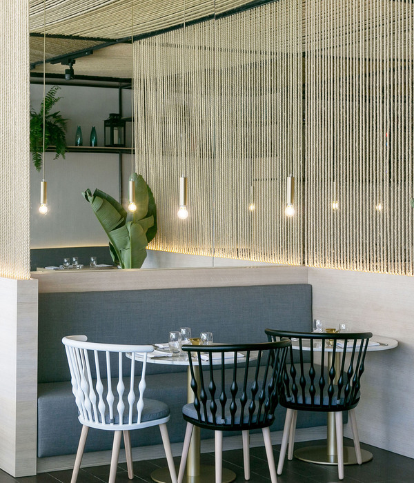
The space is covered with highlighted green carpentry, with 20x20 cm porcelain tiles in vintage style, and mirrored squares combined. This design creates a wall that shines with dazzling light from different directions, giving a deep pixelated look. A pair of elongated hanging Guirlanda lights illuminates the sitting and bar areas and an exposed air conditioning system contributes to the light industrial feel. A lighting element that repeats itself by surrounding the restaurant is fixed to the wall, covering and illuminating the white tiles upwards, allowing the restaurant's look to vary according to the type of crowd arriving. At noon one amount of lighting and in the evening another quantity.
The gallery overlooks the entrance floor with a padded seating bench adjoining the wall to the width of the restaurant. It creates an area of group sitting, separated by Mashrabbiye, designed metal partitions in order to create intimacy with its own lighting fixtures.
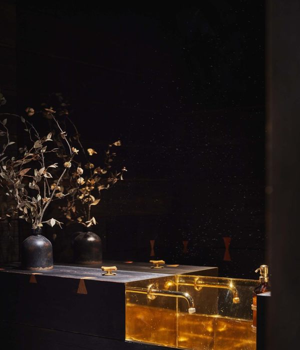
The metal staircase is covered with platted tin floor and leads down to the kitchen floor and to the bathroom, where there is a hall with iron element and a sink that combines iron and brass.
The flooring which appears on the entrance floor in green and white colors, repeats itself in shades of black, white and blue. The special look of the rail is designed to provide a sense that the place is active and has been around for a while, by using remains of glass created by grid mosaics in a vintage-industrial look. And like everything old, the rail is aimed to arouse memories among visitors and joining the sensational experience, which is created by the restaurants' tastes, vocals and the feel that come from materials that remind of a patio and Irish bar.
Status Completed works
{{item.text_origin}}

