MINSE DESIGN 民舍制作空间 设计工作室
Space
云上咖啡 CloudCafe
Nov 08th.2022
Copyright@MINSEDE
SIGN
DESIGN/
©贺赞辉
此项目位于江西萍乡云玺楼下咖啡店,项目面积为 170 平。空间保留原始的混凝土墙面,将木饰面、石皮、氧化铝板、乳胶漆、涂料、镜面不锈钢等元素融入其中。材质之间粗矿与细腻的结合打造出全然不同的咖啡店。
整个空间中视觉焦点为二楼的造型盒子以及台阶处理方式。用木饰面将延伸楼板将其包裹,以悬浮盒子的形式呈现。通过材质的区别化,让悬浮盒子成为一个独立的个体。运用块面切割手法,让简单的盒子细节化。
The visual focus of the whole space is the modeling box on the second floor and the step treatment method. Wrap the extended floor slab with wood veneer and present it as a floating box. Through the differentiation of materials, the floating box becomes an independent individual. Use block cutting technique to make simple boxes detailed.
吧台区域天花选用乳胶漆,区别于粗矿的混凝土墙面,让原本灰暗的空间中出现一抹干净面,同时削弱了原本一楼操作区层高导致的压抑感。
The latex paint is selected for the ceiling of the bar, which is different from the concrete wall of coarse ore, so that a clean surface appears in the originally gloomy space, and at the same time, it weakens the sense of depression caused by the height of the operating area on the first floor.
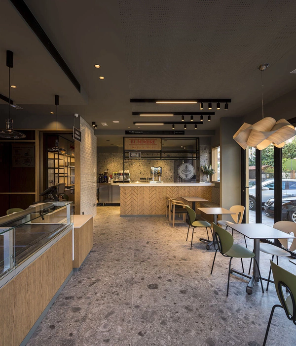
长桌座位区和悬浮岛台座位区布置出来两条主动线。开放的大空间内,站立、围坐或是对坐,通过座位方式的设定来消除人与人之间的距离感,促进了顾客与顾客之间的交流与互动,使空间成为一个有温度的交流场所。
Two active lines are arranged in the long table seating area and the floating island seating area. In a large open space, standing, sitting around or sitting opposite each other can eliminate the sense of distance between people by setting the way of seats, which promotes the communication and interaction between customers and makes the space a place with temperature.
进门右手边的镜面造型长廊,通过镜面特有的反射属性来延伸空间,减弱原始建筑中这块区域的狭长感。
The mirror-shaped corridor on the right hand side of the entrance extends the space through the unique reflection property of the mirror, and weakens the narrow feeling of this area in the original building.
卡座区的吊顶我们希望形成一个虚的使用空间。黑色体块盒子内打上灯光,将注意力跟随灯光引入其中,营造出神秘的空间氛围感。增加空间中多样性的同时,激发人们的好奇心与求知欲。
We hope to form a virtual space for the suspended ceiling in the booth area. The black block box is lighted, and attention is led into it with the light, creating a mysterious sense of space atmosphere. While increasing the diversity in space, it can stimulate people’s curiosity and thirst for knowledge.
楼梯作为一、二楼的衔接点,同时作为空间亮点兼顾打卡区。我们摒弃传统扶手式阶梯,以建筑的做法,将楼梯以体块穿插的形式左右延伸。与一楼卡座区结合使用,将楼梯打卡区域最大化呈现。
Stairs serve as the connecting point between the first and second floors, and at the same time, they serve as the highlight of space, taking into account the punch-in area. We abandon the traditional handrail staircase, and extend the staircase left and right in the form of blocks interspersed with buildings. Combined with the booth area on the first floor, the stair punching area is maximized.
PLAN A&B
二楼悬浮盒子的打卡区作为设计的亮点,其它区域则进行减法设计。大面积混凝土墙中设置长形开放格,即是功能区域也起到点缀作用。
The punch-in area of the floating box on the second floor is the highlight of the design, while other areas are designed by subtraction. Long open lattices are set in large-area concrete walls, which means that the functional areas also play an ornament role.
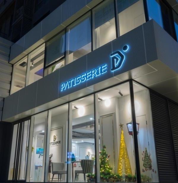
因不能对外立面建筑进行改动,在设计中我们将黑色铝板直接落地,窗户以门的形式呈现,让视觉感受得到延伸。门头区域,没有繁杂的造型,通过桌面与天花体块的双向延伸,模糊室内外界限感。
Because the facade building can’t be changed. In the design, we put the black aluminum plate directly on the ground, and the window is presented in the form of a door, which extends the visual feeling. The door area, without complicated shapes, blurs the sense of indoor and outdoor boundaries through the bidirectional extension of the desktop and ceiling blocks.
項目名稱:云上咖啡 Cloud Cafe
項目地址:江西萍乡
設計單位:民舍製作空間設計
設計主創:贺赞辉
建築面積:170m²
項目類型:商业空间
歡迎轉發分享本文
You are welcome to share and repost this article.
以空间承载乐 以色彩记录趣
贺赞辉
杭州民舍制作空间设计工作室、萍乡民舍制作空间设计工作室联合创始人
2021 百度馨居奖全国 top50
2020 UNDER40 中国杭州设计杰出青年
2020 中国设计新青年华东 TOP50
2020 ADA 菲斯曼设计优秀作品
2019 金堂奖年度杰出作品
2019 年 IDS 设计星十佳作品
2019 亚太空间设计新锐设计师
联系我们
民舍制作空间设计工作室
地址:杭州市滨江区江南岸艺术园区
地址:江西省萍乡市雅天大厦 A 座 301 室
sanb667
媒体联络:-三贝-
绿洲:-三贝-
三贝
▼圖文涉及隱私版權.如需轉載.請先通過文末的郵箱地址與公眾號管理員聯繫.我們會第一時間回覆.謝謝!
{{item.text_origin}}

