SUPERFUTUREDESIGN*打造迪拜购物中心时尚大道扩展区-- The Kape 精品店设计
Architect:SUPERFUTUREDESIGN*
Location:Dubai - United Arab Emirates
Category:Shops;Showrooms
THE KAPE is a new brand on the scene of modest women’s fashion and has a different approach to garments, specifically the traditional Abaya. The message and name of the brand are soon to stick with women all over the UAE, and they needed an impactful interior design at their boutique in the Dubai Mall. The name behind ‘THE KAPE’ is Hanadi al Hawi, and she approached SUPERFUTUREDESIGN* with a proposition.
To SUPERFUTUREDESIGN*, playing upon the brand’s disruptive attitude would be a demanding process, considering its products and the message it speaks. Through many meetings with the client, we helped her clarify the vision she has for the brand’s image. Through this creative process, SUPERFUTUREDESIGN* became more understanding as to the type of space that the client wanted. However, we had only just scratched the surface of a rigorous ordeal that required choosing between different moods, perspectives, colour palettes, and textures.
The entire project took a few years to set up, and it was an interesting view as it was being put together, piece by piece. The Kape Dubai Mall, it’s an accurate reflection of SUPERFUTUREDESIGN*’s taste for significant aspects, something which is embedded without undermining modern minimalism. This is such a valuable theme for our eclectic philosophy.
Located in the new extension of the Fashion Avenue of the reputable Dubai Mall, our most recent venture into the domains of luxury retail space design involved big names made the task a big challenge. Despite our experience, we were tasked with the retail design projects in the Dubai Mall Fashion Avenue Expansion.
It was an overwhelmingly great operation for us, SUPERFUTUREDESIGN*’s works would be the backdrop behind famous brands such as Prada, Burberry, Gucci and The Kape. No stranger to working with high-ranking luxury brands in one of the world’s most profitable shopping centres, it felt a little different than with any other project.
Thousands of people visit the fashion avenue every day so our work would come to mind immediately when people think of the famous fashion houses because unlike the fashion in these stores, the spatial design would remain constant. Hence, SUPERFUTUREDESIGN* had to come up with a distinct statement that would complement the façade. We’ve been hard at work on the recent brand debuts of THE KAPE.
This was one of our favourites because it was a recent startup with its first store and office in the Dubai Design District; the SUPERFUTUREDESIGN* concept and philosophy would be embedded in every detail of the boutique, and it would become something that is intertwined with the unconventional fashion garments that are designed and sold by the brand. In the ambient spaces, we implemented techniques that would result in a relaxing environment. They contributed to a spatial effect that calms the mind, along with balanced elements that enhance the senses.
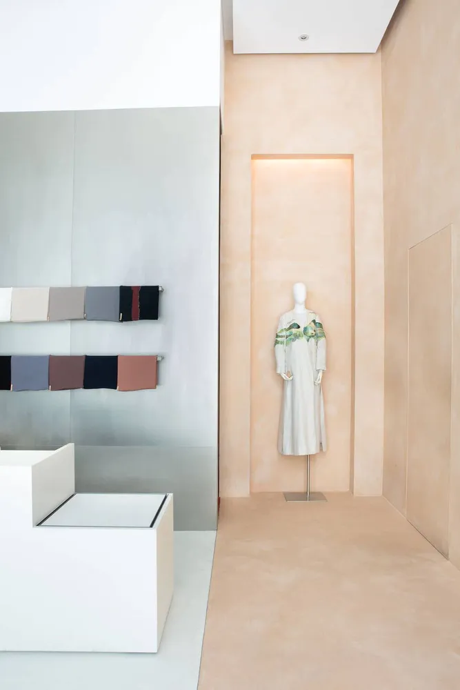
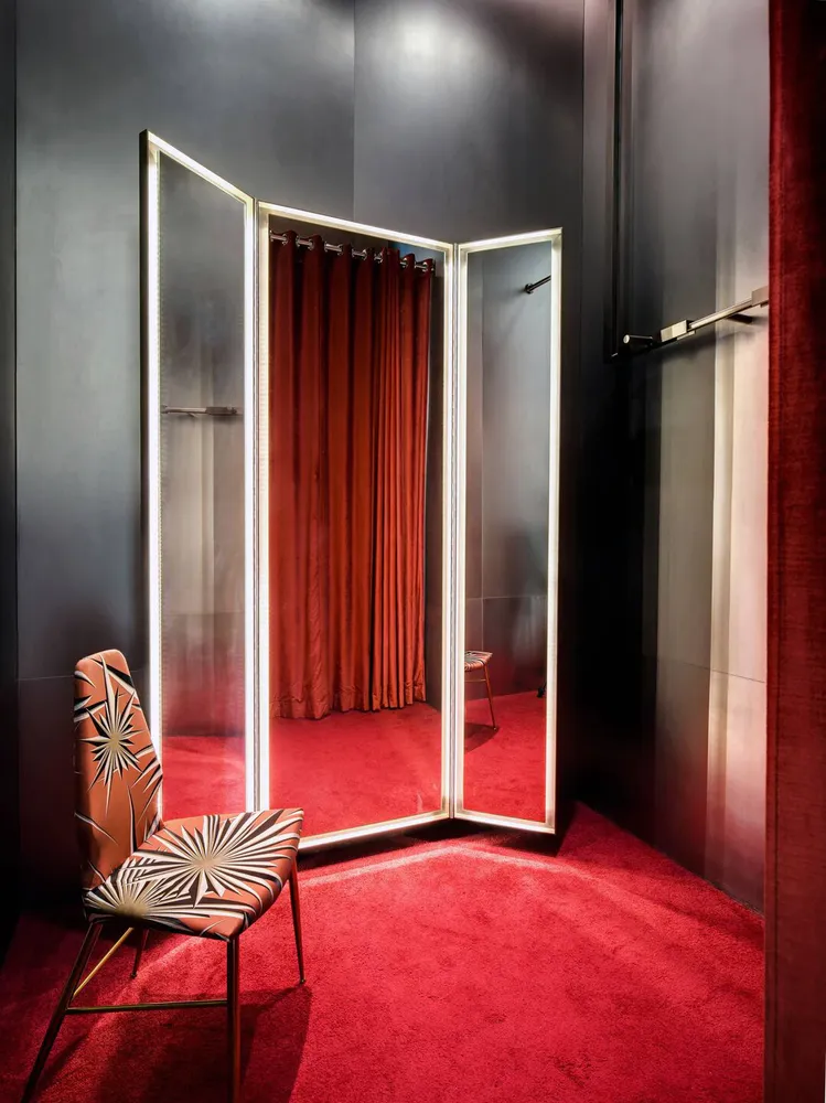
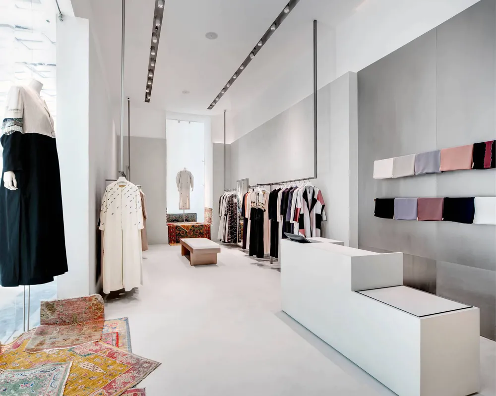
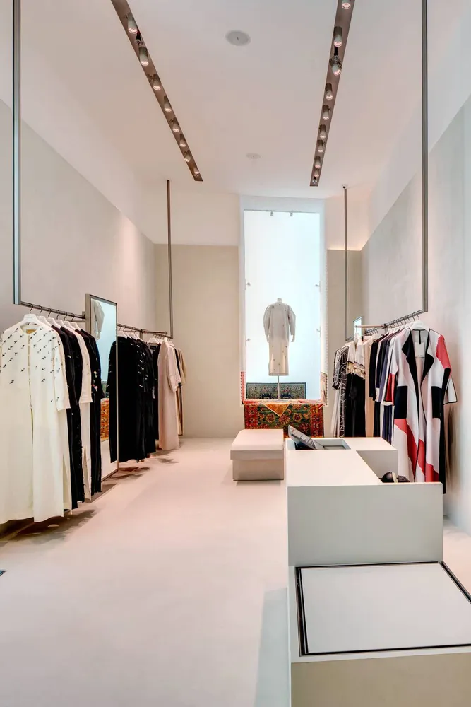
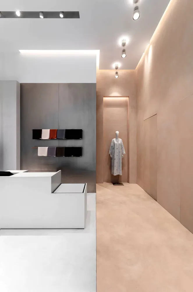
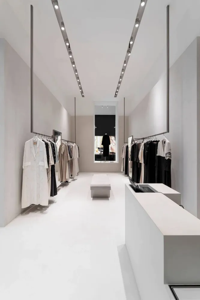
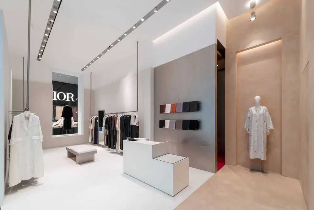
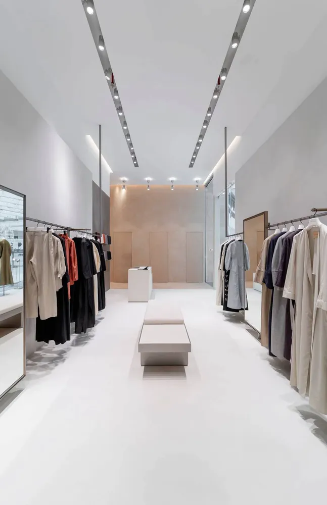
For the 70 square meters boutique in the Fashion Avenue of the Dubai Mall, we emphasised light as being the main factor because of the way it manipulated the earthy and futuristic masses of cementitious resin. This core feature highlighted our Avant Garde attitude that is different from other one-sided approaches. The contrasting characteristics of light and resin are skillfully blended to highlight the smoothness of one and heaviness of the other. While we couldn’t change the size of the boutique, we tried to maximise the height of the ceiling by giving it a ‘tray’ effect by keeping the resin, flooring and walls the same till a particular height. Also, the colour palette was kept neutral except for the pop of red in the fitting room to add a dramatic effect.
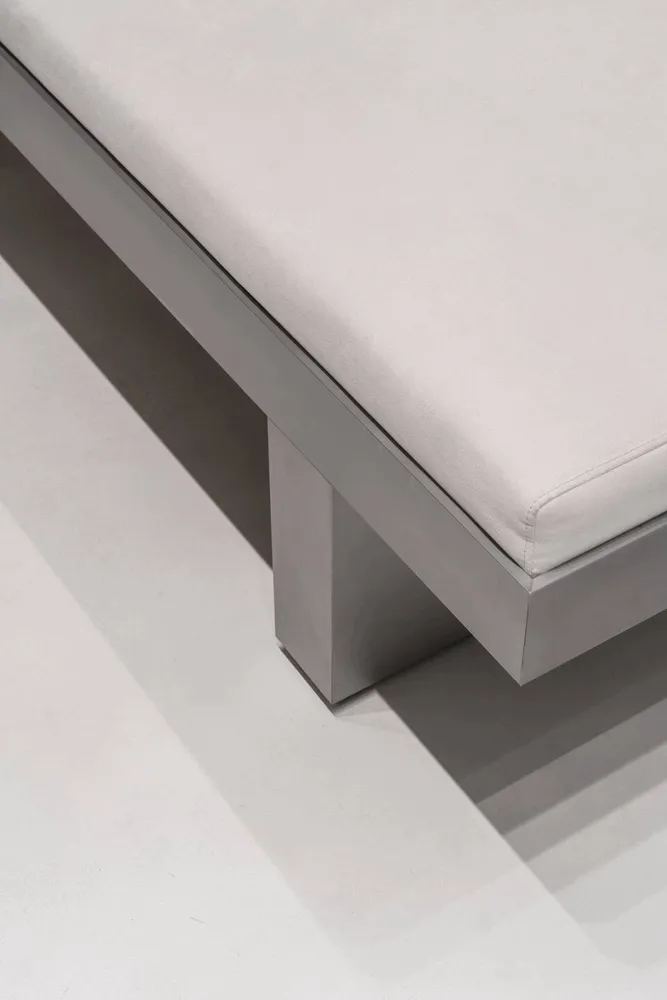
For the boutique, simplicity had a lead role in defining the ambience and mood, as contrast was defined between the rough patterns and texture that was implemented for the exterior and the smoother finish of the floors. Tasteful and comfortable sofas make for excellent seating space, and a touch of class is added by the vintage chair from the 50s upholster with Jim Thompson fabric.
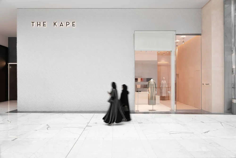
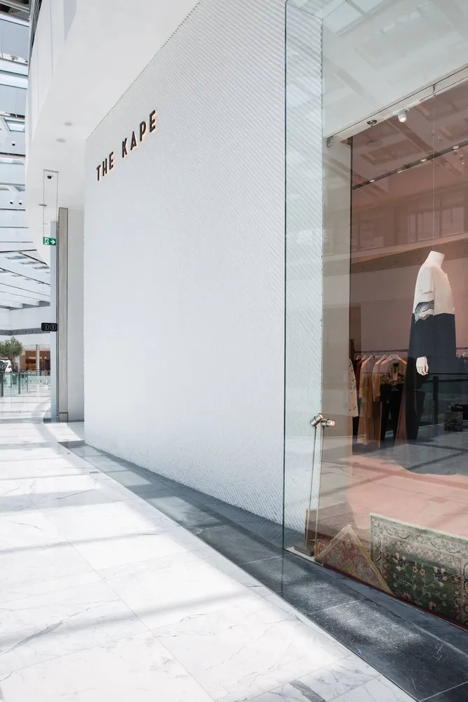
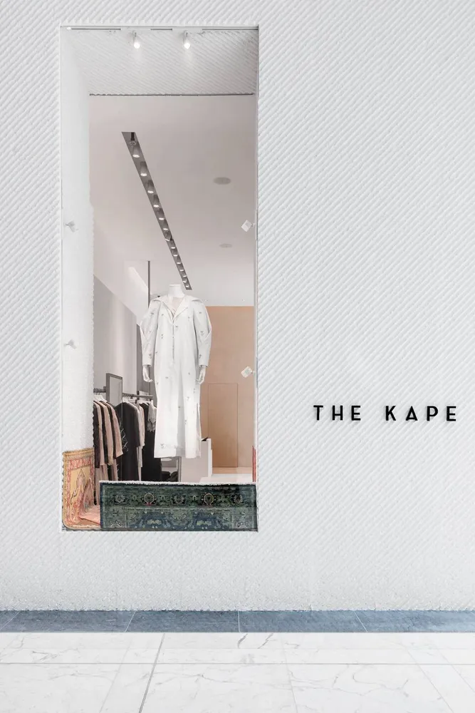
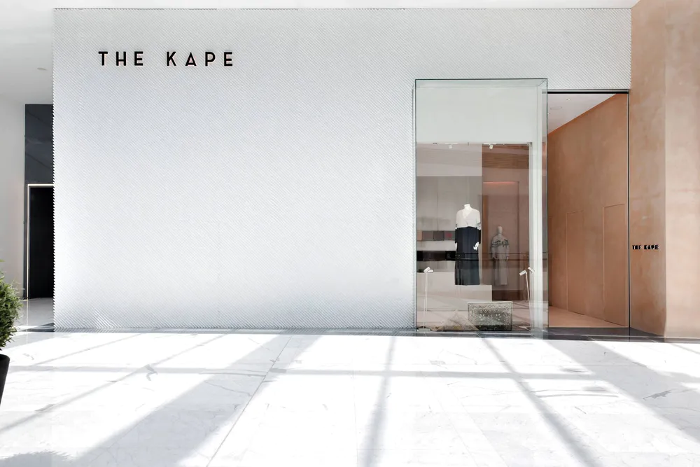
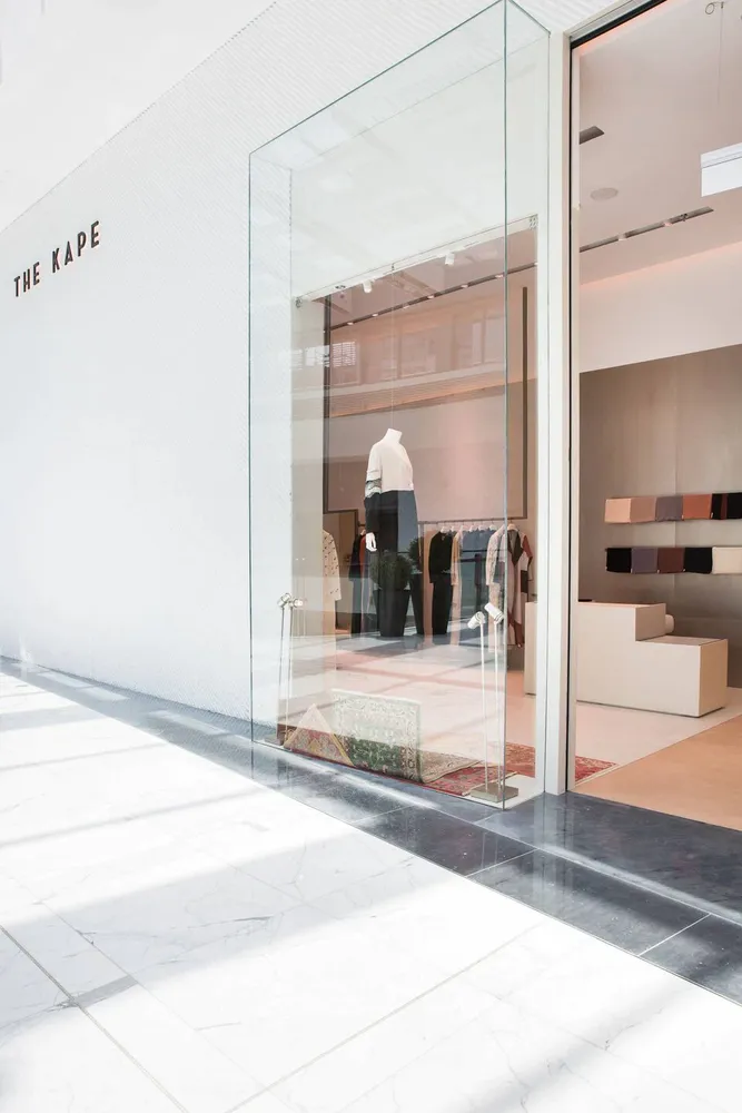
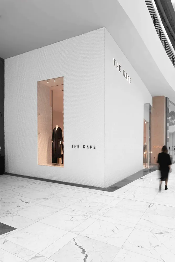
The façade in the boutique was a result of some experimentation with new materials and elements; prefabricated cement panels were delicately transformed using a patented moulding technology to produce an interesting wave-like pattern and texture that would play upon the senses. It crossed the surface in a diagonal direction and created an amusing effect that would grasp the audience’s attention.
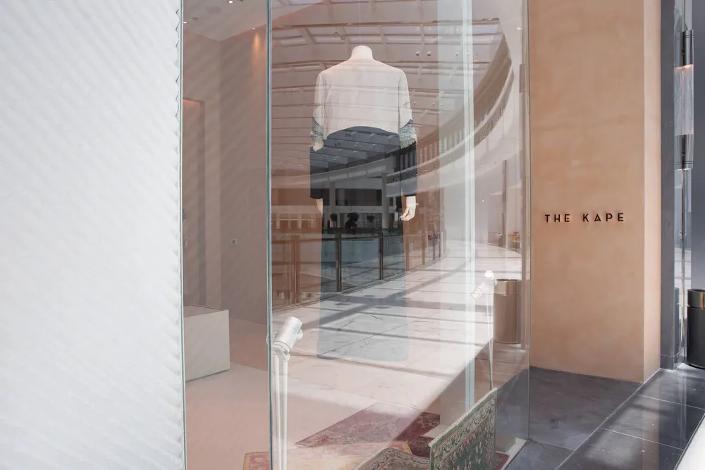
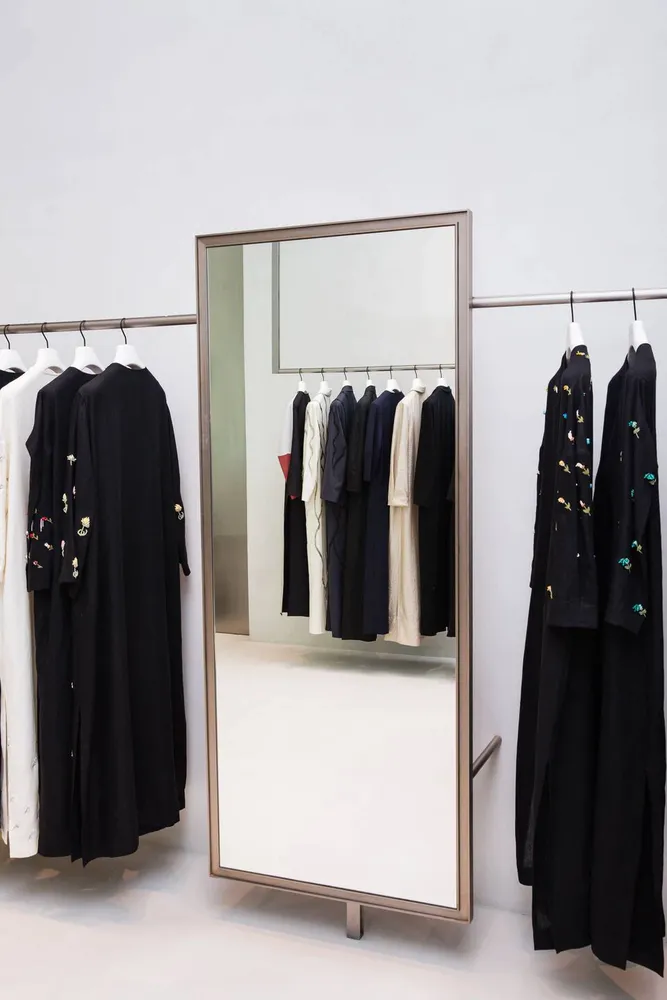
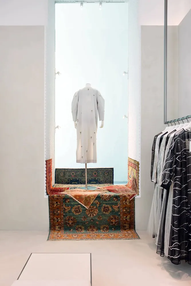
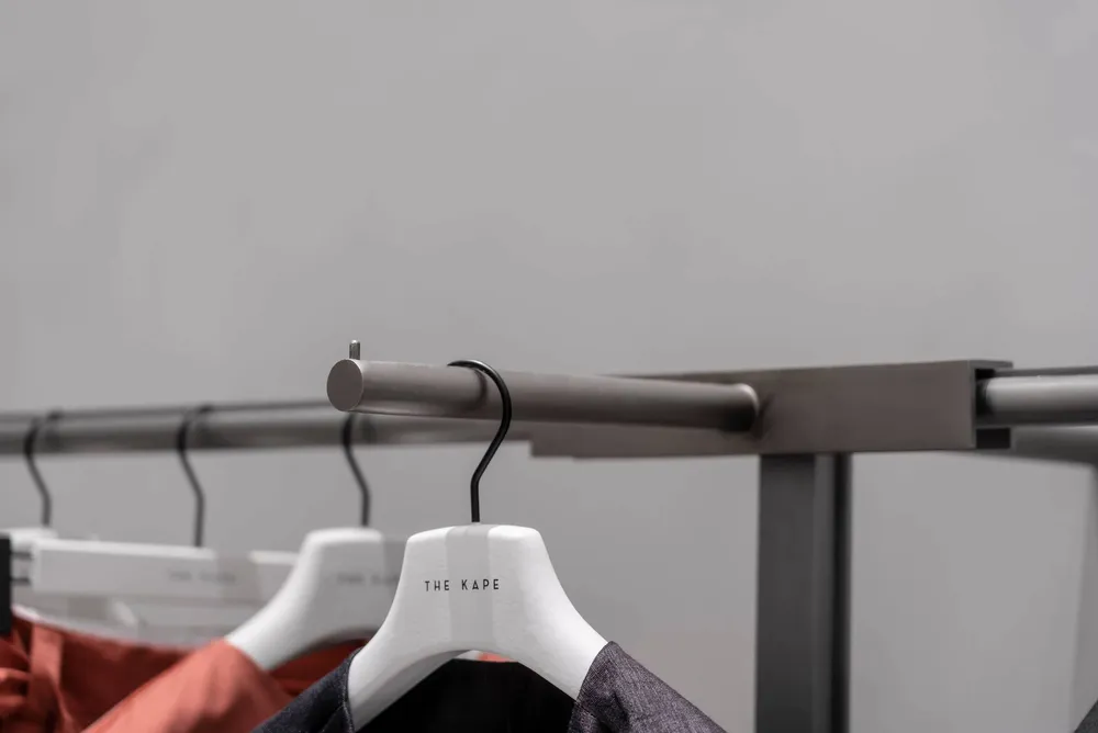
ncorporation of movable mirrors and front hangers allows for a flexible and effective display of clothes. The exterior is delicately finished by adding a futuristic shop window that protrudes out of the expanse and appears similar to a fish tank. Inside, the resin flooring gives way to the other attractive features of the boutique, like the stunning red fitting room and the elegant frames that define the displays.
▼项目更多图片
