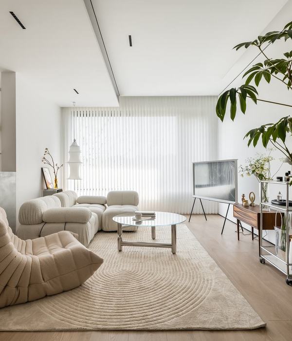
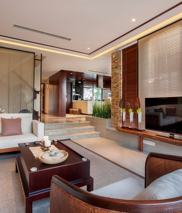
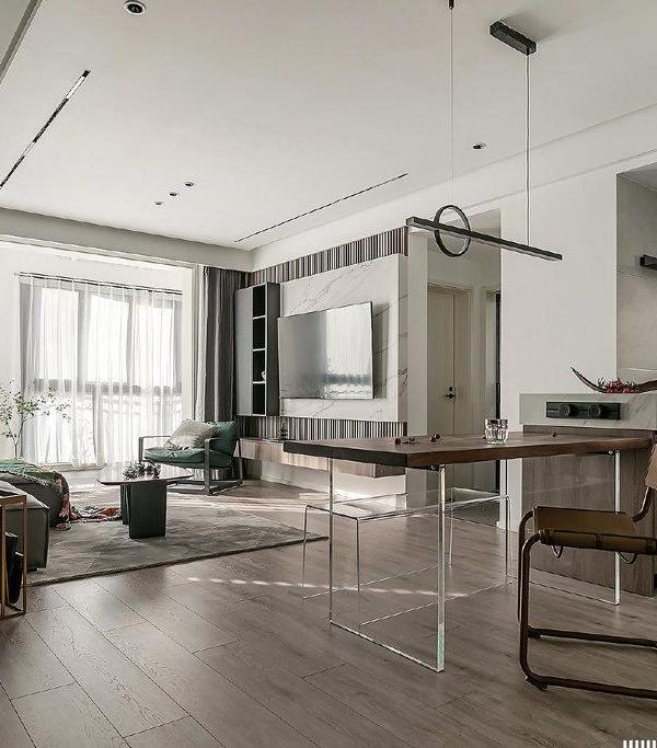
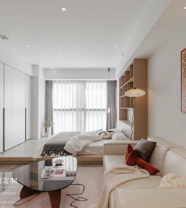
Studio Didea has completed a new renovation and interior design project in the heart of Palermo. The architects transformed an old apartment into a contemporary living space in order to adjust it to the needs of a young couple.
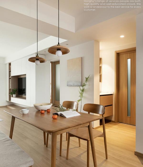
LAYOUT The apartment had a neat layout featuring only two bearing pillars as structural limitations. The architects optimized it and tried to expand the floor space as much as possible by reducing circulation areas. They also got rid of all built-in storages, replacing them with integrated fixed cupboards. «The design process was extremely precise and detailed» say the architects. «Our main challenge was to accommodate numerous requirements from the clients within the limited space available». The layout develops around a central axis in correspondence with the entrance door and which marks a sharp distinction between living and sleeping areas. The pillars support the new cupboards furnishing the living room, which include a wardrobe, a hidden desk and a set of open shelves designed for the dining room.
MATERIALS The apartment is at the sixth floor of the building and enjoys a lot of sunlight and a special view on the city’s historical gardens. The architects wanted to create an atmosphere enhancing these qualities and the identity of the place. The living area features wide windows facing the gardens. The view is better enjoyed thanks to the continuity between the kitchen and the dining room – separated by transparent doors – and is also framed within the wooden niche in the kitchen. The main cupboards and the kitchen’s furniture are characterized by wide, white surfaces reflecting and enhancing the abundance of natural light. While the open shelves are made of durmast wood, whose light and warm colour helps to create a cosy atmosphere. For the bathroom they chose grey resin. The niches with cupboards and the interplay between white and wooden surfaces provide visual continuity in all the rooms, conveying a minimalist and sophisticated appearance.
{{item.text_origin}}

