- 项目名称:Bananain蕉内概念店
- 项目地点:深圳宝安壹方城
- 空间与装置设计:Some Thoughts空间设计工作室
- 主持设计师:李京泽
- 设计团队:谢朕,刘盛雨,刘金玮
- 项目业主:蕉内
- 主要用材:铝合金,夯土,水磨石,亚克力,涂料
- 室内面积:180㎡
- 摄影:邵峰-榫卯建筑摄影
未来进程感式概念阐述
The concept of the futuristic proceeding
当视角进入隧道并开始相对论驱动时,关于未来的进程就变得缓慢且显而易见。线条吸收了物体迅速向后延伸的速度并模糊了周边的轮廓,随机断裂的截面还原了现实中独立物体的不连续性。所有的地点、光线的变量都在构图之外得到平衡,对“进程中”凝视状态的展开描述了对当下和未来的抽象本质的思考。
When one’s perspective is drawn towards the “tunnel-shape unit” and starts to be driven by “relativity” empowered in the overall design, the proceeding of the future becomes slow and obvious. The lines presented in the space absorbs the medium, rapidly extending backwards in a certain motion and blurring the peripheral boundaries, while the random fracture sections of the tailor-made units or the installations restore the discontinuity of the independent object in reality. The variables of all the spots and light in the interior are balanced out of the composition, in order to ensure that patrons could probe into the essence of the current or the future’s abstractions under the unfolding of one’s staring status in the “proceeding”.
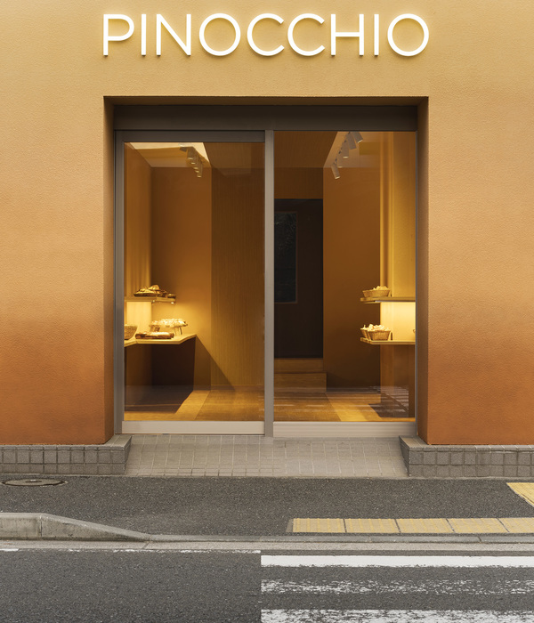
▼项目概览,overall view © 邵峰-榫卯建筑摄影
空间的构思与功能
The design and the function of the space
在概念店的布局规划中,Some Thoughts认为空间之间应该有自然渗透的能力,内外空间缺一便无法立足。斜向的阵列柜体将空间切分为前后场,这样空间处理方式也正是缘由产品陈列产生的真实需求。设计构思上,设计师将内穿属性的商品放置于定制的柜体中,主动回避了选购时的尴尬;而复购率高的商品则置于前场的巨大的弧形装置中,以更友好的方式提供给大众心理和物理上的全面探索。
▼概念图解,diagram©Some Thoughts
When planning the Bananain Concept Store, Some Thoughts conceive that space should be equipped with the ability to infiltrate naturally, and the indoors are inseparable with the outdoors, equally vital.The display cabinets arranged in oblique array divide the space into front and back fields, which meets the practical demand for showcasing Bananain’s products. In thinking how to house different products, a number of customized cabinets are introduced to store underwears, avoiding any inevitable embarrassments that may occur. The commodities with high re purchase rate are placed in the huge arc-shaped unit in the front atrium, providing the public with a comprehensive psychological and physical exploration in a more friendly way.
▼前场弧形装置,thearc-shaped unit in the front atrium© 邵峰-榫卯建筑摄影
▼入口装置,installation at the entrance© 邵峰-榫卯建筑摄影
▼展柜,cabinet area© 邵峰-榫卯建筑摄影
定制展柜细节,thecustomized cabinets© 邵峰-榫卯建筑摄影
▼从前场望向收银区,view to thecheck stand from the front field© 邵峰-榫卯建筑摄影
▼细节,details© 邵峰-榫卯建筑摄影
流线几何与空间层次叠加
The combination of streamline geometry with spatial layers
当几何系统无须僵硬时,大众与场地的互动就会变得更加积极。进一步探索蕉内概念店,顾客可以感受到场地不同的层次的叠加,将城市景观的体验性、包容性转化为具有现实力量的异质空间。随着人们脚步在场地或快或慢的移动,画面不断叠加、消失、生成…一种秩序便以体验的形式出现。
The geometric system applied in the interior aims to deviate its rigidity, further activating the interactions between consumers and the site. Exploring deeper into the Concept Store, one can feel the superposition of different texture embedded in the space, for example, the walls, the installations and the carefully-designed units, transforming the experience as well as the inclusiveness of urban landscape into heterogeneous space with realistic design power. With people meander fast or slow in the store, the scenario are constantly superimposed, disappeared or generated, an order appears in the form of individual’s visiting experience.
▼展示空间,display area© 邵峰-榫卯建筑摄影
试衣区入口,fitting room entrance© 邵峰-榫卯建筑摄影
▼装置细节,installation detailed view© 邵峰-榫卯建筑摄影
材料与设计概念的平衡
The balance of materials and conceptions
关于几何性质的抽象集合是通过探索非常规的线条与材料来完成的。铝合金是一种相对理想的再加工材料,其强度与柔韧的双向可操作支持了作品在感官上的侵入性,而夯土、亚克力将这种戏剧性的冲突形成了综合。材料、尺度、形式的互相作用为到访大众的“轻”体验刻下“重”机械的印记。
The assemblage of geometric abstraction is achieved by designers’ experiments in unconventional lines and materials. In the end, the dual aspects of aluminum’s strength and flexibility has made it the relatively ideal material for re-processing and alternating for sensory invasiveness, yet the combination of rammed earth and acrylic have relieved this dramatic conflict. The interaction of materials, scale and forms carve out the mark of “heavy” machinery for the “leisurely” experience of the individuals.
▼为“轻”体验刻下“重”机械的印记 © 邵峰-榫卯建筑摄影
the design carved out the mark of “heavy” machinery for the “leisurely” experience
▼夯土和亚克力的使用与铝合金相平衡© 邵峰-榫卯建筑摄影
the combination of rammed earth and acrylic completes the use of aluminum alloy
▼收银台细节,check stand details© 邵峰-榫卯建筑摄影
Some Thoughts设计的首家蕉内概念店位于深圳宝安壹方城内。作为一个“技术与设计驱动”的内衣品牌,蕉内专注于通过将面料科技、品质工艺、大数据反馈注入产品设计中,概念店的空间设计灵感也来源于蕉内产品设计所彰显的科技与秩序之感并蓄。设计师在空间内设计的装置道具相对凝固状态下,合理构建消费者与空间的相对驱动关系。
The first Bananain Concept Store designed by Some Thoughts is located in the Uniwalk Center of Baoan in Shenzhen. As a “technology and design driven” underwear brand, Bananain focuses on integrating fabric technology, quality mechanics and data feedback into product design. The design inspiration of the store also originates from the sense of technology and order interwoven in Bananain’s product design. The designer meticulously create the driving relationship between patrons and the space in a relatively solidified status of the installations and units designed within.
装置道具,installations© 邵峰-榫卯建筑摄影
试衣间细节,fitting room details© 邵峰-榫卯建筑摄影
▼轴测分解图,axon exploded©Some Thoughts
▼平面图,plan©Some Thoughts
项目名称:Bananain蕉内概念店
项目地点:深圳宝安壹方城
空间与装置设计:Some Thoughts空间设计工作室
主持设计师:李京泽
设计团队:谢朕、刘盛雨、刘金玮
项目业主:蕉内
主要用材:铝合金、夯土、水磨石、亚克力、涂料
室内面积:180㎡
设计时间:07/2020-09/2020
建造时间:10/2020-12/2020
摄影:邵峰-榫卯建筑摄影
撰文及图纸由Some Thoughts提供
Project Name: Bananain Concept Store
Project Location: Uniwalk Center, Shenzhen, China
Interior&Installation Design: Some Thoughts
Principal Designer: Li Jingze
Design Team: Zhen Xie, Rain Liu, Liu Jingwei
Client: Bananain
Key materials: aluminium, rammed earth, terrazzo, acrylic, painting
GFA: 180㎡Design Period: 07/2020-09/2020Construction Period: 10/2020-12/2020
Photographer: Shao Feng
Project description and drawings offered by Some Thoughts
{{item.text_origin}}

