Chelsea Market 的“Pearl River Mart” | 传统元素融入现代零售空间
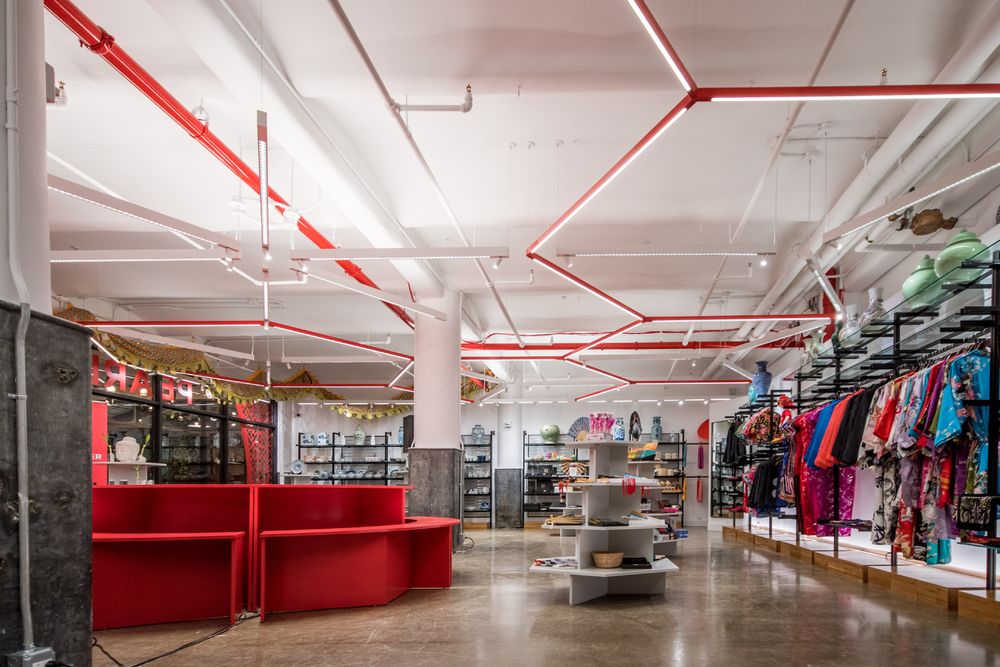
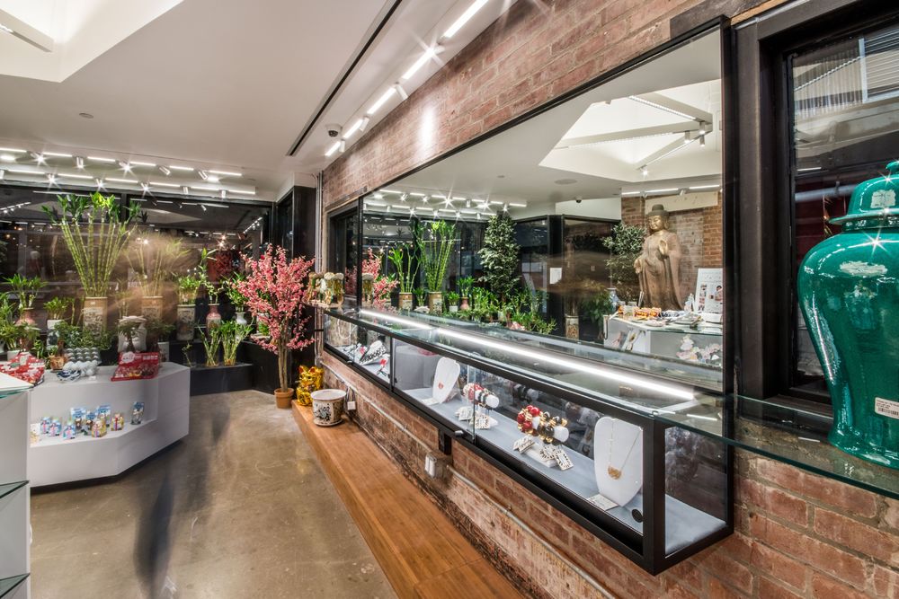
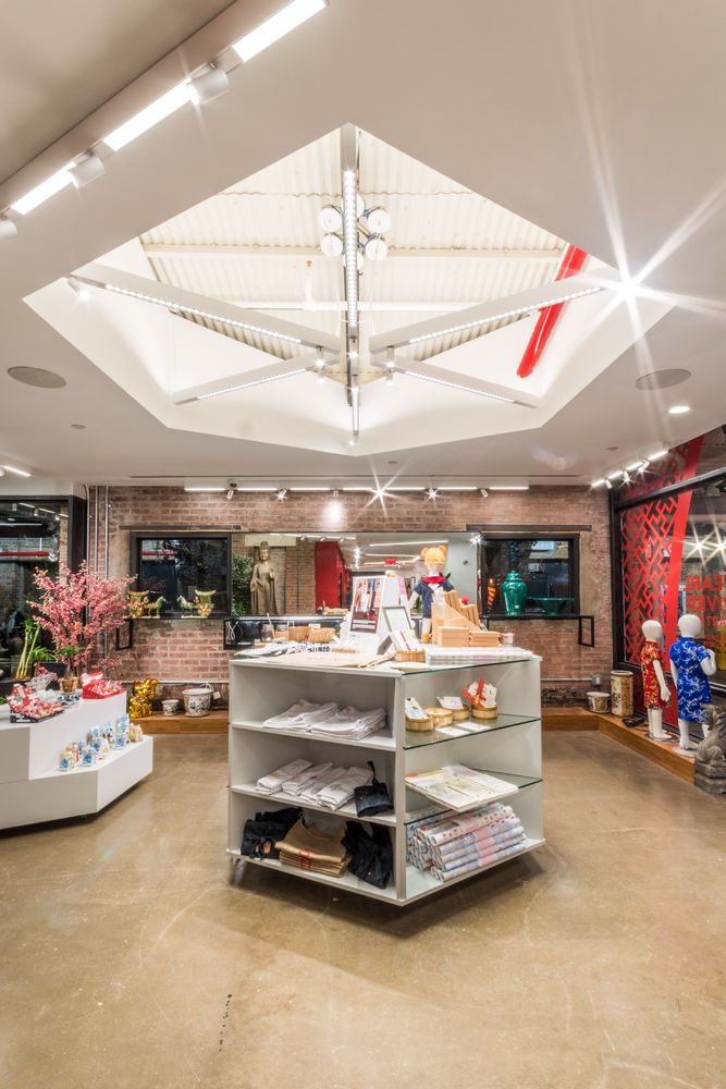
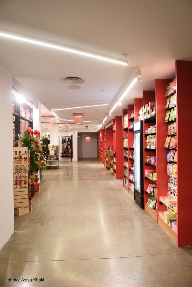
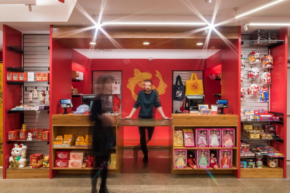
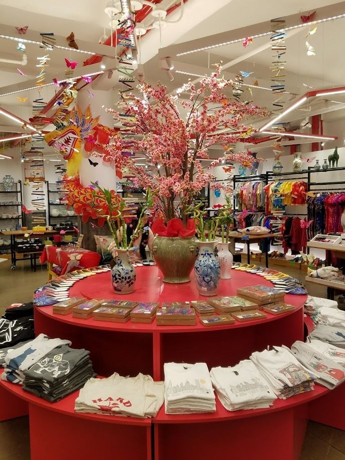
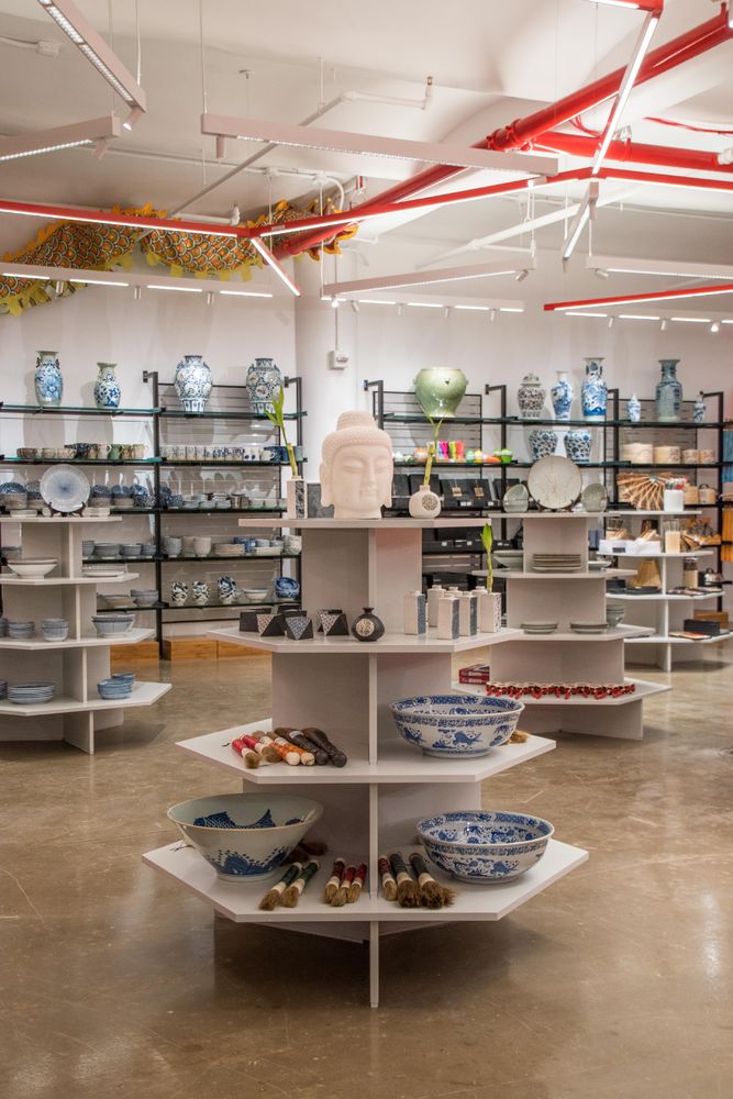
Pearl River Mart started fifty years ago, when the relationships between the US and China were non-existent, it was a symbol of friendship between the two countries, evolving into a beloved neighborhood Institution. TRA studio has worked with PRM since 2001 when we designed the vast 20,000 sqft space in SoHo, followed in 2008 by the 10,000 sqft Pearl Home. The SoHo store already incorporated some of the wellness support spaces that are now becoming an essential aspect of experiential retail: a quiet tea-room, photo opportunities, performing places and ample public restrooms, a service Mr. Chen has always insisted upon offering.
In 2016 the Tribeca Pop-up store continued the Pearl tradition of reaching out to the Community, through the inclusion of an active Art Gallery.
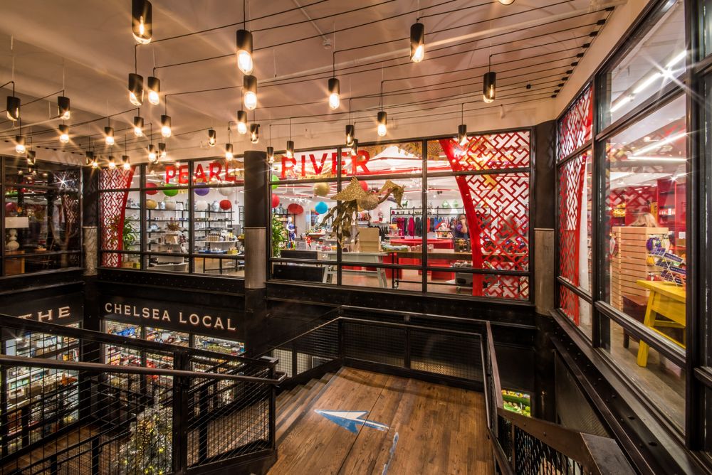
Chelsea is the natural development of the previous Mart to the much smaller Friendship Store prototype, it represents a fresh storytelling approach to an old story, celebrating the heritage and equity of the Institution, while keeping the familiar connection with the old customers, it still functions like an emporium and the original political statement is still the inspiration behind the experiential attitude of brand. The Chelsea location continues Pearl’s tradition to consciously select architecturally interesting spaces in significant locations, they always understood that location matters, the design always drawing from the area.
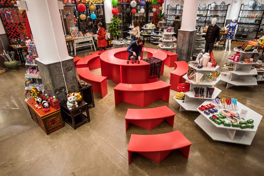
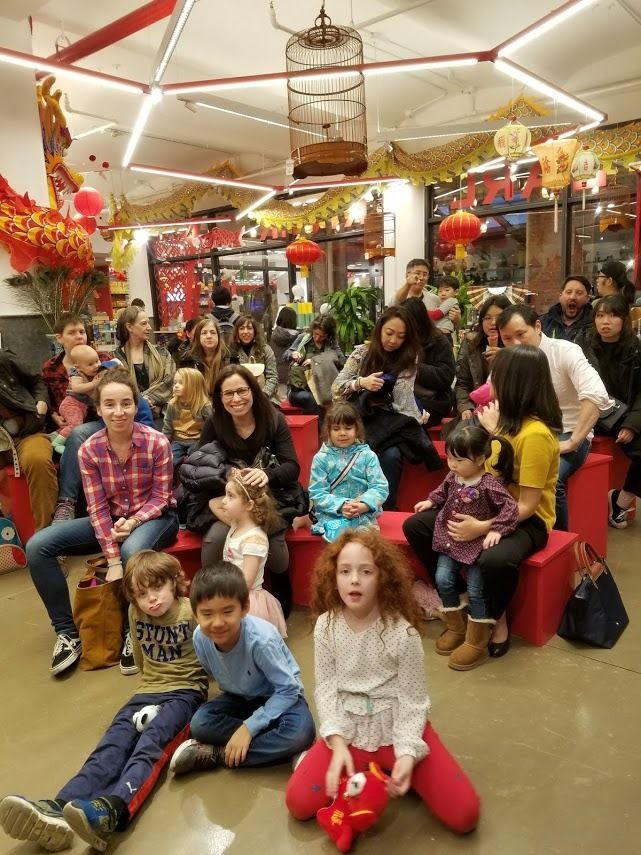
The educational aspiration of the brand identifies with the desire to be part of and serve the Community. The space, which although limited in size, is also used as a warm gathering place for all sorts of amplified experiences, such as cultural events representing the Asian Community and beyond, from tea ceremonies to workshops, screenings, book signing, paper cutting and calligraphy, Post Office stamp signing, live performances and, simply, having fun.
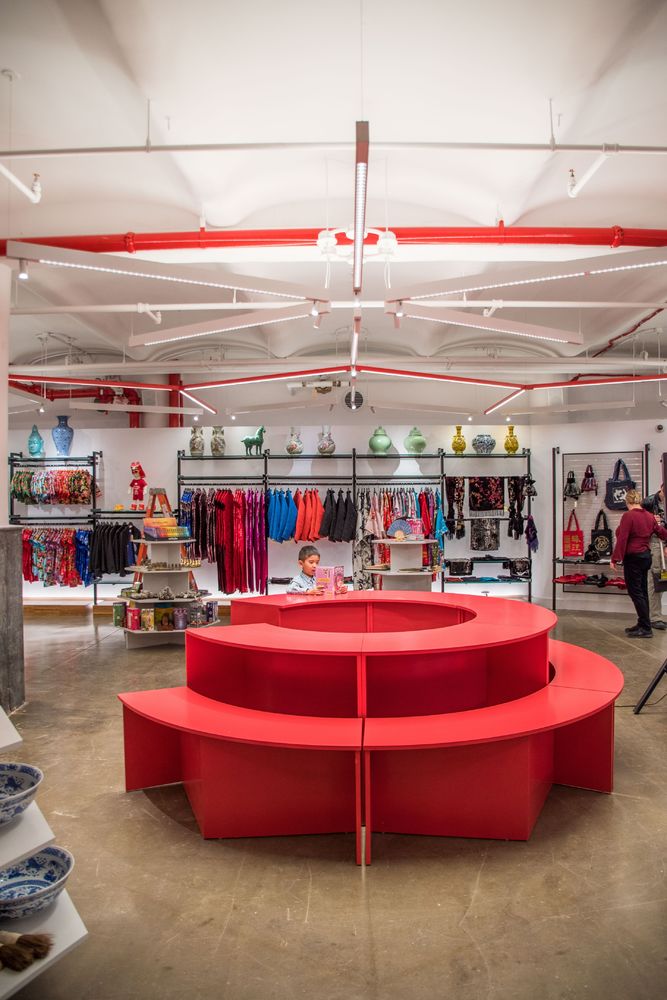
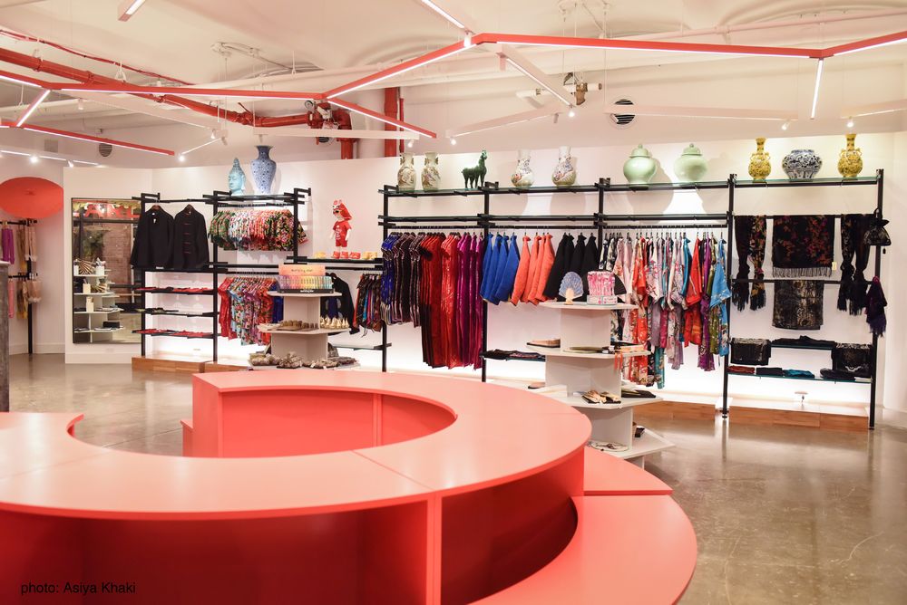
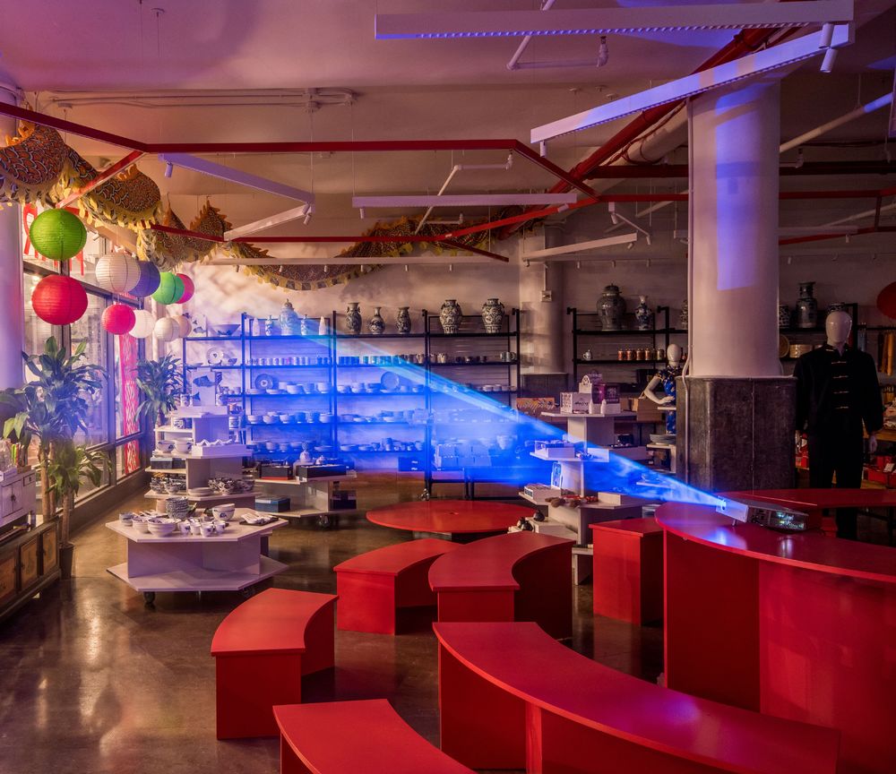
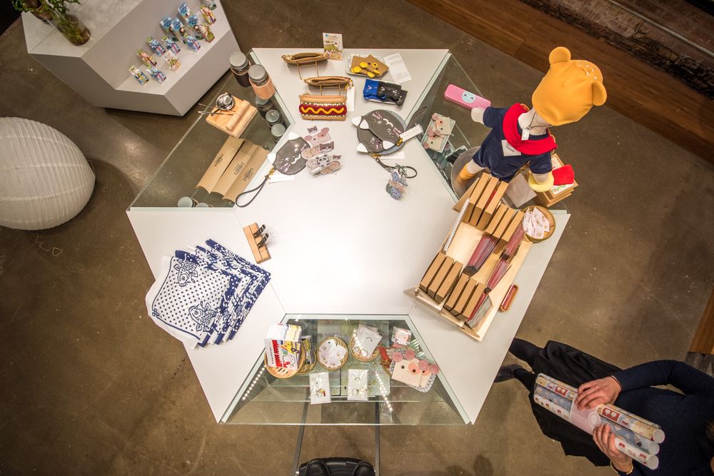
The large round table in the center serves as a tiered display, a lectern, a demonstration stand or expands its scale into a small amphitheater, creating an open court in the center. A similar hexagonal hub, also composed of movable units, marked by the same starburst chandelier above, houses the creations of guest designers. The adjacent flower display platforms also double as a seating area. The rear fashion wall even hides a fully equipped private multi-functional room which can house a classroom presentation or a kids' parties.
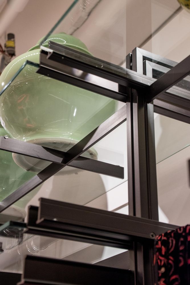
As in the past stores, the lighting defines the spaces below, the superstructure of large hexagons creates an interlocking network of open canopies, where the different types of merchandise can find their place. The luminous aura is enhanced by the choice of the all-sustainable materials.
Transformation is the essential tool to keep customers coming back, the flexible, iconic and identifiable quality of the space makes the store a destination.
The thoughtful, educational, fun, memorable, accessible public space and the transformational quality of the fixtures are not only essential to the success of this store but also we believe, will become vital to the survival of retail in the city.
The design narrative developed naturally, but we could later recognize its roots in the Chinese iconography: the rice character, the red colonnade, the circular courtyard, the geometric latticework, the hexagonal pagoda, the river meandering through the rising cliffs portrayed in traditional Chinese landscape painting, the terraced landscape for the cultivation of tea. Finding the references became a fun tool that justifies design decisions made instinctively.
Year 2017
Work started in 2017
Work finished in 2017
Status Current works
Type Multi-purpose Cultural Centres / Showrooms/Shops / Interior Design


