佛山单向空间 | 知识妖怪与社区客厅的共生设计
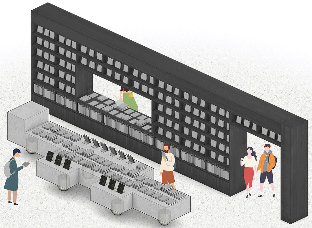
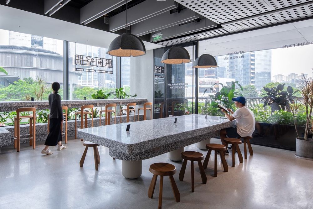
我们在佛山单向空间中设计了5件大尺度家具。这可以是一个7m长的展台,用于展示书籍和文创礼品,也可以是一个可同时容纳20人的大长凳。每件家具都有粗短的钢腿,给人一种即将开始行走的感觉,就像某种动物一样。我们将这些家具称为“知识的妖怪”。咖啡馆的大桌子由三条腿排列成一条线,像是在挑战重力定律,给人一种漂浮的感觉,让我们想起一只单腿站立的雨伞妖怪。来到佛山单向空间的游客会因为这些妖怪带来的好奇心而兴奋,也会因设计中表达的“玩味”而露出笑容。
We designed 5 pieces of large-scale furniture in the OWSPACE, for example a 7m long display table for books and goods, and a large bench that can accommodate 20 people at the same time. Each piece of furniture has stubby steel legs, giving the impression that it is about to start walking, like some kind of animal. We decided to call these pieces of furniture “Monster of Wisdom”. The cafe’s large table stands on three legs arranged in a row, defying the laws of gravity, giving it a floating feel, reminiscent of an umbrella monster standing on one leg. Visitors to the OWSPACE will be excited by the curiosity brought by the monsters, and will also smile because of the playfulness expressed in the design.
▼一个孩子疑惑地观察着“知识的妖怪”的腿,A child suspiciously observes the legs of a “Monster of Wisdom” © 吴嗣铭
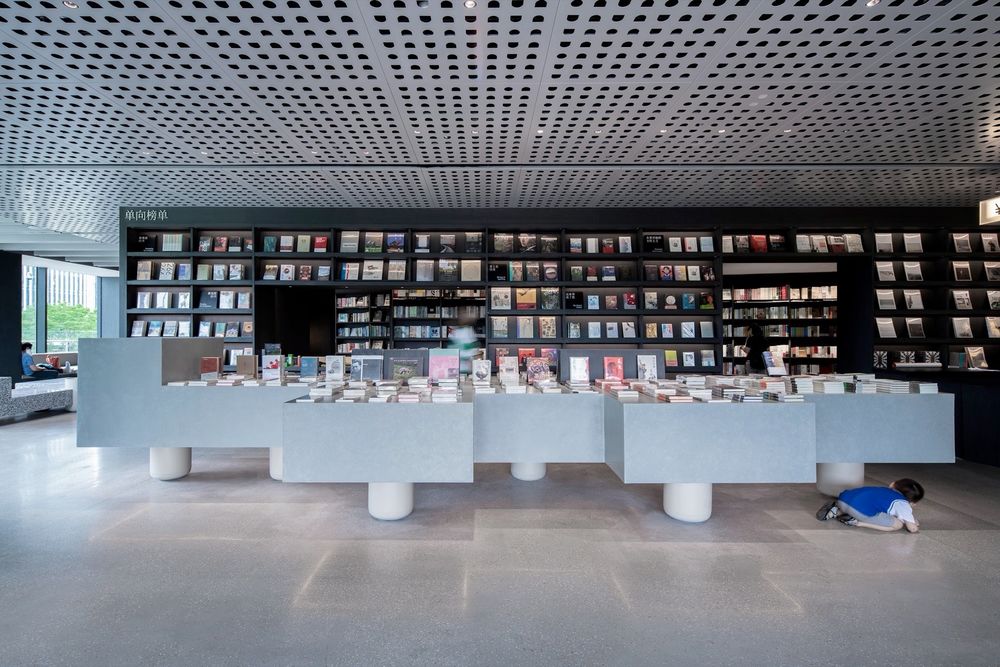
▼“知识的妖怪”创造的神奇漂浮感,A mysterious floating feeling created by the “Monster of Wisdom” © 张超

项目背景
除了以十三邀为代表的一些媒体活动外,单向空间还有实体文化空间,在那里经营书店和咖啡馆,出售文创礼品,并定期举办文化沙龙活动。在书店纷纷从街头消失的当下,他们成功打造了一个以知识为主题的新型实体文化空间。自2005年开设第一家实体店以来,单向空间不断根据社会变化更新实体店的模式。第一代是街边店业态,第二代是综合商业体里的店,第三代是偏向走进社区中。该项目是单向空间在南方地区的第一家实体店,位于佛山美的总部园区内一个开放街区的一角。以三万名美的员工组成的社区为基础,它被定义为第三代模式。我们的目标是创造一个开放交流的空间,感觉就像社区客厅。Background
除了以十三邀为代表的一些媒体活动外,单向空间还有实体文化空间,在那里经营书店和咖啡馆,出售文创礼品,并定期举办文化沙龙活动。在书店纷纷从街头消失的当下,他们成功打造了一个以知识为主题的新型实体文化空间。自2005年开设第一家实体店以来,单向空间不断根据社会变化更新实体店的模式。第一代是街边店业态,第二代是综合商业体里的店,第三代是偏向走进社区中。该项目是单向空间在南方地区的第一家实体店,位于佛山美的总部园区内一个开放街区的一角。以三万名美的员工组成的社区为基础,它被定义为第三代模式。我们的目标是创造一个开放交流的空间,感觉就像社区客厅。
In addition to some media activities represented by Thirteen Invitations, OWSPACE also has physical spaces, where it operates bookstores and cafes, sells cultural and creative products, and holds regular events. Since opening its first store in 2005, OWSPACE has continuously updated its store model according to social changes. The first generation is street stores, the second generation is stores in commercial complex, and the third generation prefers to go into communities. This project is the first physical store in the southern region, located in a corner of an open urban block within Foshan Midea Corporate Town. Based on a community of thirty thousand Midea employees, it is indeed considered as a third-generation model. Our goal is to create a community’s living room.
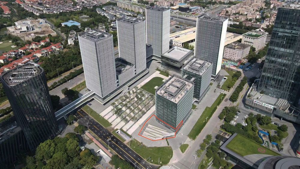
▼顺德美的总部,员工高层公寓集中的街区,Midea employees’ high-rise apartments and commercial podium © 一十一建筑
▼改造前的店铺外观及店前无障碍坡道,Barrier-free ramp in front of the store before renovation © 一十一建筑
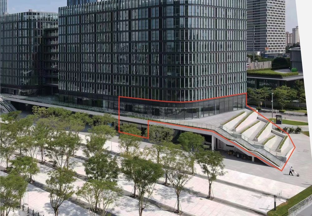
美的在佛山顺德新建了总部园区,其中一个街区名为“顺德ALSO”,专为年轻员工设计,拥有公寓楼、文体中心、商业裙房。单向空间位于街区主入口广场,计划改造一楼150平方米、二楼500平方米的空间。南边道路对面是和美术馆,由安藤忠雄设计。二楼店前有下至广场的户外楼梯和无障碍坡道,但5米高的坡道6次折回,全长90m,缺乏设计感,不合适作为ALSO主入口景观。实际上,园区有数个公共电梯厅,这个户外坡道很少使用。我们与美的和单向团队经过讨论,决定将这个区域改造成一个服务社区的公共空间。
Midea has built a new headquarters and a corporate town covering a few urban blocks in Shunde, Foshan. One block is called “Shunde ALSO”, designed for young employees having apartment towers, sports and cultural facilities, and commercial podium. Our project is located at the entrance of this urban block. It has the area of 150m2 on the ground floor and 500m2 on the second floor. Across the road to the south is the He Art Museum, designed by Tadao Ando. In front of the store on the second floor are the stairs and a barrier-free ramp leading up from the public square. The ramp turns for 6 times with a total length of 90 meters. It lacks a sense of design and is inappropriate for the landscape of ALSO’s main entrance. In fact, there is public elevators just behind the store, and this outdoor ramp is rarely used. After discussions with Midea and OWSPACE team, we decided to transform this area into a public space matching the need from the community.
▼改造后的店铺和台地式社区庭院,Renovated store and terrace-style community garden © 吴嗣铭
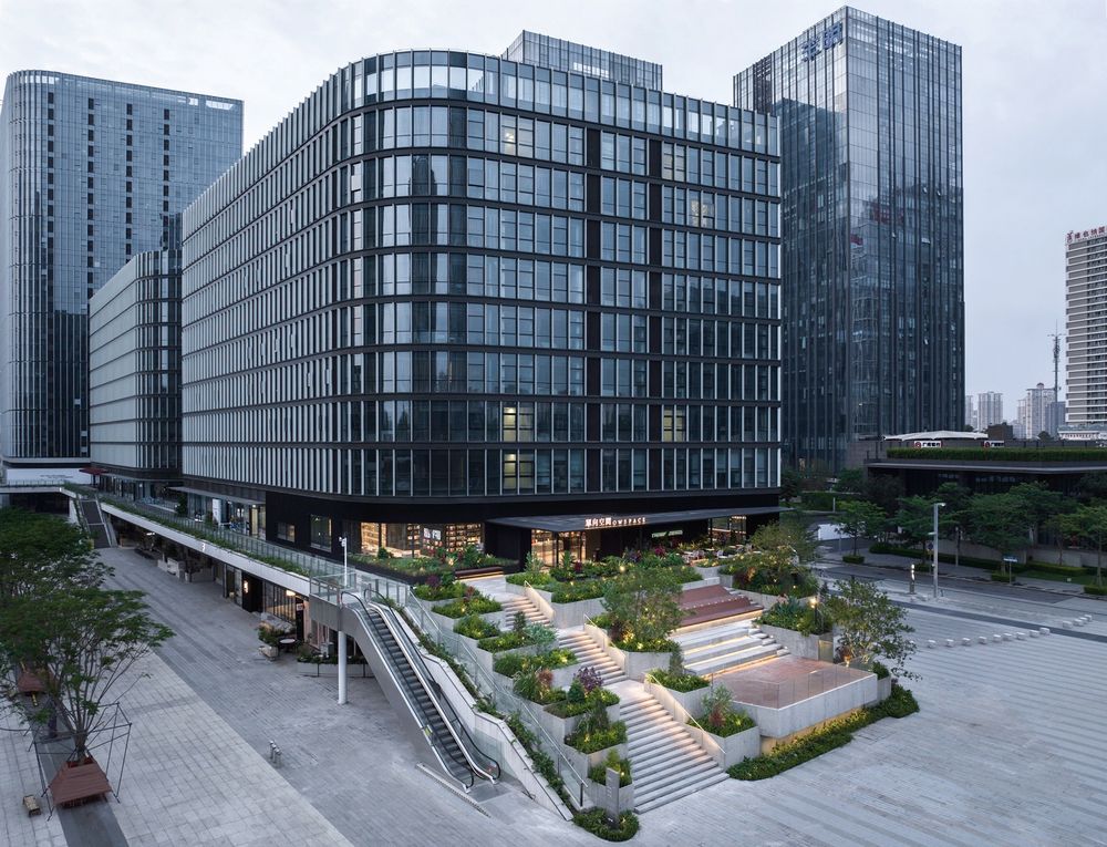
▼台地式社区庭院和后面的和美术馆,Community garden and He Art Museum © 吴嗣铭
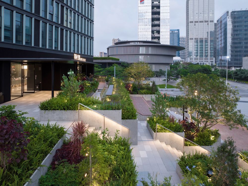
台地式社区庭院Terrace-style community garden
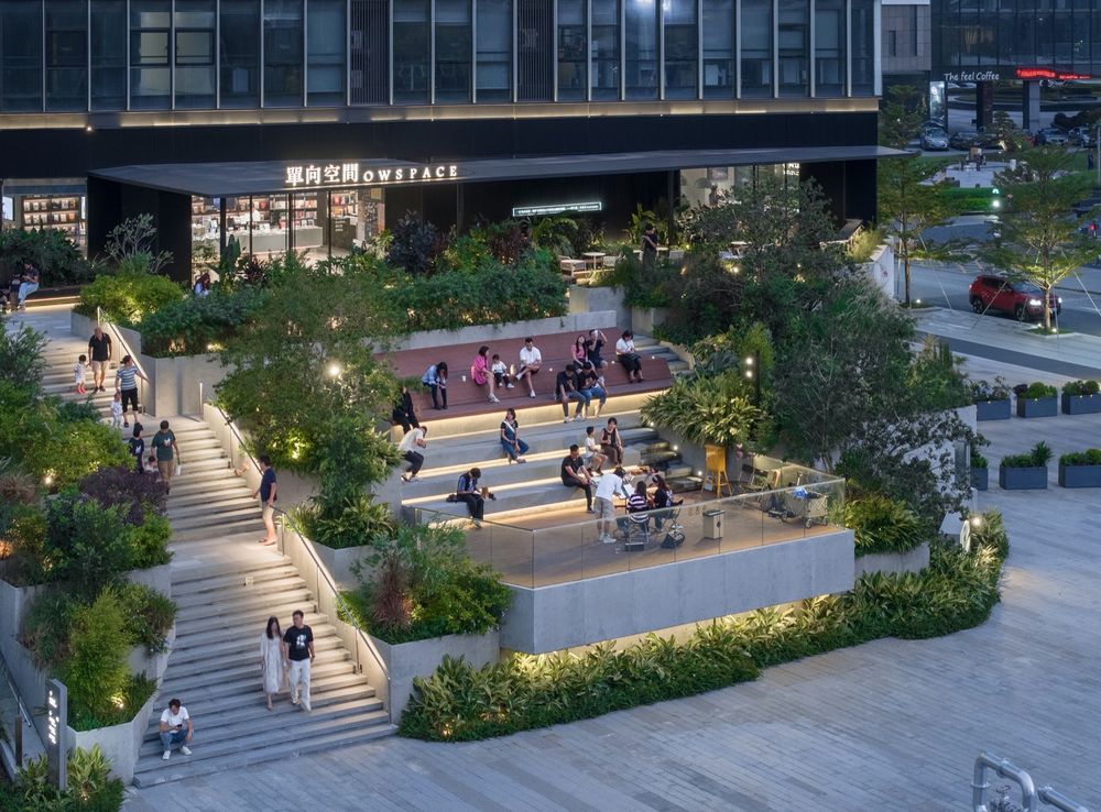
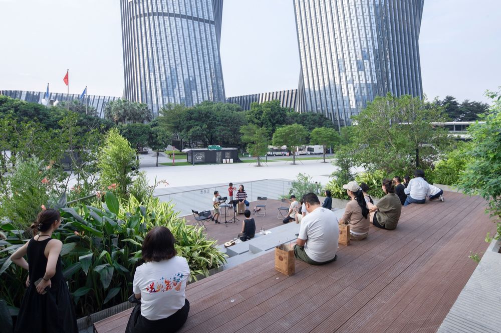
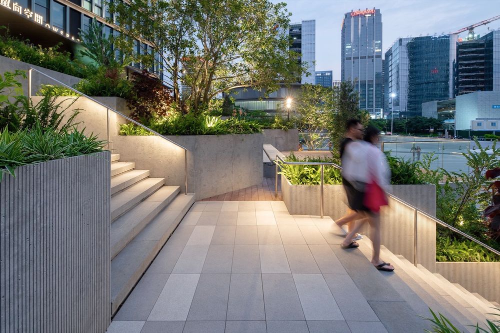
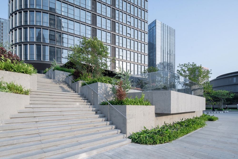
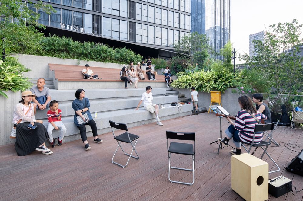
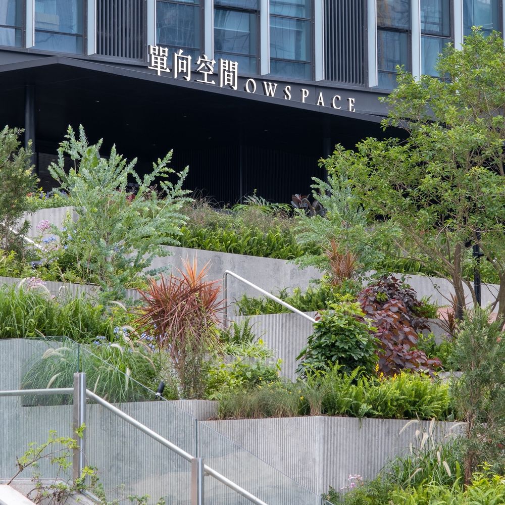
我们在改造坡道时没有拆除任何现有的钢筋混凝土结构,而是通过最小的空间布局调整,设计了多层台地式公共庭院。为了创造一个可以让人放松身心的散步目的地,我们在设计时综合考虑了空间的大小、远近的风景、材料的质感以及灯光效果。舞台和大台阶是为音乐表演等小型活动而设计的。庭院的上半部分是一个铺着户外竹木的甲板空间,可以躺在倾斜靠背上看天空发呆,也可以与朋友聚在一起野餐。周围是南方特色的茂密且种类多样的绿植,花坛外表面采用干挂竖向细纹预制水泥板,与现有的灰白色花岗岩广场相呼应。
We did not touch the existing structures when transforming the ramp, but through minimal spatial layout adjustments we designed a terrace-style community garden. In order to have a relaxing walking destination, we took into account the size of the space, the views from the terrace, the texture of the materials and the lighting effects. A stage and seatings were designed for small events such as music performance. The upper half is a deck covered with outdoor bamboo panel where you can lie down on the inclined backrest and stare at the sky in a daze, or you can gather with friends for a picnic. Surroundings are the lush and diverse green garden suitable for the southern region, and prefabricated cement boards were used for the outer surface of the flower bed, echoing the existing off-white granite of the square.
▼台地式社区庭院航拍,Aerial photography of the community garden © 吴嗣铭
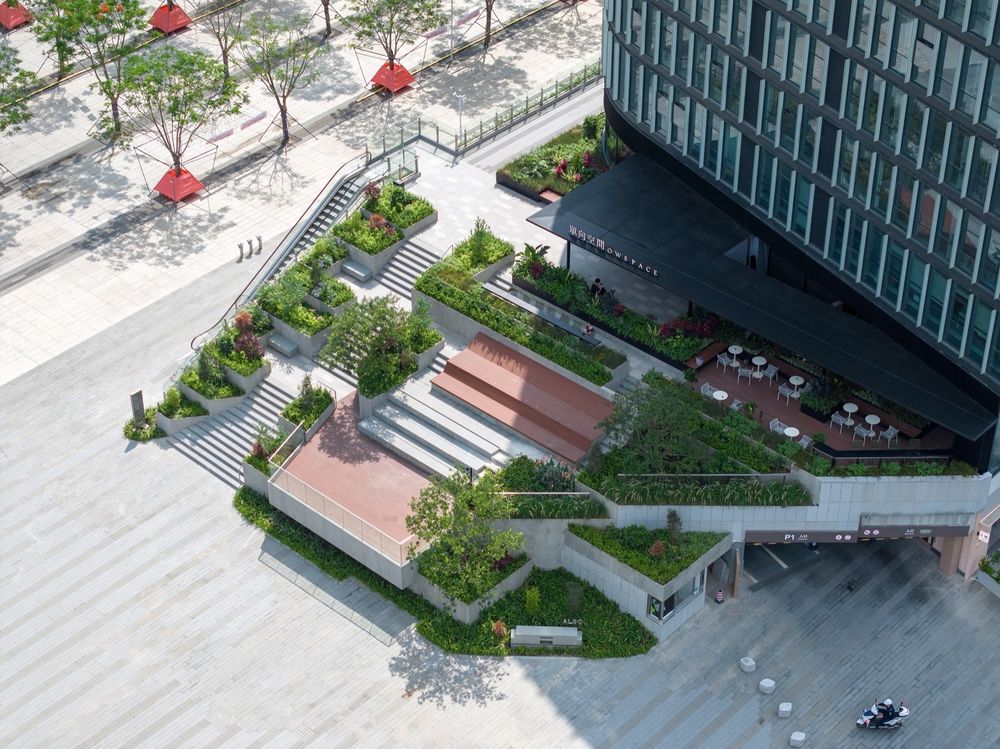
绿植环绕的社区庭院,Community garden surrounded by greenery © 吴嗣铭
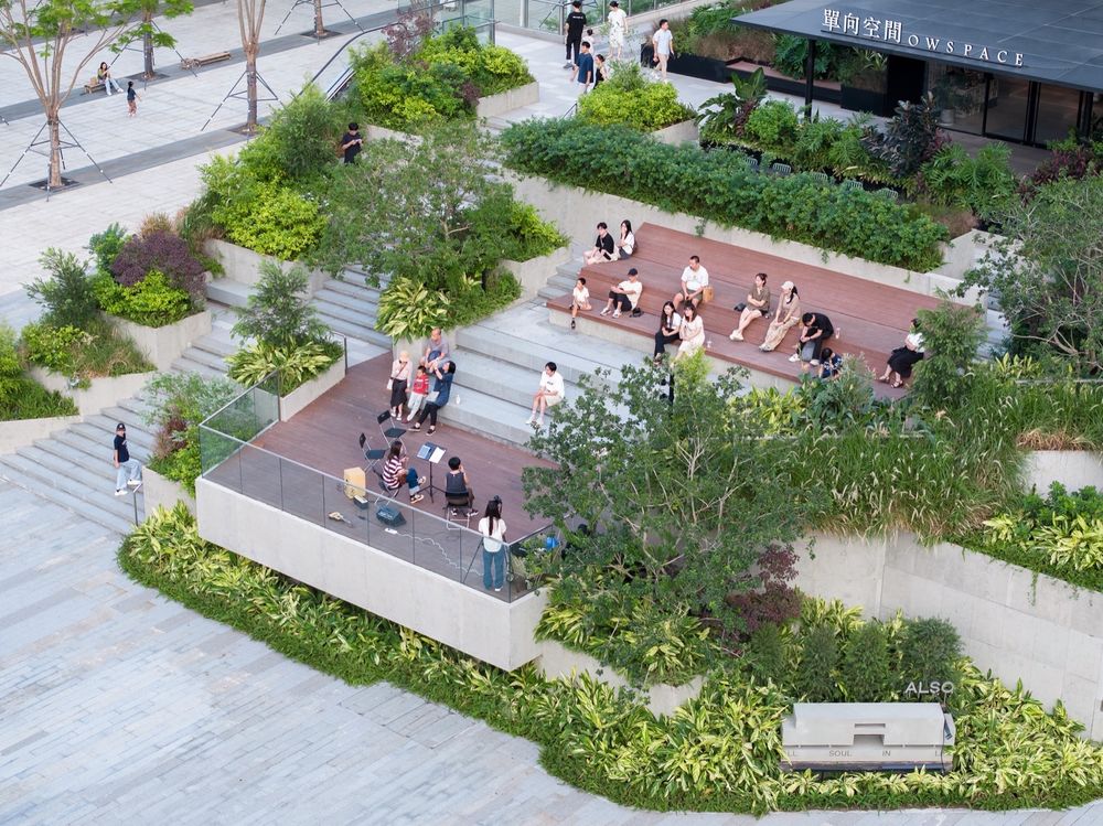
▼从广场向上看的社区庭院,Community garden looking up from the ground level © 吴嗣铭
音乐会活动,Community event in the garden © 吴嗣铭
景观地台和植物,Overlapping flowerbeds and various plants © 张超
入口 Entrance
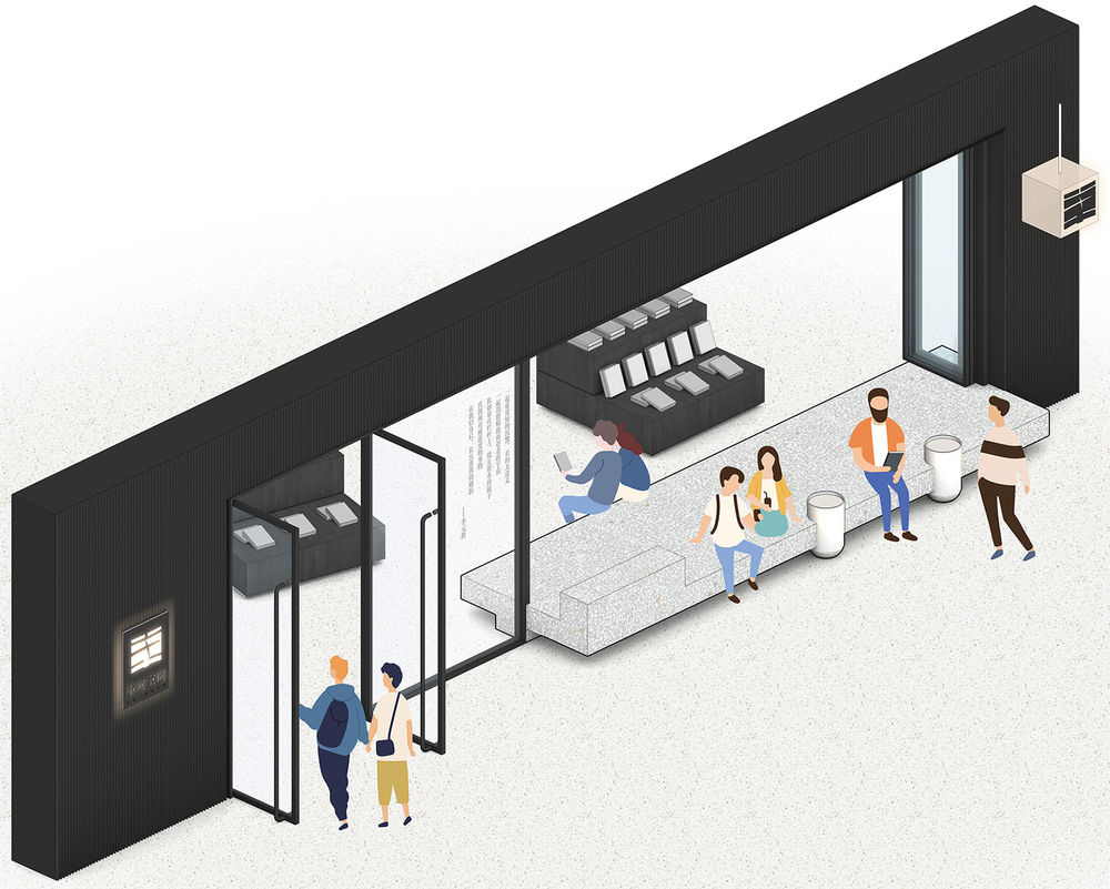
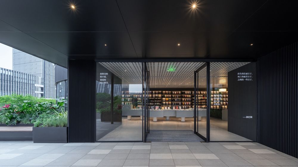
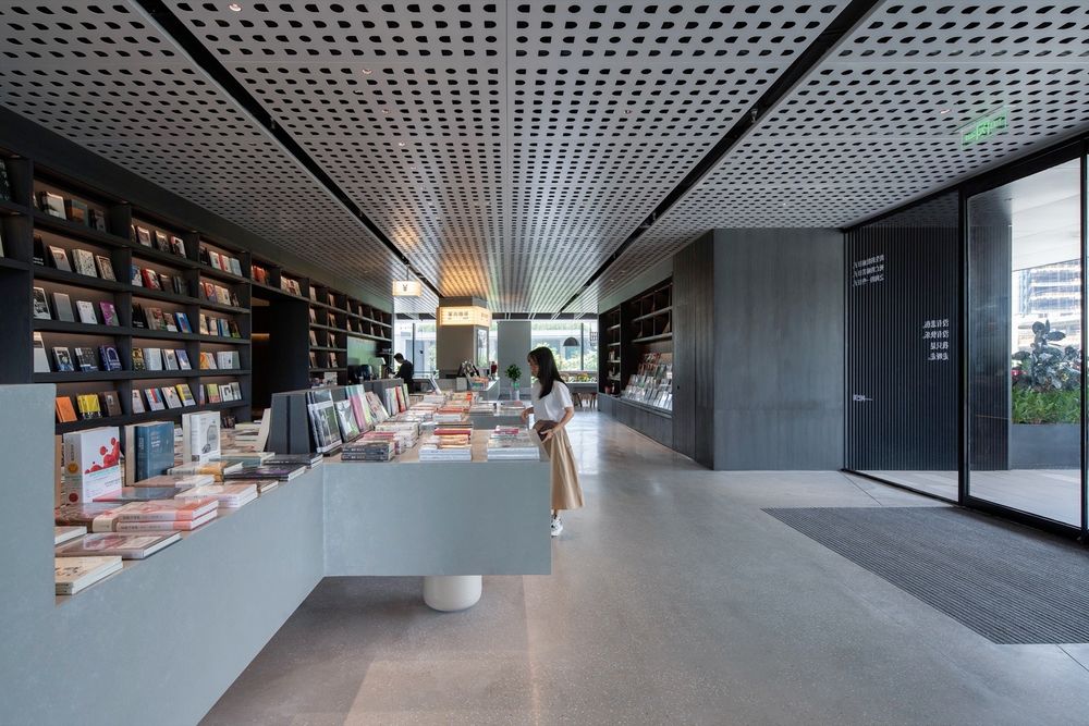
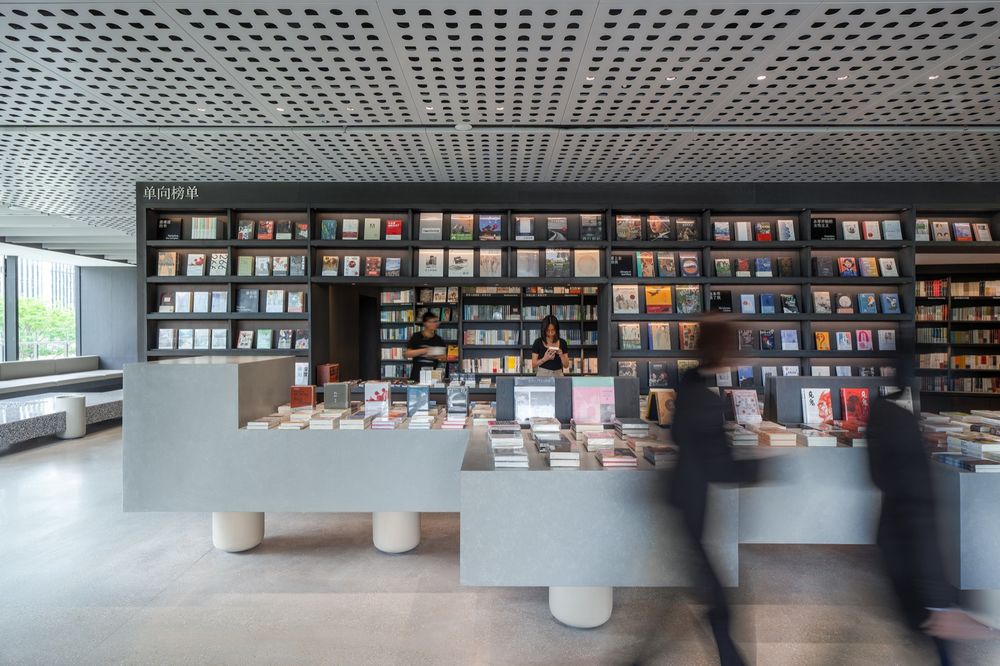
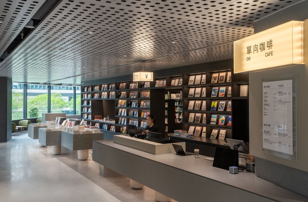
单向空间的主入口在二楼,店铺的外墙采用黑色波纹铝材,与单向空间杭州店和秦皇岛阿那亚店的店面黑色主题色类似,有传承品牌形象的意图。一进门,映入眼帘的是一面标志性的16m长书架展示墙,将右侧的咖啡区、左侧的社区客厅和墙后的书架区划分开来,形成清晰的空间布局。虽然天花板不是很高,但我们定制了带图案的穿孔铝板天花,并整合了灯光等天花设备,营造出一个简洁而柔和的空间。
▼“知识的妖怪”,“Monster of Wisdom”© 一十一建筑
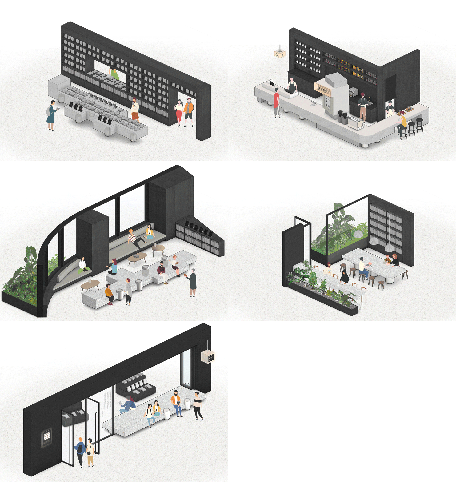
The main entrance of the OWSPACE is on the second floor. The exterior wall of the store is made of black corrugated aluminum, which is consistent with the black color of other OWSPACE stores in Hangzhou and Qinhuangdao Aranya, inheriting the brand image. Upon entering to the store, you will be greeted by an iconic 16m-long bookshelf display wall, which divides the cafe area on the right, the community living room on the left, and the bookshelf area behind the wall, forming a clear spatial layout. Although the ceiling is not very high, we customized a patterned perforated aluminum ceiling and integrated lighting in order to create a simple and soft space.
▼首层的 “知识的妖怪”跨越内外的界限,半个身子伸出店外,The Monster at the ground floor sticks out the half of its body out from the store©张超
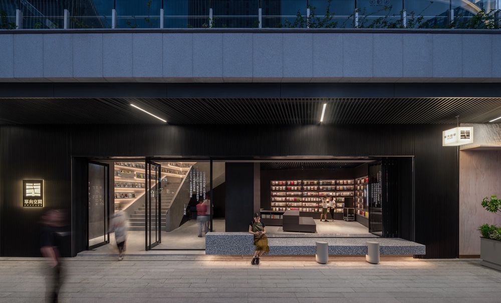
▼二楼平台上的主入口,Main entrance on the second floor ©张超
▼入口的展台和书架展示墙,Large book display stand and long bookshelf wall ©吴嗣铭、张超
书架区Bookshelf area
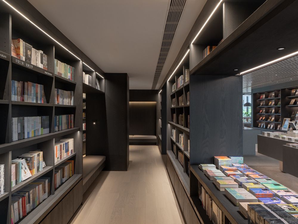
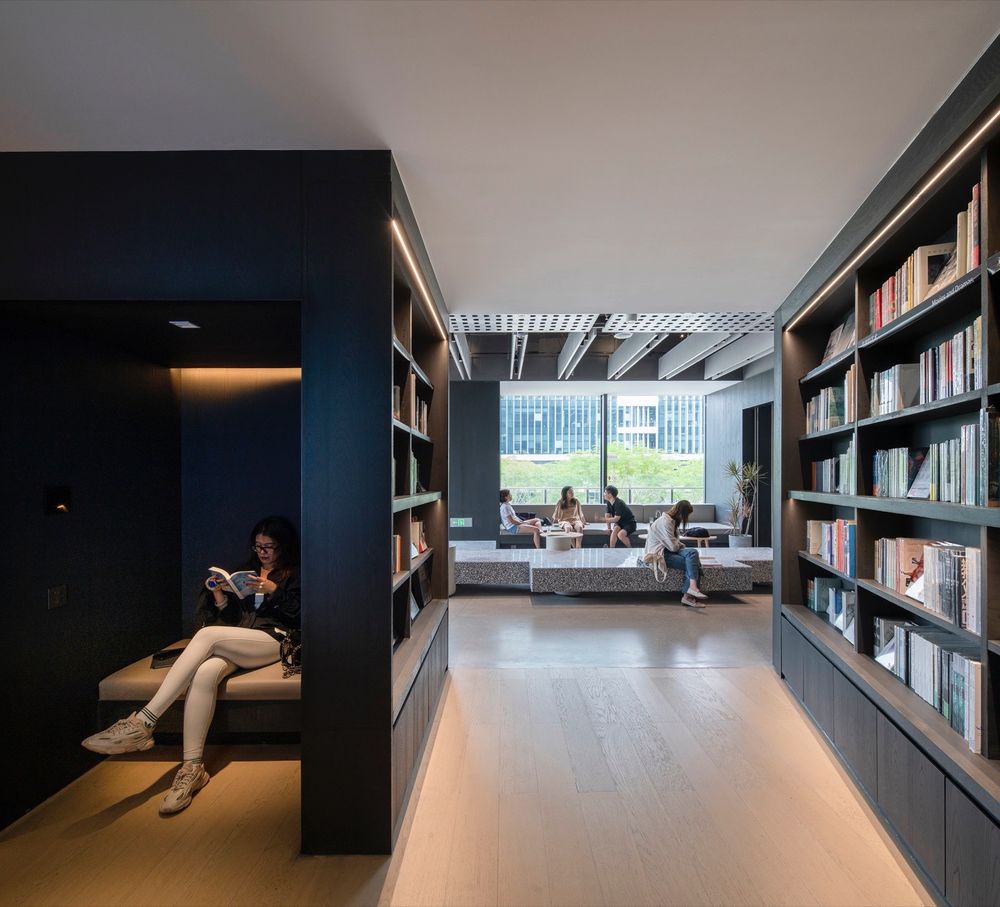
书架区规划在距离主通道一步之遥的地方,旨在让人们可以轻松地步入,悠闲地看书。在书架中嵌入了若干处座位,并配有专用的阅读壁灯,方便拿起一本书就地坐下阅读。
The bookshelf area is planned one step away from the main passage, so that it can be kept quiet. There are several seats embedded in the area and equipped with wall lamps, making it easy to pick up a book and sit down to read it.
▼书架区,Bookshelf area © 张超
▼书架中嵌入座位,Embedded seat in the bookshelf area ©吴嗣铭
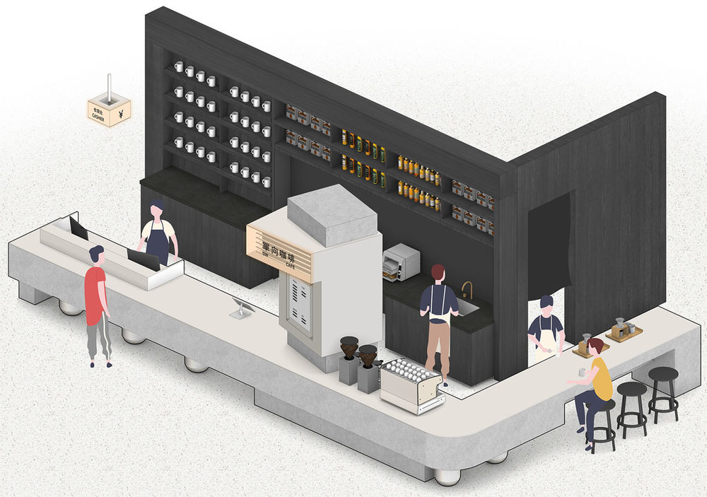
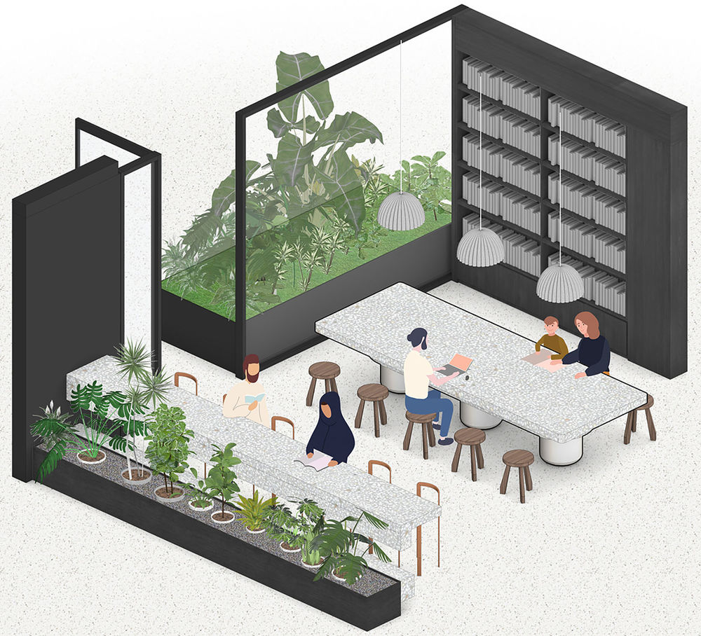
单向咖啡 OW Café 单向空间被分为可以与朋友聊天的社区客厅和看书、用电脑的安静座位区。座位区南面长边是连续的大玻璃窗,空间高而明亮,沿着低矮的窗台设计了线形绿植花池、座椅和吧台。坐在吧台的位置,和美术馆就在你的面前。
The OWSPACE is divided into a community living room where you can chat with friends and a quiet seating area where you can read books or using own computer. The entire south side of the cafe is lined with continuous large glass windows, making the space high and bright. Along the low window sill, green planters, seats and a bar are designed. If you sit at the bar counter facing outward, you can see He Art Museum right in front of you.
▼单向咖啡,OW Café © 张超、吴嗣铭

▼咖啡厅座位和南侧玻璃面,Cafe seatings and south side glass windows © 吴嗣铭
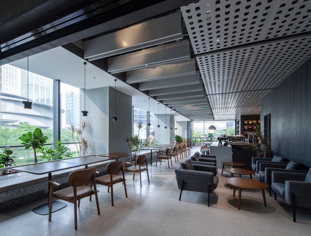
咖啡厅座位,Cafe seatings © 张超
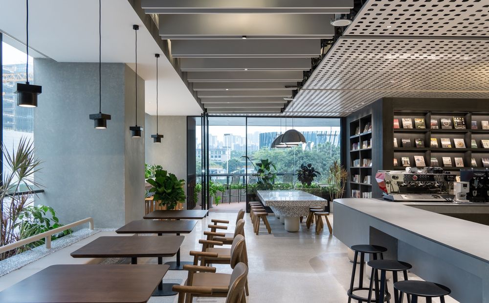
▼咖啡区的大桌子由三条腿排列成一条线,挑战重力定律,The cafe’s large table with three legs arranged in a row defying the laws of gravity © 吴嗣铭
咖啡露台
Cafe terrace
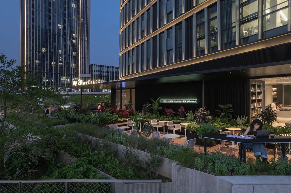
露台座位与咖啡厅直接相连。有一个大屋檐可以遮阳避雨。露台的设计与前面的地台式社区庭院融为一体,营造出一个绿植环绕的舒适空间。往下走几步,有长吧台,可以欣赏远处美的双塔的景色。
The customers can walk out to the terrace area directly from the café. The area is full of greenery, and there is a large eave to provide shade from the sun and rain. A few steps down, there is a bar table where you could enjoy the view of Media’s twin towers in the distance.
台地式社区庭院和咖啡露台区,Café terrace connected to the community garden © 吴嗣铭

▼屋檐下的咖啡露台,Cafe terrace under the eave © 吴嗣铭
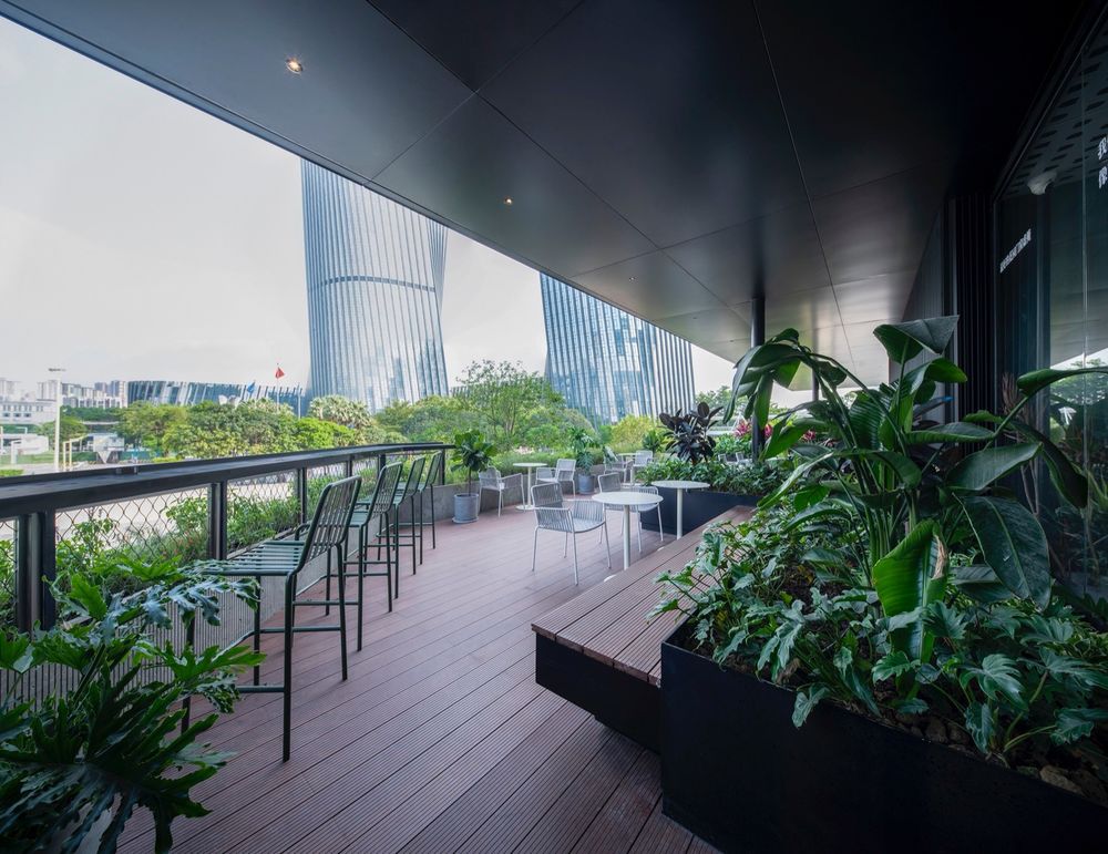
▼长吧台和美的办公塔楼,Bar table with the view of office towers © 吴嗣铭
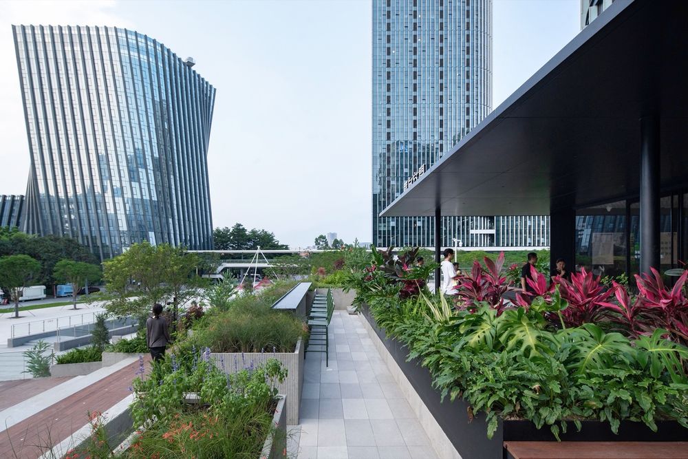
社区客厅 Community living room
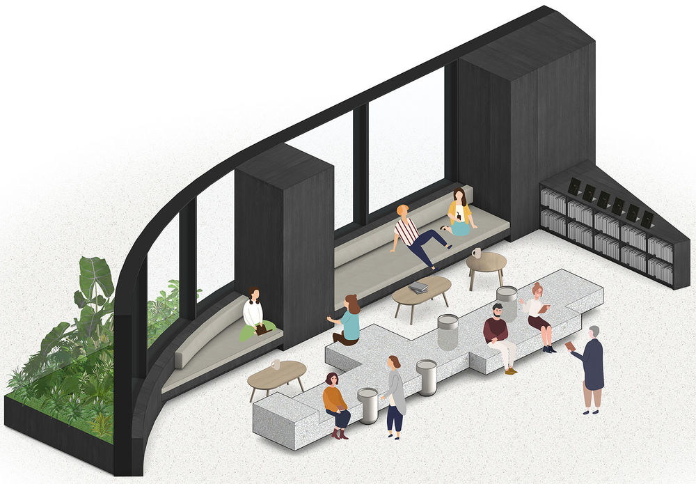
社区客厅靠窗处有一张深度达1米的内置长沙发,前面是一张可同时容纳20人的长台。两者都有大而抽象的设计,适合多种用途,方便社区邻里随意访问使用,并在这里轻松愉快地交谈,结交新朋友。
There is a built-in couch with a depth of 1 meter by the window of the community living room, and in front of it is a long bench that can accommodate 20 people at the same time. Both is large and have abstract design that is suitable for a variety of uses, making the place ideal for casual visits by neighbors and for a relaxing place to chat and make new friends.
▼社区客厅空间,Community living room © 张超
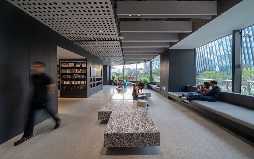
▼一张可同时容纳20人的长台,A bench that can accommodate 20 people at the same time © 张超
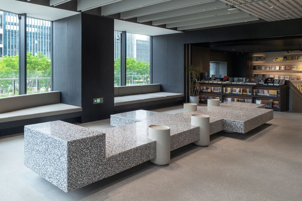
▼从社区客厅看书架区,View of the bookshelf area from the community living room © 张超

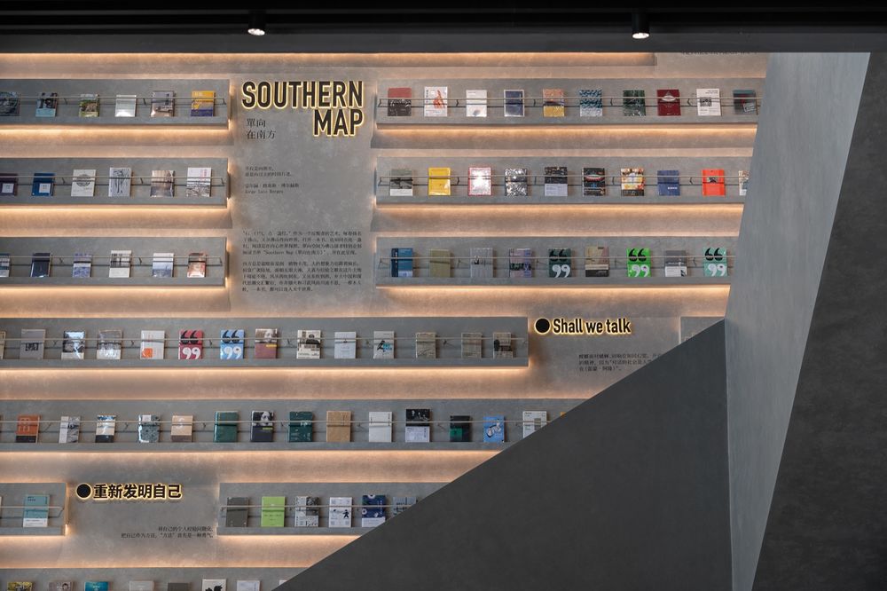
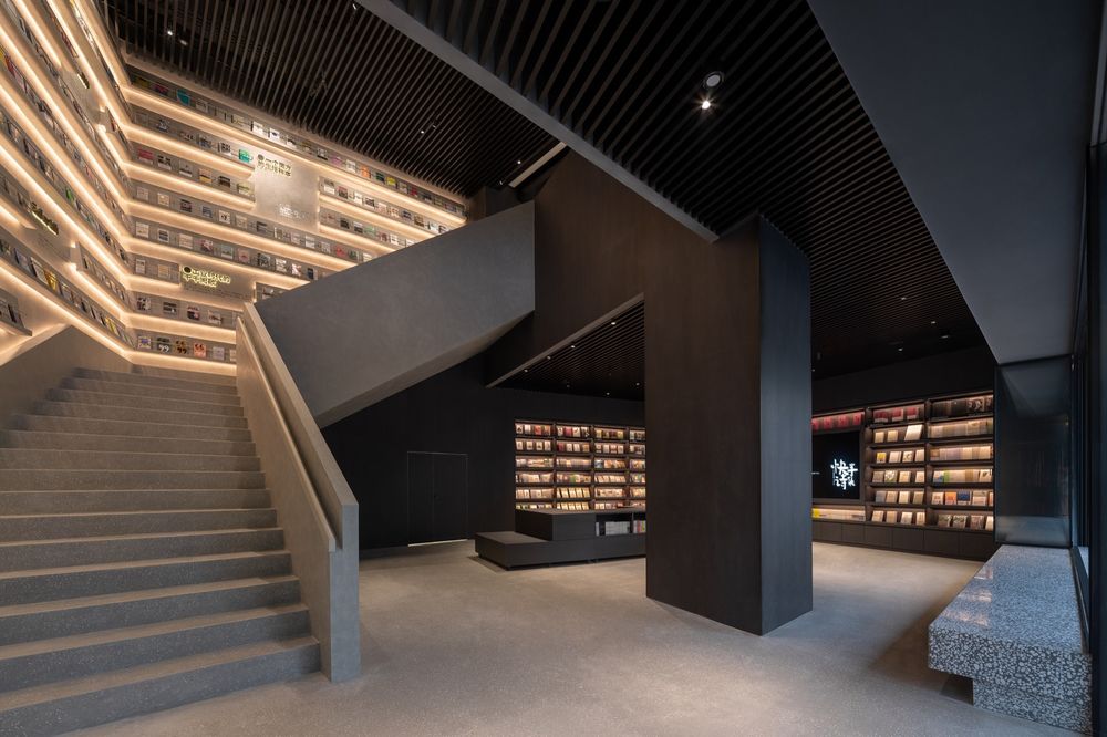
中庭 Atrium 店里最深处有连接一、二层的中庭。在这个高大的空间里,我们利用两堵墙和楼梯设计了一个空间亮点。在墙上,我们与单向空间团队合作,用书籍设计了一个名为“SOUTHERN MAP”的文学地图展示墙。读书人,懂得如何从“字里行间”领会作者的真实意图。这个SOUTHERN MAP表达了在书本的字里行间蔓延的另一个世界。
The deepest part of the store has an atrium connecting the first and second floors. In this tall space, we designed a highlight of the store using two walls and sculptural stairs. On the wall, we worked with the OWSPACE team to design a literary map called “SOUTHERN MAP”. People who are well-versed in reading know how to grasp the author’s true intentions “between the lines.” This SOUTHERN MAP expresses another world that spreads between the lines.
▼中庭,Atrium©张超
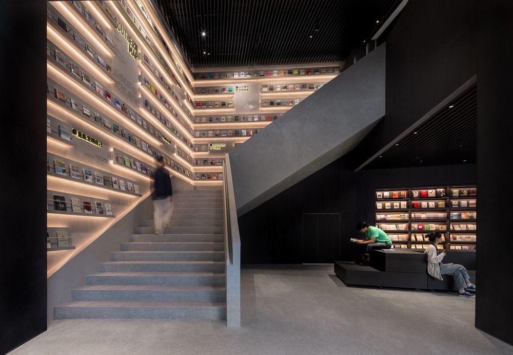
▼“SOUTHERN MAP”的展示墙,”SOUTHERN MAP” display wall © 张超
一楼活动空间 Ground floor event space
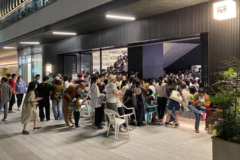
一楼是活动空间,空间可以根据活动内容灵活布置。平时,可移动展台用于展示书籍和文创礼品。但通过布置椅子,可以将其转变为可容纳100人的文化沙龙演讲厅。打开面向ALSO广场的折叠推拉门,可以让空间变得更大。设计上刻意模糊了边界,让活力超越空间,溢出到广场。
The ground floor is an event space. Usually, movable exhibition stands are used to display books and goods. But by placing chairs, it can be transformed into a lecture hall with a capacity of 100 people. Opening the folding doors facing ALSO square makes the space even larger. The design deliberately blurs the boundaries, allowing vitality to transcend the space and overflow to the outside.
一楼活动空间日常书籍展示场景,Movable stands in the event space© 吴嗣铭
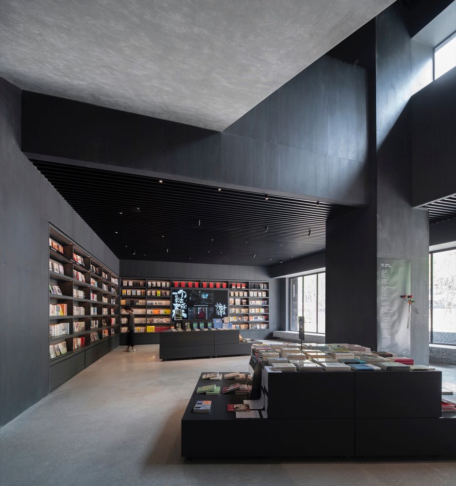
一楼活动空间,Ground floor event space © 张超
咖啡露台夜景,Night view of the cafe terrace© 张超
