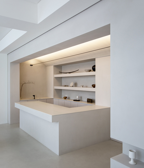
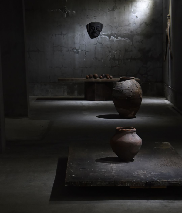
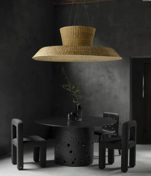
A lining plaster – that used to configure a low height - and its main pillars was the principal elements of the building, which has gone through other reforms. During the project, the pillars were stripped to their limits and the ceiling was demolished, as well as the roof on the back. Thus begins the work that brings together the different references presented by the client to create a harmonious environment that can translate the language of the furniture brand in architecture.
The façade is made of black panels made whit the Japanese technique shou-sugi-ban that consists of burning the wood surface to the point of charring. The sobriety of the material is broken by the openings of gears and pulleys that take different forms and reveal vivid colors on the opposite side of the panels.
Different coatings - concrete slabs, glass, burnt cement, rubber, wood, brick, paintings - are combined and applied in the space that is left almost like a ruin, without polishing. The materials were thought to be fluid and conform different geometrical compositions.
In this way, different atmospheres are defined by the composition created by the set of materials, resulting in free layouts and bringing a greater flexibility to the exposure of sofas.
The roof of the posterior part has been replaced by a higher one. It was built in cement tile with a green cover. To achieve the load that the tile can afford, was used a lighter substrate than soil, this way meters of conventional earth can be exchanged for few centimeters of the substrate. Such coverage improves the thermal insulation and humidity of the place. In addition, it was installed skylights, allowing the entrance of natural light and becoming a more attractive place in the store background.
On the second floor, you can see the roof garden and the ground floor through a small opening created in the parapet level. There is a library with books of architectural references and other coated wood pine space where customers can see the catalogs of materials and possibilities that the brand offers.
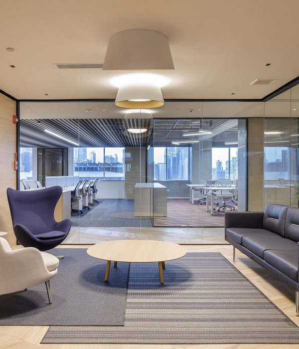
Cable trays make all electrical distribution and the power points are flexible, facilitating the provision of new layouts in the store. The slab have a neutral tone and the ceiling is done with metal lath to bring unity to the place.
{{item.text_origin}}

