Architects: Inbetween Architecture Project: Woori Apartment Location: Melbourne, Australia Year 2018 Photographer: Tatjana Plitt
建筑师:中间建筑项目:Woori公寓位置:澳大利亚墨尔本2018年摄影师:Tatjana Plitt
Give an old beauty a new lease of life Located on the first floor of a 1960s apartment building in the leafy Melbourne suburb of Toorak, the Woori apartment has canopy views and a sense of privacy rarely found in such a location. The rooms are generous, but the 1980s renovation was looking tired. The living space felt internalised despite the garden outlook and north facing position, and the floor plan was not conducive to today’s contemporary open-plan living.
给一位老美人一个新的生活,它位于20世纪60年代的一栋公寓楼一楼,位于茂密的墨尔本郊区托拉克(Toorak),有着天篷景观和一种难得的隐私感。房间很宽敞,但上世纪80年代的装修看起来很累。尽管园景和北面的位置,居住空间感觉内化,而平面图不利于今天的现代开放式生活。
Tasked with giving the apartment a ‘refresh’, we challenged the client to also consider giving the floor plan a few tweaks; a dressed up 1960s floor plan is still a 1960s floor plan. The original kitchen with adjoining meals area, while large, was completely separated from the dining and living rooms and the access to the balcony was awkwardly tucked away in a corner of the living room.
我们的任务是对公寓进行“更新”,我们要求客户也考虑对楼面平面图进行一些调整;60年代装修的平面图仍然是60年代的平面图。原来的厨房虽然面积很大,但却与餐厅和客厅完全分开,而阳台的入口则尴尬地藏在客厅的角落里。
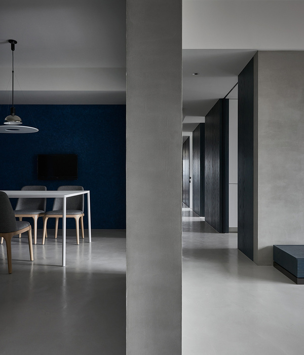
The biggest alteration was removing the wall between the kitchen and dining rooms to create open-plan kitchen / dining and give the kitchen a view to the garden. The meals area was reconfigured to create a walk-in pantry with casual meals catered for at the new island bench.
最大的改变是拆除厨房和餐厅之间的墙壁,创建开放式厨房/餐厅,让厨房可以看到花园。餐区被重新配置成在新岛的长凳上提供随意用餐的步入式储藏室。
Peeling back and starting over At the heart of this project was the need to give the Woori apartment a cosmetic refresh. There were some oddities from the previous renovation, but the bones were always good. The approach was to simplify and streamline, to create a feeling of freshness, openness and light. We worked within the existing constraints, such as layout of wet areas and locations of existing fixtures, but dramatically updated the look through a coordinated and refined selection of new fixtures and finishes. By making small tweaks, we were able to improve the functionality of the spaces within their existing general layouts.
从这个项目的核心重新开始,需要给Woori的公寓一次整容。上一次翻修时有些奇怪,但骨头总是很好。其方法是简化和精简,创造一种清新、开放和轻盈的感觉。我们在现有的约束条件下工作,例如潮湿区域的布局和现有固定装置的位置,但通过协调和精细化的新装置和成品的选择,我们戏剧性地更新了外观。通过进行一些小的调整,我们能够在现有的总体布局中改进空间的功能。
Approaching the project with a consistent material and colour palette provides continuity throughout the apartment. Working with a limited base palette reduces the visual clutter and allows the selected features to stand out against a more subdued backdrop.
使用一致的材质和颜色调色板接近项目,可在整个公寓中提供连续性。使用有限的基础调色板可以减少视觉混乱,并允许选定的功能在较柔和的背景下突出显示。
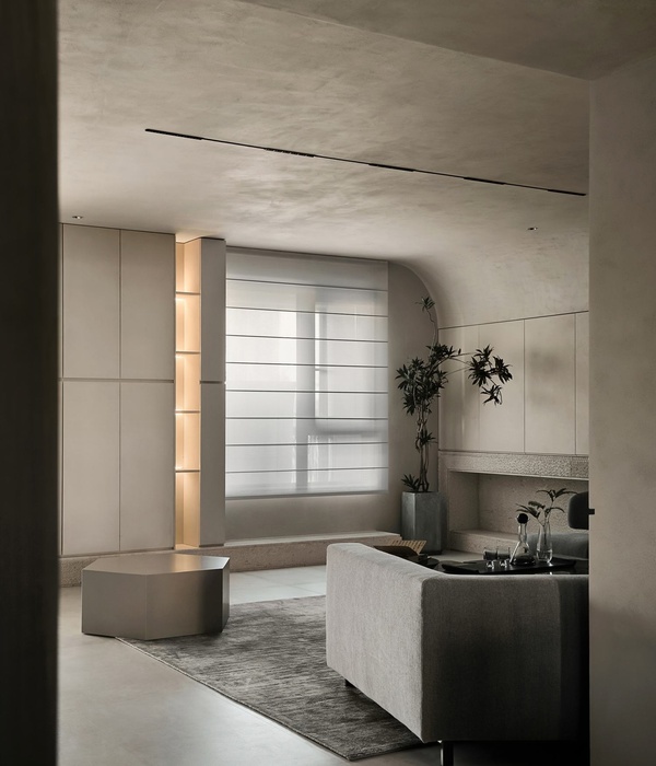
Finding a moment to enjoy Relocating the access to the balcony from the living room to the dining area opened up the opportunity to create a more cozy, comfortable living space. A new bench seat, where the old door used to be, creates a casual space to enjoy the sunshine and view, and a new fireplace gives the room a focus and adds a homely quality to the living space.
找个时间享受一下,把阳台从客厅搬到餐厅,创造了一个更舒适、更舒适的生活空间。一个新的长椅,旧的门,创造了一个休闲的空间,以享受阳光和景观,和一个新的壁炉给房间一个焦点,并增加了家居空间的质量。
{{item.text_origin}}

