When we, studio karhard®, were commissioned to design the interiors of the new Sony Music Entertainment Germany, Europe, and Sony Music Publishing headquarters in Berlin in April 2019, we first established the connections to this historic location. The site on Bülowstraße in Schöneberg is shaped by Berlin's music history from the late 70s to the present day. Many clubs and institutions found their audience here, especially in the 80s were style-defining for the music scene in Berlin.
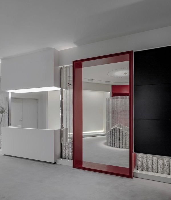
So it was easy for us to envision the headquarters as a place of encounters, where not only all the employees can meet in one location, but also musicians and other performers are being offered various opportunities for presentation and production. Stylistically, the building is shaped by the glamour of the 80s with a lot of steel, glass, and glitter, for example in the form of stainless steel mosaics, but also colourful carpets and shiny planters. In addition to a café as the focal point with a stage and a bar, the building comprises many different spaces in which music can be heard, presented, and also produced.
To create the Sony Music headquarter aesthetics we combined materials that are typically more likely to be found in clubs and bars, such as black asphalt screed flooring, a creamy white facade of exposed aggregate concrete, and backlit glass slats. In addition to meeting rooms with state-of-the-art media technology, there are music listening rooms in which music can be played at high volume without disturbing any employees working nearby. For video calls, custom-designed phone boxes are available. These are fitted with coloured fabrics and an infinity light on the inside.
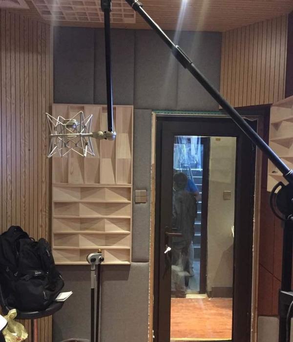
Furthermore, a fully equipped recording studio has been designed for both professional recordings and production options for streaming, podcasts, and all other social media applications. To create a cozy and stylish atmosphere on all levels, an individual and unusual furniture selection were made. The choices live up to all kinds of different music genres — just like Sony Music does. The chosen furniture in the open space areas achieved an optical stringency that creates a warm ambiance despite high-quality technical features like height-adjustable tables.
The custom-designed dimmable lighting also contributes to this. In the many conference rooms, tables made of different materials such as concrete and linoleum were combined with chairs that in turn have been upholstered differently from room to room. The media walls in those meeting spaces were developed to meet modern technology requirements while also being acoustically effective and aesthetically pleasing. The ceiling lights and steles with the corresponding switches were custom-designed and individually manufactured. For better orientation, the six office floors are carpeted in three different colours, ranging from deep aubergine on the 1st and 2nd floor, rusty red on the 3rd and 4th floor to dusky pink on the 5th and 6th floor. Particular attention was paid to special use areas such as The White Room on the 5th floor.
The space is open to all employees and provides access to a roof terrace, a jukebox with a white sofa for up to ten people, and a rounded bar counter made of stainless steel. The lobby is situated next to the cafeteria on the ground floor and gives off a gallery-like feel thanks to a wall of white exposed aggregate concrete and a free-standing video column. The Multifunctional Room was originally intended to accommodate events like press conferences but now serves as a multi-use space instead.
With its wide larch floorboards, white media walls, and colour gradient curtains, it is more reminiscent of a yoga studio than a regular press room. The pendant lights designed by Georg Hobelsberger also contribute to the contemplative atmosphere. The conference centre adjacent to the cafeteria has a futuristic look and consists of two smaller round meeting rooms and one larger square meeting room. Those three rooms are divided by glass construction walls and equipped with technically sophisticated ceilings that combine functions like heating and cooling as well as room acoustics.
Based on the layout of a Situation Room, the meeting rooms are furnished with black tables, suspended circular lights, and brightly coloured seating. The final meeting room is called The Darkroom, not only because of its midnight blue colour scheme for walls and furniture but rather due to the fact that studio karhard® is not your usual office fitters. They've made a name for themselves by creating clubs such as Berghain and designing the food and restaurant floor (quadrant C and D) of Berlin’s most popular department store KaDeWe.
{{item.text_origin}}

