- 项目名称:之物WU品牌男装店
- 项目地址:北京三里屯通盈中心一层
- 设计单位:CUN寸DESIGN
- 主创设计师:崔树
- 设计起止时间:2019年03月06 日-2019年04月01日
- 开放时间:2019年06月28日
- 项目面积:150㎡
- 项目造价:60万元
- 主要材料:毛石,金属板,烤漆饰面,镜面
- 业主名称:北京梧远服装有限公司
- 摄影师:王厅
之物WU服装品牌中WU意取“wu”,现代汉语的四个声调:屋 无 五 物,寓意是探索反思万物本源,渗透到生活方式的四个维度,去打造多元化的品质生活。恰好这与我们的设计思维相吻合。
The store name WU comes from the four tones of Mandarin, which are 屋(wū, means house) , 无 (wú, means nothingness), 五 (wǔ, means five) and 物(wù, means object). It implies the idea of exploring and rethinking the origin of all things on earth, penetrating into the four dimensions of lifestyle, so as to create a diversified high-quality life. This exactly coincides with the design thinking.
未来·屋Future · wū is habitat
项目地点在北京三里屯通盈中心,位于L1层临街的位置。我们认为“WU”品牌2.0空间,应该有容纳它特殊的地方,从呈现形式出发,到故事情节发展,再到普及的元素,历经的时间等,各个部分组装在一起,才能爆发属于“WU”的势能。
With street frontage, the project is located in the 1st floor, Topwin Center, Sanlitun, Beijing, China. It aims to be a space to contain the special features of brand WU, ranging from form, storyline, elements and time; all of which are put together to show the great power of WU.
想要打动当下的消费群体,依靠填鸭式的设计往往收效甚微,我们认为,商业模块中的营销和创意都应该是有体验的。围绕着自然,极简的方式,糅杂着“Yuppie雅痞”的情调和“Dandy时髦绅士”的精致,设计将男士的着装礼仪融入进空间与穿搭。
Nowadays, it is always ineffective to impress consumers through cramming design. In the designer‘s opinion, marketing and creativity in business should be experienced. In a natural and minimalist way, Yuppie culture and Dandy style are mixed here, and men’s dressing etiquette is blending into space design.
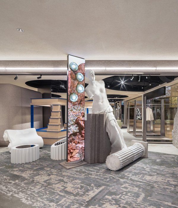
空间中,我们利用了毛石材料的自然特性进行陈列,自然的石材是对传统记忆的保留,同时加入了极具反差的科技质感的金属材质。我们希望消费者走完整个空间之后打破传统单一的展示方式,用使用场景来增强互动,让受众享受传统记忆的同时与科技未来进行结合。这样的消费空间在未来是不会被迅速过时的,反而更加符合新生代的审美标准。
Rubble stone is adopted as one of the main materials for display in the space. Its natural feature is a preservation of traditional memories. In addition, metal material with technical texture forms a shape contrast. The designer hopes that the whole space arrangement can break through the traditional single display mode. Instead, scene is created to enhance interaction, allowing customers to enjoy traditional memory and future technology at the same time. Such a consumption space will not be quickly outdated in the future, but will be able to meet the aesthetic standards of the new generation.
界限·无Boundaries · wú is limitless
我们擦掉产品定义空间的界限,让几何图案与线条,搭配上偏理性的冷色调光源,结合空间中的镜面与定制的拱形灯带虚实相生,呈现出一个穿越未来的“时空隧道”。
Regardless of the space limit defined by product, geometric patterns and lines along with cold light source echo with the mirror in the space and the customized vaulted strip light, creating a “spatio-temporal tunnel” to the future.
因为店面在商场一层临街位置,所以拥有前后两个出入口,刚好连接空间内的“时空隧道”,与内部空间结合作为延伸。并设计了一头极具科技感的的舞狮,引领三架胶囊舱(试衣间)在隧道内穿梭前行的概念。
The storefront is on the first floor of mall with two entrances in front and back doors, connecting the “spatio-temporal tunnel” in the store and acting as an extension of interior space. A lion dancing with high-tech feeling is designed to lead the concept of three capsules (fitting rooms) moving through the tunnel.
Coco Chanel曾说过:“时尚即设计,都是关于比例与分割”。对此,在空间中休息区、前台区、试衣间、服装展示区的比例设置中,为了让这些功能区的形象不脱离整体,我们以模块的形式堆积组合,使各个功能相互咬合。
Coco Chanel once said: “Fashion is architecture: it is a matter of proportions.” When it comes to the proportions of this project, the functional areas like rest area, front desk area, fitting room, and the clothing display area are accumulated and combined in the form of modules, being interlocked with each other.
设计上我们淡化了前台的使用形象,与休息区域组合搭配,形成一个弧线功能操作间,这里是整个流动空间的中心点。它的位置属于整个空间的后侧,不影响消费动线的同时,解决购买与服务的体验。
The image of front desk is downplayed and matched with the rest area to form an arc operation room. As the center of entire flow space, it‘s in the back side of store, so, it does not affect the consumption line, while solving the experience of purchase and service.
顶面的灯槽是对应商品陈列的位置进行了设计,将轨道射灯融于顶面,把焦点留给衣服本身,调整光影角度,让光影在空间中赋予节奏。灯光的饱和和镜面的穿插,使空间强烈并且有张力,同时呈现出衣物的最佳品质。
The light trough is designed corresponding to the display position of products. And the track spotlight is embedded in the top surface, highlighting the clothes and adjusting the angle of light and shadow, thus adding rhythm to space. The light saturation and interspersed mirrors give the space a strong tension while presenting the best quality of clothes.
三个太空舱式样的试衣间,处于空间正中心位置,这里是动线最集中的地方,消费人群拿到意向服饰,可以直接进入舱内进行“升级改造”。为了方便顾客试衣,还在舱壁上符合人体工程学的位置设计了一圈存放手机和随身物品的置物槽。在太空舱顶端不同的位置都留有圆形窗口,保证空气流通的同时,可以在里面真实感受“太空舱”。
The three capsule-style fitting rooms are located in the center of space, where the moving lines are most concentrated. Consumers who get their intentional clothes can directly enter the capsule for “upgrade and transformation”. In order to facilitate fitting, a recessed round storage space for cellphone and personal belongings is set on an ergonomic position in the capsule wall. There are round windows at different positions on the top of fitting room to ensure ventilation and vivid feeling of capsule.
逻辑·五Logic · wǔ is sense
我们始终相信消费者是最重要的元素,能够打动消费者的,激发他们从购买中体会品牌的链接,就是引发他们在空间中的触觉和视觉感知、勾起记忆和情感的物质化的东西。在设计之物WU品牌空间中我们整理并运用了5个商业逻辑:
The designer keeps the faith that consumers are the most important elements. What impress consumers and stimulate them to purchase and understand the brand link lies in the objects which trigger their sense of touch and visual perception, and remind memory and emotions. In the design of WU, there are five business logics:
1.了解甲方:商业空间设计中所展现出来的场所精神,实际上是运营手段,也就是说有了运营的需要,才有了商业空间设计。带动客流创造品牌价值,空间指向性(动线的交汇点、驻足停留的点、购买流程的节点)达到激发消费兴奋感。
1. Understanding the client: The place spirit displayed in commercial design is actually a means of operation, that is to say, only when there is a need of operation, there is commercial space design. The design should lead customer flow to create brand value, so that spatial orientation (including the intersection of moving lines, the staying point, the node of purchase process) can stimulate high consumption.
2.倒推好设计:好的商业设计都是从盈利模式和我们未来的产品内容来倒推场所,让它赋予消费者认知的心理能够起到暗示积极交易的场景模型。
2. Good design from backward induction: Good commercial design comes from a reasoning method based on profit model and future products, so that it gives consumers a cognitive psychology which implies a scene model for positive consumption.
3.创造价值:商业购买的情感诉求正在成为当下消费者衡量一个品牌、一个空间的标准之一。相较于单纯的物质需求,他们更看重产品背后的价值标签。在新的应用的空间场景下,消费者不再愿意仅仅为了物品本身的使用价值买单,反而更关注空间带来的情感溢价。
3. Creating value: In commercial buying, emotional appeal is becoming one of the standards to measure a brand and a space for customers. They emphasize more on the value tag behind product than the pure physical needs. In the new application space scenario, consumers are no longer willing to pay just for the objective value in use, but instead paying more attention to the emotional premium brought by space.
4.IP植入:消费的底层商业逻辑是一种为目标消费群体提供的价值符号认同感和明确感。完整的商业设计,空间只是一部分,融入品牌的SI系统,完成品宣+消费导向。
4. IP implantation: The underlying business logic of consumption is offering a sense of identity and clarity of value for the target consumer group. For a complete commercial design, space is only a part of it, it should integrate into the brand’s SI system, as well as product promotion and consumption orientation.
5.空间未来性:这次也是属于CUN寸DESIGN的新的尝试,这里实际上更像是一个场景装置。可以理解为是我们对未来商业研究的一个实际模型。空间形式只是完成它的样貌,更多的是对“新”消费人群的购买习惯与感受的可能性。
5. Space futurity: As a new attempt by CUN DESIGN, the project is actually more like a scene installation, which can be regarded as a practical model on future business research. Space is just a form, which is more like an exploration on the possibility of buying habits and feelings for the “new” consumer group.
商业·物Business · wù is object
“WU”是一个什么空间?为什么这些人愿意到这里来打卡?这里的男装品牌好吗?如果项目完工可以引发好奇的声音,那么我觉得这次的设计目的已经达成。其实大到商业逻辑细到产品本身,商业品牌营造的是让来到的每一个人都能感受到的氛围,并接受到普及。我认为还是更多是一种实验性,是一种更加面向未来商业的状态。
What is “WU”? Why are these people willing to come to visit it? Is it a good menswear brand? If the project can raise these concerns, the design goal has been achieved. In fact, no matter it is business logic or product itself, commercial brand aims to create an atmosphere that everyone who comes can feel it and accept it. From the perspective of designer, the project is an experimental practice and a future-proofed business form.
项目信息——
项目名称:之物WU品牌男装店
项目地址:北京三里屯通盈中心一层
设计单位:CUN寸DESIGN
主创设计师:崔树
辅助设计师:林孟丹、闫梦瑶
设计起止时间: 2019年03月06 日-2019年04月01日
开放时间: 2019年06月28日
项目面积: 150㎡
项目造价:60万元
主要材料:毛石、金属板、烤漆饰面、镜面
业主名称:北京梧远服装有限公司
摄影师:王厅
Project information——
Project name: WU Menswear Flagship Store
Project location: 1st floor, Topwin Center, Sanlitun, Beijing, China
Design firm: CUN DESIGN
Lead designer: Cui Shu
Participate designers: Lin Mengdan, Yan Mengyao
Design period: from 6 March, 2019 to 1st April, 2019
Opening time: 28 June, 2019
Project area: 150㎡
Project cost: 600,000 Yuan
Main materials: rubble, metal plate, paint finish, mirror
Client: Beijing Wu Yuan Clothing Co., Ltd.
Photographer: Wang Ting
{{item.text_origin}}


