East Hampton is known for its ease and relaxation – a beach destination where visitors like to forget about their daily lives and slow down. Studio Galeon founder Lucia Galeano wanted to impart this sense of leisure in the East Hampton location of Swiss timepiece maker Audemars Piguet, without compromising its integrity as a luxury brand.
We approached this unique combination through a number of strategies. First, we saw an opportunity in creating a central element that would invite visitors into the space. We worked with a local millworker to clad the space’s existing steel support columns in white oak paneling to form a colonnade whose arches mirror the windows of the building’s facade. In addition to functioning as an introduction for incoming visitors, the colonnade subdivides the elongated space into a series of intimate rooms or “nests” where salespeople can have more direct and personal conversations with visitors or where private consultations can take place.
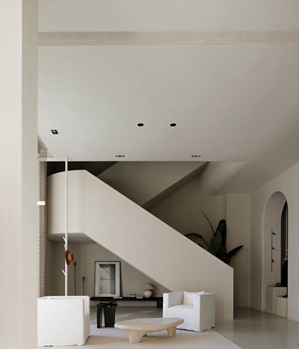
Studio Galeon worked with Audemars Piguet’s store design team in Switzerland to ensure that all store elements cohered with the brand identity. We interpreted it to fit the beachtown setting by steering clear of shiny or glossy surfaces and, instead, privileged more natural materials and an overall monotonal, soft palette rendered in white oak paneling on the walls and floor.
Again, we collaborated with a designer from LA and our NY millworker to custom design and fabricate all the furniture for the store and engaged a glassblower to craft unique glass globes for the light fixtures we designed to be distributed throughout the space.
Custom-designed lounge sofas wend their way through the store’s antechambers, providing more rounded, curvaceous moments to encourage relaxation and also to break up the narrow space’s right angles. The sales desks are embossed in parchment-white leather, which mirrors the white oak flooring and custom display cases visitors encounter on the way in. Two varieties of Vals Quartzite, each a dramatic hue of green-grey with unique striations, contrast slightly with the lighter palette to provide a sense of depth and perspective. They are specified in more heavily trafficked areas such as the flooring for the entryway and bathroom, while also comprising the trapezoidal volume of the welcome desk, which anchors the space and provides a strong brand statement.
{{item.text_origin}}


