双胞兄弟的和谐共生之家
- 项目名称:双胞兄弟的和谐共生之家
- 设计方:Eyal Apple,Raz Melamed
- 项目面积:700㎡
- 项目地点:Hod Hasharon
- 完工时间:3 年
- 主要材料:混凝土,木材,黑色和白色
- 项目业主:两兄弟
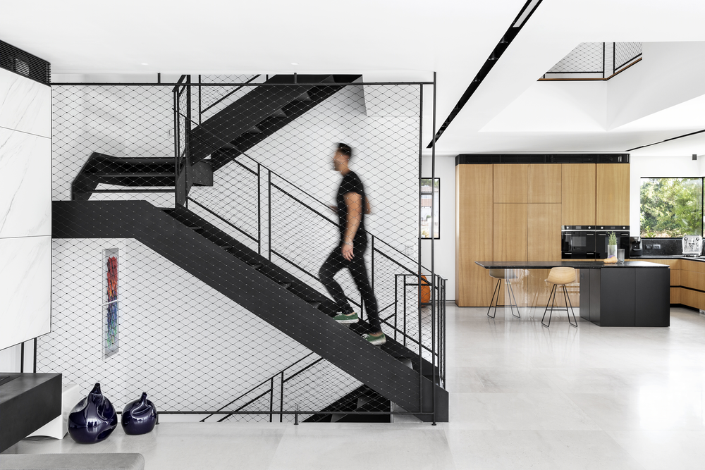

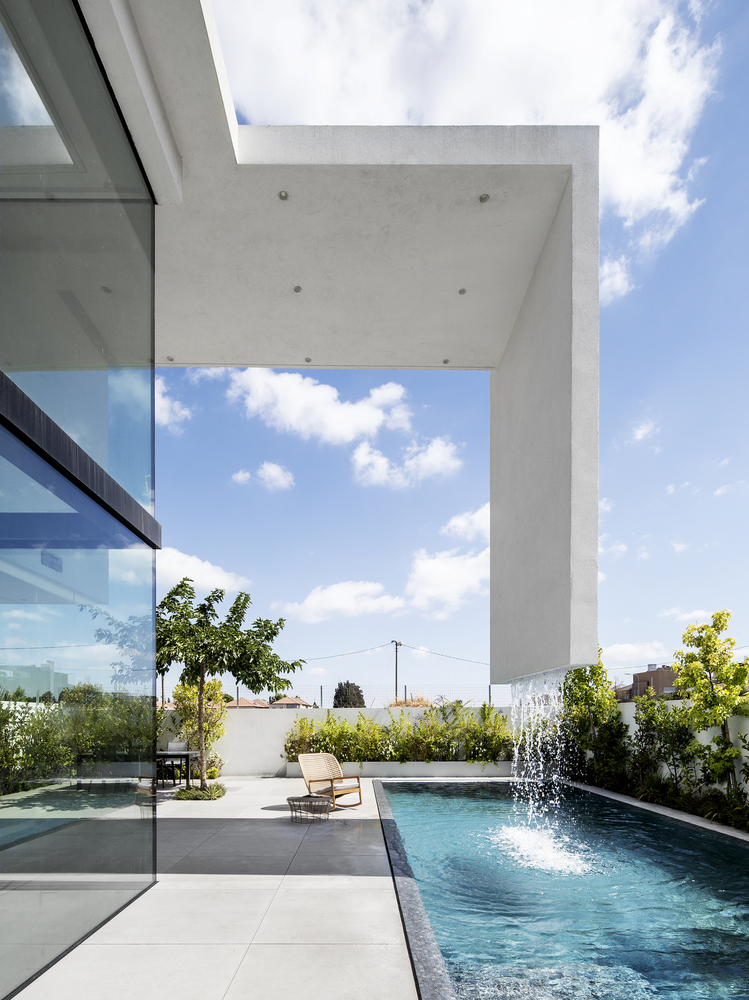
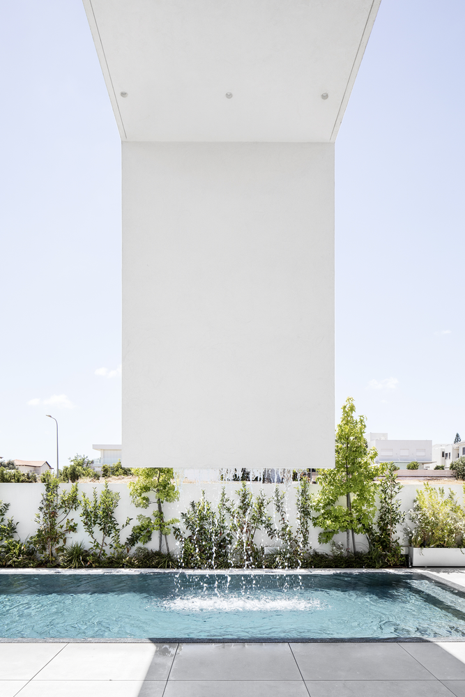
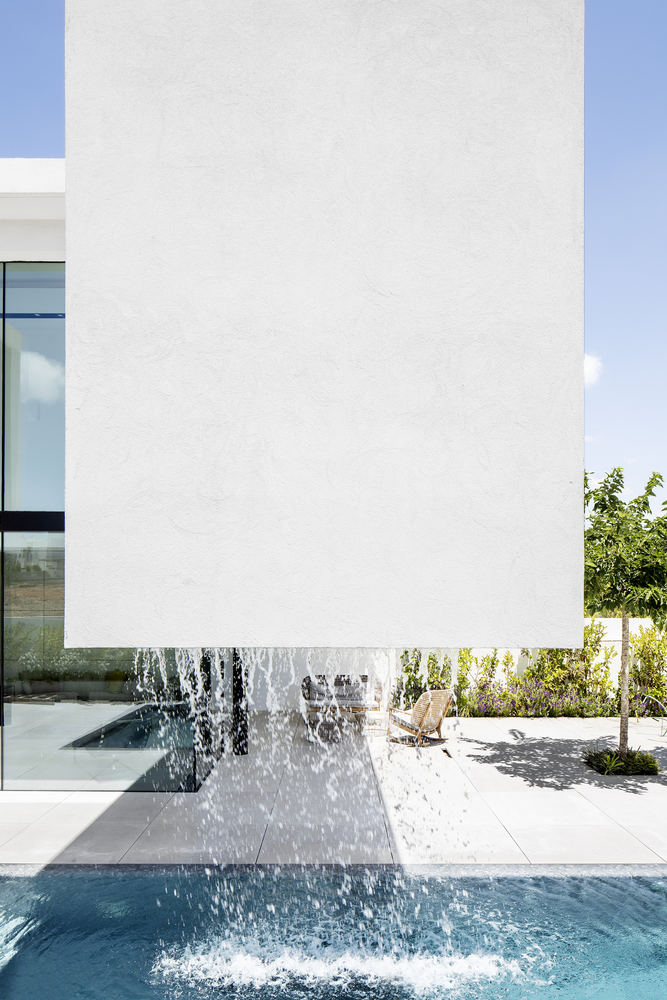
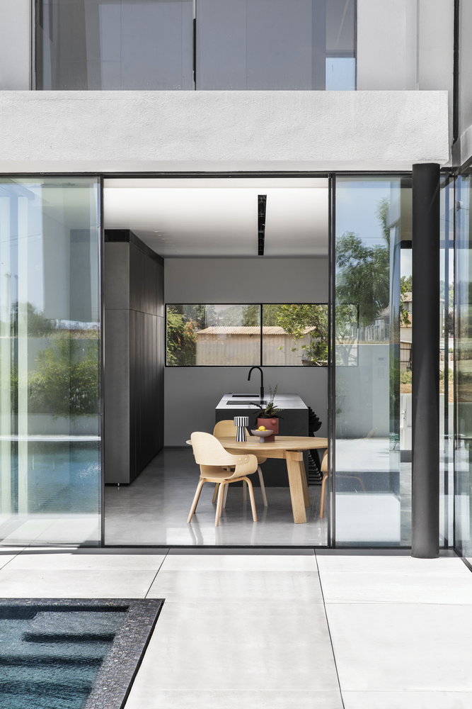
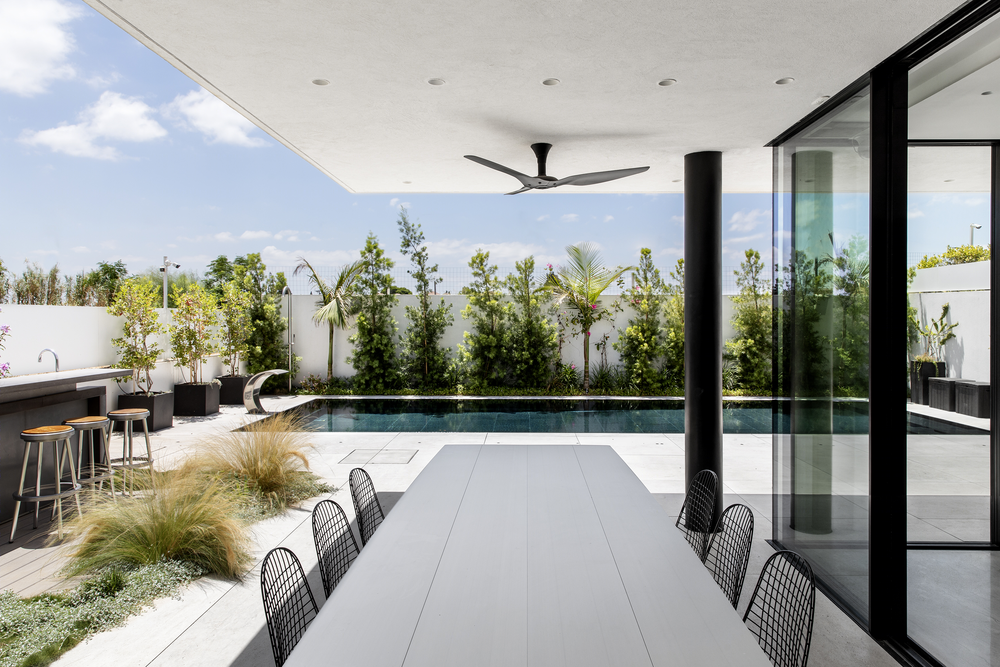
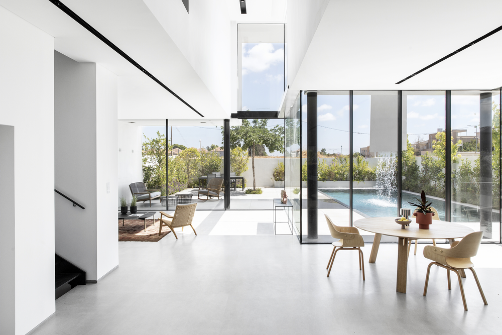
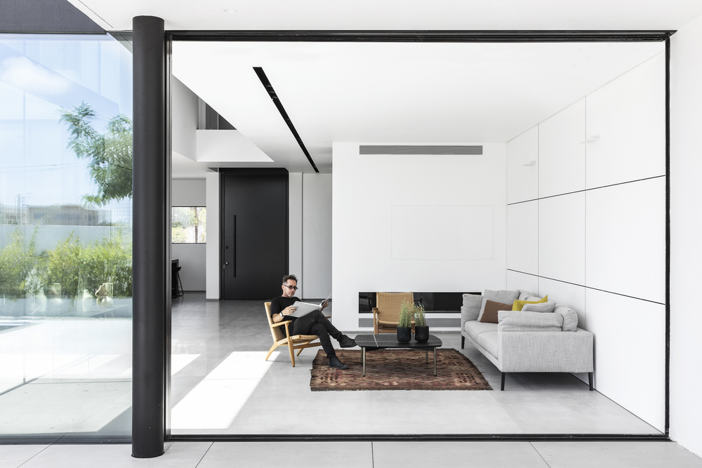
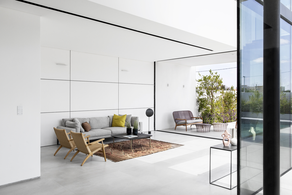
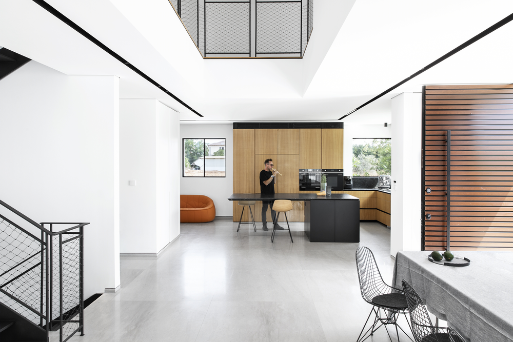
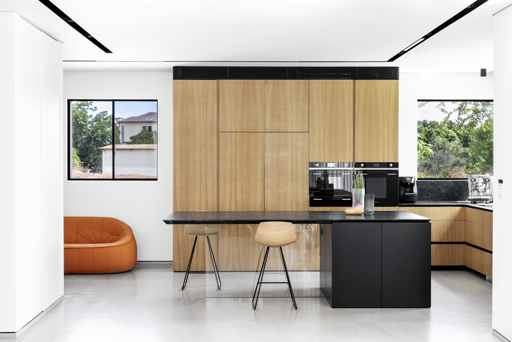
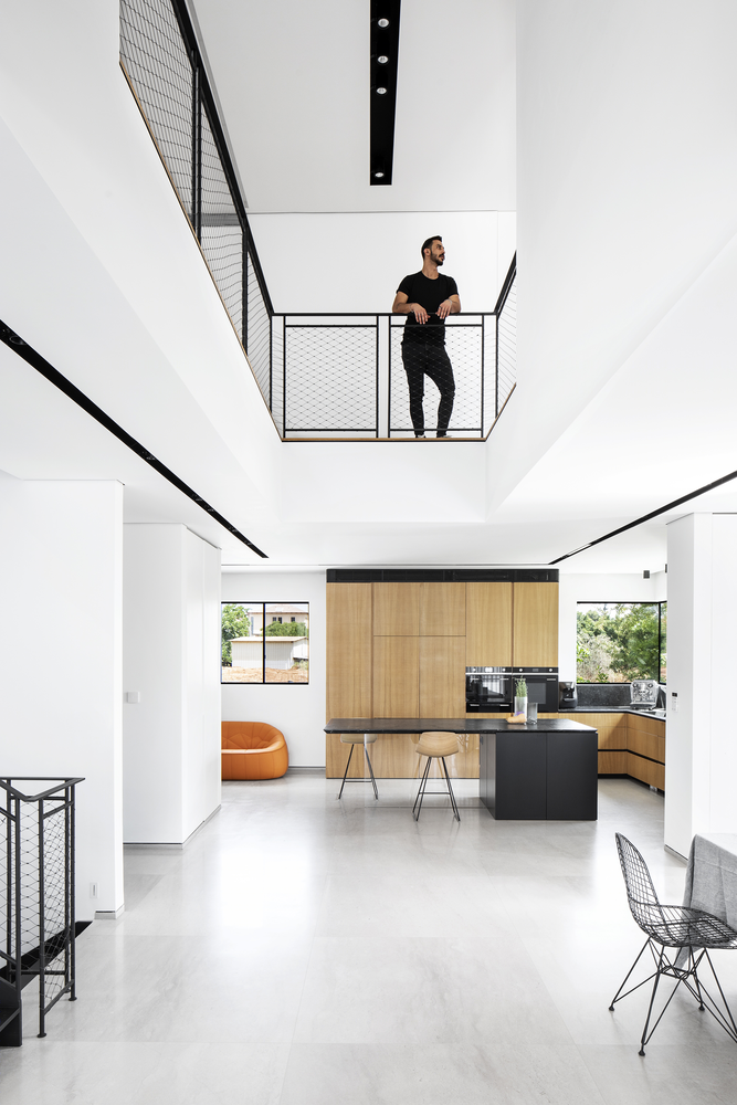
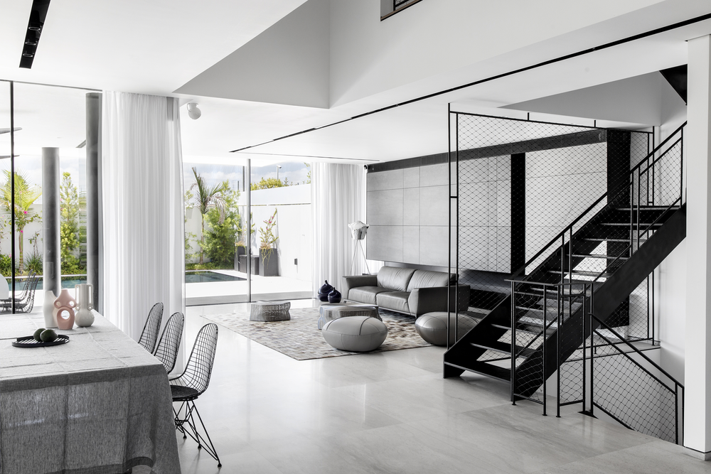

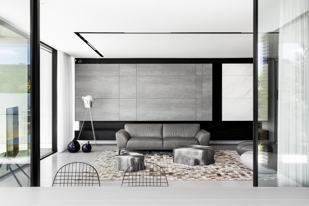
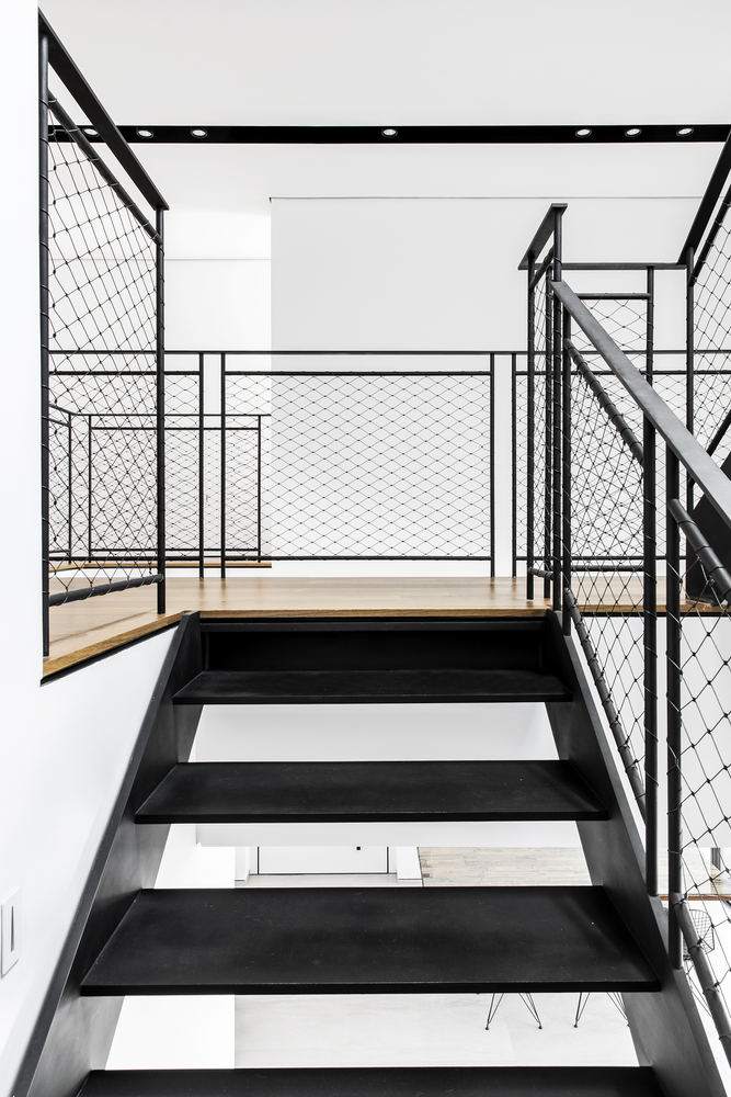
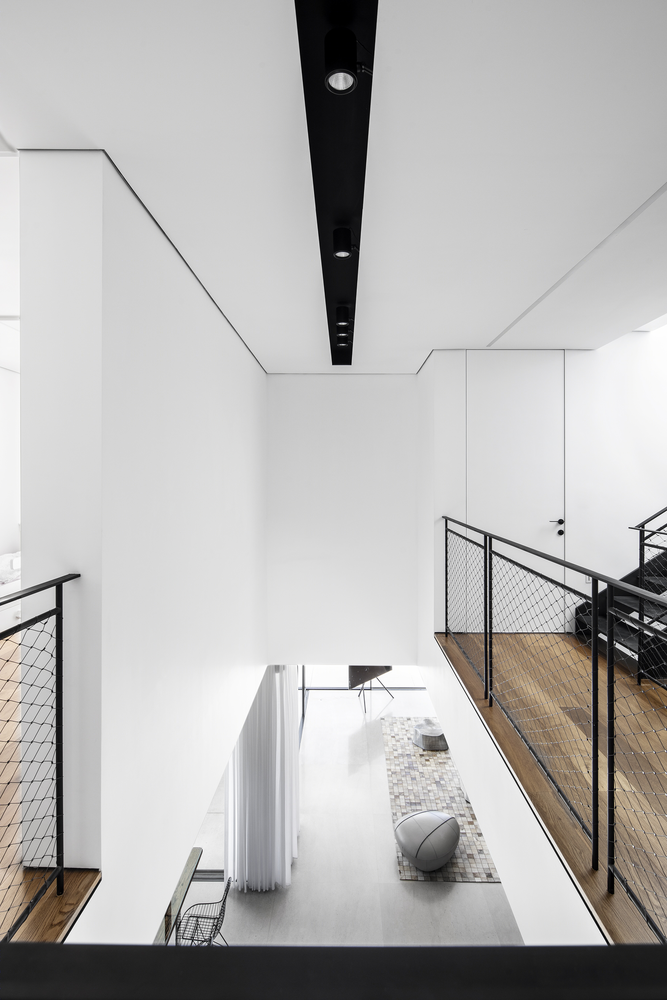
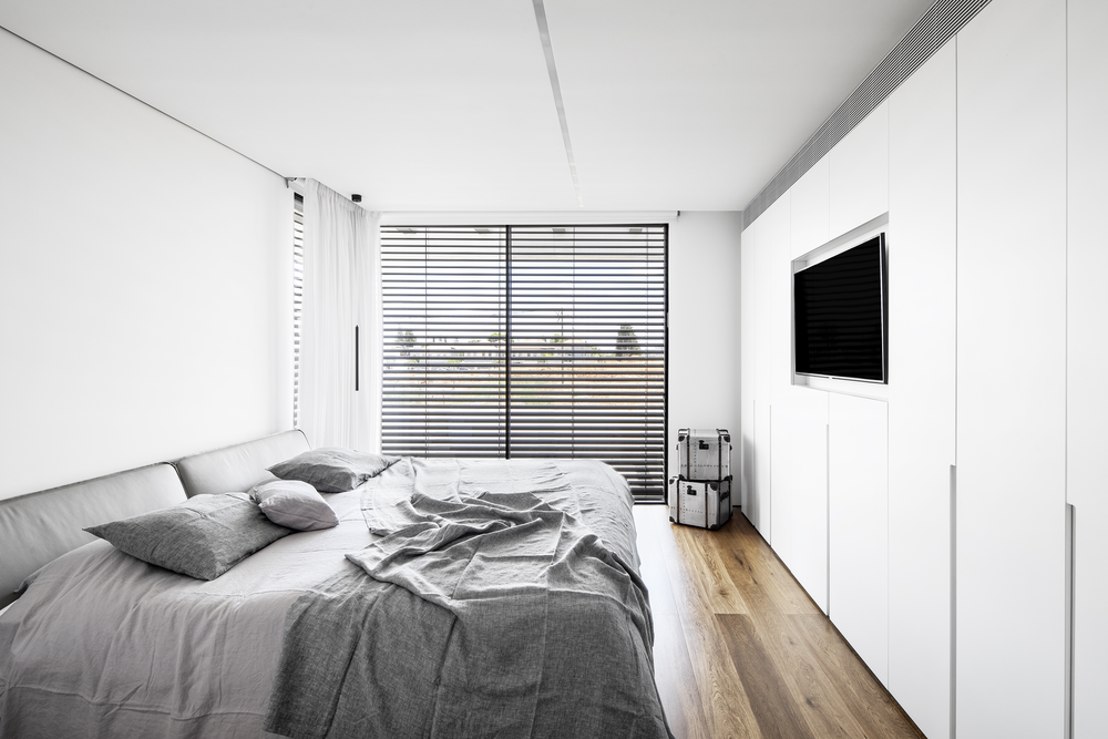
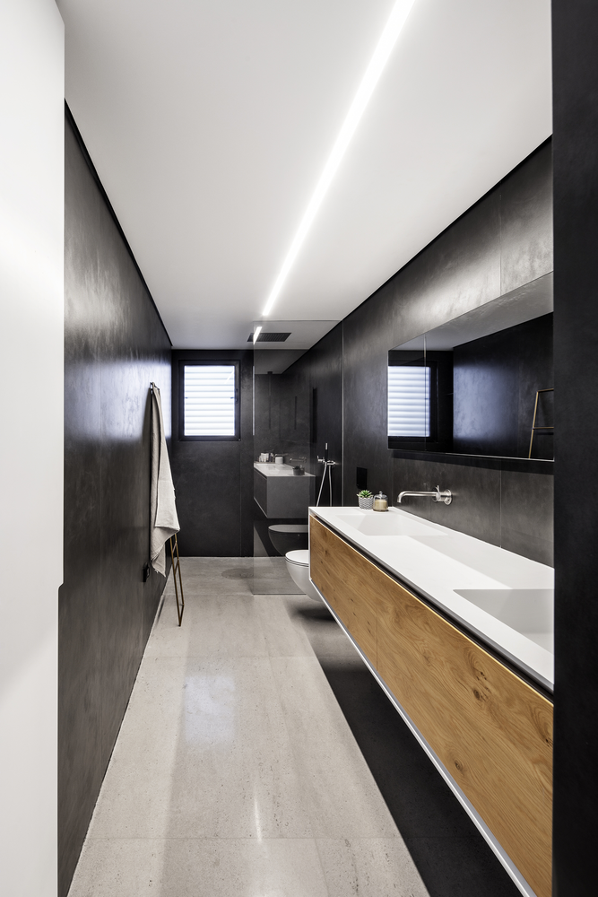
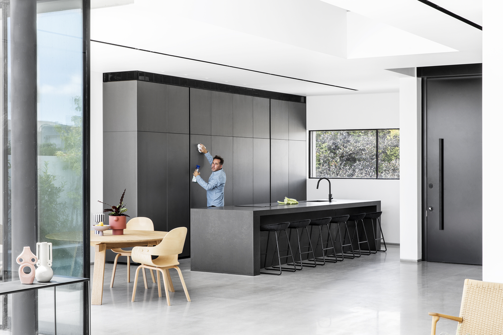
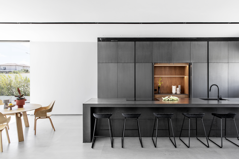
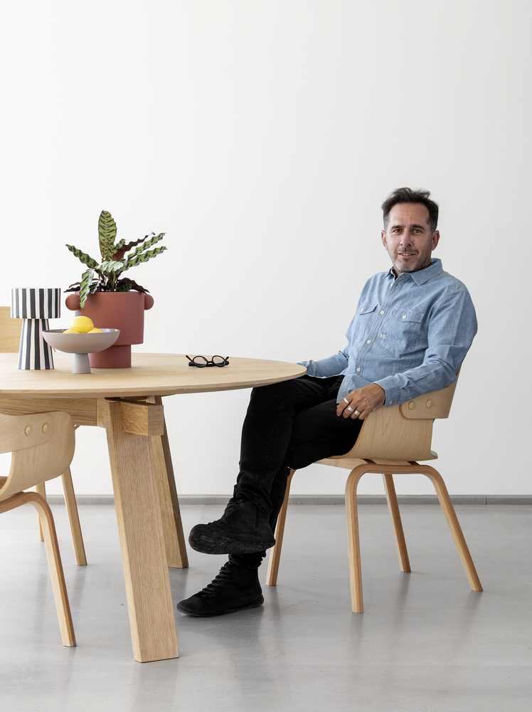
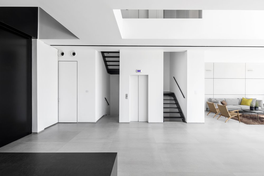
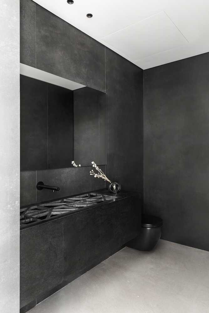
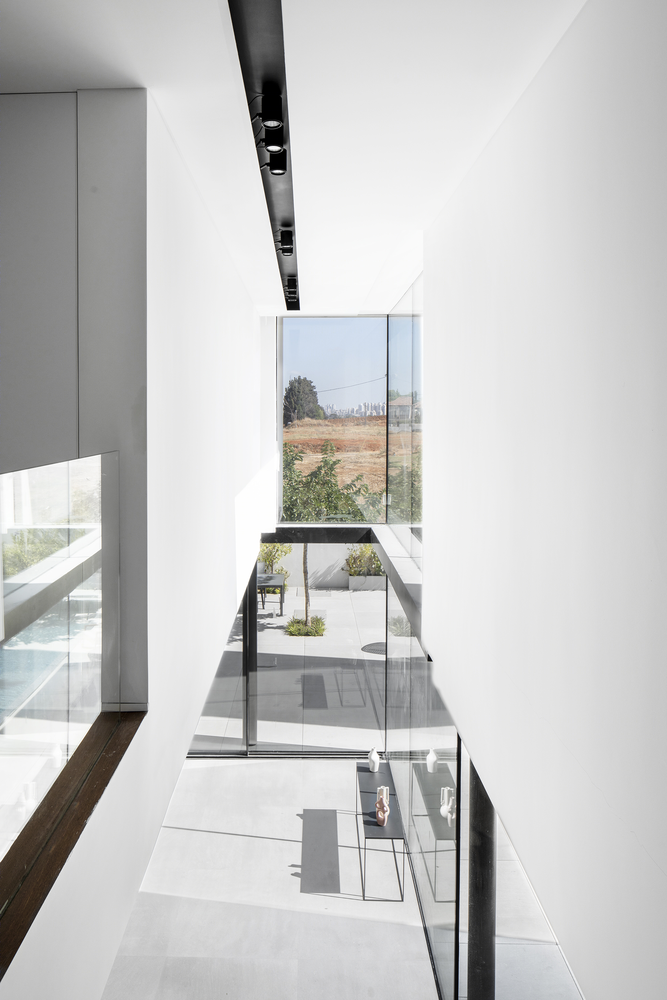
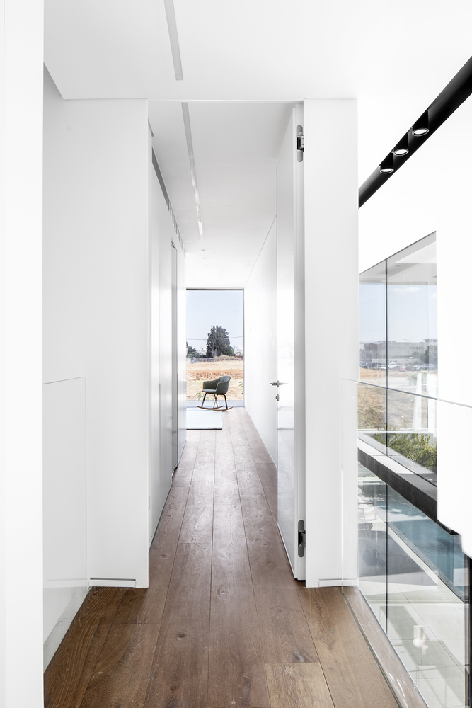
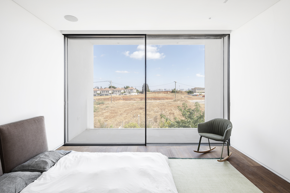
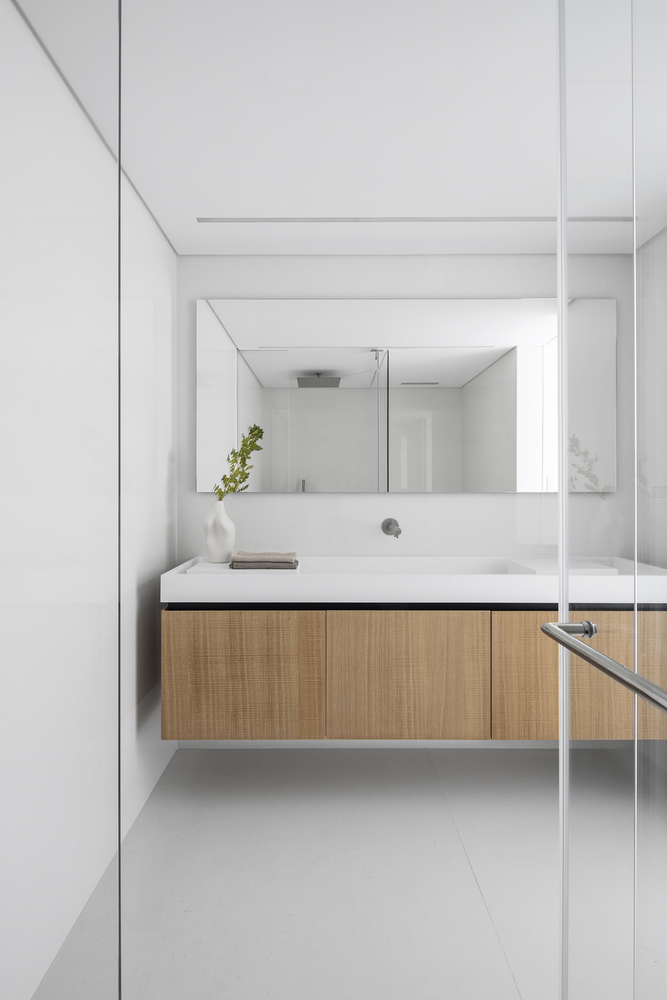
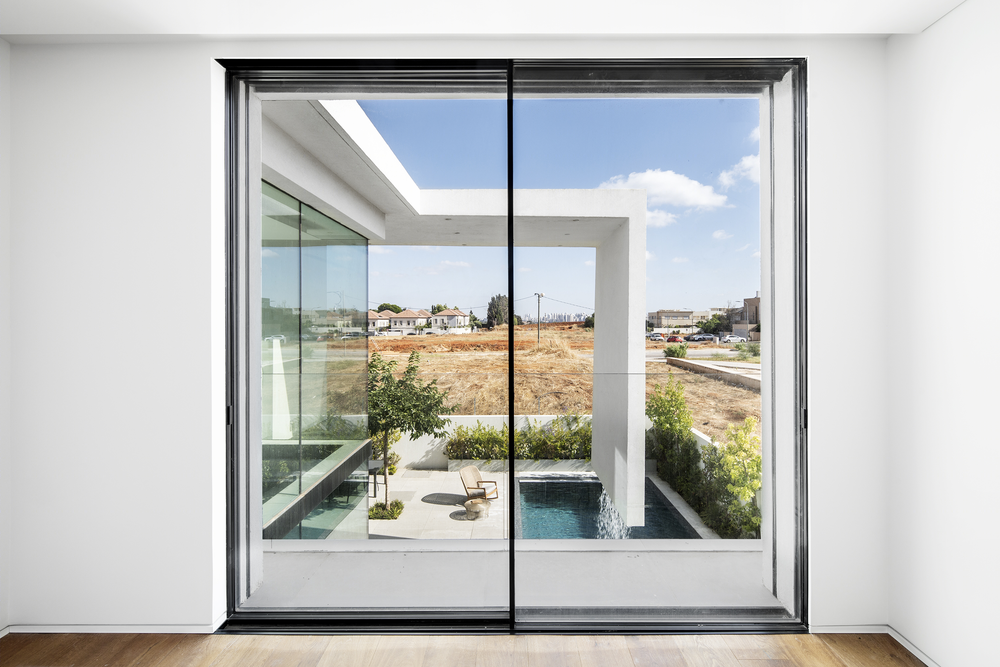
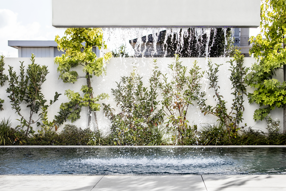

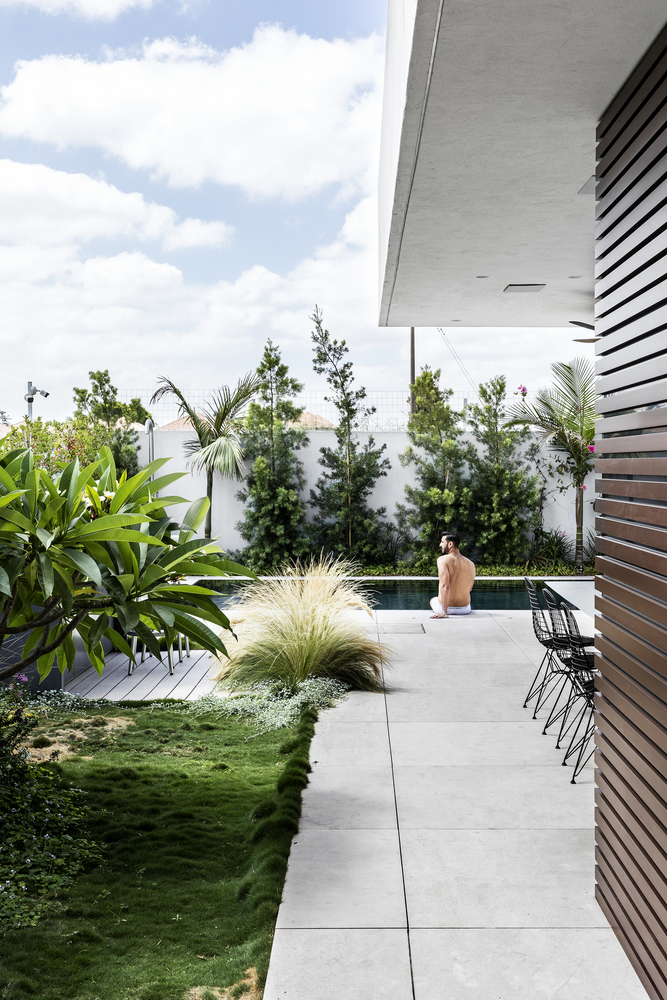
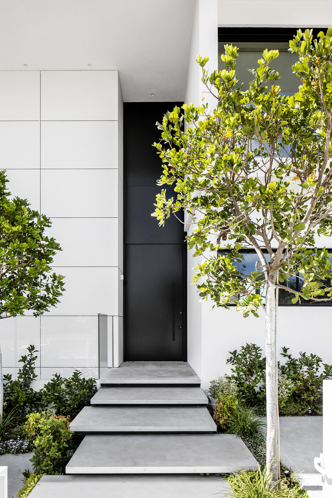
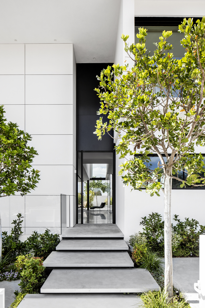
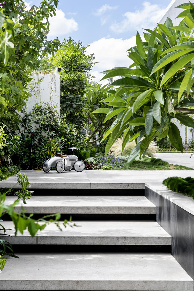
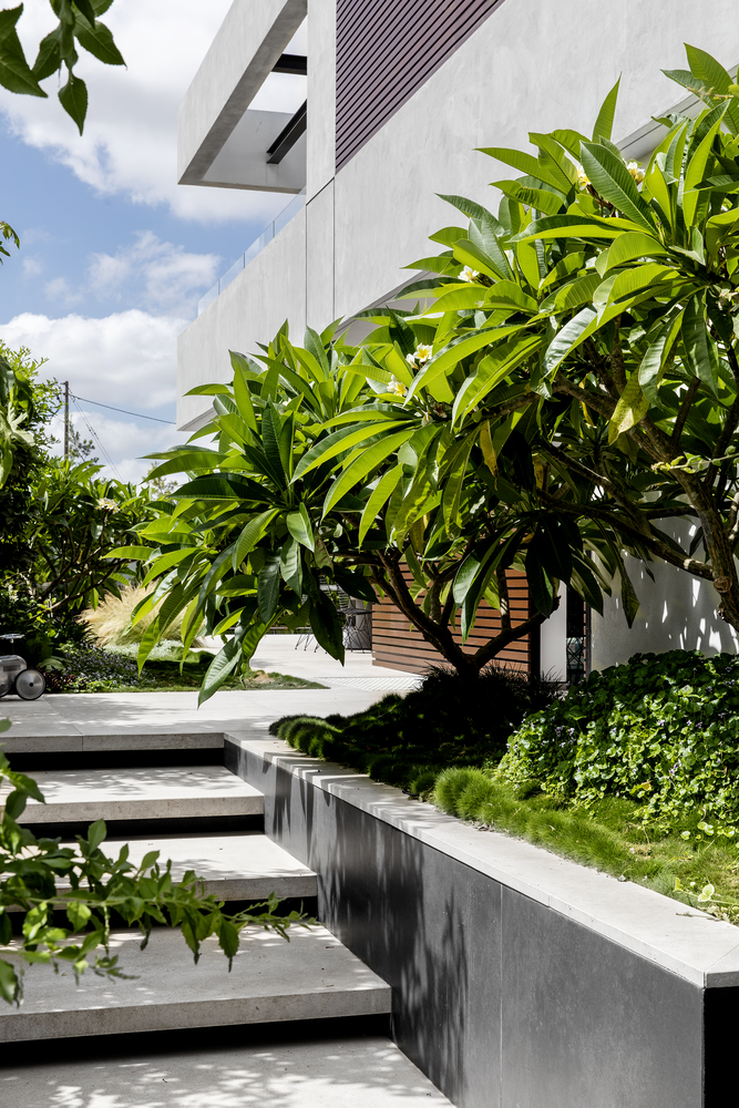

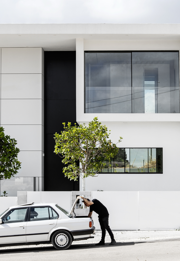
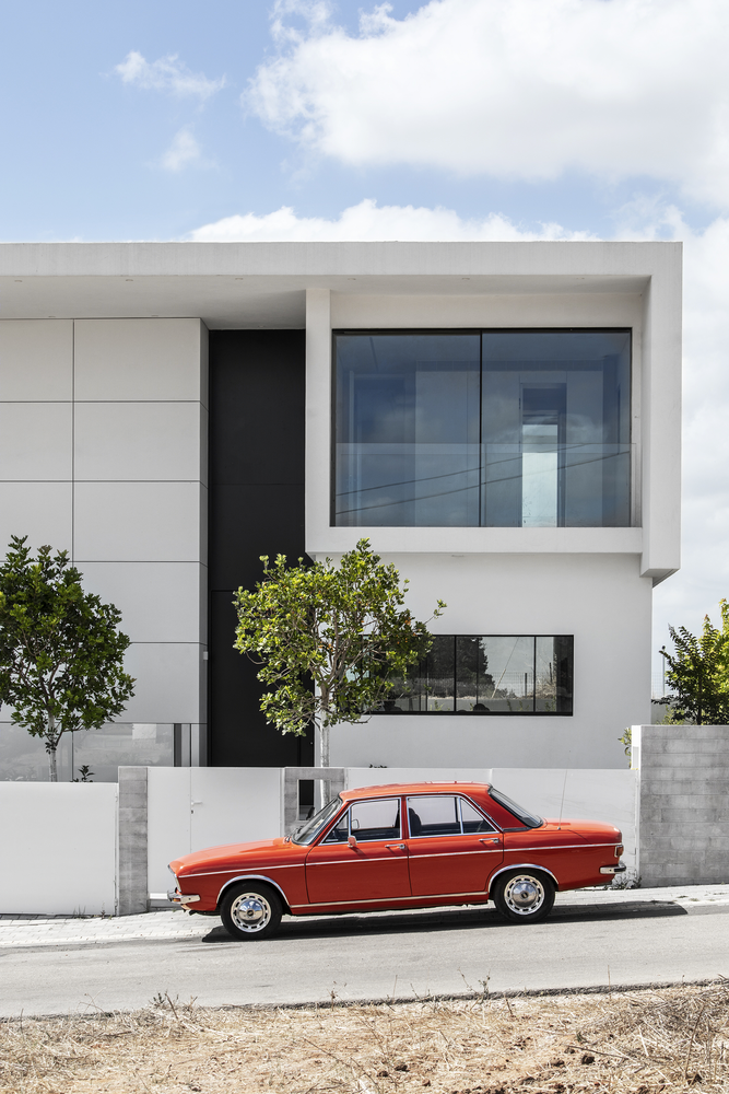
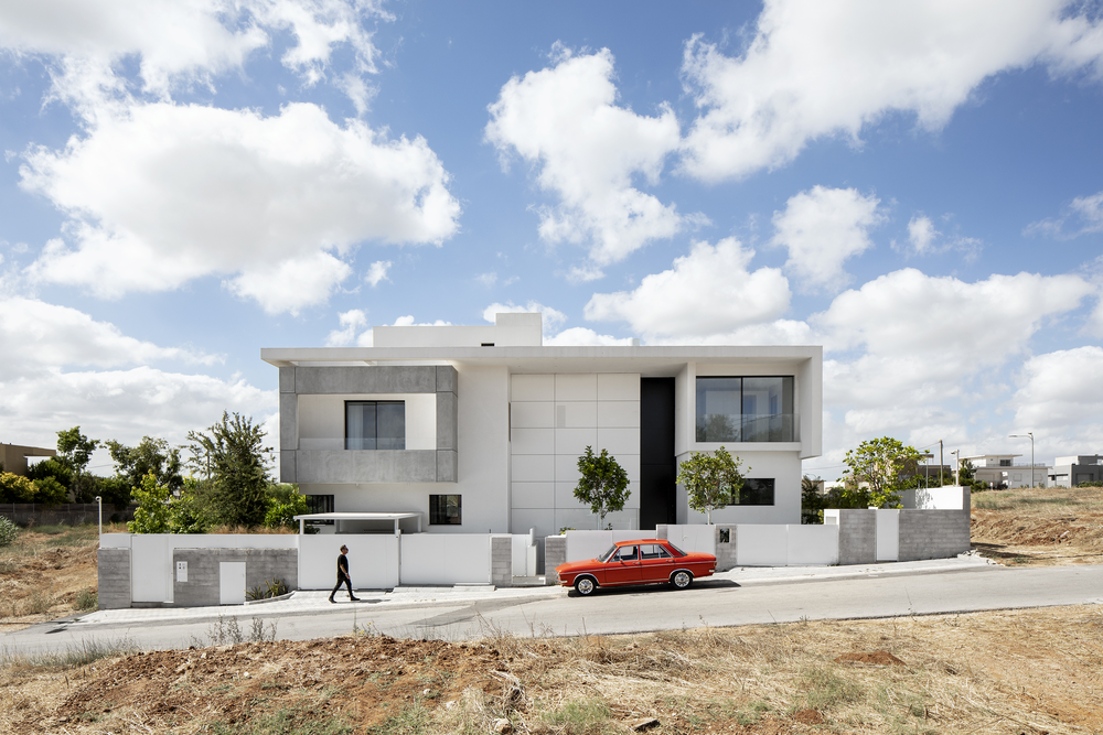
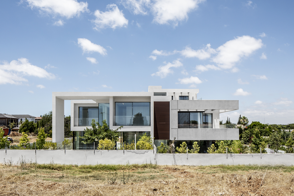
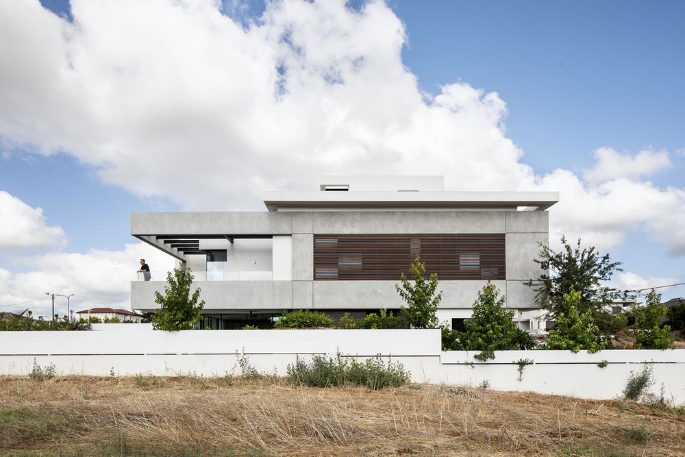
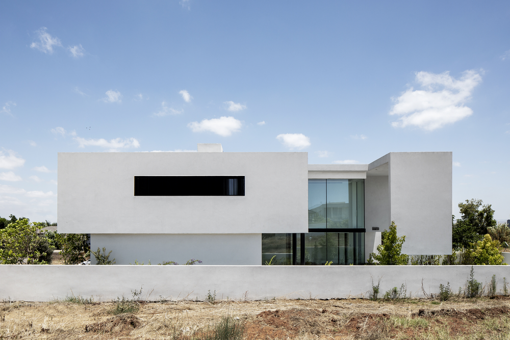
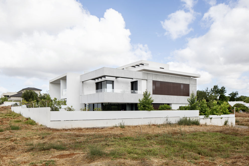
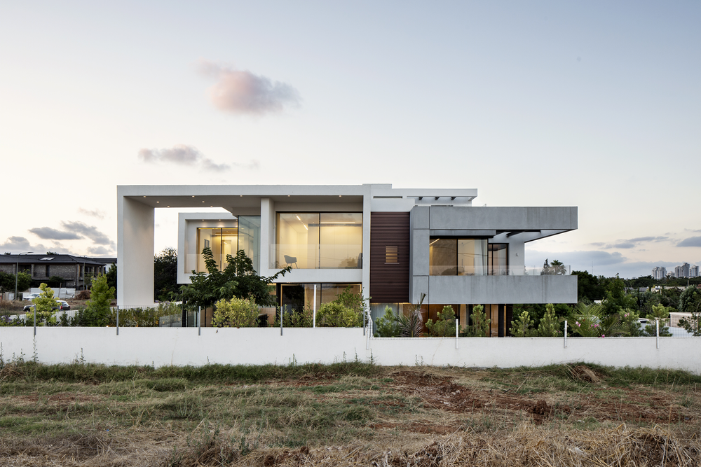

The House features spectacular architecture through balanced touches of concrete, wood, black and white which seamlessly lace from the exterior to the interior of the house in all their glory. From the outside, the building looks like a singular house, but the inside tells a different story: two brothers, two separate programs and two houses living side by side, with a common wall separating them, which is in fact the only architectural element they have in common. The initial design of this house was done by architect Eyal Apple and continued by architect Raz Melamed in coordination with the building engineer. Upon adopting this project, Melamed focused on updating the openings of the house, changing columns and designing the facades, and planning the entire interior design. Creating a magic-like appearance made possible through careful thought and planning, the architect created a harmonious and continuous architectural unit, without partitions. Only those who know the interior of the houses would be able to identify when one house ends and the other begins. This is not a classic two-family house with a common wall that creates a mirror image. From the initial planning phase of the House in Hod Hasharon, the plans referred to the building as two separate houses – “House A” and “B” - with each space adapted to the customers’ wishes, and yet the architectural language is common to both. The project lasted 3 years and expresses Melamed's architectural mission that clings to clean lines, quiet colors and natural materials. All of these appear in the project, with an emphasis on a warm atmosphere, functionality, and the suitability of the house for those who live in it, while taking into account everyday needs along with precise aesthetics. Those who stand on the street in front of the fence will be tempted to gaze at the building from all sides, just like a book that you cannot set aside, flipping to the next chapter, as each step you take around the house will reveal a game of complete and emptiness, of mass and lightness. On the main façade, a white cement board rises to a perfect grid height, which covers the meeting between the two houses, making it homogeneous. The asymmetrical façade obscures the division of the building into two, as well as the front door to the right house, which implies that it is one house, when in practice the house to the left is sideways. The house on the right from the street is “House A”, in which concrete stairs lead to the black door, which stretches to the entire height of the building, standing out in contrast to the white grid and produces a dramatic entrance. The entrance axis leads all the way to a window that also stretches lengthwise and produces a repetition of the door shapes, which intensifies the height of the structure. At the request of customers, the space was designed with particularly high ceilings, omitting an additional floor so that all in all the house contains 3 floors. Outside of the house is a steel fountain that displays powerful geometry, and fills the pool as an architectural marvel, as it looks at all like a white wall bursting into the garden, stretching its boundaries to the outdoors. The surrounding garden is filled with vegetation and tin planters, a marvel that is visible through the free-standing glass surrounding the garden without connections. This landscape architecture is illuminated by low outdoor lighting, which dares not compete with the various elements of surprise. Inside the house Melamed sought to create a clean glass look by moving the vertical construction pillars away from the fronts and corners so that they hold the second floor on the one hand and contribute to a transparent and continuous façade on the other. At the same time, these columns do not connect to the black beams, forming a constructive and intentionally designed horizontal line throughout the structure. The entrance features gray natural stone flooring, while in the rooms it is replaced by parquet, a design used in both houses. To the right is the graphite kitchen, designed in both homes with tall cabinets with a wooden cube for the work area in front of a free-standing island whose stone surface seems to grow from the floor, designed for comfortable seating and efficient work. The air-conditioning unit is painted black, like the lighting and construction, and is hidden within the carpentry as a design choice that honors the height and prevents unnecessary lowering. Light fixtures stretch along the space, leading towards the dining area with a light look and the warmth of hardwood. Next up is the living room that leans against a wall in the pattern of the white grid in the front of the house, a perfect grid that brings the outside in. Two wall light fixtures are hung from the wall, which also repeat in the garden on the same axis, illuminating airy furniture in straight lines that stand on floating legs. Following the stairs that surround the elevator shaft, we arrive at the bedroom floor and head straight into the master suite. At the entrance, a carpentry cube has been designed to hide the bathroom and closets, so that in the sleeping space there is only a bed and a chair. The bathroom is paved with stone and covered with white tiles to create a pastoral space with a wooden cabinet that brings peace. The guest bathroom, on the other hand, is dramatic and covered in minimalist dark gray for a theatrical atmosphere. To the left of this house stands “House B”. In this house, it was important for its occupants to have a luxurious home spread over 4 floors. The entrance is through a detailed wooden door, a design element which repeats in varying shapes on the house’s three outer facets, while hiding the seam line between the two houses from the back. This wood is used to fill the open spaces in the concrete to create privacy for the bathrooms and children while also contributing to the warm accents of color. It is woven into the house's perimeter of concrete through a grid that creates a design interest, which leads to an open balcony in the front of the house. To the right of the entrance is a kitchen made of wood veneer for a feeling of warmth and connection with the outside. It incorporates an asymmetrical gray island with a surface that looks like a floating cloud despite the massive material from which it is built. Next to it is a family corner for quality time with a touch of happy color on the orange sofa. The air conditioning, lighting and aluminum systems are painted black, and around them the design is composed of light shades. The living room is also intended for family gatherings and entertaining, with an asymmetrical wall in the back of the sofa covered with carpentry that repeats the gray grid in front of the house, and hides the fireplace, air conditioning, and control systems. Next to it is another cube covered with porcelain granite and below it a black shelf that serves as a sideboard. The combinations of colors and materials on the same wall create a strong connection between the exterior and the interior, as well as create a spunky and elegant design. The architectural mass gets a light twist thanks to the floating iron steps combined with an airy mesh railing, which climbs into a double space. The dining area next to them is equipped with black mesh chairs, which reinforce this visibility in the space. Upstairs are the bedrooms, with the guest suite furnished with white carpentry, and attached to it a bath with dramatic cladding, and a wooden closet that creates quiet. In each house separately, and in both houses together, the name of the game is balance - low and high space, wood and iron, white and black, functionality and aesthetics - all of which in harmonious precise touches come together to make the architecture a remarkable harmonious masterpiece and perfect for living.
Total built area (m2): 350 each House = 700m2
Photo credits: Itay Benit

