To have the interior tell an authentic story of the locale, to create a design that is in harmony with the special characteristics of the local environment and the culture of its residents, which are the values that the Mercure brand supports. As does our studio.
The hotel has split-level architecture. Every room has a different layout and different window levels, which is why we had to create an individual design for each room.
To include the carved patterns of the Mordovian folk craftwork and elements of the mythology of Mordovia’s ethnic groups in the modern architecture of the hotel. Geometric patterns and shapes of interior details and decorations blend with the broken lines of the building, creating a harmonic architectural image, and the vivid local color brightens up the interior and adds coziness to it.
To find some inspiration, we visited the museum of a famous artist, sculptor Stepan Erzia. Erzia’s work is permeated with love for his people, the Erzya Mordvins. We also found a deep appreciation for both the sculptor’s work, and the flair of these people. Throughout the hotel, we gave preference to natural materials and paints. We used a lot of wood in the finish and decorations, and chose pastel and green colors, the same as the museum, to emphasize the connection between the interior and the cultural heritage and history of the city. Erzia is famous for his wood sculptures. This is why we use this material a lot in our design: the Mercure brand panel in this hotel is made of wood; there is wooden furniture, panels with Mordovian patterns, and a light fixture made from a solid piece of wood.
Local artist Andrey Kiryushkin created the wood sculptures based on our sketches. In the décor, we accented Mordovian motifs in a delicate and modern way. Thus, a traditional ornamental pattern is created by perforations on black metal. The common areas offer the hotel guests a mini-gallery of paintings with scenes from local mythology, which were painted by a local artist especially for this project.
The complex yet ergonomic architecture of the building defined the geometry of the interior. There are many straight lines and angles that pass from detail to detail, bringing them together into a single shape. A desk flows into a headboard, which spills into a portion of the wall with a built-in lamp. An ornamental pattern of triangles and hexagons on the floor continues the line. A local artisan created wooden panels with carvings based on our sketches. The reception desks also copy the geometric shapes of the whole interior. We made provisions for one tall desk and another lower one, for wheelchair-bound guests, according to Mercure standards.
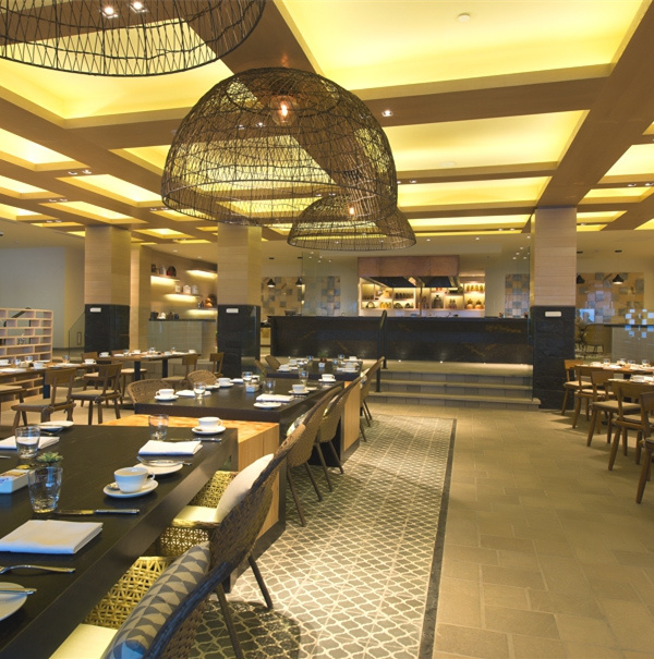
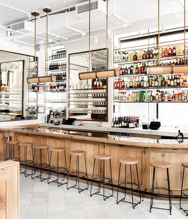
The hexagon-shaped bar is located in the center of the lobby; this is the original design that makes the bar accessible from all sides. It attracts both passers-by from the street and hotel guest form the lobby. We created partition walls for the restaurant to create the possibility of sectioning off some of the space at nighttime for special events and dinners.
Both modern architecture and folk art came together to form a single image of the new Mercure Saransk Center hotel. We were able to create an interior that is easy to understand and comfortable for today’s guests, but is also able to tell the story of the locale.
Year 2018
Status Completed works
Type Hotel/Resorts / Interior Design
{{item.text_origin}}

