Architects:Wright Architects
Area :164 m²
Year :2020
Photographs :Christian Cooke
Manufacturers : Neolith, Interpon, Arpa Fenix , Belgotex, Dulux, Marmoran, WomagNeolith
Architect In Charge : Greg Wright
Design Team : Suzaan De Kock, Gert Coetzee
Interior Design : Mazel Interior Design
Structural Engineer : Poise Design
Joinery : FFC
Quantity Surveyor / Pa : Riverside Consulting
City : Cape Town
Country : South Africa
The client, whom we have been fortunate to have worked with on many architectural ventures, has always had a keen eye for design and a passion for pursuing architectural projects that push the design envelope resulting in projects that are both award winning and find their way into an array of magazines and online publications.
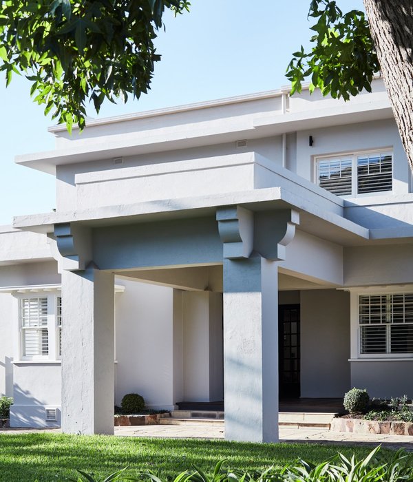
The Pavilion is no exception, and is another chapter in a legacy of architectural endeavors. The addition of the Pavilion onto the client existing property with the main house that was recently completed by Greg Wright Architects, is in itself a striking building. The idea of a pavilion typology informed this boutique project where the structure is kept to the minimum, materiality is celebrated and spatial boundaries are blurred, characterizing this recent addition to the Cranberry family of buildings.
Striking in its dark color and angled composition the pavilion-like structure is situated above the original main house. The morphology of the cottage is characterized by two, thin floating planes stacked on top of each other, jutting out into the surrounding lush garden. The illusion of these floating planes is accentuated by levitating them from the perimeter stone walls by means of discreet steel columns, achieving the light and open structure characteristics of a pavilion structure.
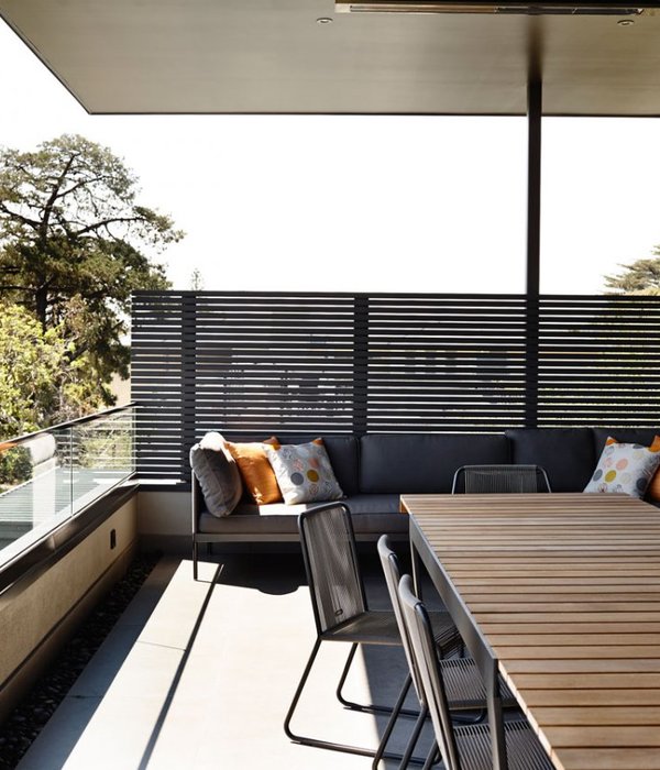
The topography of the area is taken into account with focused and considered views ranging from the west facing façade which opens up to the Atlantic Ocean, to the first floor terrace that gazes upon the iconic Lions Head and the framed views through the clerestory windows of the 12 Apostle mountain range.
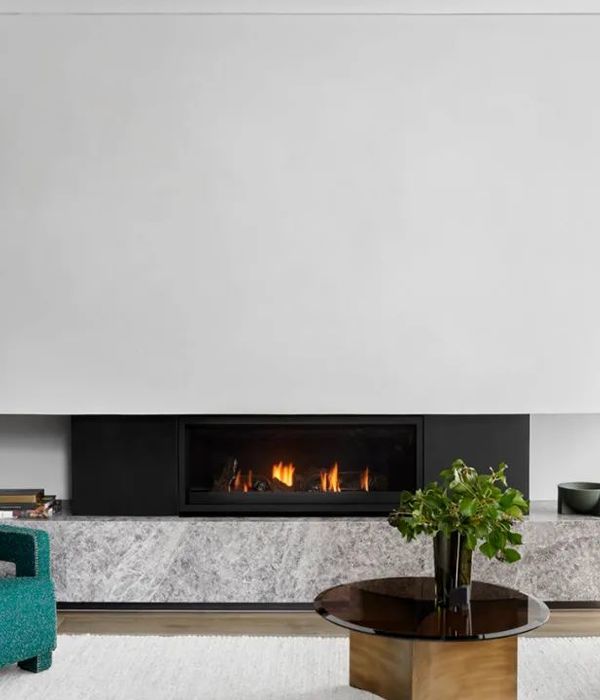
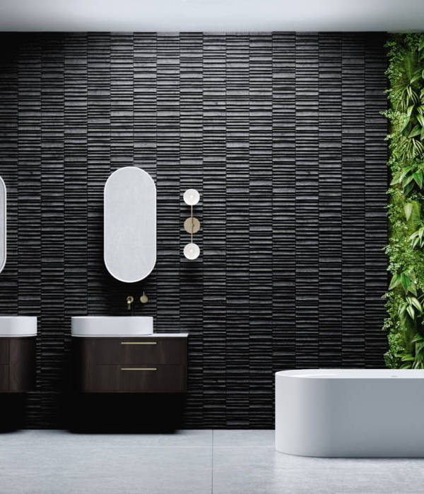
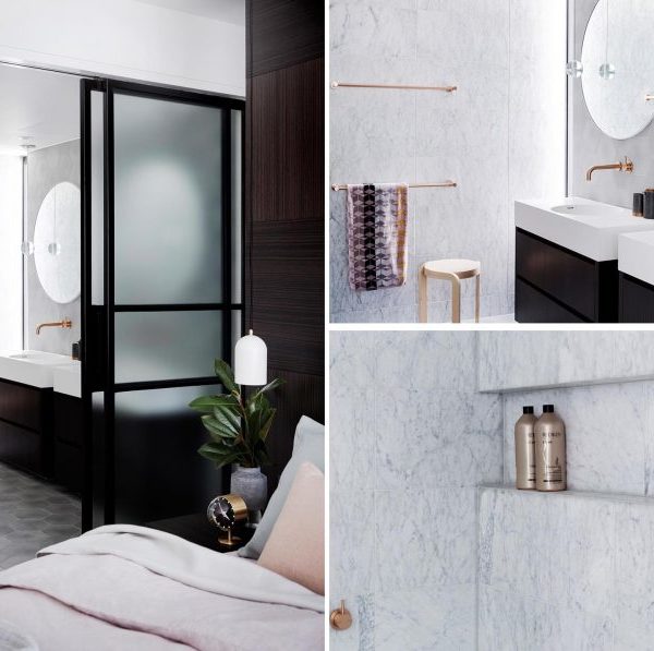
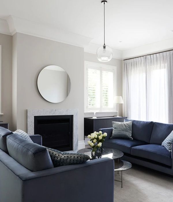
The choice of a dark palette in colour and materials is a reference to the main house with the earthy greys, black and bronze of the stone wall getting picked up throughout the building. The floor tiles subtly reinforce the geometries of the primary structural elements , whilst fragmenting the tiling pattern with the introduction of brass in-lays that extend vertically into the en-suite bathrooms that are accentuated by the late afternoon golden light.
In keeping with the idea of a Pavilion, the threshold between interior and exterior gets blurred by means of large sliding aluminum doors that, when opened up, provide the sense of expanse into the external landscaped areas. Interior furnishings, form and selection of materials and colour are carefully orchestrated to work harmoniously together with the architecture complimenting the experience.
▼项目更多图片
{{item.text_origin}}


