阿姆斯特丹史基浦机场新航站楼——现代实用与舒适空间的融合
Design Team:
José Alberto Sánchez, Andreas Alevras, Paul Beck, Paul van Bergen, Miguel de Bernardo Atienza, Roberto Calonge, Maicol Cardelli, Alice Colombo, Jana Culek, Sebastian van Damme, Marta Dyjaczynska, Paolo Faleschini, Di Fang, Ernesto de la Fuente, María García, Jesper Goorden, Jesus Hernandez, José Julián Horcajo, Cristina Jurado López, Kees Kaan, Carlos Lamela, Carlos Lobato, Rodrigo López Agudo, Arnout Meijer, Endri Metaj, Hana Mohar, Alberto Ortiz Quevedo, Vincent Panhuysen, Marco van der Ploeg, Julio Resino, Dikkie Scipio, Roberto Serrano, Christian Sluijmer, Hrvoje Smidihen, Walter Spangenberg, Johan Steenvoorden, Claudia Vermeulen, Mieke Vink, Jaap Wiedenhoff
Design: 2017
Start construction: 2020
Completion: 2023
GFA: 100,500 sqm
Capacity: approx. 14 mln. passengers
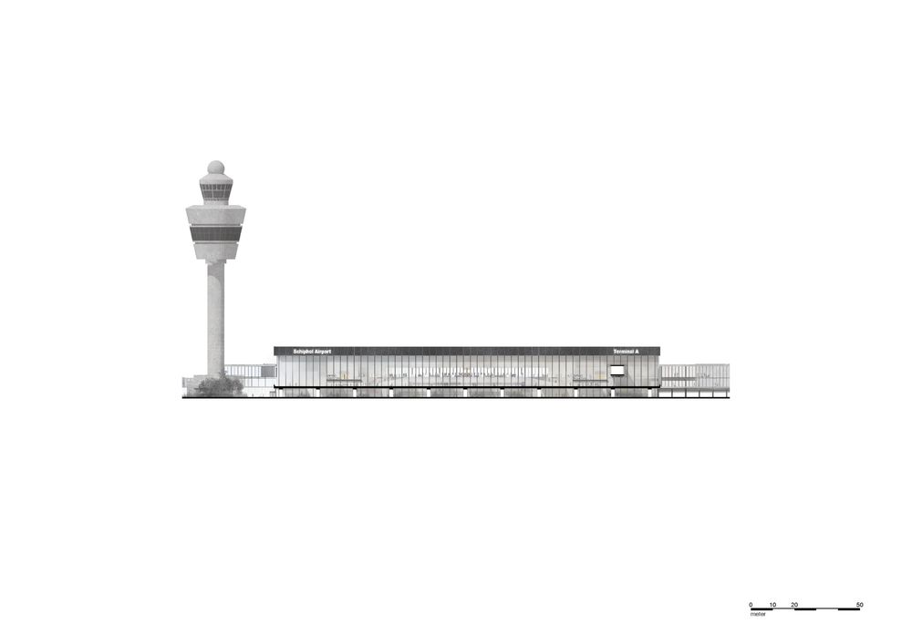
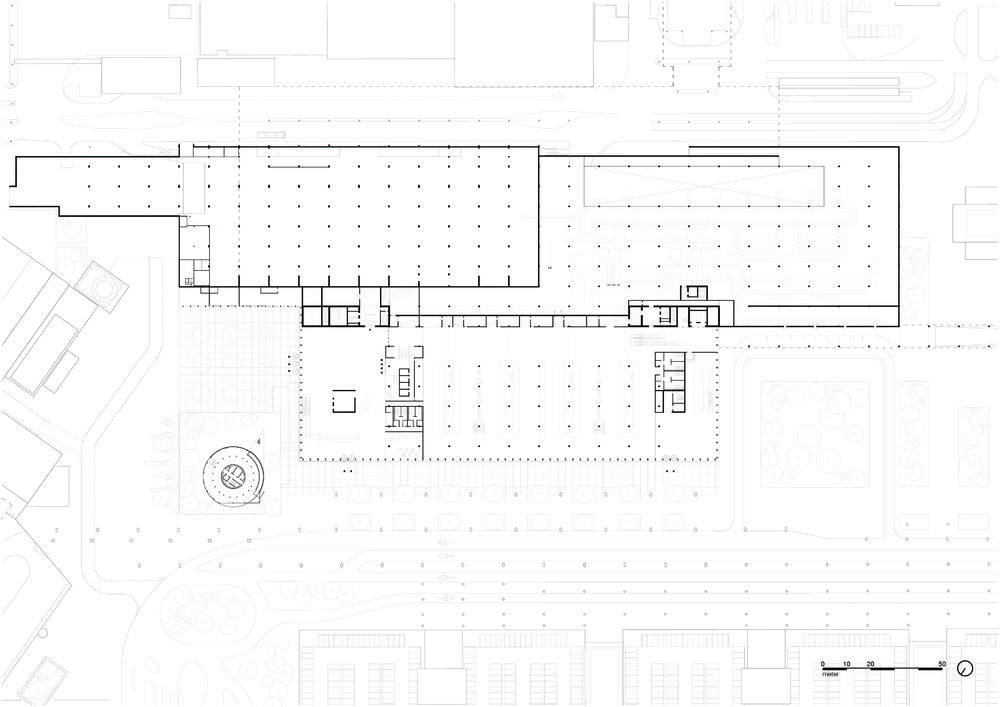
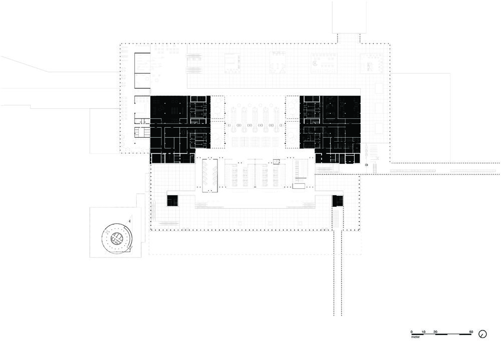
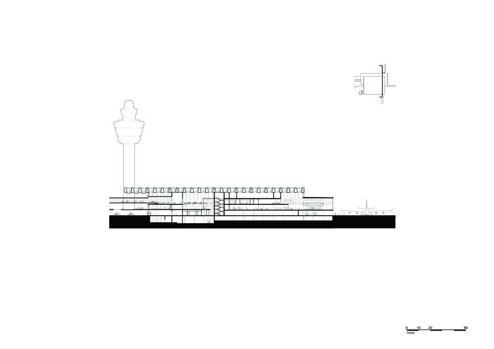
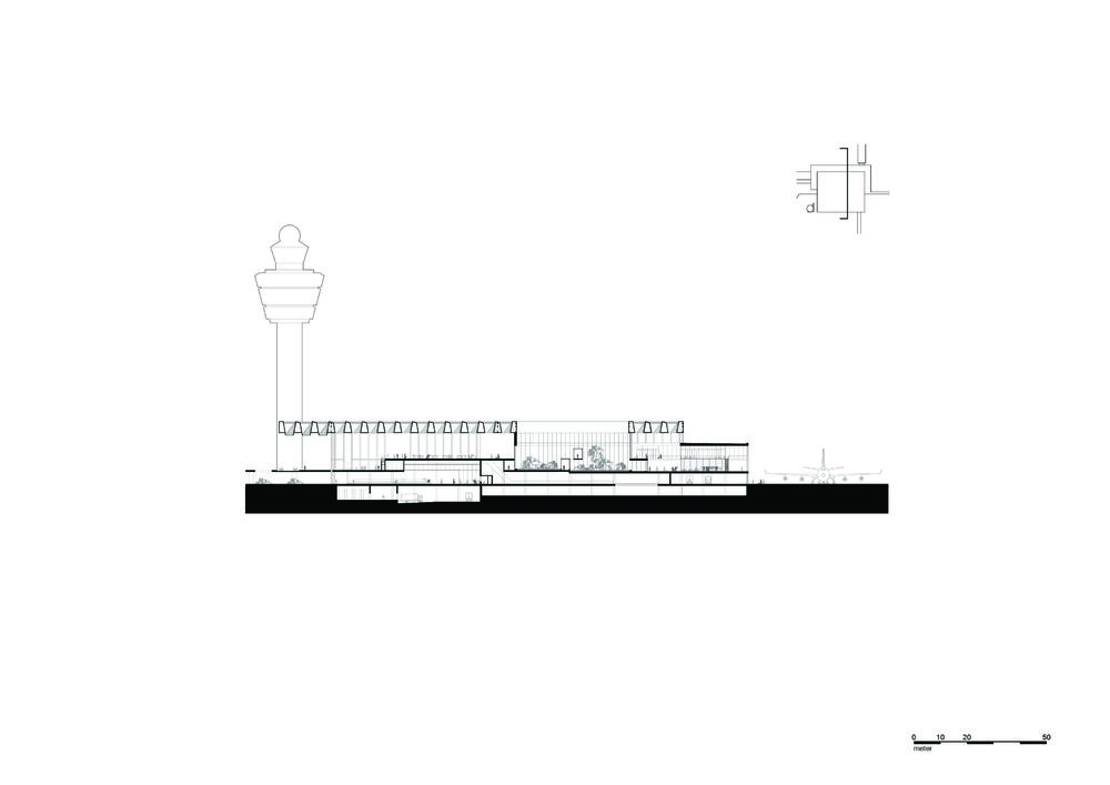
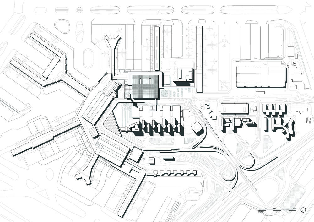
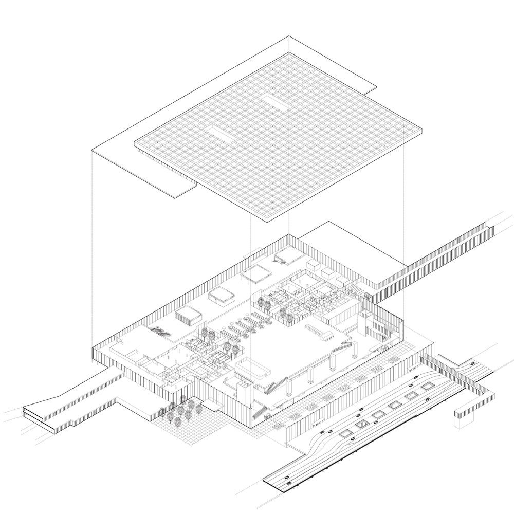
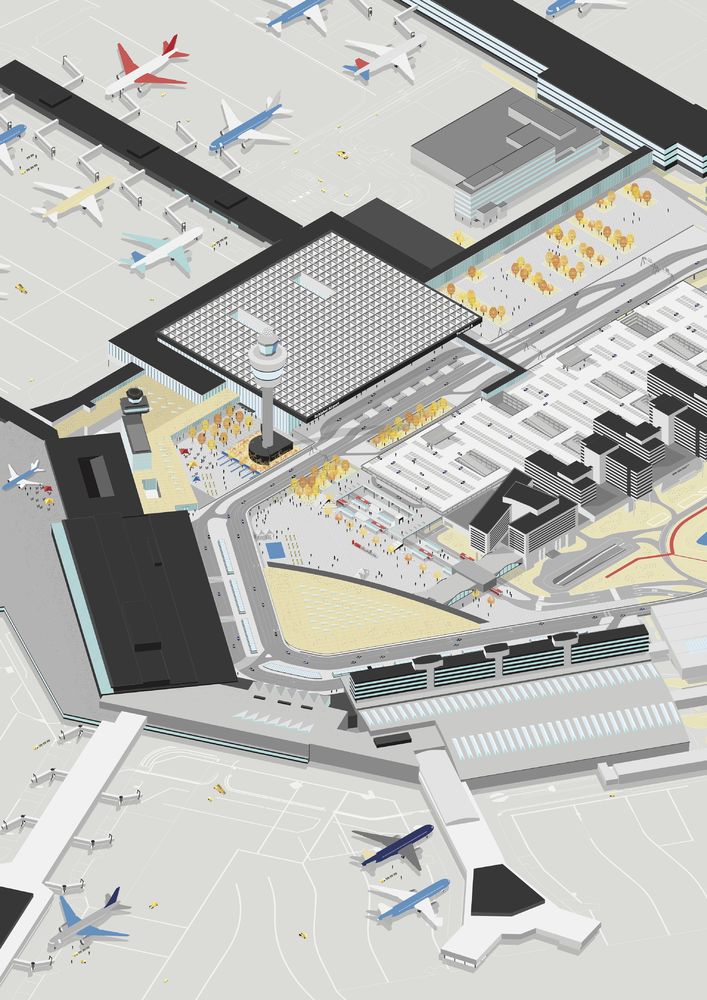
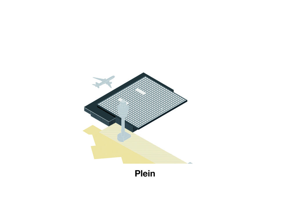
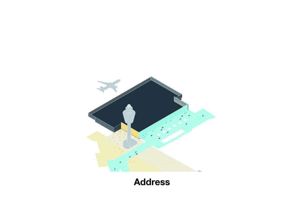
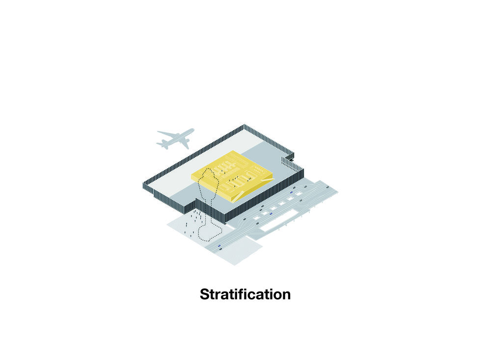
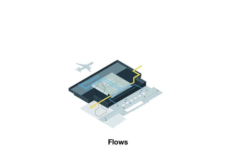
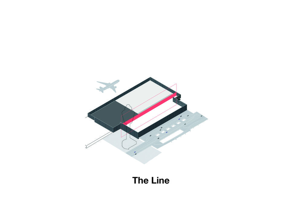
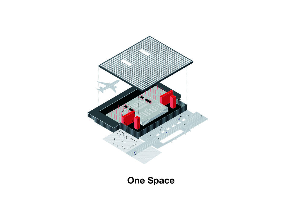
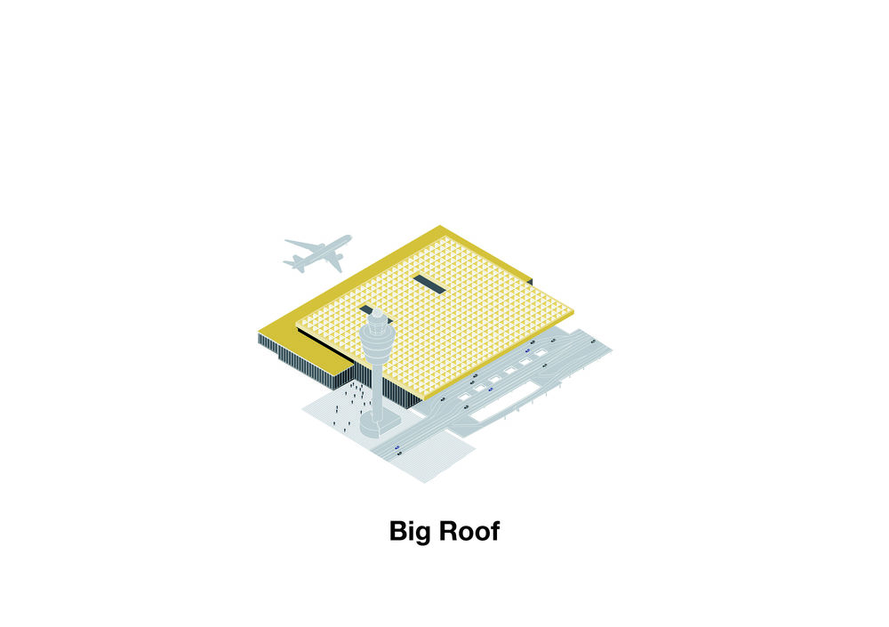
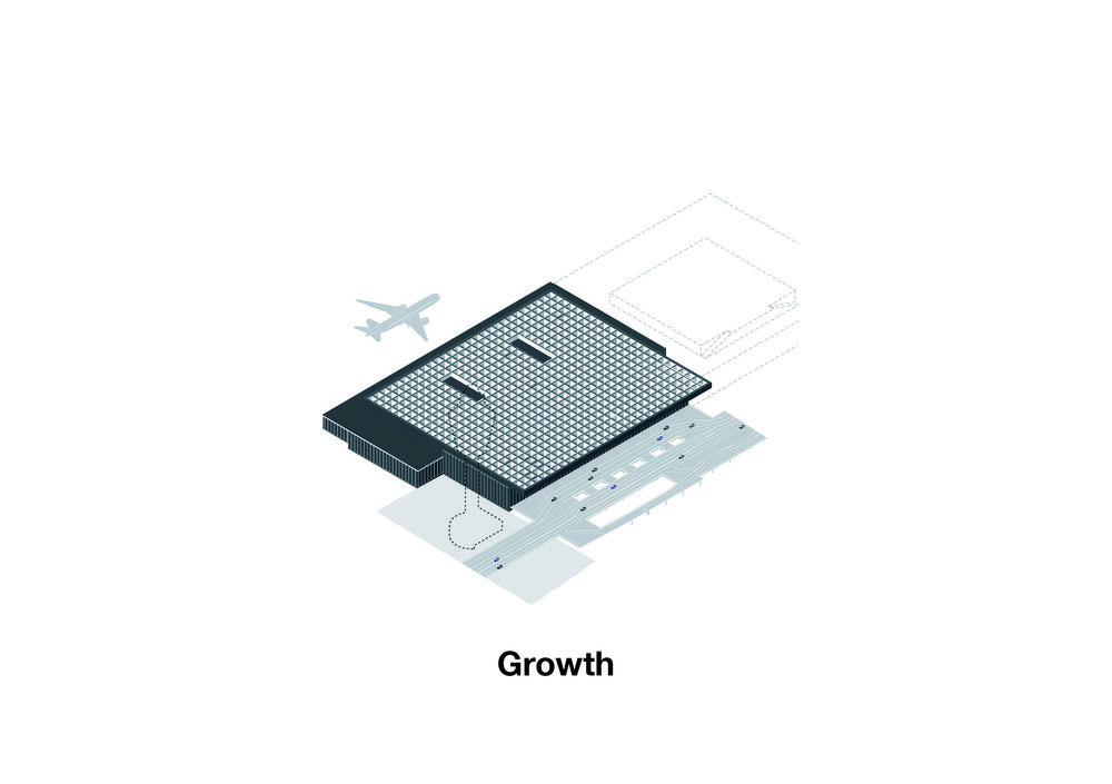
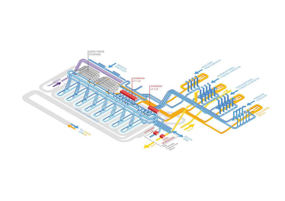
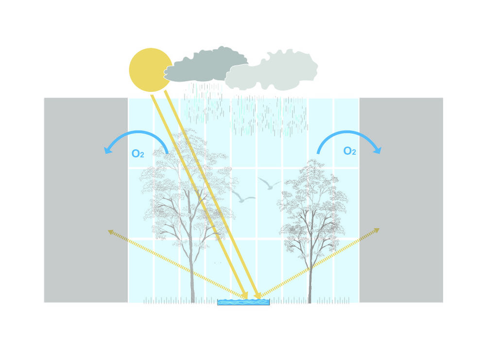
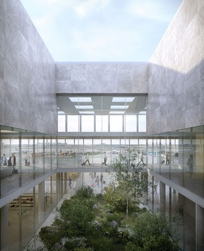
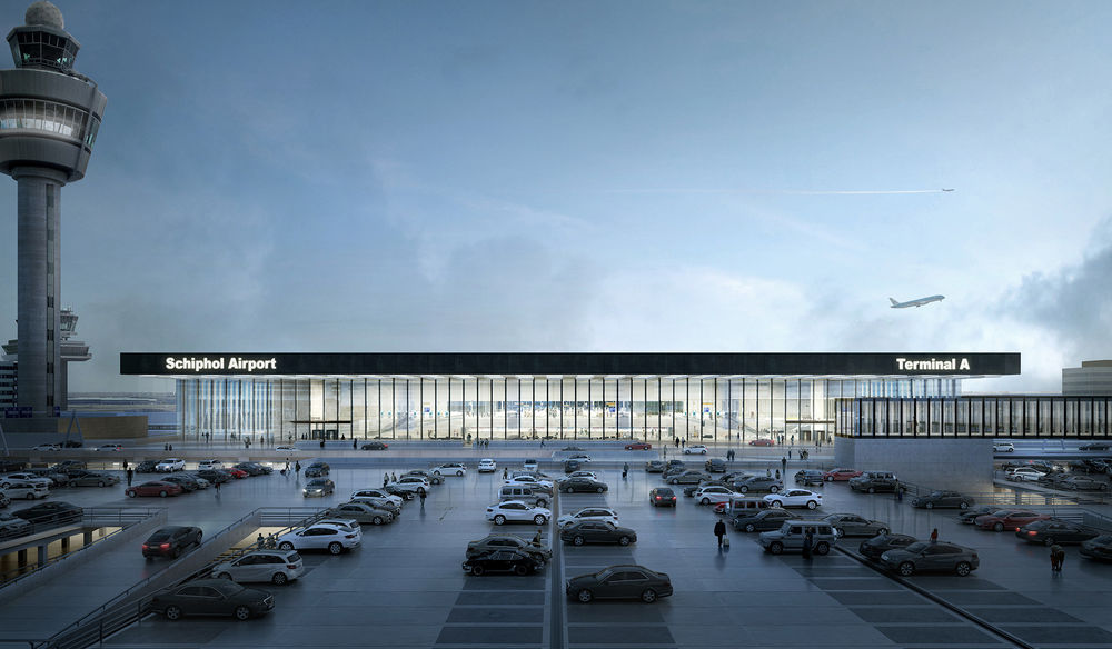
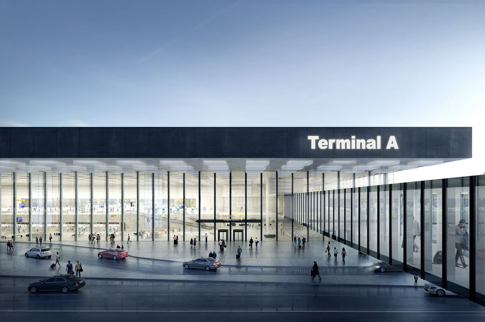
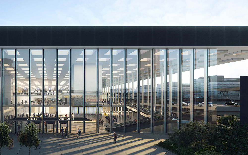
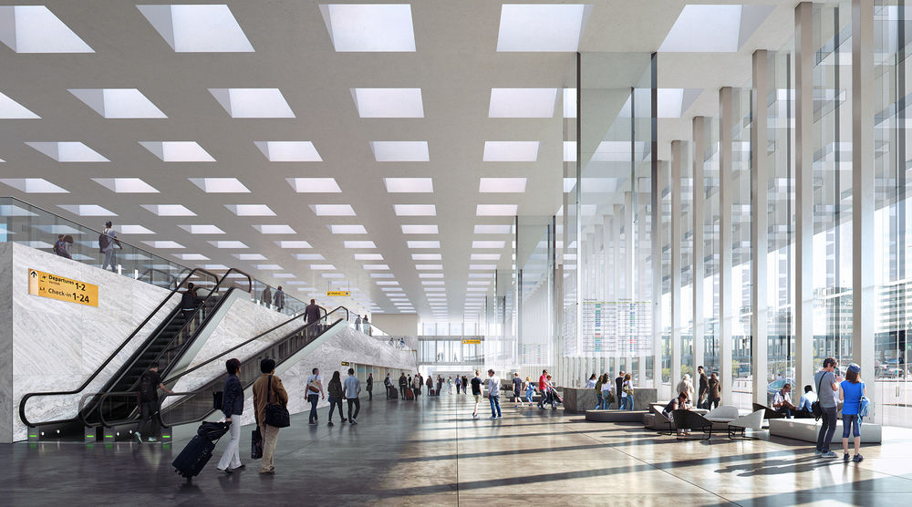
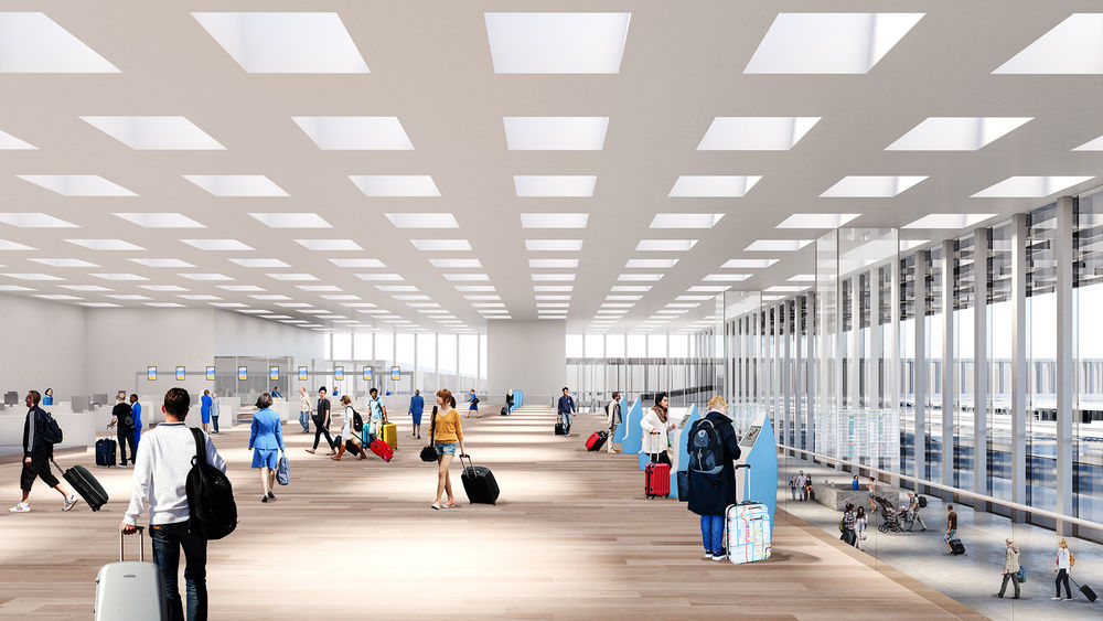
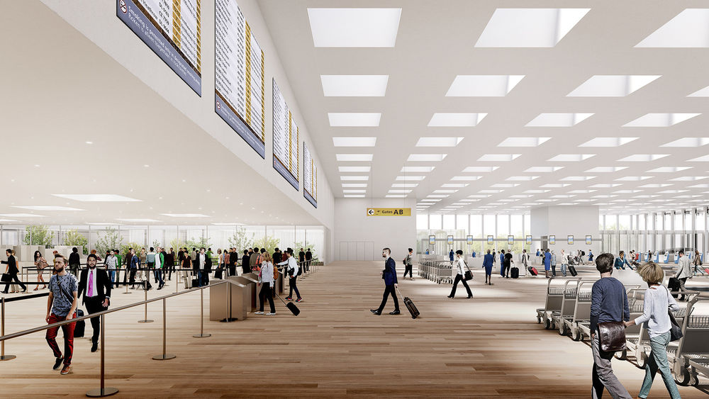
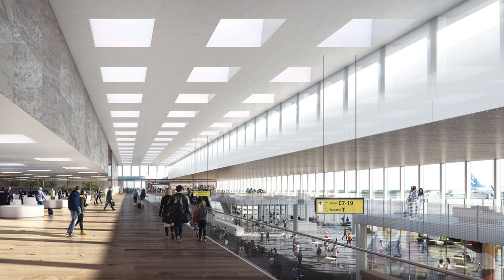
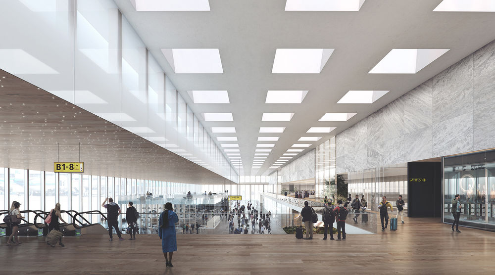
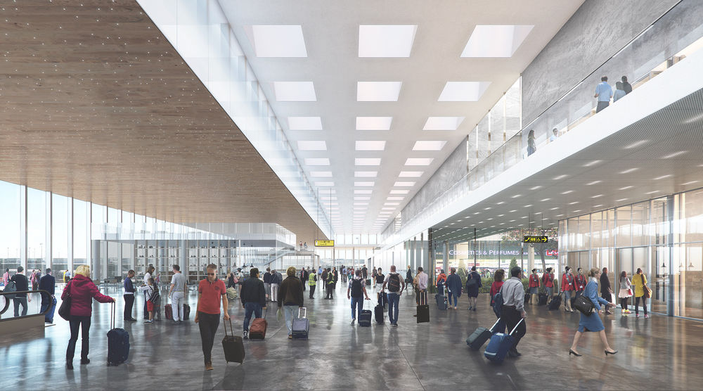
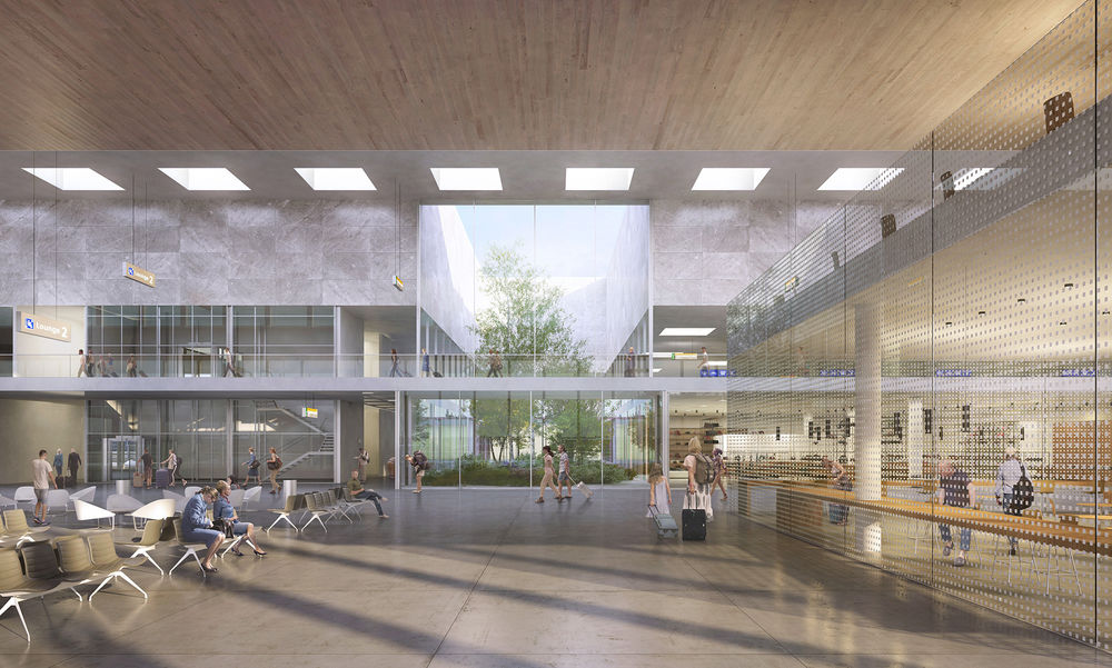
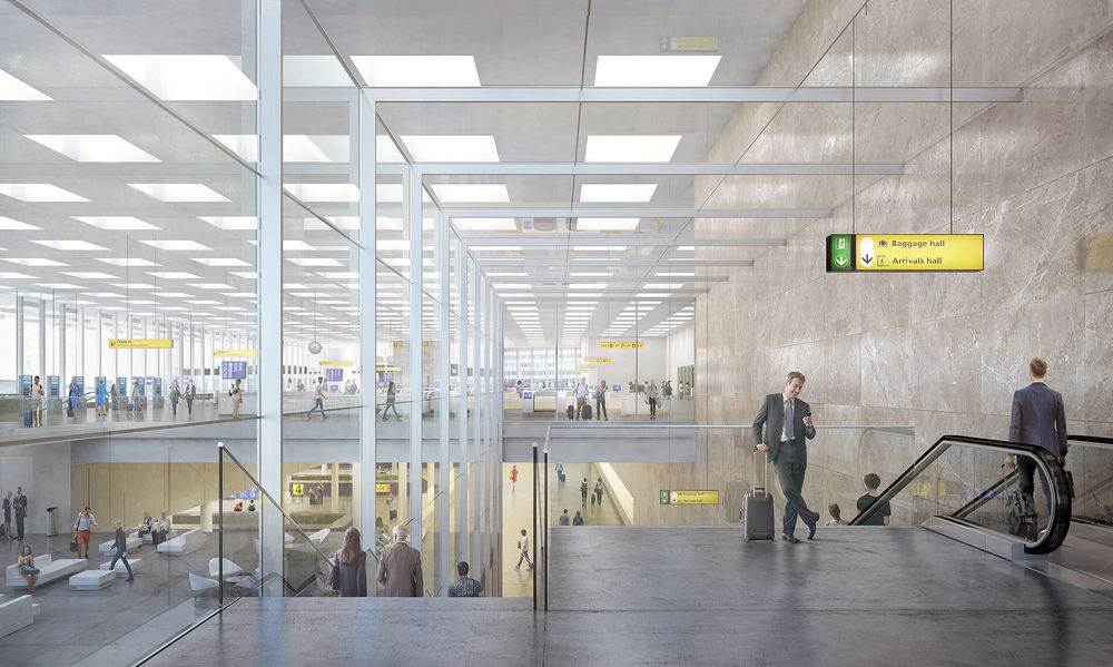
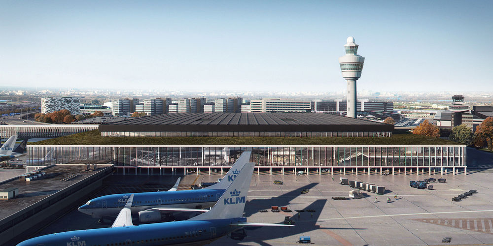
KL AIR is to design the large new terminal at Amsterdam Airport Schiphol. The Departures and Arrivals Hall that welcomes 14 million travellers a year will be ready in 2023. KL AIR is further supported by DGMR, Arnout Meijer Studio and Planeground. The design proposal submitted to the international competition scored the most points on all criteria. The inspiration behind the design is Schiphol itself and the ethos that has shaped the airport over the past 50 years: functionality, user overview and attention to detail, all well-integrated in an atmosphere of calmness, distinction and practicality. In what could be said to define the essence of Schiphol’s DNA, space, light and wide open views have been given priority over architectural form. The design submission defers to the airport’s sobriety and the ‘one terminal’ concept, including transfers free of check-out and check-in and automatic baggage transfers for passengers. The understated Modernist glamour of the 1967 terminal fired the imagination, in particular the interior work of Dutch designer Kho Liang Ie (1927-1975). With this shining example in mind, the design proposal by KL AIR sets a new standard, appropriate for different times and different conditions. The building’s structure will be only minimally seen and appear as the most logical of bones. Not a single column will block the space. The façade columns and certain functional areas in the building will bear the load of the roof. Its openness will facilitate any future changes, which speaks of its architectural sustainability. The new terminal’s architectural quality is to be found in its layers of opposites: it is a practically organized and user-friendly place yet also offers a grand, atmospheric and light-filled space for a pleasant experience. The everyday and the extraordinary merge to create an exceptionally welcoming space. The traveller experience is central to the design, both in individual and crowd terms. Overviews, ease of movement, natural daylight and a generous sense of space greet not only departing passengers, but arriving passengers too are given views, comfort and a pleasant spatiality. Rather than exiting onto a street somewhere under a flyover, arriving passengers will be streamlined after customs through a spacious hall for baggage reclaim, be treated to natural daylight and a view of the Departures Hall, and be welcomed to the urban outdoors at the Jan Dellaertplein facing Schiphol Plaza and the underground train station. Situated at the centre of the hall is a large plateau. Departing passengers will rise to the plateau level while those waving them off stay below. From the raised platform travellers will be surprised by the spaciousness of the terminal and the views afforded by the large glass façades, initially of the landside and, higher up, of the airside with its airplanes and extensive views of big skies and the polder landscape. After automatic baggage processing and the check-in desks, the security checks will take place in an area of warm wooden floors and large light wells filled with lush greenery, creating a more relaxed atmosphere. Apart from creating a natural division of users, which helps to avoid unnecessary crowding, the raised Departures floor also creates another advantage. The plateau makes a dual-level intersection possible, so that both departing and arriving passengers can enjoy a scenic route through the terminal. The plateau furthermore gives leeway to baggage handling underneath it, which is an important aspect for Schiphol as a major stop-over airport. The terminal’s ambiance, something that has a positive effect on people’s experience of the place, is largely determined by the light. The ceiling and roof of the high, central section is a veritable crown of light, spanning 180 x 150 meters and providing travellers with access to local light, day and night. It is a latticework of squares topped by glass panels and supported by mansized box girders that gradually change shape in the transition from wall to ceiling, creating openings that appear equally square. Travellers can look out to the sky as though peering through an ultra-thin membrane. Tried and tested technical facilities inside the casings of the ceiling provide opportunities to vary the colour, nuance and optical effects of the light. The glazed frontage and the light-infused ceiling underscore the typically Dutch character of the terminal. And they embody the low horizons and big cloud-filled skies of those Dutch Golden Age paintings.

