Architects:SAOTA
Year :2012
Photographs :Adam Letch
Project Team : Stefan Antoni, Bobby Hugill, Duke Williams
City : Cape Town
Country : South Africa
“The brief was to create a home with all the spectacle of an Atlantic Seaboard showpiece but also to respond to the practical needs and complexities of family life. The thinking was towards massive open-plan and double-volume spaces and tasked zoning,” says Stefan Antoni, director, and Partner at SAOTA. The site is positioned in the heart of Bantry Bay, on the slopes of Lion’s Head directly overlooking the bay. Views towards the east are of Sea Point and Robben Island in the distance.
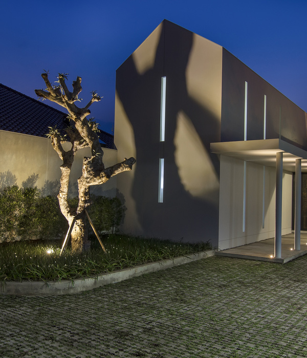
Working with a relatively tight site, required lateral thinking, thereby creating a dynamic play on levels. Built over four floors, the areas, although open-plan, have definitive identities. A simple redwood and grey-shale façade, that opens on to a sculptural courtyard and leads into an entrance gallery, serves as a taste of the impact ahead. Sculpture, dramatic volume, far-reaching views and raw textures – rock, timber, concrete – are the cornerstones of the look of this house, designed to maximize the setting and develop a patina over time.
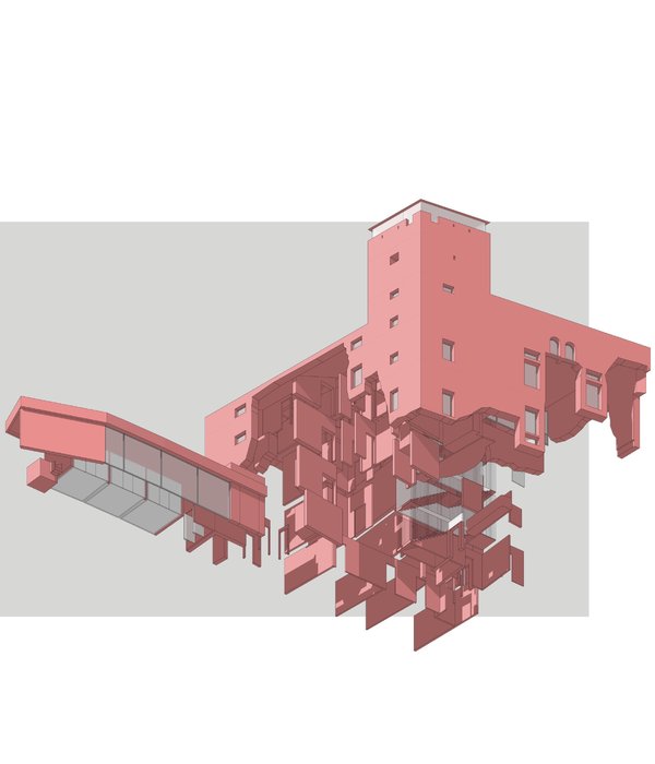
The mood and role of each zone shifts as one moves through the different spaces; from cocooning and comfortable in the family room wing with its solid and secure hunkered down L-shape focusing on functional living spaces, to all-out contemporary cathedral-like in the double volume living area with its rippling concrete feature wall and commanding views. This ocean fronting section is a soaring space anchored by concrete and rock – a five-tonne bar of rough-hewn granite that had to be craned in holds down one side of the living space. Descending two levels below this to the bedroom floor (one down) and guest and ‘playroom’ floor below that, the spaces have a feeling of connectivity – cut-out shapes and open atrium spaces linking it all back.
Although sea-oriented, with the pool terrace to the west, it also leads off to the courtyard garden on the east, access to both by the way of sliding glass doors, which open it up so completely that it’s little more than a roof. The way the living level is configured means that the children are visible at all times, whether they’re playing outside, watching TV or swimming in the pool; a brilliant combination of challenging architecture and family practicality. Bedrooms, too, were configured with children in mind, and all three inter-lead through sliding doors closest to the matching window seats in each, massive frames in which to sit and appreciate the picture-book sea views. The pool terrace with two pavilions offers a lounging area on one end and a braai-and-dining area on the other.
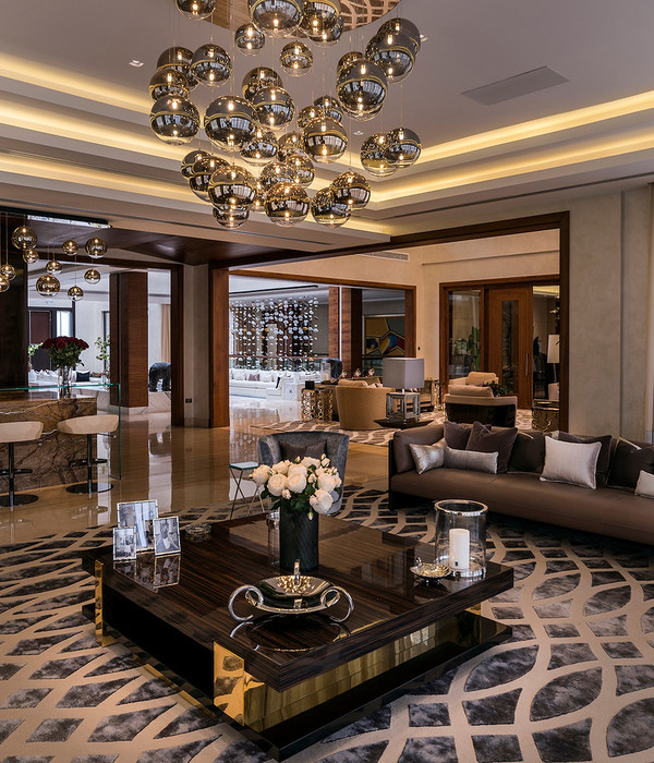
The interiors create an emotional and sensorial journey when moving through the house. Art plays a pivotal role here, with select pieces forming the initial impression – the first piece once inside the door a massive dugout canoe, the couple has always wanted a dedicated gallery and aims to fill out the space over time with special pieces. This dream space was pivotal in developing the feel of the house as a whole, with its large expanses of wall, new spaces, and a simple approach to adornment. Furnishing is minimal, to allow the layering of finishes to really shine. “We consciously emphasized the different roles of each zone, shifting the mood from room to room. We wanted the space to surprise,” explains Stefan.
By utilizing a broad base of textures and finishes, the décor feels natural and subtly organic, comfort being of paramount importance at all times; the overall ambiance is one of calm and serenity. Colour is kept to a bare minimum; the interior works predominantly with light and shade tonal range, allowing the exterior views, the mountain, the ocean and sky and also the artwork to bring in color.
▼项目更多图片
{{item.text_origin}}


