© Prasanth Mohan
(Prasanth Mohan)
架构师提供的文本描述。当接触到两个选择时,第一个选择:在一个空旷的地块中设计一个新家,并通过一个全新的、新鲜的房子来实现客户的愿望;第二个选择:翻新一所现有的房子,使它符合客户提出的要求,当然也使他对此感到高兴;选择后者将被许多人视为平凡。
Text description provided by the architects. When approached with two choices one: to design a new home in a vacant plot and to realize the aspirations of the client through a brand new, fresh, home; two: to renovate an existing house and make it meet the requirements put forward by the client and of course making him happy about it; to choose the latter one would be tagged mundane by many.
© Prasanth Mohan
(Prasanth Mohan)
Ground Floor Plan
© Prasanth Mohan
(Prasanth Mohan)
当客户要求他为他的三口之家(他自己是一位老师、他的妻子和一个两岁的儿子)想要一个小房子的时候,他也“看起来很小”,简单而优雅,没有装饰性的细节,没有巨大的形式,但无论如何都是谦逊的,第一种选择太明显了,因为第二种选择给建筑师们提供了一套房子,几乎没有任何东西能打动客户的住宅理念。
On hearing the requirements from the client that he wants small home for his family of three (himself a teacher, his wife and a two year old son), which also ‘looks small’, simple but elegant with no ornamental detailing, no massive form but modest by all means, to go with choice number one was too obvious given that the second option presented the architects with a house to be renovated with almost nothing that strikes a chord with the client’s idea of a home.
© Prasanth Mohan
(Prasanth Mohan)
相信非常规的选择有时会产生显著的效果,或者换句话说,“跳出框框思考”可能最终会给你带来满足和满足,这导致了这个家的创造,或者更确切地说是“改造”。当你被困在迷宫般的空间和老房子里时,旅途并不是一次愉快的旅行;摆脱这个过去的幽灵似乎相当困难。
The belief that unconventional choices sometimes make remarkable outcomes, or in other words ‘thinking out of the box ‘ may ultimately bring you content and satisfaction, led to the making or rather ‘reinvention’ of this home. The journey was not a jolly ride when you are trapped in the maze of space, of the old home; to get rid of this ghost of the past seemed quite difficult.
© Prasanth Mohan
(Prasanth Mohan)
我们面临的挑战是重新定义内部空间,以更流畅、更开放和最简单的外观,没有或最起码地说明什么是完全违背这个想法的结构的内部。认为建筑并不总是需要是新的或材料,甚至空间也可以“重复使用”,仔细分析背景,并通过解决制约因素带来可持续的产出。
The challenge was to redefine the interior spaces with more fluidity, openness and the exterior with utmost simplicity with no or minimum indication of what is inside out of a structure which was completely contrary to the idea. The thought that architecture does not always need to be new or the materials and even the spaces could be ‘reused’ with careful analysis of the context and bringing a sustainable output by solving the constraints.
Concept Sketches
概念草图
这里的约束涉及与客户需求不匹配的空间,并且在一定程度上没有吸引力。可持续性在于材料的再利用、获得的热舒适性和整体的能源效率。
Constraints here involved spaces that were not a match for the client requirements and were to an extent aesthetically unappealing. The sustainability lies in the reuse of materials, the thermal comfort attained and the overall energy efficiency.
© Prasanth Mohan
(Prasanth Mohan)
这个房子-要求为一个小家庭提供一个简单而优雅的家。这个地方带来了自己的挑战,因为它是一个小的地方;没有提供一个精心设计的前院,而是坐落在住宅区一条狭窄的道路旁边。因此,打破垂直是至关重要的。强调水平线,从而用场地伪装高度,是因为在右边增加了一个汽车门廊,除了入口外,没有任何门窗形式的开口,只有一个静坐空间,对里面的东西只有很少的了解。其余的外观仍然忠实于水平的观念,用同样间距的金属管隔开。
The home The requirement was for a simple and a graceful home for a small family. The site brought its own challenges, being a small one; there was no provision for an elaborate front yard and was located on the side of a narrow road in a residential area. Thus breaking the verticality was crucial. The emphasis on horizontal lines and thus camouflaging the height with the site was brought by the addition of a car porch to the right and giving no openings in the form of windows in the façade other than the entrance with a sit - out space giving the minimal idea of what lies inside. The rest of the façade remains faithful to the idea of horizontality with a screen of equally spaced metal pipes.
室内空间已经被重新改造,其复杂程度涉及到摆脱迷宫般的空间,其中包括:摆脱不想要的墙壁,引入自然光和通风,从而使其节能。包括一个‘光井’和另一个旁边的就餐是关键的作用,与双层屋顶,以提高家庭的热舒适性。室内保持良好的照明和通风,即使没有许多窗户打开的高度。
The interior spaces have been reinvented with the sophistication involved in getting rid of a maze of space, which included: getting rid of unwanted walls, bringing in natural light and ventilation and thereby making it energy efficient. The inclusion of a ‘light- well’ and one more by the side of the dining does the key role along with the double layered roof in enhancing the thermal comfort of the home. The interiors remain well lit and ventilated even without many numbers of windows opening to the elevations.
© Prasanth Mohan
(Prasanth Mohan)
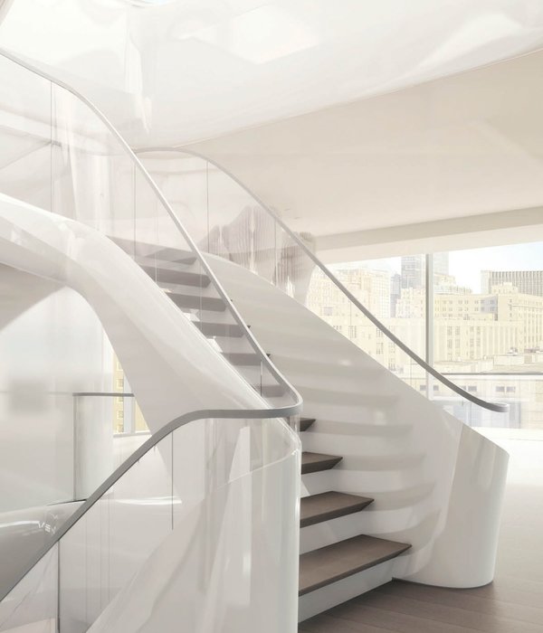
选择苍白的墙壁和木制的成品地板是为了一个微妙的混合色彩,没有太多的混乱。这体现在家具的选择和内部的整体处理上。房子增加了一层额外的地板,作为多功能空间使用,但直到人们看到楼梯的顶部,才意识到它有一个。对水平感的关注使得错觉成为可能,同时也伴随着最小的外观和与之融合的外部景观。
The choice of pallid for walls along with wooden finished flooring is aimed at a subtle blend of colors without much confusion. This is reflected in the choice of furniture and the overall treatment of the interior. The house has an additional floor added to it to be used as multi functional space but not until one sees the stair to the top realize that it has one. The focus on horizontality made the illusion possible together with the minimal façade and the exterior landscape that merges along with it.
Exploded Axonometric
爆炸轴测
这个项目背后的驱动力一直是这样一种思想,即建筑不需要是“全新的”和“大的”,而是可以成为满足给定需求的最简单的解决方案。当然,‘幸福的建筑’或‘通过建筑的幸福’取决于设计与客户的希望和愿望的一致性。
Prelude The driving force behind the project had always been the thought that architecture need not be ‘brand new’ and ‘big’ but can be the simplest possible solution for the given requirement. Of course, ‘architecture of happiness’ or ‘happiness through architecture’ lies with the unanimity of the design with the client’s hopes and aspirations.
© Prasanth Mohan
(Prasanth Mohan)
Architects ZERO STUDIO
Location Perinthalmanna, India
Project Team Hamid MM, Hafeef PK, Shabna K, AAshis J, Khadeeja Rasha,Shafeek Ahamed, Nidhin raj KJ, Deepti TS , Issudheen TM
Area 125.0 m2
Project Year 2016
Photographs Prasanth Mohan
Category Houses Interiors
Manufacturers Loading...
{{item.text_origin}}


