The project focuses on the renovation of an optics store, dating back 40 years. The store is a landmark of Nea Smyrni, Athens, located in a prominent site on the square by El Venizelos Avenue. At the heart of customer demand lays the radical renovation and overall design of a new, recognizable business brand identity. The main challenge we faced was the volume of information assembled in a confined space of about 50sqm a multitude of distinct infrastructure elements, counters with glasses, benches, drawers, furniture, lightning, and visible air conditioning systems, paired with a large amount of heterogeneous exhibits, all contributed to a loaded environment, which was both tiring for the visitor and failed to showcase the product. The product, in turn, included a wide range of different types, materials and color pallets. The basic idea behind our composition was to remove all infrastructure elements to the greatest extent possible and reimagine the product itself as a structural element, whose repetition would produce architectural space.
The existing structure was deconstructed to its components, and the resulting eight vertical and horizontal surfaces were grouped into four pairs of surfaces, composed by different materials and serving clearly distinct operations, all of which create a resolved, easily identifiable and functional space.
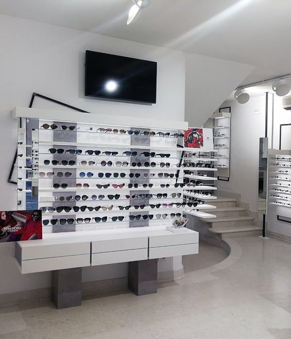
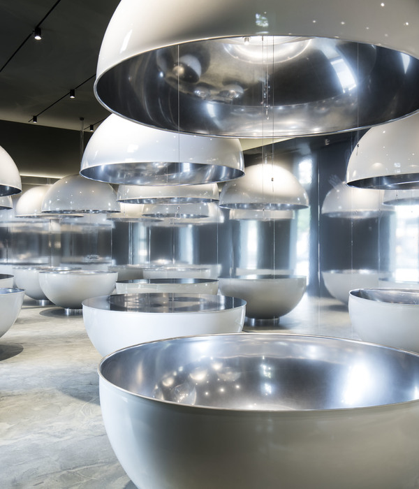
The first pair of surfaces – covering the front and one of the main sides of the store – is a metal grid, designed to host sunglasses, mirrors, and company logos. The grid design, fashioned as a metal curtain, was produced by multiplying an original unit in the scale of a pair of glasses. Overall, this design recalls an archetypical structural element, namely header bond building. This rigorous structure allows for a greater degree of freedom and a reimagined exhibition of glasses. The area opposite to the wall of the metal curtain displays the vision glasses. We used the existing drawers (designed to fit 500 glasses), which were formerly spread between all sides of the store. They are no longer used as individual pieces of furniture, but as part of a clear-cut white vertical exhibition surface. The white surface can folds back into the floor, where a three meter long metal table serves to test the glasses. The third pair of surfaces is a gamma shaped mirror surface (four meters wide), which encompasses the existing attic space and almost disembodies it. This reflective surface enlarges the dimensions of the space. In combination with a linear reflective surface on the floor, it creates an endless repetition of the grid, allowing the visitor to look beyond the disarray that unfolds in front of them and focus on the product. Barissol lighting was selected for the ceiling and the back of the store. We addressed the challenge of lighting following the logic of abstraction; we converted already existing surfaces into single lighting surfaces and opted for a limited number of objects and lightning sources. Finally, the store facade displays a double layer illuminated perforated sheet, colored white and bronze, granting the illusion of depth, as the shadows it casts can vary depending on the visitor’s standpoint and the time of day. The perforation of the sheet is based on the pattern of the grid and serves as a prelude to the store interior.
The metal curtain, the reflective and illuminating surfaces, the absence of color, the complete absence of shadows, the minimal presence of objects, the repetitive and reflective patterns, all contribute to the creation of an almost unrealistic space, both symbolic and eerie, with the purpose of highlighting and focusing on the familiar and exuberant product that it aims to showcase.
{{item.text_origin}}

