© Konstantin Dubovec
c.Konstantin Dubovec
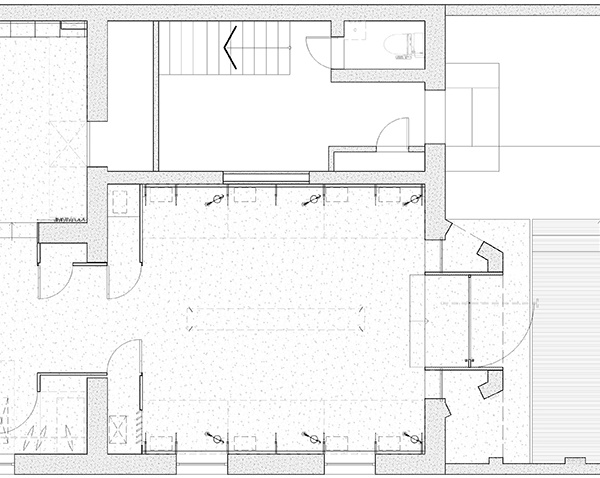
架构师提供的文本描述。这套公寓是为一个有两个小孩的家庭设计的。它分为两个不相等的部分,其中第一部分是在大门附近的公寓前面。这部分由厨房、客厅、餐厅和主卧室组成。第二部分是公寓后面的一个较小的区域,专门为儿童服务。这里有两个儿童房间和一个游乐区。一条长长的走廊把这两个部分和公用设施连接起来:一个更衣室/衣柜,一个储藏室,一个洗衣房和两个浴室。
Text description provided by the architects. This apartment is designed for a family with two small children. It is divided into two unequal parts, where the first part is at the front of the apartment near the entrance. This part consists of a kitchen, a living room, a dining room and a master bedroom. The second part is a smaller area in the back of the apartment, which is dedicated for children. There are two children's rooms and a play area here. A lengthy corridor connects these two parts with utility rooms along the way: a dressing room/closet, a pantry, a laundry room and two bathrooms.
公寓的前部设计成一个自由流动的空间,每个区域都与其他区域保持视觉联系。主卧室也是这一空间的区域之一,由宽阔的门/门和类似窗户的开口连接。床铺在讲台上,藏在砖墙后面,从任何角度看都是看不见的。因此,生活区获得视觉延伸,但睡眠区保持其亲密。起居室体积突出,加强了卧室与客厅的空间关系。它没有到达天花板,并与黑色金属片,以强调这一结构的微妙之处。
The front part of the apartment is designed as a free-flowing space, where each area maintains visual connection with the others. The master bedroom is also one of the zones of this space and is connected by wide gates/doors and window-like openings. The bed is raised on a podium and is hidden behind a brick wall, which makes it not visible from the living room from any angle. Thus, the living area receives a visual extension, but the sleeping area retains its intimacy. Protruding volume in the living room enhances the spatial relationship between the bedroom and the living room. It does not reach the ceiling and is trimmed with the sheets of black metal to emphasize the subtlety of this structure.
© Konstantin Dubovec
c.Konstantin Dubovec
“软”(又称电视)起居区被举在讲台上,从前窗向后推。因此,温和的灯光,特别的舒适和壮丽的景色从窗户下降到地板上是创造的。客厅和走廊之间用书架隔开。这些书架是按照相互的构图组织起来的,有一个高懒散的书柜供阅读.人们可以用可移动的梯子爬上去。休息室下面有一个储藏室。
“Soft” (aka TV) living area is raised on a podium and pushed back from the front windows. So moderate lighting, special comfort and magnificent view from the windows lowered into the floor is created. Living area is separated from the corridor by bookshelves. These bookshelves are organized in the mutual composition with a high-lounger for reading. One can climb up to it using the removable ladder. There is a storage space under the lounger.
© Konstantin Dubovec
c.Konstantin Dubovec
厨房前沿整个生活和用餐空间。这样可以安装很多厨房小工具。轮子上的自定义条形计数器可以很容易地沿厨房移动,并可作为额外的工作或服务桌。餐桌(也是由建筑师设计的)有着不同寻常的比例:它的台面又窄又长。这种桌子在视觉上延长了就餐区域,起到了厨房和客厅之间连接的作用。
The front of the kitchen is set along the whole living and dining space. This allows to fit lots of kitchen gadgets. Custom bar counter on wheels can be easily moved along the kitchen and can serve as an additional work or serving table. Dining table (also designed by the architect) has unusual proportions: its countertop is narrow and long. Such table visually lengthens the dining area and serves as a connecting link between the kitchen and the living room.
原来专门供儿童居住的公寓空间很长。作为解决办法,游戏室放在离窗户最远的地方。它的墙壁部分是用玻璃做的,所以不会失去自然的光线。这两间儿童房的设计相似,每个房间都由三个部分组成:一张放在木制讲台上的床,一个带沙发的软区,一个带书桌和最轻的工作区。这一设计证明了两个儿童房间的拉长性质是合理的。玻璃墙将儿童房间的柔软和工作区隔开-它在视觉上扩大了空间,增加了光线。然而,每个孩子都可以拉下屏幕-窗帘和创造隐私。
The apartment space devoted to the children area originally was very elongated. As a solution, the playroom is placed in the furthest from the windows area. Its walls are partially made of glass so not to lose the natural light. The two children's rooms have similar design and each consists of three parts: a bed raised on a wooden podium, a soft zone with a sofa, and a work area with a desk and most light. This design justifies the elongated nature of both children's rooms. Glass walls separate the soft and work areas of the children’s rooms - it visually expands the space and adds light. However, each child can pull down screens-curtains and create privacy.
© Konstantin Dubovec
c.Konstantin Dubovec
装饰中有几种不同的纹理:深色砖、轻橡木板、黑色金属片、瓷砖和粗糙的灰泥。玻璃隔板在室内被广泛使用。游戏室用彩色软木塞装饰。所有的材料都受制于特定的等级制度,因此他们创造了一个和谐的整体。
There are several different textures combined in the decor: dark brick, light oak planks, sheets of black metal, ceramic tile and rough plaster. Glass partitions are widely used in the interior. The playroom is decorated with tinted cork. All the materials are subject to specific hierarchy, and as such they create a harmonious ensemble.
© Konstantin Dubovec
c.Konstantin Dubovec
作者设计了Z形隔墙来组织客人区域内的流动空间.从侧面可以很容易地看到它们的形状。分区清楚地划分了区域,并可视地扩展了每个区域。这个解决方案对休息区尤为重要。在这个房间里,一个人会经历两种相反的情绪。一方面,安全感和舒适感-因为它的亲密。另一方面-额外空间的感觉-因为该区域在z形隔板上方向各个方向扩展。
The author designed z-shaped partitions to organize the flowing space within the guest area. Their shape is easily visible from the side. Partitions clearly divide the zones and visually expand each of them. This solution is especially important for the sitting area. A person experiences two opposite emotions when being in this room. On one hand the sense of security and comfort - because of its intimacy. On the other hand – the feeling of extra space - because the area expands in all directions above the z-shaped partitions.
在室内有很多台子,它们一起创造了一个强烈的“景观”。然而,它们的主要功能是功利的,因为下面的所有空间都是用来储存的。整个平台下有57个抽屉,另外还有两个壁橱和储藏室。由于这种解决方案,业主不必购买任何储存家具。
There are a lot of podiums in the interior, and together they create an intense "landscape". However, their main function is utilitarian, because all the space underneath is arranged for storage. Overall there are 57 drawers under the podiums, plus two closets and pantries. The owners didn’t have to buy any storage furniture thanks to this solution.
© Konstantin Dubovec
c.Konstantin Dubovec
Architects Alexey Rozenberg
Location Moscow, Russia
Category Apartment Interiors
Area 175.0 sqm
Project Year 2015
Photographs Konstantin Dubovec
{{item.text_origin}}

