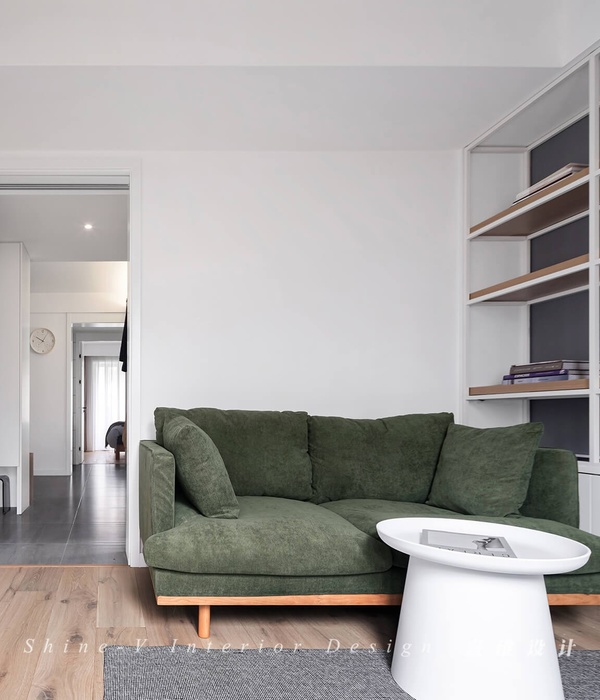
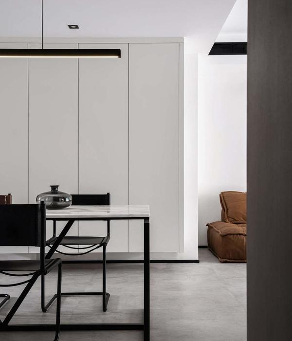
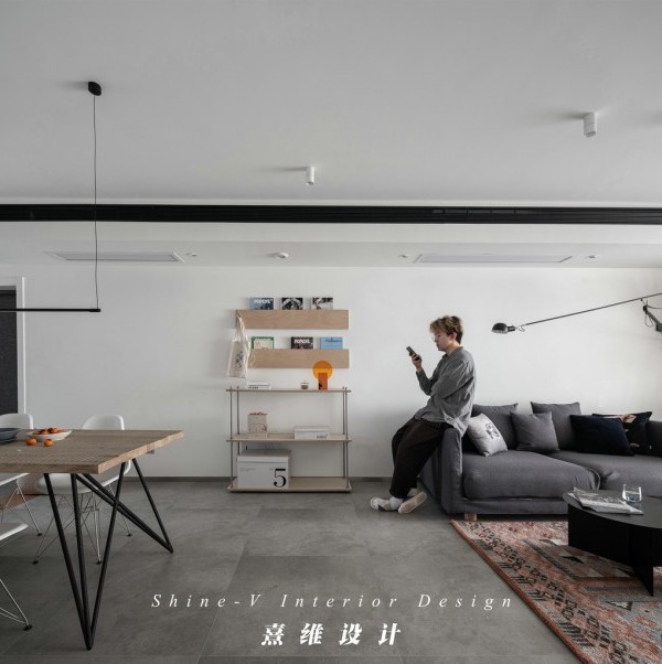
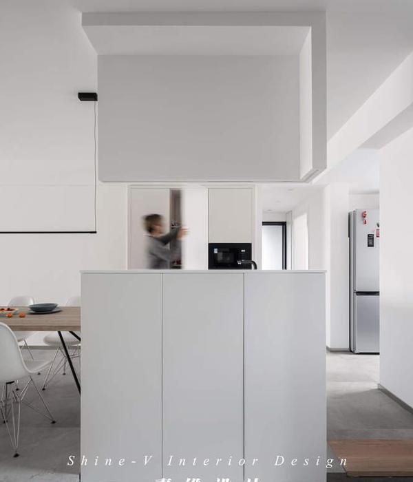
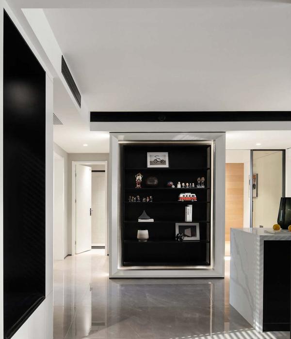
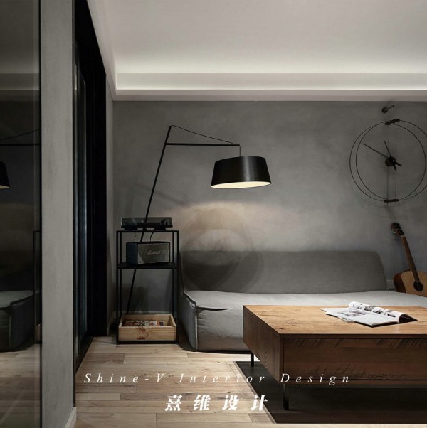
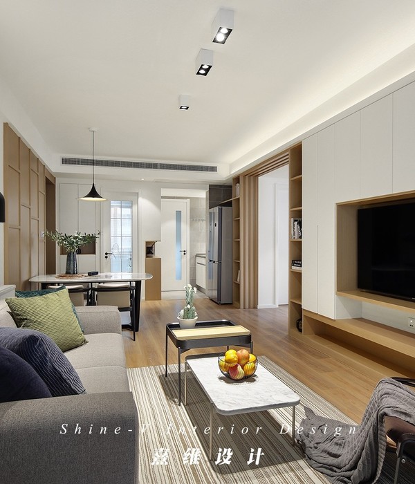
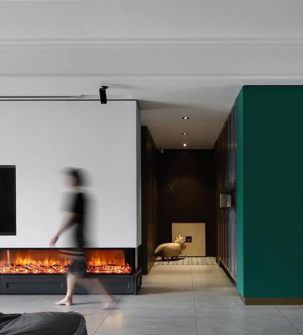
项目位于东京Magome街区,客户是从事家具制造业的一对夫妇。他们委托设计师对一处老式公寓进行翻新,将原来的两居室改造成光线充足的一居室,并将客厅、餐厅和厨房打通为大空间。
This project was a renovation of an atmospheric vintage apartment in the Magome neighborhood of Tokyo. The owners are a married couple working for a furniture maker. We changed the original two-bedroom layout to a light-filled one-bedroom with living room, dining area, and kitchen.
▼室内概览,overview © TOREAL | Koji Fujii
客户没有提出过多要求,仅希望客厅宽敞明亮,室内用色尽量简单。考虑到公寓只有55平方米,改造有一定局限性,设计师构思了增加空间深度与丰富度的方案,提出了四点具体策略。
The clients’ requests were simple: good light, a large living room, and minimal use of colors. Working with the limitations of a 55-square-meter apartment, our intention while conceiving this design was to add richness and depth to the space. We focused on the following four elements:
▼开放的起居空间,the open living area © TOREAL | Koji Fujii
设计师希望能够在这处东京大都会的公寓里打造出室外露台的氛围。为突破室内小平面的诸多限制,他们冒险在空旷的室内增加了一个突出体块。“室内露台”的概念意味着不限制房间的功能,将不同区域打通处理,仅划定出房间的边界,使空间中的人处于舒适的距离。
Our concept for the living room centered on creating the atmosphere of an outdoor “terrace” space inside a metropolitan Tokyo apartment. Up against the limitations of a small floor plan, we took a risk and added a protrusion into the empty space. The interior terrace doesn’t limit the functionality of the room. It opens up the area and adds an enriching “margin” to the room, creating a beneficial sense of distance between people within the space.
▼从起居区域看入口玄关,view of the entrance from the living area © TOREAL | Koji Fujii
设计师将卧室、书房和储物空间都整合在公寓核心的一居室中,地板的铺设既满足了经济性的要求又增加了空间的进深。设计与材料完美结合,营造出一种类似于市中心酒店的“舒适封闭感”。
Integrating the bedroom, study, and storage spaces into a single room at the core of the apartment, we added depth to the apartment while making economical use of floor space. The design and materials incorporate a sense of “comfortable confinement” similar to a downtown hotel.
▼从走廊看起居区域,view of the living area from the corridor © TOREAL | Koji Fujii
▼具有进深感的室内走廊,the corridor adding depth to the apartment © TOREAL | Koji Fujii
▼走廊拐角处,corner of the corridor © TOREAL | Koji Fujii
水平长窗在当今的公寓设计中较少出现,但却在本案中展示出独特的魅力。利用水平长窗的形状和方向感,设计师巧妙地为室内引入了充足光线并营造出强烈的空间感。
The apartment’s horizontal windows, which are rare in today’s housing complexes, have a unique charm that we wanted to emphasize. We drew in ample natural light and made the room feel more spacious by taking advantage of the windows’ shape and orientation in our new floor plan.
▼水平长窗引入充足光线,the horizontal windows drawing in ample natural light © TOREAL | Koji Fujii
▼细部,details © TOREAL | Koji Fujii
新的布局中,光线仿佛从空间的尽头倾泻而入,走廊投射下的浓重阴影更强调出客厅的宽敞。光影的平衡赋予空间纵深感和灵活性。
The new layout gives the feeling of light entering from far back in the space. Creating a corridor that dared to cast shadows emphasized the expansiveness of the living room. The balance of light and shadow adds depth and flexibility to the space.
▼室内光影,the cherishing shadows © TOREAL | Koji Fujii
最后,设计师利用最简单的颜色统一了以上四种建筑语汇,满足了客户的需求。橡木地板被染成灰色,所有的固定设施都采用了灰色中密度纤维板,墙体则用Haymespaint的纹理漆进行涂饰。百叶窗和厨房的不锈钢材质呈现出了暗淡的发光效果。为平衡公寓原结构的冰冷感,设计师通过温暖的灰色材料和粉刷表面增添了室内的丰富度。客户在室内布置的优雅家具和茂密植物也给空间带来更多分量。公寓虽然身处喧嚣的都市之中,却化身为一处轻松自在的庇护所,让人在此度过悠闲时光。
These four elements were integrated through a minimal approach to colors, which was also in line with the client’s request. The oak flooring is dyed gray. All fixtures are custom-made with gray MDF, and the walls are painted with textured paint from Haymespaint. The design is accented with a dull glow from the window sashes and stainless steel in the kitchen. Exposing the raw skeleton of the apartment could create a cold and unwelcoming atmosphere, but the subtle warmth of gray materials and painted surfaces draws out the richness originally present in the apartment’s bones. The client’s tasteful furniture selection and bold house plants adds power to the spaces. While the apartment’s ambience is undeniably urban, it also invites people to pass their time in the space relaxed and unhurried.
▼材质细部,details of the materials © TOREAL | Koji Fujii
▼平面图,plan © moss. | Takeshi Shima
Date:2021.04 Location:Tokyo Japan Type:House Size:55.6㎡ Design:moss. | Takeshi Shima Constructor:TATSU Planning Painting:a.d.p | Yuki Sakata, HandiHouseProject | Shinya Araki Nuri labo+ | Fuminori Kudo Furniture:plots inc. Switch:Slaptone inc. Lighting Planning:DESIGN STUDIO pintto | Jun Tarao Plants:tan | Kaoru Enomoto Photography:TOREAL | Koji Fujii
{{item.text_origin}}

