“不对称”以示“空间之美”
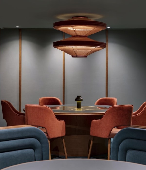
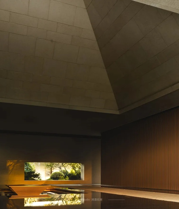
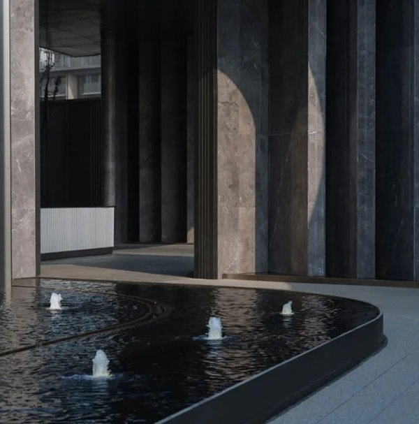
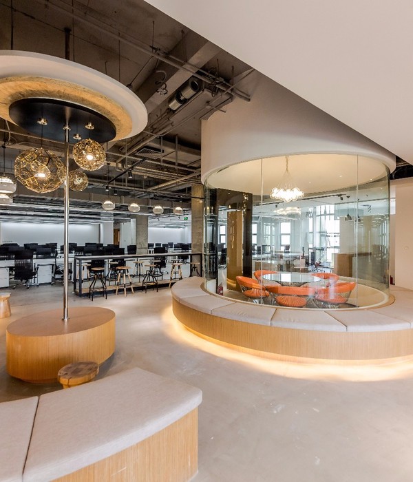
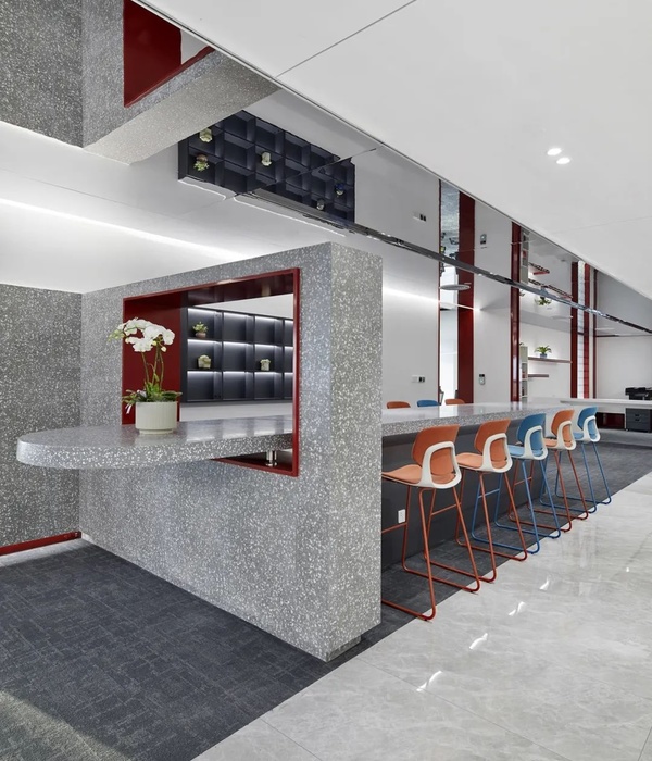
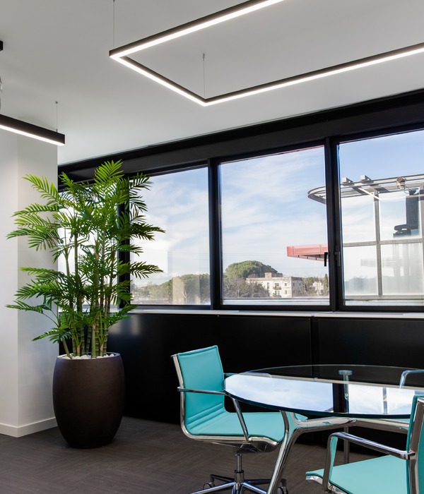
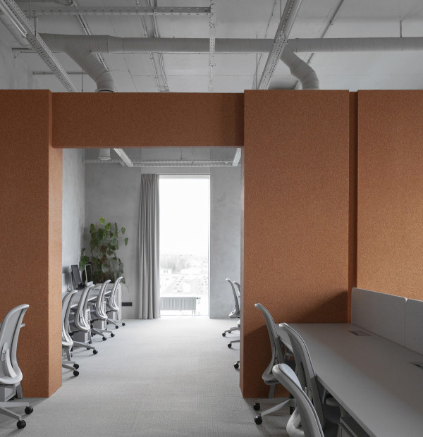
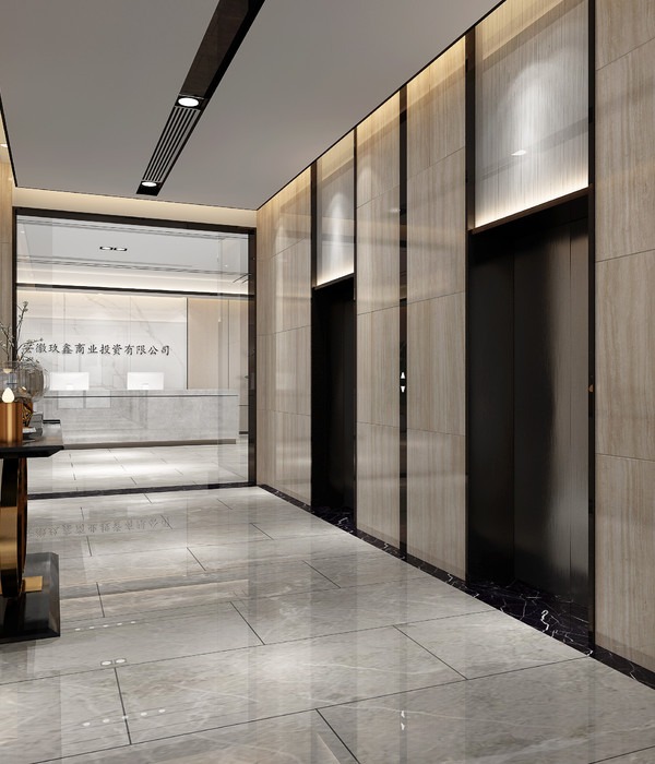
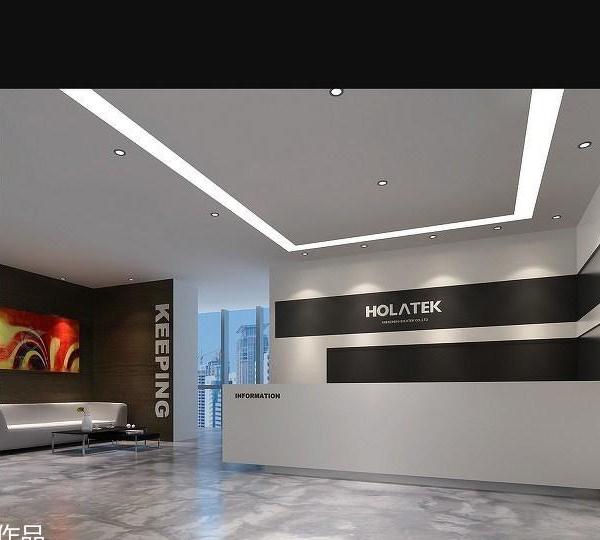
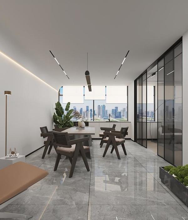
2018秋天,我们工作室受业主委托,为在广东东莞办公室设计。项目的空间营造位于建筑首层,总面积为165平米。现状平面规整,5米挑高的层高。 首先,设计团队针对业主的经营需求,品牌定位以及文化架构进行了深度研究,结合现场沟通及勘察,共同探讨出办公环境的期望方向。在众多线索中,主创提出“舍弃多余”,打造出宁静且满足企业产品展示,文化展现及打造多元办公环境这一理念。 根据业主提出的功能需求,保留了原来入口的位置衔接整个办公室的布局形式。设计师充分考虑灯具产品的展示与自然光的之间的微妙关系。入口位置离窗户距离较远,原本此位置的采光与视野条件并不理想,设计将企业形象及产品展示区系统发生于此,利用灯光潜在优势,恰好成为灯光展示的理想界面。再通过精心营造的一条灰空间走廊,串联个整体空间要素。在几何中线上打造“不对称”空间之美。在不对称的理念的原则下,对空间的细节进行“雕琢”。使每个角落的艺术品融入整体。空间纯粹宁静,秉承设计团队的初心——“舍弃多余”。不论是朝夕相伴的办公者,还是初来咋到的参观者,都能体验到企业文化之于空间的深度融合,以及产品展示与场域营造的相辅相成。
"Asymmetry" means "beauty of space"
In autumn 2018, our studio was commissioned by the owner to design an office in dongguan, guangdong. The space creation of the project is located on the first floor of the building, with a total area of 165 square meters. The present plane is regular, 5 meters high height. First of all, the design team conducted in-depth research on the owner's business needs, brand positioning and cultural structure, combined with on-site communication and investigation, to jointly explore the expected direction of the office environment. Among many clues, the main creators putforward the idea of"abandoning excess" to create a peaceful and satisfying enterprise product display, cultural display and multi-office environment. According to the functional requirements proposed by the owner, the original entrance position is retained to connect the whole office layout. The designer fully considered the subtle relationship between the display of lighting products and natural light. The entrance is far away from the window, and the lighting and visual field conditions at this location are not ideal. The enterprise image and product display area system is designed here, and the potential advantage of lighting makes it an ideal interface for light display. Through a corridor of carefully constructed grey space, the whole space elements are connected in series. Create the beauty of "asymmetric" space on the geometric center line. Under the principle of asymmetric concept, the details of the space are "sculpted". Make every corner of the art into the whole. The space is pure and quiet, adhering to the design team's initial intention -- "discard excess". No matter the office workers or the visitors, they can experience the deep integration of enterprise culture into space, and the complementarity of product display and field construction.
{{item.text_origin}}

