"YUKULTURA"-TEMPORARY MUSEUM EXPOSITION
Museum Design & Visual Identity Design
Year:2019
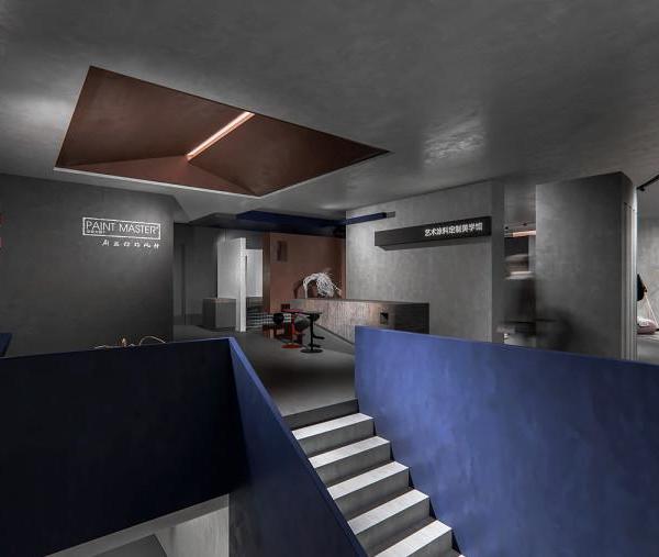
The project includes design of a temporary exhibition as well as the visual identity of the Exhibition itself and promotional materials. The design includes design of the entire exhibition part, consisting of 4 halls divided thematically.The furniture and the cases of the exhibition are designed to be fully adapted to the new configurations of artifacts and media. Eighty percent of the exhibition space is suited for this interchangeability. The strategy saves money and materials for future exhibitions.This exhibition aims to interpret the basic concepts of design, industrial, graphic, textile and product design in the era of Yugoslavia industrial revival and the creation of a consumer society with the intention of identifying successful examples.
Visual identity:
The visual identity of the museum is based on circles and squares inspired by the Yugoslavia period, combined with a warm and cold color palette. The logo of the museum is a sign combined with typography.The red and blue colors come from the history of Yugoslavia.The symbols used visually translate the structures that will be part of this museum pole and are directly related to the design and the historical imagination they represent.
1.Tickets/Information
Section
All of you who are nostalgic for Yugoslavia and her culture should come to Yukultura exhibition. The main purpose of this exhibition is to bring you back to Yugoslavia. As you walk through the exhibit, you will listen to fantastic audio-visual demonstrations, view photographs that highlighted events of the time and see many costumes from the films made in those eras. The exposition focuses on design, hobbies, lifestyle, events and movies. The exhibition will present the most representative examples of newspaper advertisements, design of packaging, industrial design, film,music between 1969 and 1980.
The challenge for the exhibition charts was to give a physical form to complex stories using many different exposure techniques. In some places, the graphic plays a supporting role by explaining dioramas or objects in a natural size.
In more meaningful areas, the charts themselves become the main exhibition experience, acting as objects themselves. So my graphic strategy had to move forward and backward between these two different contexts.
2.Hall/Music
Section
3.Hall/Movies
Section
4.Projection room
5.Hall/Design
Section
6.Hall/Design
Section
6.Hall/Design
Section
{{item.text_origin}}

