阿姆斯特丹建筑中心 - 创意折叠式立面设计
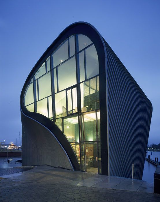
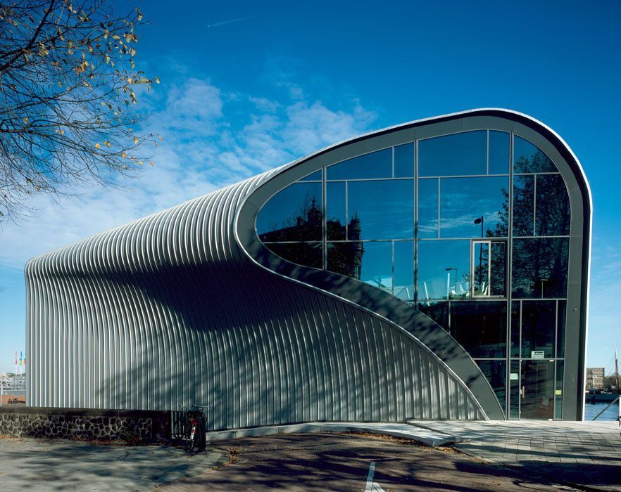
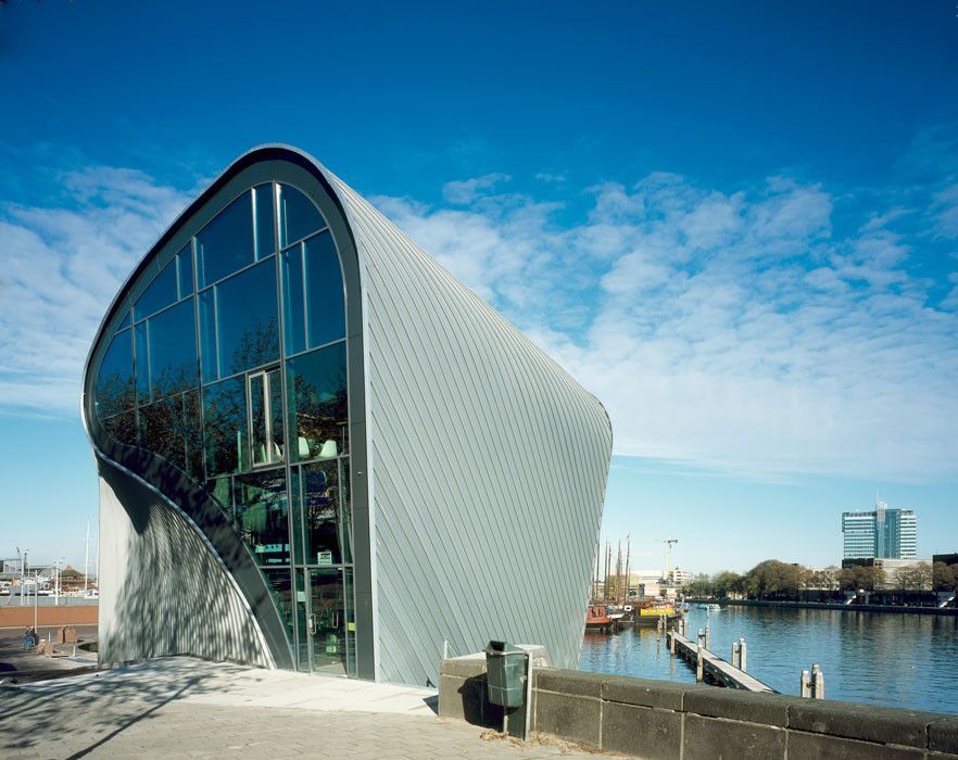
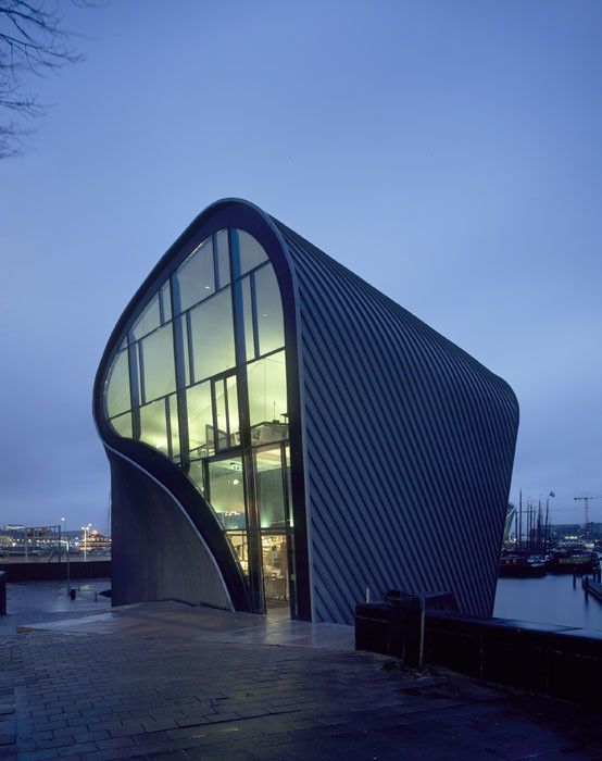
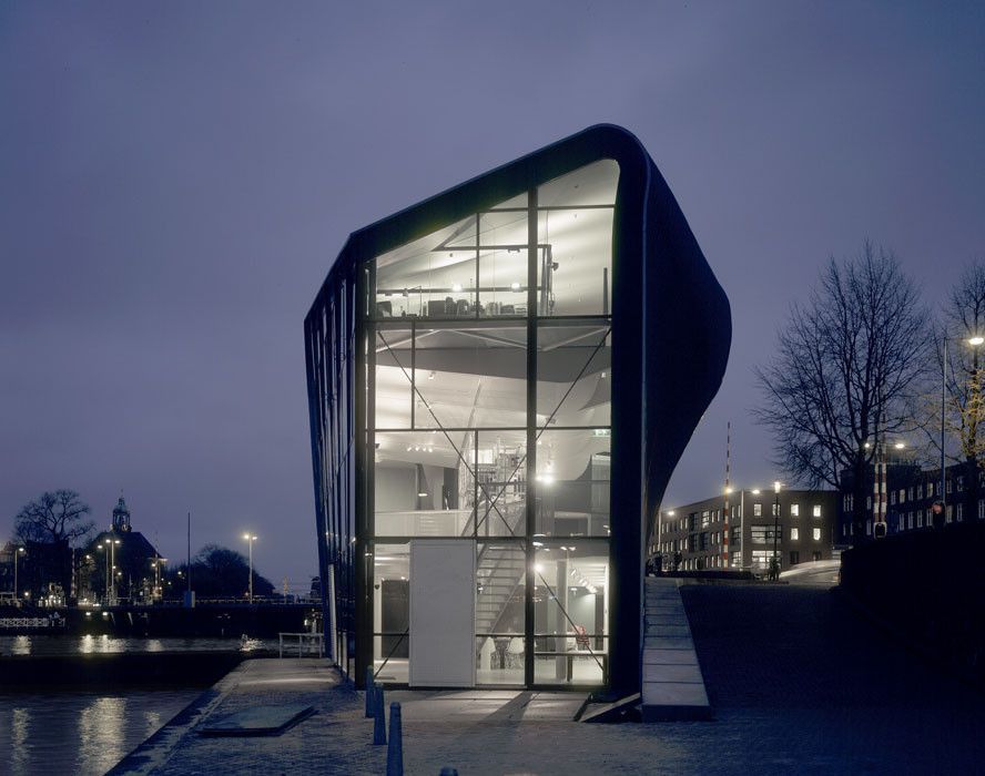
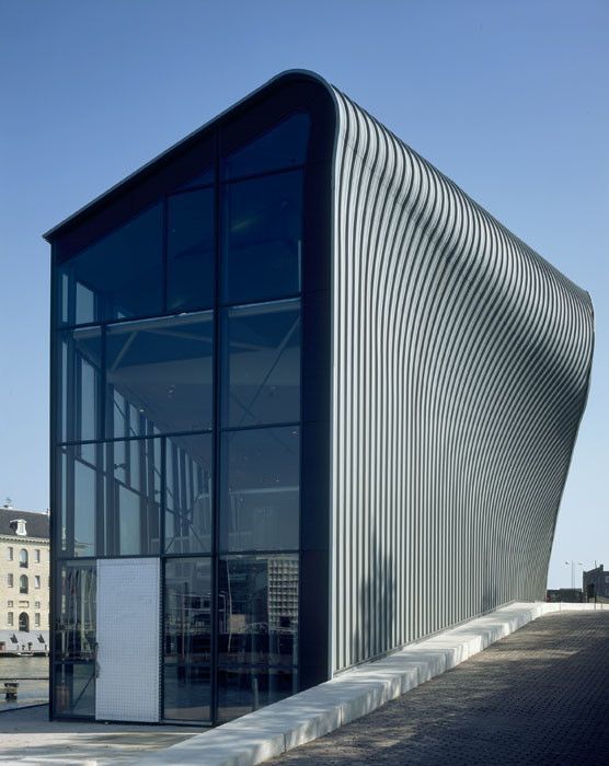
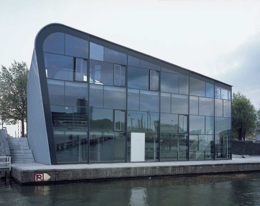
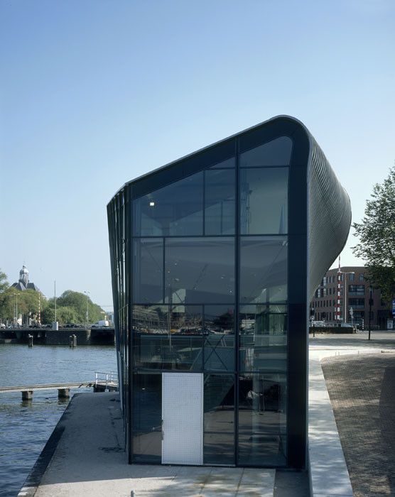
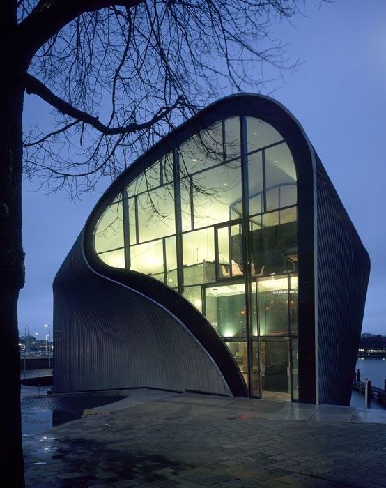
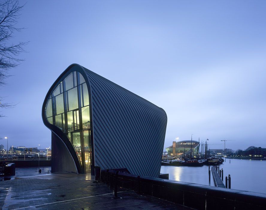
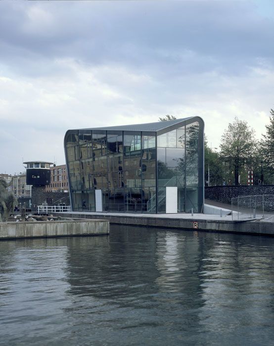
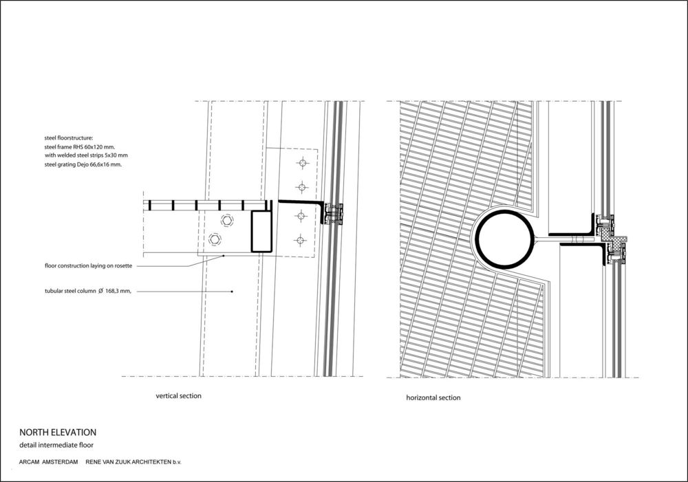
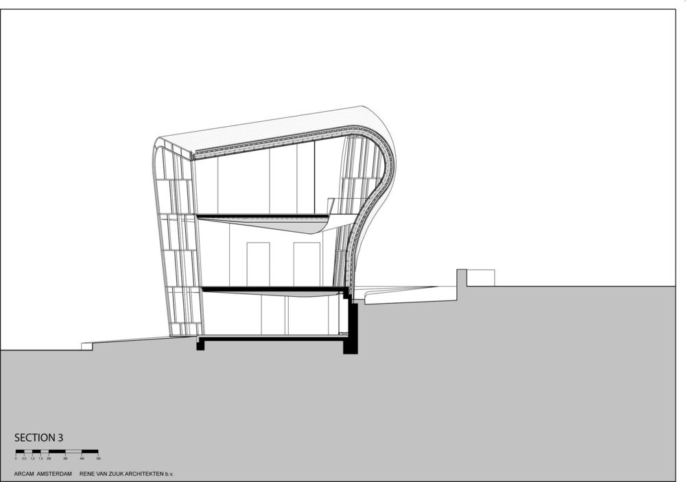
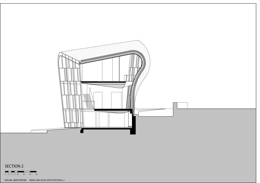
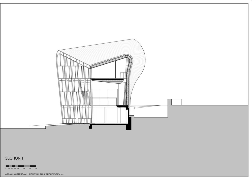
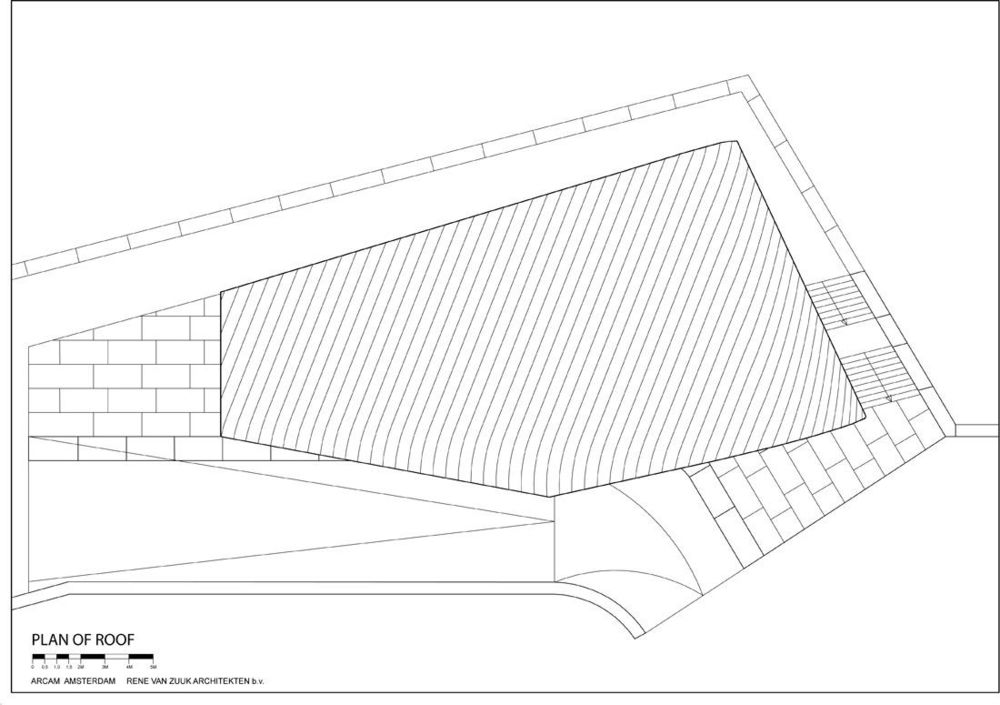
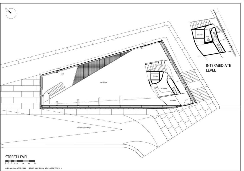
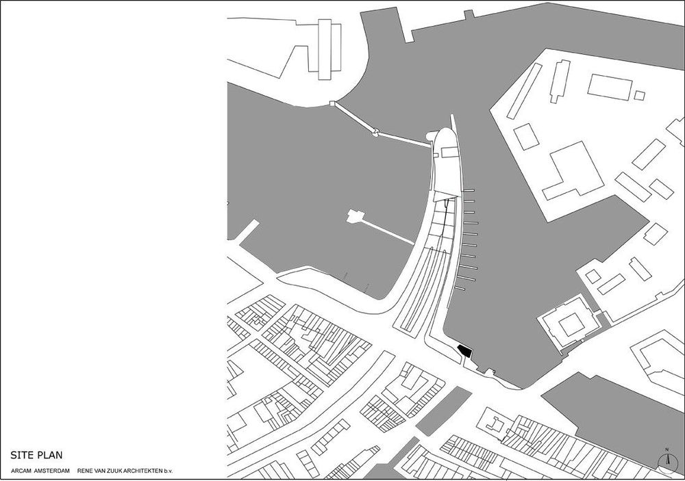
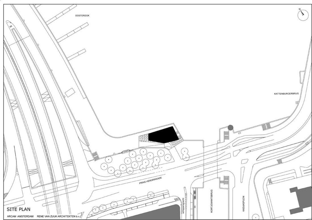
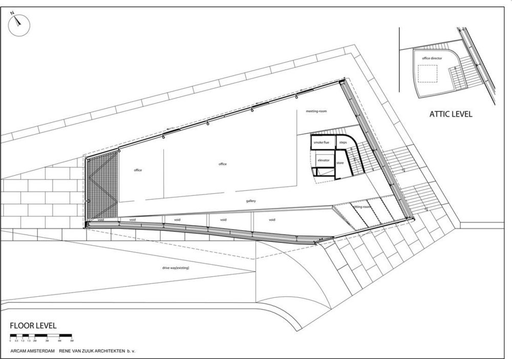
The Architecture Centre Amsterdam (ARCAM) needed a significantly larger accommodation. Therefore a wonderful location close to the Oosterdok was allocated to this promotional institute. In the vicinity of Renzo Piano’s New Metropolis was a small pavilion also designed by him that was going to be demolished. The columns and some of the floors needed to be integrated into the new design. Reuse of foundation parts was not the only limitation laid upon the architect. Consultation in the early stages of the design process of various parties (among others, two successive government architects) resulted in a maximum building envelope. This outline provided a trapezoidal building volume up to three storeys high. In addition, three important requirements had to be taken into account. First, the view of the pavilion from the Maritime Museum needed to be utmost modest. This providing the possibility to lower the waterfront façade compared to the street façade at the Prins Hendrikkade. Second, the street facade needed to represent a closed character and at the same time the building should open up on the waterfront. Last but not least it was demanded that the pavilion would be a compact monolith. Despite, or thanks to, this strict package of requirements an unprecedented shape emerged, turning the architecture centre into a landmark. The new pavilion is indeed a humble and compact three-storey building. On the street level, an exhibition space is located.
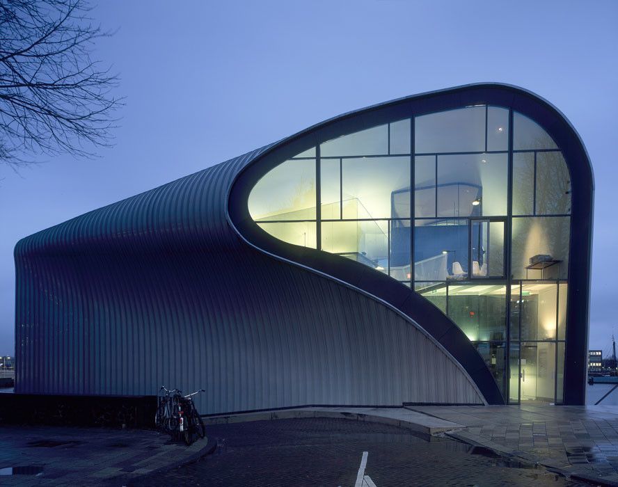
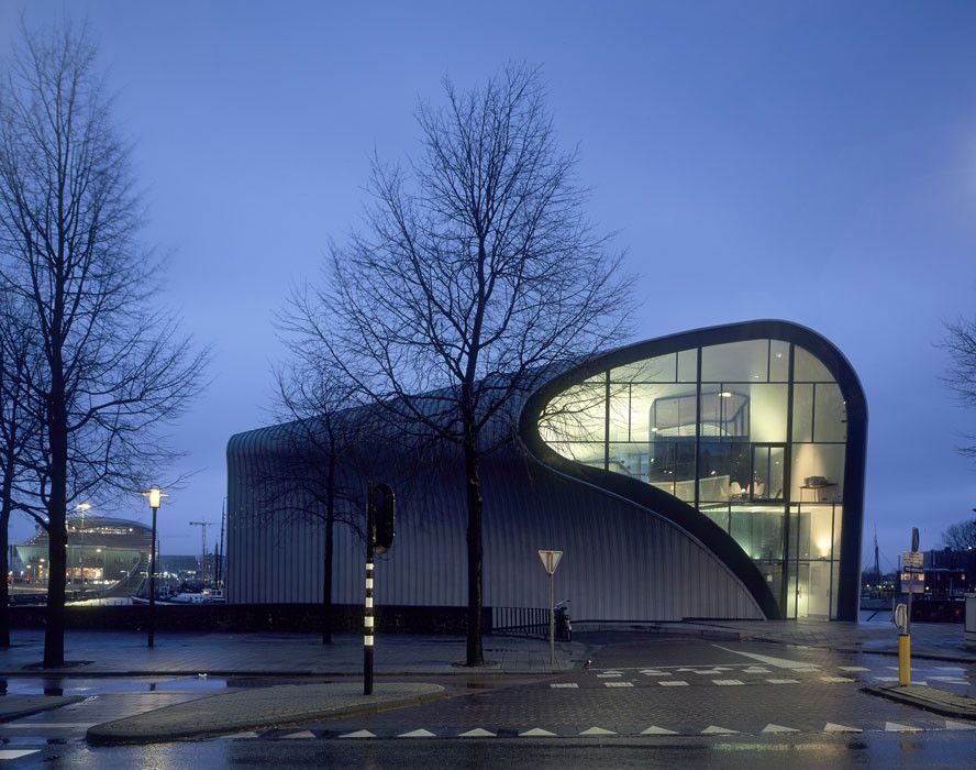
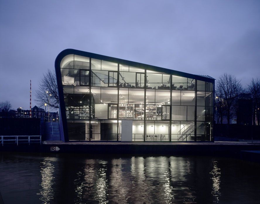
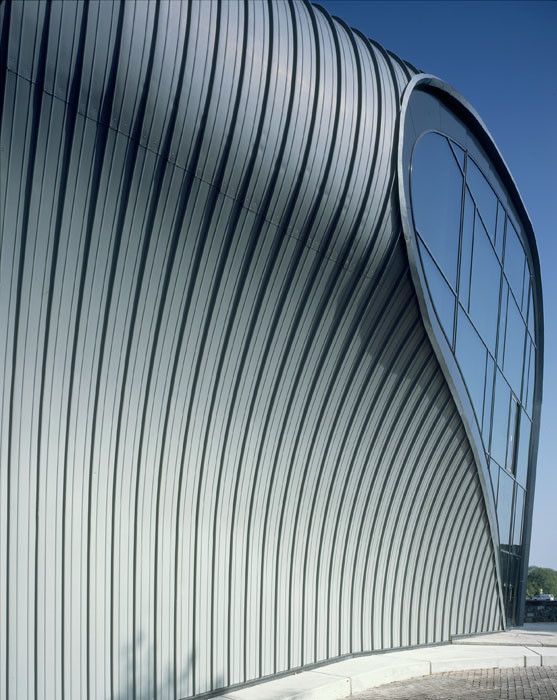
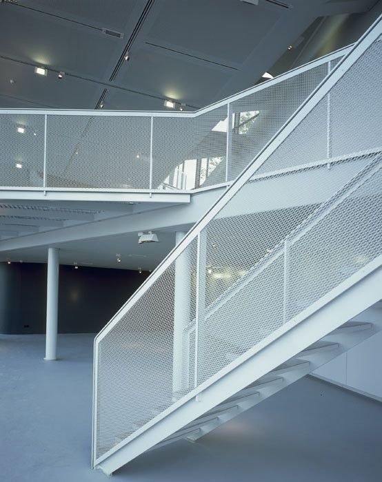
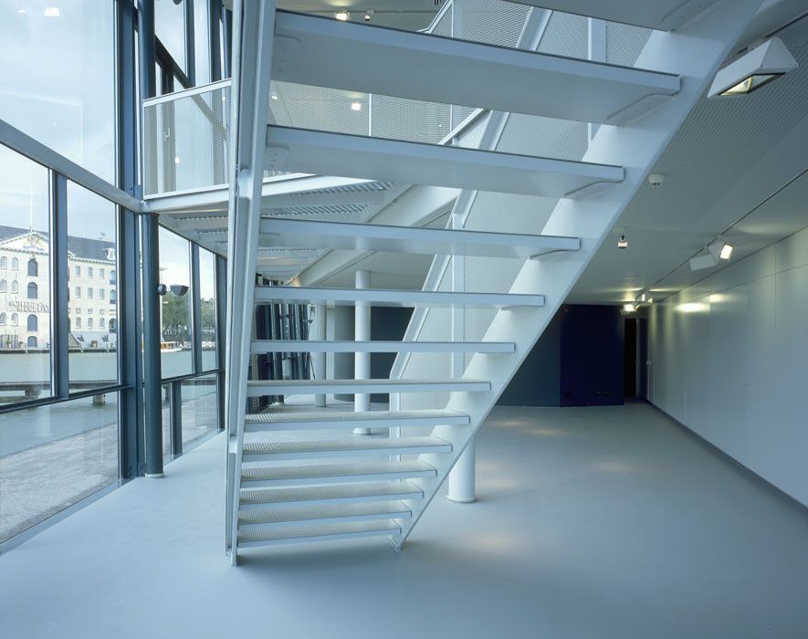
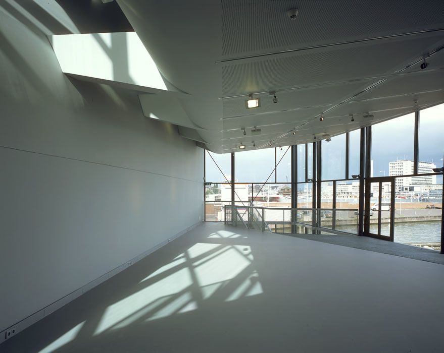
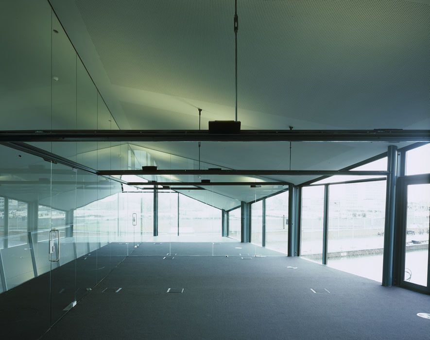
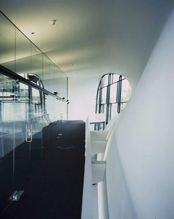
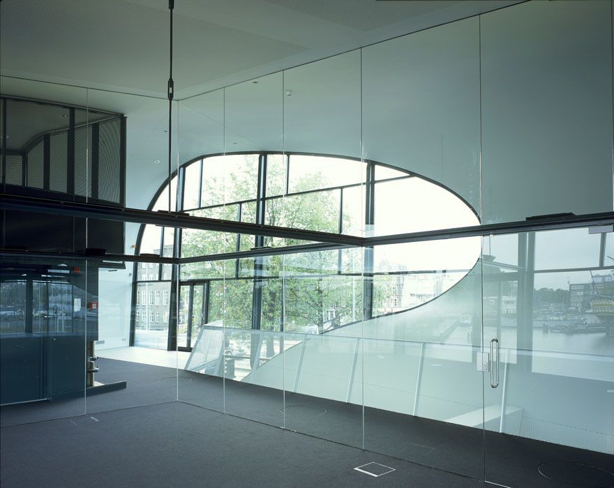
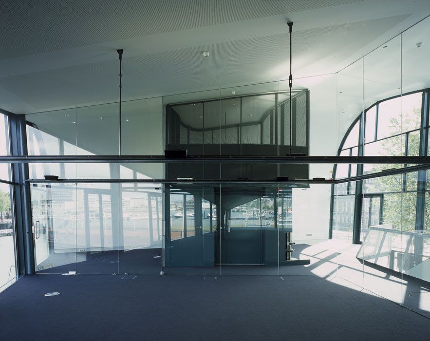
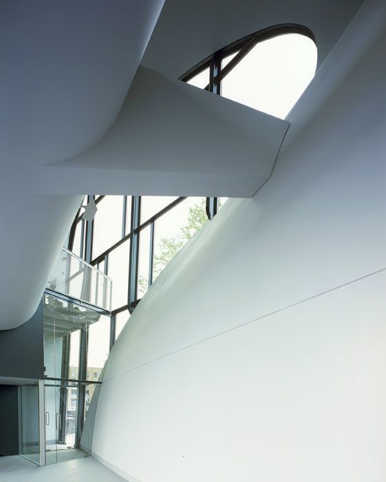
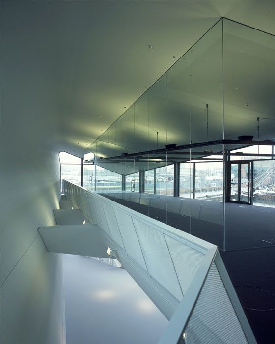
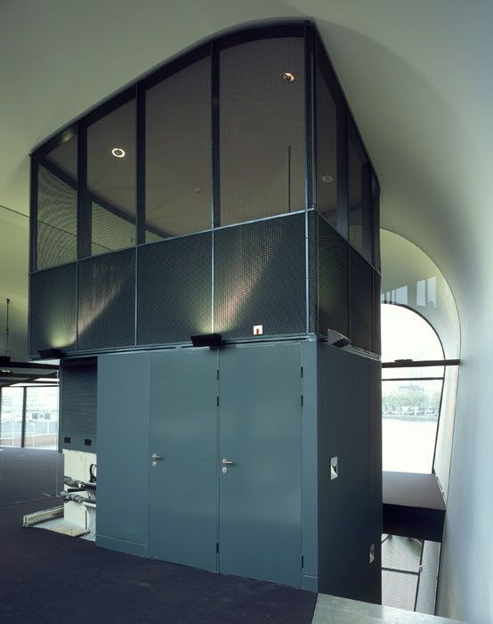
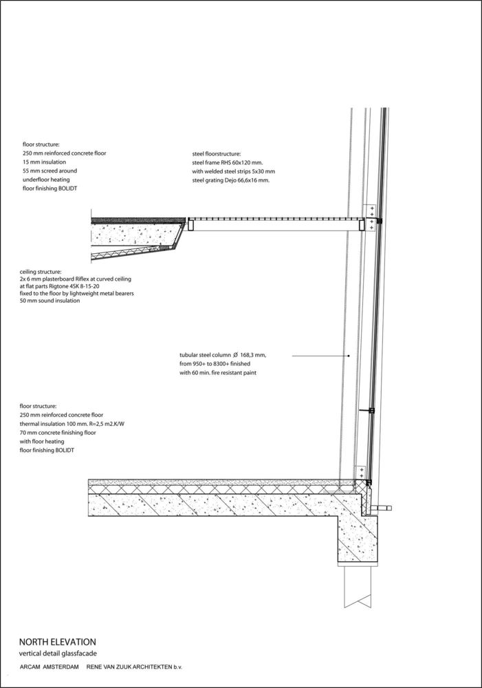
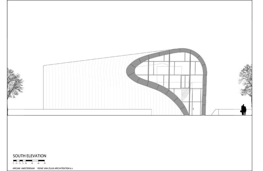
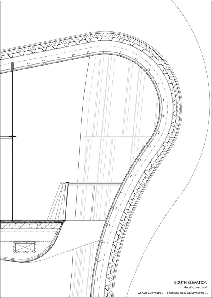
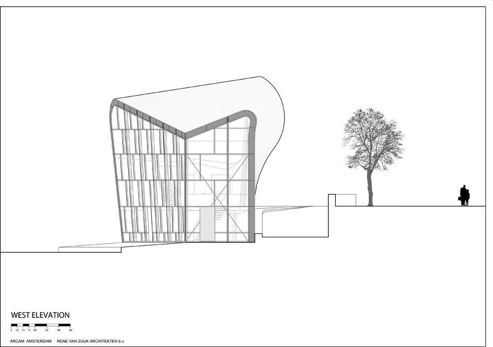
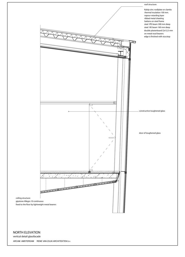
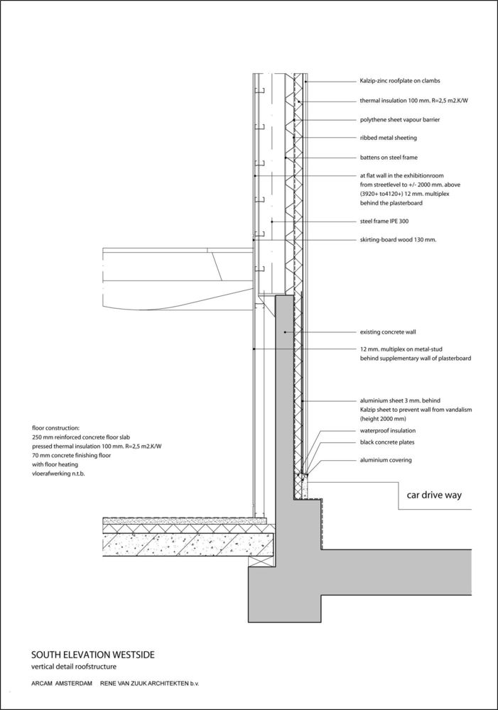
The upper floor is fitted with glass partitions, creating an attic-like atmosphere. On the waterfront, at the quay level, a multipurpose space for meetings, discussions and reception of groups (classes, excursions). The internal openness is remarkable. All the different levels are linked by voids, in a way that all the spaces are a part of a perceptible larger entity. The performance of the facades is mainly due to the ubiquitous application of the KalZip skin. This folded seam method is ideal for creating singularly curved surfaces. The zinc-coated aluminium strips form a continuous plane curling itself all around the building mass.The different facades all have their own distinctive perspective. For example, the folded skin combined with the bevelling glass facade results in a spectacular entrance. On the other hand, the east side displays a most austere view. The waterfront view reveals the soul of the pavilion through the curtain glass, barely showing the structural steelwork. In this view, the layered organization is visualized in the elevation. The peculiar sculptural shape of the pavilion, despite its unobtrusiveness and small dimensions, provides just enough attention in the monumental setting of the Oosterdok. Project Info :
Architects : René van Zuuk Architekten Budget : US $2.03 M Project Year: 2003 Project Area: 300.0 sqm Building Contractor : H.J.Jurrïens b.v., Utrecht/ NL Structural Engineering : Advies en Ingenieursbureau Van der Laar, Eindhoven/ NL Project Location : Ateliers Westerdok, Westerdok 318, 1013 BH Amsterdam, The Netherlands
