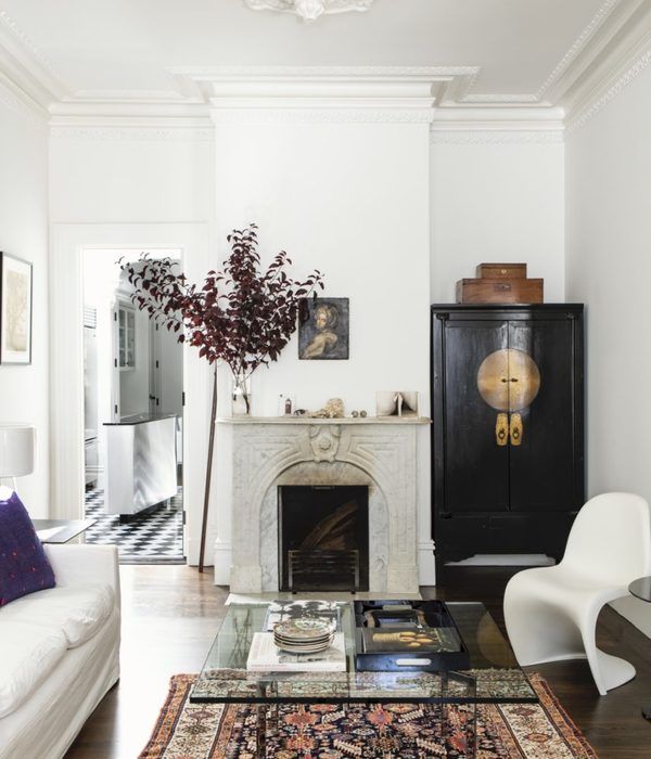
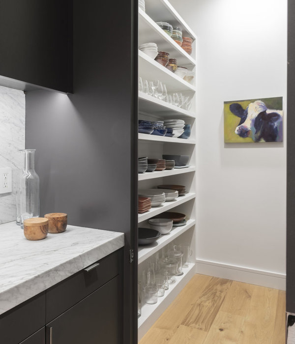
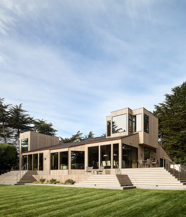
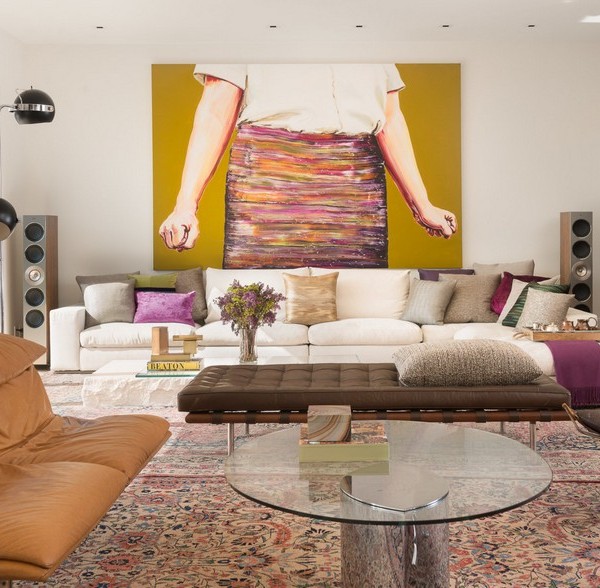
Since its inception, Arent&Pyke has grown into an award-winning design practice with a distinctive style and approach to living in the home, underpinned by the belief that clients should connect emotionally with the spaces they live in. Formed in 2007 by principals Juliette Arent and Sarah-Jane Pyke, the design duo combine decades of design expertise with a shared dedication to creating comfortable and sophisticated interiors. The studio’s success relies in part on its masterful approach to colour and materials.
In their first book, Arent&Pyke address their design ethos expressed through joy, colour, character, spirit and alchemy—and showcase eighteen of their best residential spaces. Each of the projects featured includes paint names, fabric brands, key learnings and insights into how these spaces were created. Generously illustrated and artfully designed, Arent&Pyke: Interiors Beyond the Primary Palette exemplifies how a thoughtfully designed space has the power to generate a sense of grounding, comfort and freedom to create a full, joyous living experience.
One such project featured in the book is Layer Cake. This renovation of a Federation Arts and Crafts home in Sydney’s inner west, in collaboration with Carter Williamson Architects, took cues from the art and crafts ethos. The studio layered colour and materiality with fine craftsmanship to bond the old and contemporary architecture. Enjoy an extract below.
“Spaces for nurture and nourishment. Spaces for relaxing and recharging. Spaces for congregating, or just contemplating. We think about all these things when approaching an interior design, looking at how people live in their house as we consider ways to enhance their living experience. It might be as complex and nuanced as the emotions evoked by the colour of a room, or as simple as the tactile pleasure elicited by running hand along a textured wall. For the owners, and their three children, the renovation of their four-bedroom Federation bungalow in Sydney’s inner west centred around creating a robust, comfortable series of spaces that could accommodate extended family gatherings.”
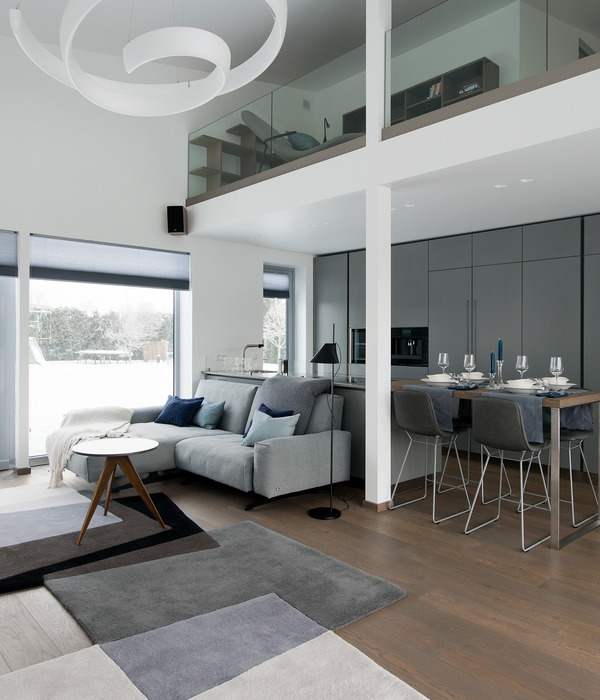
“Cooking and entertaining are cherished priorities here, so we knew that the open-plan kitchen and dining area, part of the new two-storey addition to the house, was going to be a focus of the design. We also knew that this would be an area where kids love to congregate. One of our first steps was the introduction of a timber-lined window nook with a cushioned bench seat, which faces the kitchen and frames a view of the pool outside. Snack area, homework space and chill-out zone, it presents a beautiful moment of stillness in the rhythm of the house, and is painted a serene forest green that is soft and inviting. It is also central to the spirit of the house, celebrating the artistry of colour and texture in defining a mood, and showcasing how intimate areas can be created within large architectural volumes. The nook sits beside a double-height void that was designed as part of the extension by architects Carter Williamson.”
“Flooded with sunshine, the void highlights the kitchen and dining area as heart and hub, but its generous scale had to be tempered to ensure the proportions related to family life. This is where materiality wields such a transformative power. The texture that can be created with materials such as timber and stone bring surfaces into focus, reducing the scale of the space from the architecture to the personal. Having laid oak floorboards in a herringbone pattern, which brought lovely detail to the room, we worked with the architects to also line the ceiling and trim the void with oak. The timber panels make the ceiling a feature, visually drawing it closer while also providing a softer look against the room’s black steel window frames. In contrast to the natural finish of the floors and timber dining table, we added a lime wash to the ceiling. This not only brings out the grain of the wood but also gives it a luminous, reflective quality that enlivens the whole area. An aptly named Floatation pendant light by Ingo Maurer completes the effect, bridging the gap further by hovering gracefully above the dining table.”
Arent&Pyke: Interiors Beyond the Primary Palette, published by Thames & Hudson Australia, will be available on October 25th. For more information and to get your copy click here.
[Images courtesy of Arent&Pyke. Styling by Olga Lewis. Photography by Anson Smart.]
▼项目更多图片
{{item.text_origin}}

