Cliquot
As in TRA's project history, the Chelsea interventions had a measurable impact on the upcoming neighborhood. Clicquot, which came just before Loft 25, greatly contributed to the expansion of the destination areas into fringe pockets.
The design is at the threshold between entertainment and office production. Like the program, the physical space presented an intriguing contrast between the urban landscape viewed through the glass walls to the skyscrapers and the river seen flowing below.
“Liminal spaces” feel special because they are on the brink of change, the space changes function from the day to the night as much as it changes color with the passing of the hours, thus light was the primary design tool giving the static nature of conventional walls a liquid feel.
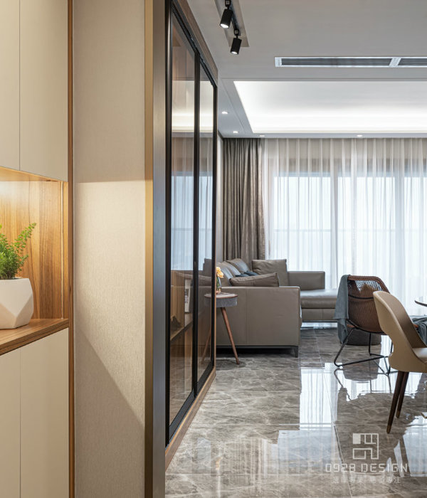
The visitor is greeted at the reception by uninterrupted lines of sight above or through the workspace and beyond to the city views; there they are transported to their destination by the circulation path. Every employee sees where they work and immediately understands their relationship to the rest of the company, yet everybody has privacy when needed.
The glass conference room, simultaneously a viewing platform and a stage, can feel secluded or become part of the reception area, gallery, entertainment or the café. The champagne bar, placed under the umbrella of the concrete mushroom column is the company heartbeat, the host area to “signature” parties. The blurred distinction between outside and inside is reinforced by the exterior grade “green materials”. The color is sparse, changing with the transition of the day. The interior forms echo the faceted building walls and sinuous modernist columns, so to dissolve the exterior into the interior walls and these into the furniture. The layering of the glass walls is arranged to allow for the edited framing of the skyline.
The paintings, poured acrylic gestures in Clicquot’s signature orange color, are by Robert Traboscia and illustrate the close relationship in practice between visual arts and architectural design.
The area of the roof occupied by Clicquot was defined by a galvanized semi-transparent fence, part utilitarian, part sculpture.
The interior was completed on a very tight budget, furnished accordingly with elegant but inexpensive Heller seating.
Client Clicquot Inc.
Status Completed works
Type Office Buildings
{{item.text_origin}}


