悉尼丝绸公寓,色彩缤纷的垂直住宅典范
非常感谢
Tony Caro Architecture
Appreciation towards
Tony Caro Architecture
for providing the following description:
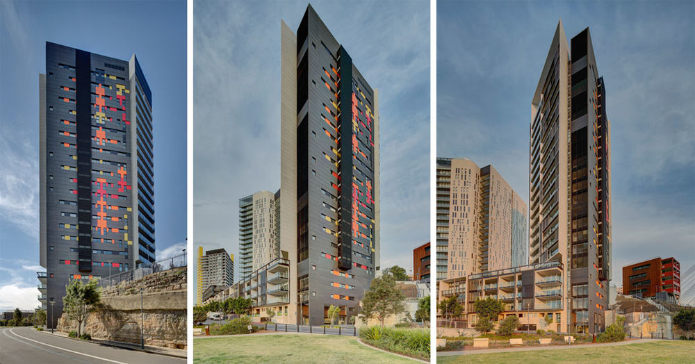
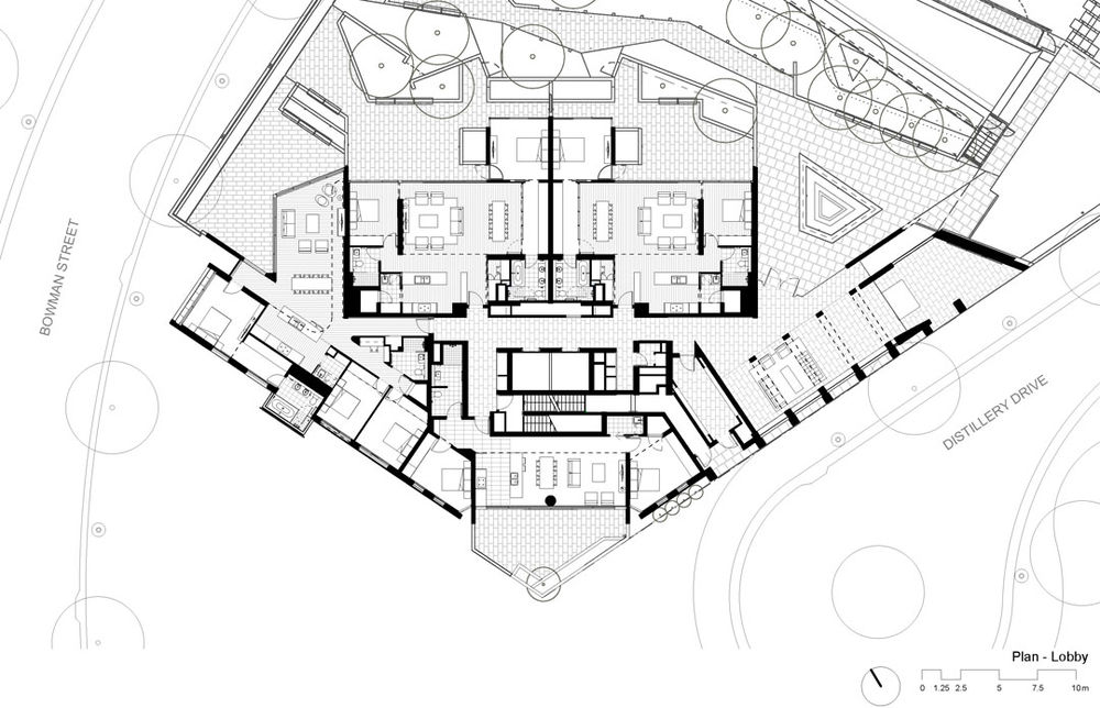
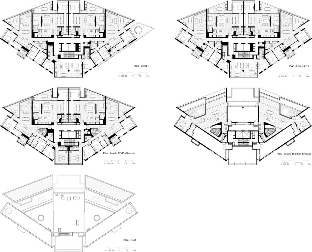
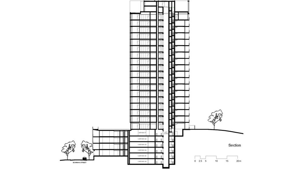
20层高的丝绸公寓位于悉尼中央商务区的西部,拥有得天独厚的景观视野。公寓标准层每层6户,设计巧妙的平衡采光与隐私间的关系。建筑外表皮拥有五颜六色不失优雅庄重的色彩和表情,每一个立面的形态都发生着变化。
This project spanned the challenging economic circumstances of the 2000 decade, and was subjected to a long development gestation and intermittent periods of prolonged inactivity. It challenged our perception of enduring architectural and aesthetic values in many ways.
The project is the final development stage within the Distillery Hill residential precinct at Pyrmont Point, immediately to the west of the Sydney Central Business District. The precinct is a master-planned community comprised of six residential towers of approximately 20 floors each and designed by different architects. Planning relationships between the tower buildings was of utmost importance in terms of balancing natural light and privacy whilst capturing outstanding views from all apartments.

It is a place of extraordinary contextual contrasts: the benign, north-east facing harbour setting and the complex south-west aspect with its attendant noise, privacy and environmental challenges. The buildings fan-shaped plan-form and divergent facade resolutions respond directly to these conditions.
To create architectural proportion and scale appropriate to its context, the buildings broad footprint was modulated into six quite slender, vertical elements. These elements have varied expressions that evolved through response to internal program, context and orientation. The two roof portals articulate the tower form as a collection of discreet vertical elements rather than a single monolithic form.
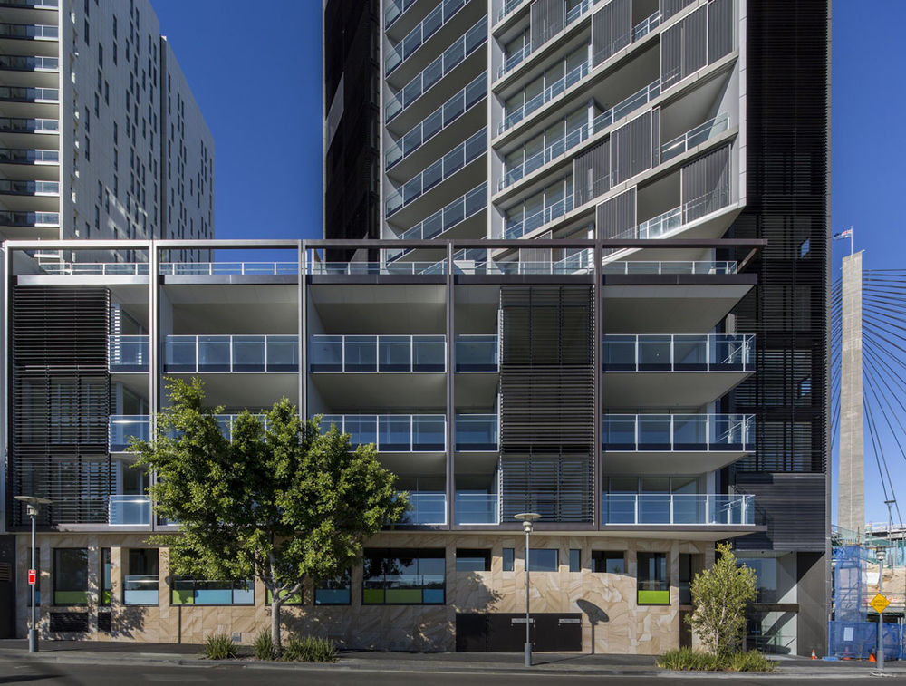
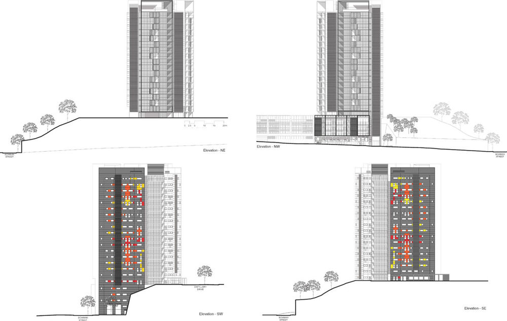
西南面有城市美丽的安扎克大桥。海湾和城市道路在公寓脚下蔓延,夜晚华灯初上,车水马龙,霓虹闪烁。东北外立面设置了穿孔可折叠的金属幕作为建筑“外部的窗帘”控制光线,保护隐私。
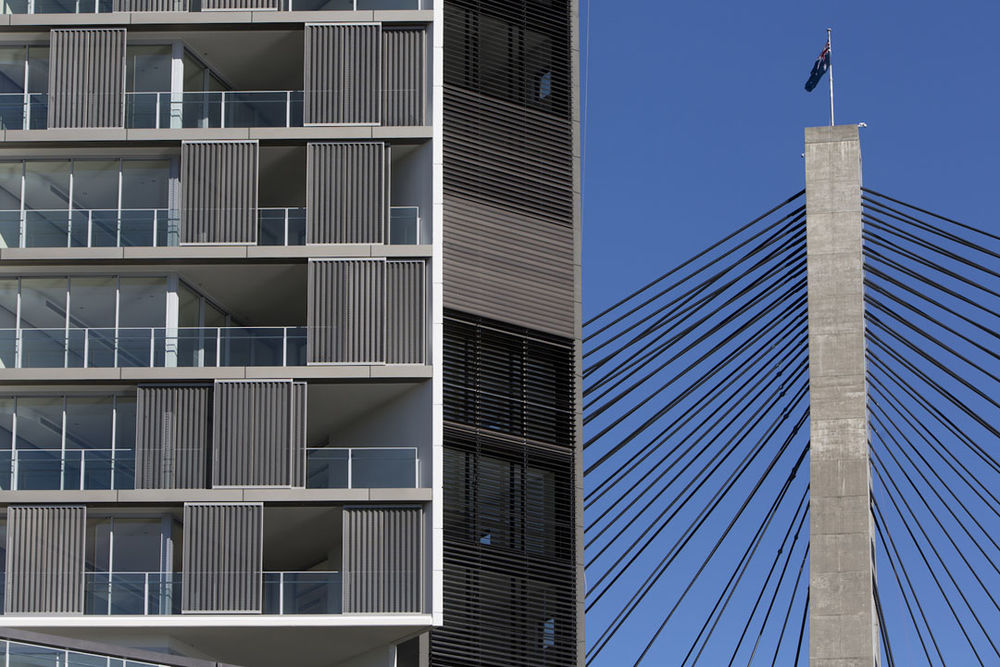
The south and west facades respond to the challenging south-west orientation and monumental scale of the Anzac Bridge and its surrounding post industrial landscape. These facades are generally only seen from the Bridge or at distance from nearby areas across Blackwattle Bay. We saw this setting as an opportunity for an effervescent, graphic response to both the monumental context and incessant arterial flow of traffic to and from the city through its western gateway. An opportunity to divest from the “beige symphony” of the Sydney urban landscape and resonate with the dynamism and blinking lights of the freeway.
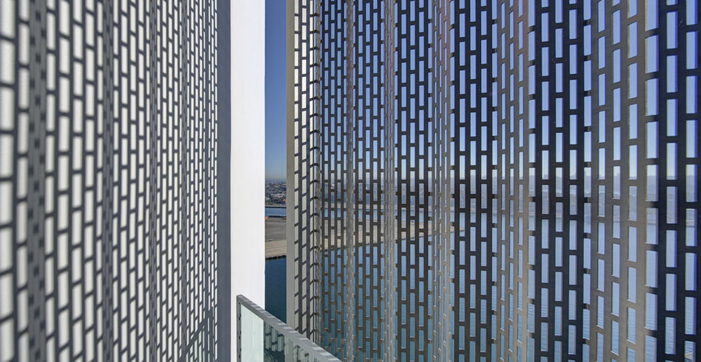
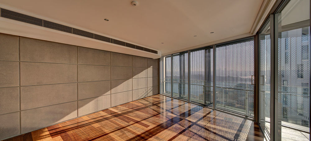
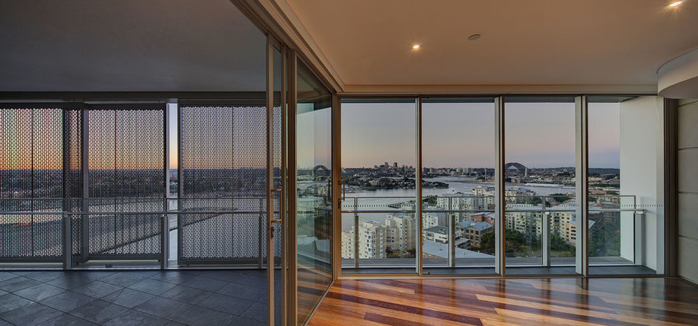
The north-eastern facades are more conventional in character, with primary living spaces designed to enhance a sense of connection with the landscape and the ability to control light and privacy. The perforated, folded metal sliding sun screens were conceived as “external drapes”.

该项目一举夺得2013年的新建筑公寓类大奖,评委赞誉:别出心裁的内部空间,简洁大方的表达,深思熟虑的措施,改善了人们的生活体验。简单强有力的形态对城市作出回应,面桥大桥方向的彩色立面提醒人们即将进入CBD。临靠水域的巨大体量实现了平静,轻松,温馨的环境。

建筑内装主材为预制混凝土隔断墙,木地板,玻璃隔断。这些材料创造出简单丰富,适宜高密度住宅项目的风骚典范。
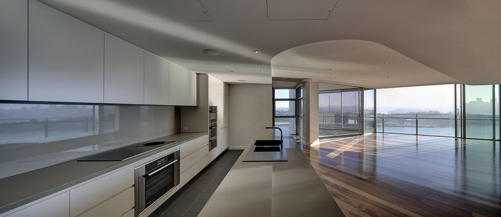
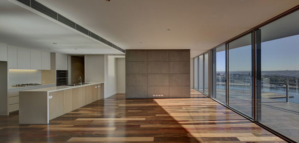
The project interiors incorporate expressed precast concrete walls, floating timber floors and delicately framed timber and glass “shoji” partitions – a sophisticated, quite raw aesthetic vocabulary for high-density housing that challenged market-based paradigms for the project team.

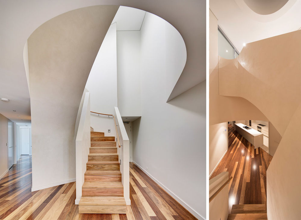
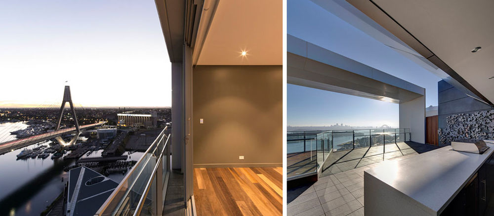
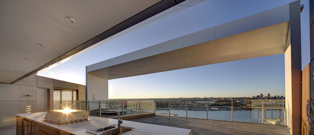
Project Name: Silk Apartments
Practice Name: Tony Caro Architecture
Client: Lend Lease
Builder: LLPMC
Cost: $75M
Floor Area: 13,097sqm
Address: 2 Distillery Drive, Pyrmont NSW 2009
GPS Coordinates: Latitude: 3352’5.84”S, Longitude: 15111’17.80”E
Project Team: Tony Caro, Louise Chapman, Blair Young, Alex Koll, Jason Fraser, Katja
Hempel, Nick Mittens, Simon Mather, Tony Camilleri, Rebecca Donoghue.
Consultants:
Low Rise Documentation: Lend Lease Design
Landscape: FJMT
Structural: Robert Bird Group
Service Consultants: NDY
Acoustic: Renzo Tonin
BCA: Phillip Chun Consultants
Electrical: AECOM
Civil: Hyder Consulting
QS: Altus Page Kirkland
Photography: Brett Boardman

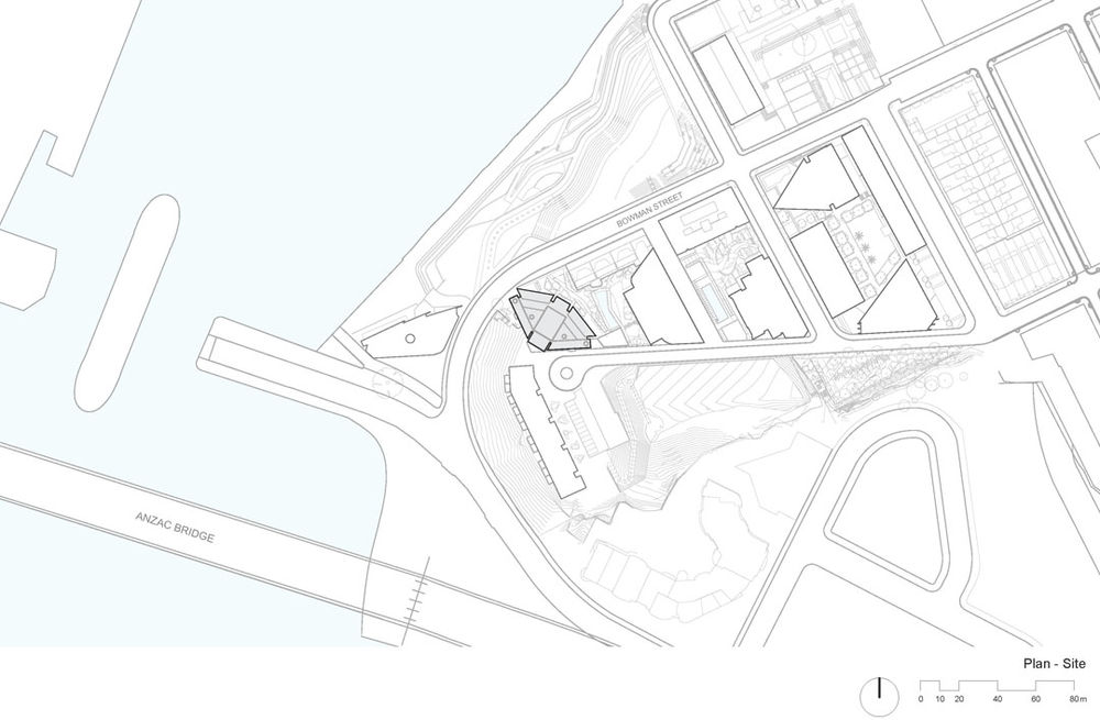
Here is the more information form Tony Caro Architecture
2013 NSW ARCHITECTURE AWARD FOR RESIDENTIAL ARCHITECTURE – MULTIPLE HOUSING JURY CITATION:
Silk Apartments deliver remarkable internal amenity through careful planning and simple elegant architectural expression. The building is well considered and peruses a number of clever planning initiatives to enhance the living experience – deep inset balconies achieve protected external living environments while pushing living rooms to the buildings edge, engaging occupants with the view.
Externally the building is robust and simple. To the south the building addresses the broader urban realm of Anzac bridge through the bold use of colour, heralding the western entry to the CBD. The north, east and west facades are structured around strong vertical gaps driven into the building form which act to reduce the overall bulk and scale – giving the tower a slighter and more elegant form than the plan would suggest.
Folded screens are employed across the balcony edges, reducing the northern heat load. They are simple and effective, offering a light, beautiful layer to the building both internally and externally.
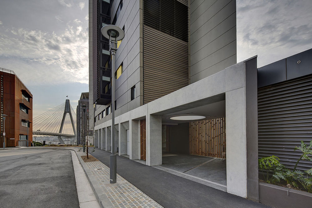
Entries to the building address both the public water edge and the more private hill-side of the site. Both are intimate and personal with the popular hill-side entry cleverly mediating the immense scale of the tower and that of the individual pedestrian to achieve a calm, easy and homely environment.
This building has been delivered by a practice that understands post – occupancy issues. Details have been designed to enable easy ongoing use and maintenance – often overlooked in multiple housing projects.
MORE:
Tony Caro Architecture
,更多请至:


