Architect:Puccio Collodoro Architetti
Location:Palermo, PA, Italy; | ;View Map
Project Year:2024
Category:Shops
In Palermo, the concept of fast food undergoes a revolution thanks to the visionary project by Puccio Collodoro Architects for the new Ciccio's Burger. Located at the intersection of two main roads in the Sicilian capital, this new venue promises not only delicious dishes but also a unique and original experience for customers, visible from the first glance thanks to the large windows that invite exploration. The atmosphere of the venue proposes an ironic blend of theater and museum, where the sales counter becomes a true stage, illuminated by spotlights that enhance the menu graphics and frame the kitchen windows and the distinctive sign depicting Ciccio's face, the founder of the concept.
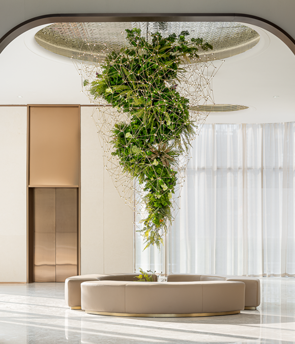
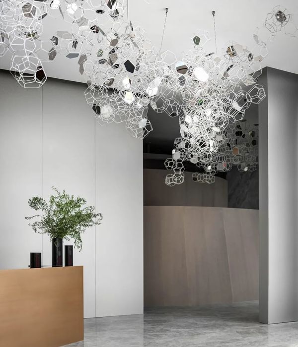
The entire room is enriched by artistic installations that tell stories of "Cicciopoly," highlighted by punctual wall lighting, as for great works of art. The design of the dining area alternates between sobriety, given by the two outer dining areas, and eccentricity, given instead by the central oasis made with a metal structure with regular geometries that tends to blend with plant compositions and furnishings. The choice of materials, such as chrome-plated sheet metal and gray marmorino, contributes to creating a dynamic and welcoming atmosphere, while the use of scenic lighting emphasizes the concept of the venue. Despite the challenges encountered, the final result is an original and engaging project, capable of conveying the passion and quality of Ciccio's Burger products, which aims to be not simply a place to enjoy delicious hamburgers but a multisensory experience to live and share.
The project unfolds in a corner located at the intersection of two main roads in the capital of Palermo. This space is characterized by large windows that allow a clear view even from outside the premises. A spacious outdoor area precedes the entrance, where all furnishings, the logo, and the arrangement of plants have been carefully curated, creating an inviting and welcoming atmosphere.
The atmosphere of the venue is conceived as a theatrical or museum-like experience, where the undisputed protagonist is the sales counter reinterpreted as a stage. Spotlights focus on the house specialties, illuminating this counter made of sheet metal, framing the windows overlooking the kitchen preparation area. The flag-shaped sign depicting Ciccio's face, the creator of the concept, becomes the brand logo. The cash register area is preceded by a neutral volume, enriched by artistic installations depicting Ciccio in various actions in the style of "Cicciopoly," emphasized by lamps as in a museum. A rectangular volume houses the dining area, interrupted by an installation in wrought iron that creates an oasis atmosphere immersed in greenery.
For the cash register area and the sales counter, corrugated chrome-plated sheet metal was used, topped by a constellation of grid lightbulbs. The sales area features porcelain stoneware flooring with a geometric pattern and walls covered with a textured effect of gray marmorino, creating a neutral environment to highlight graphic and architectural details. The dining area is characterized by seating and tables with a metal structure that integrates with the surrounding nature.
Architect: Puccio Collodoro Architetti
Photography: Benedetto Tarantino
Construction: Mecos srl
Forniture :
1. Claddings: Domus Design Store
2. Lightning: CocoLumo
3. Smith: Michele Noto
▼项目更多图片
{{item.text_origin}}

