The formality of the concept draws inspiration from the historical Cape Dutch House vernacular as well as its outbuildings, with the scale of the project replicating that of the existing Manor House in the near vicinity. The building’s symmetrical form demonstrates an open-ended extruded gable profile, with glass panels orientated to address expansive views of the valley and mountains.
By design, the layout of the building exudes simplicity, with the restaurant seating area located in the main volume, while a kitchen, some storage facilities and services clip on to the main building to form a traditional H-layout, with a series of linking elements.
In plan, the restaurant appears to take the shape of two staggered, rectangles adjoined by glazed link. The kitchen and services occupy one of the volumes, whilst the restaurant front of house occupies the entirety of the other. The services block is predominantly closed-off whereas, in contrast, the restaurant is comprised of many glazed elements and appears relatively transparent.
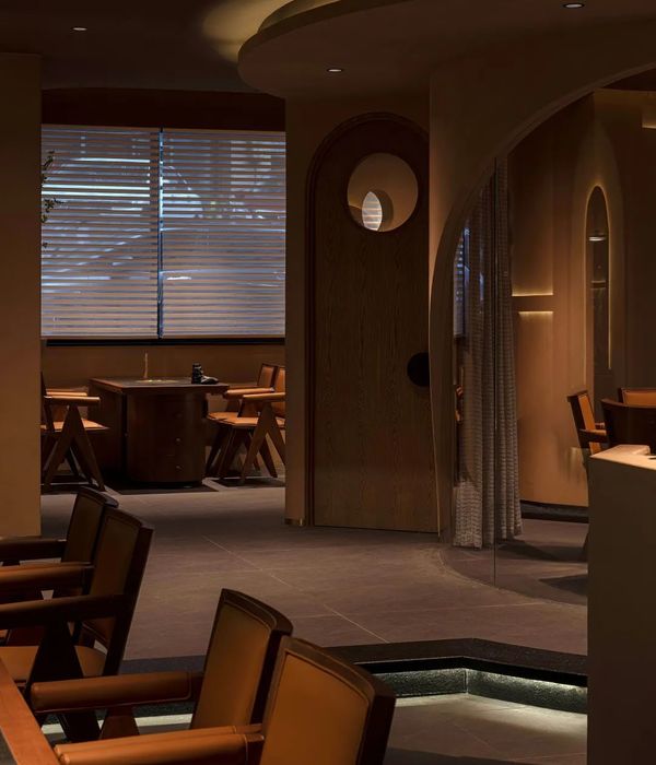
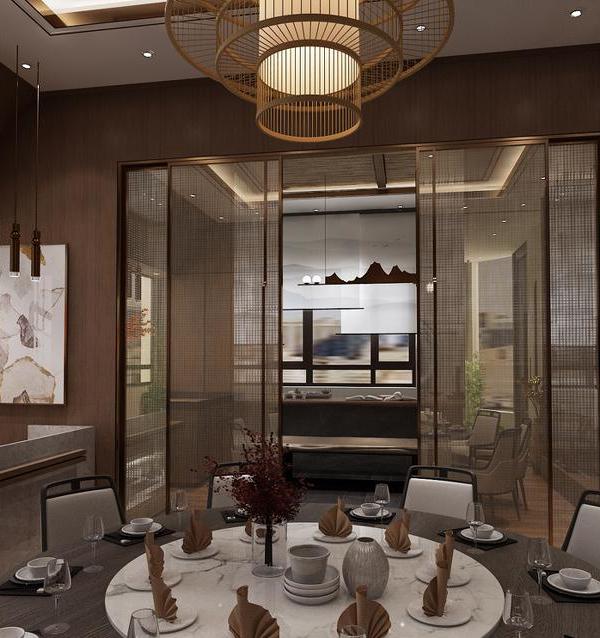
The interior features an ash timber slatted ceiling, with Isover Ecosound infill strips between the timber slats to enhance the acoustic treatment of the space. It boasts high ceilings, glass walls, a wooden terrace, mountain views and a historical-and-nature inspired blue and white tiled mural of the 'Tree of Life' created by Lucie de Moyencourt and Michael Chandler.
Stone, concrete, glass and wood comprise the principal construction materials. These were chosen with the aim to blend the building in with the surrounding landscape. The use of concrete as a plinth juxtaposes more natural elements with a more industrial approach of a shed.
{{item.text_origin}}


