Architects:Thirdspace Architecture Studio
Area :1200 m²
Year :2020
Photographs :Suryan // Dang
Lead Architect :Praveen Bavadekar
Structural Design :D.L.Kulkarni Associates, Dileep Kulkarni
City : Belagavi
Country : India
Could an existing structure be extended without really disturbing it or even barely touching it? How can the new negotiate with the old so that each retains their own identity and yet are cohesive together? These were among the many questions we asked ourselves when a reputed educational charity institution needed additional space for their 50-year-old, two-story corporate office. The existing office, though nondescript, was nevertheless a space that had significance to the Institution’s collective memory, and it was sought to be retained out of a sense of historicity. The offices were always bustling with activity and had undergone a mid-life retrofit, so any addition to the top would have to be done in a manner that did not disturb or disrupt the workings of the office. Therefore the challenge was to intervene in a manner that the existing office would not be affected in its functioning nor would its interiors be damaged through intrusive structural works.
Several contexts - The City Artery, Mother Campus, and Sports Field.
The Artery: The proposed building required multiple responses to its multiple contexts. On the one hand, the building, though being a part of a hundred-acre, century-old educational campus, was on an important arterial road in the city of Belagavi. Any building on this road would occupy an important place in the visual map of the city. It was a mandate of the brief that the building should establish itself as a visual landmark on this important road of the city. The Campus: The proposed building would also be one of the frontages of the century-old campus which marked the birth and growth of this remarkable charity organization. The campus was a collection of buildings built over the past century, loosely connected by a retrofitted interstitial landscape. Because of the number of trees and the low-slung nature of the existing buildings, the campus was perceived by the city more as a very long perimeter wall with barely any views of the inside. This was an opportunity to create a meaningful intervention that could give the campus a recognizable identity. The Sports Field: The sports field of the campus abutted the existing head-office building and whereas the existing building barely registered in the view from the ground, the new intervention would be a part of the peripheral edge of the ground. As much as the building had to respond to these three contexts, the building also would be viewed from these three vantage points.
Strategy - After a deep study, a three-pronged response to the brief was envisaged: The building would not be a mere extension/extrusion of the lower floors, but rather could be a structure that floated above the old building barely touching the ground. This would be a structure that had to respond to three separate micro-contexts - the road fronting the site, the colonial-era campus within, and the adjacent campus sports field. The structure was restricted to a height of 15 m because of fire regulations, and its footprint was restricted by road setbacks as well as the buildings and the ground in its proximity. The building construction would have to happen in a manner that did not disturb the functioning of the existing campus.
Resolution - Structure as Space: The proposed addition was thought of as a space that could hover over the existing building in a manner that creates little disturbance at the ground level - A Hover Space. At its simplest, the design is a space between two full-floor height edge trusses. These trusses would be supported on just 8 cylindrical RCC columns, carefully positioned to avoid creating obstacles to the existing conditions at the ground level. These eight columns at the periphery of the truss allowed a seamless uninterrupted interior space of around 1200 sq.m. The width of the office on top was restricted by the existing context on site as well as the considerations of daylight penetrating throughout the whole interior. The length of this space was similarly restricted by the ground on one side, and an existing garden with a historically significant memorial on the other. In elevation, it comes across as an inverted L form with a vertical arm containing the circulation and lobby and a horizontal arm that floats over the old building and cantilevers onto the sports field. The vertical circulation that forms the L form also helps visually anchor the building to the ground on one side, while allowing it to float in the background of the sports field on the other side. The L form of the building creates an entry portal from the road to the campus which aligns with the central tree-lined avenue along which there are several heritage structures. These heritage buildings are framed through this triple-height entry portal as one views the campus from the road.
Verandah as a second skin: The simple box of column-free office space is wrapped around with a continuous verandah. This verandah is an interpretation of one of the ubiquitous features of the colonial architecture of the subcontinent. A verandah is simultaneously a social space, which is undefined in a singular function but allows for a multiplicity of uses, as well as a passive climatic device that protects the interiors from the harsh rain and sun of the subtropics. This continuous verandah, here, is a breakout space for the offices as well as a climatic buffer between the interior and exterior. The floor-height trusses, painted in a deep red, become a sculptural element that defines the edge between the core office space and the verandah outside. Simple aluminum sliding doors act as an interior envelope allowing for easy access to the verandahs. An expanded mesh aluminum skin of operable vertical fins further enhances the climatic and transparency control offered by the verandahs that front the longer eastern and western facades thus filtering harsh direct sunlight on these facades.
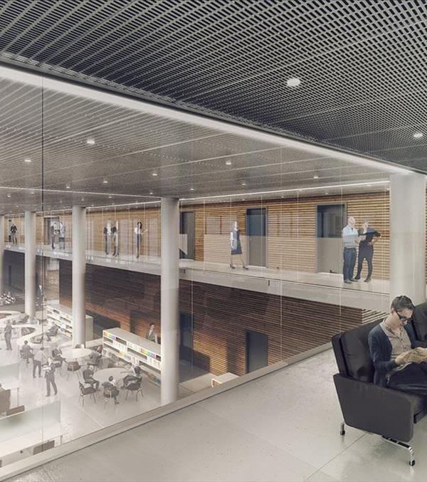
The views of the exterior from the interior spaces are layered and framed, by the form of the trusses as well as the simple aluminum glazed windows, the plants in the verandah, and the light aluminum mesh screen. Thus, the office spaces provide a sanctuary from the bustle of the city outside yet filter in the city and the campus through layers of transparency. The interior spaces of the offices benefit from the abundant natural light and ventilation and a simple palette of whites and accent colors with foliage of plants and trees enliven the space. The interior is programmatically divided into three main spaces - the entrance lobby with the Chairman’s chambers, a middle section with private offices and meeting rooms, and a rear section with open office cubicles with a view of the city and the sports field. The roof trusses are left exposed in many areas, and a clerestory skylight along the center of the roof defines a spine that also emphasizes the main circulation corridor.
Interstitial Space: Programmatically the new addition was required to function in cohesion with the offices in the existing building. Visually and conceptually, they needed to be distanced. The two structures are connected by a glass elevator facing the sports field, which provides dynamic vistas of the campus and its sports ground as one travels vertically through the office complex. The glass elevator is also an element that not only connects the two buildings physically but also allows a user to temporarily exit the buildings albeit in a glass box and reconnect back to the offices. This ritual of being transported while being in the building yet being apart from it, further emphasizes the distinction between the old and new. The terrace of the old building becomes an interstitial space that can function as an event space/terrace garden. This anti-space acts as a buffer and a pause point, visually as well as programmatically, between the old and the new. The terrace had access from the lower floors through a regular dog-legged staircase. It now also gets a sculptural circular staircase that connects it with the new addition above. The placement of the new addition with respect to the old one generates a condition where parts of the terrace are open to the sky and a part of it is covered by the hovering space above.
Several responses: The new addition, though appearing to be a simple metal box, has several layers of complexity woven into its very fabric. It responds to the road by appearing as a linear screened box that is set parallel to the road and is experienced through the foliage. It forms a portal entranceway to the campus beyond. It also is experienced as a backdrop to the sports ground and track acting as a visual anchor for the campus. Overall, the new office space created has given a new identity and presence to the organization as well as created a sense of an entry portal for the larger campus. The offices with their combination of private chambers and open work desks vastly benefit from the exterior verandahs which shelter the interiors from the harsh outdoors. In its several nuances and details, the design addresses several functional, contextual, and climatic parameters through simple strategies.
▼项目更多图片
{{item.text_origin}}

