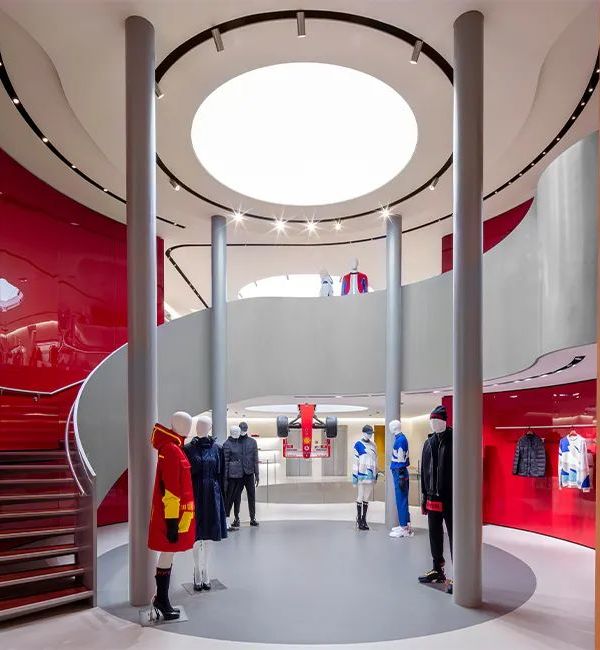
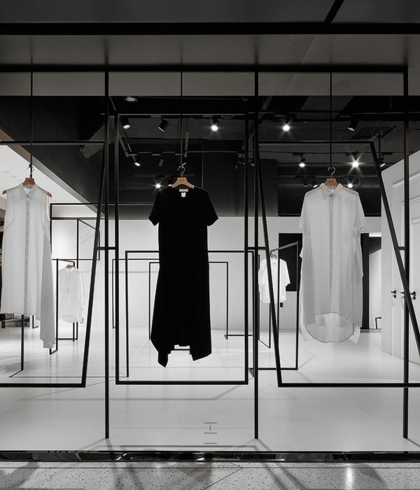
在「复合型业态空间」已逐渐成为共识的当下,如何通过多元组合与搭配手法,为空间带来更多层次感与使用体验,成为了本次Farbric Shop试图探讨的命题。此次尝新,是一次探索,更是一场赋予生活更多灵感的实验。
At the moment when “complex format space” has gradually become a consensus, how to bring more sense of hierarchy and use experience to the space through multiple combinations and collocations has become the proposition that this farbric shop is trying to explore. This trial is not only an exploration, but also an experiment to give life more inspiration.
▼项目概览,preview ©形在空间摄影 贺川
连贯的体块沿圆弧形外立面围合而立,坐落于商场二层,恰如一方小小岛屿,身处人流汇聚之处,静默而温柔,于无声中吸引着过往行人驻足。空间以业态为界,自内而外一分为二。咖啡在右,以热情包容之态招揽人群留驻,一杯醇香即可感受惬意与悠闲。定制西装在左,内敛静默,经由一株葱郁绿植指引,踱步里间,丈量挑选。赋予每一位进入者充分且必要的仪式感。
The continuous body block is surrounded by a circular arc facade and is located on the second floor of the shopping mall, just like a small island. It is in the place where people gather. It is quiet and gentle, attracting passers-by to stop in silence. Space is divided into two parts from the inside to the outside. Coffee is on the right, attracting people to stay with enthusiasm and tolerance. A cup of mellow fragrance can make you feel comfortable and leisurely. The custom-made suit is on the left, introverted and silent. Guided by a lush green plant, it walks inside, measures and selects. Give every entrant a full and necessary sense of ceremony.
▼咖啡站,coffee bar ©形在空间摄影 贺川
▼圆弧形外立面,circular arc facade ©形在空间摄影 贺川
咖啡的存在在一定程度上抵冲了定制西装之于受受众固有的高冷与距离感。而定制西装的加入,则在另一维度赋予咖啡一抹独有的优雅与精致。这一崭新组合方式,在同一场域中通过一动一静两种态势碰撞出奇妙的化学反应,不仅在整体结构与氛围调动上实现了体块之间的平衡,业态板块之间的互补互助,更为整个空间呈现出独特的氛围感。
The existence of coffee, to a certain extent, counteracts the high coldness and the sense of distance inherent in the customized suit to the audience. The addition of customized suits gives coffee a touch of unique elegance and delicacy in another dimension. This new way of combination, through the collision of dynamic and static situations in the same field, produces a wonderful chemical reaction, which not only realizes the balance between the whole structure and the atmosphere, but also complements and helps each other between the business types, and presents a unique sense of atmosphere for the whole space.
▼咖啡站座位区,seating area ©形在空间摄影 贺川
▼座位区细部,details of seating area ©形在空间摄影 贺川
空间的自我表达与情绪语言往往通过色彩、材质与光线的运用调度加以体现,它们不仅赋予空间独立的性格,更给予进入者渐进式地感官体验。斜切面店标沿顶部转角依次排开,低调而不失醒目地向途径此处的行人大方“say hi”,开放外摆配合大面积皮质坐垫点缀其间,以舒适、开放之态,配合咖啡的独有风味,吸引来者停驻。浅木色做底,米色、浅灰外立面上下聚合,搭配暖调灯光,完成了咖啡区域核心色彩与内容填充。告别咖啡区域,继续向前,浅粉色麂皮外立面似分界线一般,自然渡入视野,弧面玻璃展示柜架立于两侧,引导访客继续行至里深处,方可一探究竟。
The self-expression and emotional language of space are often reflected by the use of color, material and light. They not only give the space independent character, but also give the entrants gradual sensory experience. The oblique section shop signs are arranged in turn along the top corner, low-key and eye-catching, to the pedestrians who pass here, generous “say hi”, open swing with a large area of leather cushion embellishment, with a comfortable, open state, with the unique flavor of coffee, to attract visitors to stop. With light wood color as the background, beige and light gray facades are converged up and down, combined with warm lighting, the core color and content filling of coffee area are completed. Bid farewell to the coffee area and continue to move forward. The Light Pink Suede facade looks like a dividing line, naturally crossing into the field of vision. The curved glass display cabinets stand on both sides, guiding visitors to continue to the depth of the interior, so as to explore.
▼西装店入口,entrance ©形在空间摄影 贺川
▼弧面玻璃展示柜架立于入口两侧 ©形在空间摄影 贺川 the curved glass display cabinets stand on both sides
▼弧面玻璃展示柜架细部 ©形在空间摄影 贺川 details of curved glass display cabinets
▼标识细部,details of logo ©形在空间摄影 贺川
深色地板铺就,辅以亮色皮料与麂皮材质,射灯一打,立挺的西装外套映入眼帘。此刻,玻璃对门感应开启,瞬间将人拉入属于定制的独有语境之中。
The dark floor is paved with bright leather and suede materials, and a dozen of spotlights bring a stiff suit coat to your eyes. At this moment, the glass opens the door, instantly pulling people into the unique context of customization.
▼服装展示区一览,display area ©形在空间摄影 贺川
▼展示区细部,details of display area ©形在空间摄影 贺川
▼细节考究的家具配置,exquisite furniture ©形在空间摄影 贺川
选材、沟通、量体裁衣,整条工序自左向右,沿行走动线在空间中依次排列,玫瑰金扶手恰如其份地穿插其中,不同于室外的明亮活泼感,克制而含蓄的灯光运用极具“指向性”的服务于各个板块,提供更多功能助益与沉浸式体验。其中不同布料材质的大面积运用,既实现了该区域的“点题”功能,又区隔于常规定制空间的强距离感,予人恰如其分的松弛与妥帖。
Material selection, communication, tailor-made, the whole process from left to right, along the walking line in the space in turn, rose gold handrail appropriately interspersed, different from the outdoor bright and lively feeling, restrained and implicit lighting use “directional” service in each board, provide more functional help and immersive experience. Among them, the large-scale application of different fabric materials not only realizes the “topic” function of this area, but also has a strong sense of distance separated from the conventional custom space, giving people the appropriate relaxation and Appropriateness.
▼灯光设计,lighting design ©形在空间摄影 贺川
至此,两大核心板块在这一深一浅中构筑了属于自我的表达语境,亦在渐进式的色彩、光线承接中实现了整体的统一与串联。咖啡与定制西装,两者看似毫无关联的内容,正以崭新的组合方式在此对撞、相融。并在城市群落中构筑了一方赋予生活惬意与奇妙体验的灵感小岛。
So far, the two core plates have constructed the context of self-expression in this deep and shallow, and also realized the unity and connection of the whole in the gradual succession of color and light. Coffee and custom-made suits, which seem to have nothing to do with each other, are colliding and merging in a new way. And in the urban community to build a side to give life comfortable and wonderful experience of inspiration island.
▼平面图,plan ©Fei Design Studio
▼项目更多图片
{{item.text_origin}}


