客户:Commerce & Finance Law,
面积:64,583 sqft
年份:2021
坐落:Beijing, China,
行业: Law Firm / Legal Services,
completed the
offices with a professional, yet modern feel in Beijing, China.
As one of China’s top commercial law firms, Commerce & Finance Law Offices has created several “first cases” and landmark cases, (The most famous is the founding design of VIE structure, which has profound significance to the development of China’s Internet.) and it was selected as one of the eight Red Circle elite Chinese practices in 2012. On the occasion of the 30th anniversary of the establishment, Commerce & Finance Law Offices moved its office to Tower 2 of the international trade center in Beijing CBD. The new office leased three floors, which can accommodate more than 500 lawyers.
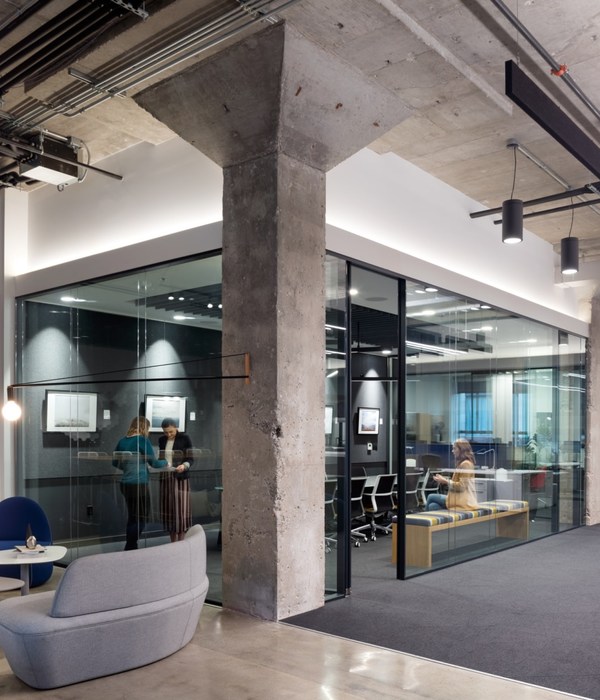
The idea of the design originates from the art collection owned by the office. These art collections provide designers with rare and precious creative materials, and challenges as well – how to arrange these works of art in the office without disturbing the function of the office space. We aim to keep the two in great harmony.
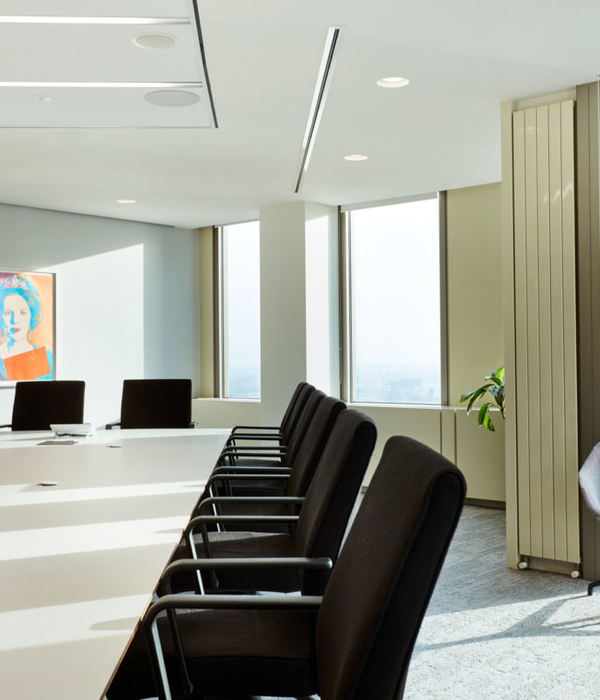
Now we will elaborate the designing idea and creation from the following three aspects: Firstly, in terms of spatial layout, the “Gallery” is mainly integrated into the reception and conference area. The staggered layout of different forms of conference rooms not only increases the display function, but also presents the rich diversity of the space. Walking out of the elevator hall, the first thing that comes into view is the sculpture work of artist Cai Lei – . The perspective of the sculpture is very strong, the lines stretch out into the distance, and the image is about to open the golden door; Entering the reception area, there are two symmetrical paintings on the wall – , which seem to be the same works, but actually have subtle changes from the new to the old, making the space quiet and revealing an invisible power; Entering the conference area, different forms of paintings decorate the space, making people feel like entering the gallery.
Secondly, in terms of hue, the overall space simulates the light color background of the art gallery, highlighting the rich and diverse works of art. In particular, the huge quadruple painting outside the conference room, which is the work of artist Zhu Jinshi. The heavy oil color texture and bright and cheerful colors are intertwined, giving people a feeling of clarity and joy. In designing, the only colorful material with matching purpose is the gray blue wood veneer wall of the conference room. It is like an individual block and placed in the center of the space, so that the color of the space can change and set off the light colored paintings at the same time. It forms a strong color contrast with the light pink painting , which brings people a sense of excitement and surprise.
Thirdly, in terms of material application, semi reflective metal spray paint panels are used on the top surface to make the space bright and transparent and have a sense of visual extension based on the fact of 2.6 m of the floor height. The ceiling near the wall adopts semi reflective material, and in the middle area adopts wood color metal transfer ceiling, which gives the space more warmth and leveling. Also the use of gray blue dyed wood veneer highlights the space by incorporating the image color of Commerce & Finance Law Offices.
设计师:
团队:Ye Shanhe, Wang Wan, Zheng Lu
摄影:courtesy of Ujing Interior Design Company
14 Images | expand for additional detail
{{item.text_origin}}

