时尚,是一种优雅、纯粹、品味与不凡感受,赋予空间不同的风格与气息。
Fashion is a kind of elegance, purity, taste and extraordinary feeling, giving the space a different style and atmosphere.
01
-
Design inspiration
设计灵感
展厅设计理念是什么?
What is the design concept?
----------------
每一块瓷砖都是一段文化
而德拉芙就像书本
是文化的载体
纯粹而律动的空间,
犹如一页页充满文化的纸张飘荡在空间。
Pure and rhythmic space,
Like pages of paper full of culture floating in the space.
02
-
Appearance design
外观设计
展厅建筑外观就像堆叠的书,设计感十足。设计师采用了白色作为主调,莫兰迪色作为撞色,用极具视觉冲击力的色彩搭配,让人眼前一亮。
The building appearance of the exhibition hall is like stacked books, with a full sense of design. The designer uses white as the main tone, Morandi as the contrast color, and uses the color matching with great visual impact to brighten people's eyes.
03
-
Design inspiration
设计呈现
前台
Reception Area
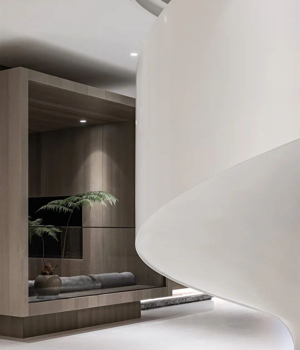
前台空间以高级、柔美的莫兰迪色系搭配晕染展开,简约、富有设计感的曲线造型,给予优雅的空间品质。
The front desk space is developed with high-grade and soft Morandi colors with smudges, and the simple and design-rich curve shape gives elegant space quality.
沙龙 | 休闲区
Salon | leisure area
休闲区中各种造型的内嵌体块打造出这一奇妙的展示空间。设计师应用不同的色彩、镜面和背景来塑造不同瓷砖的展示,以此达到最好的展示效果。
A variety of inlay blocks in the relaxation area create this wonderful display space. The design team applied different colors, mirrors and backgrounds to shape the display of different tiles to achieve the best display effect.
产品展示区
Product display area
产品展示区采用样间的布局集中,选材区在四周环绕,空间通透,便于消费者穿梭于展厅各个区域。
The product display area adopts a centralized layout of sample rooms, and the material selection area is surrounded by the surrounding space. The space is transparent, which is convenient for consumers to shuttle through various areas of the exhibition hall.
办公区
Administrative Area
办公室设计也是采用马卡龙色系撞色,用淡淡的奶油换色涂满了墙面,温暖的色调再搭配家具,营造出空间的层次感。
The office design also adopts the contrasting colors of macaron, and paints the walls with a light cream color change. The warm tones are matched with the furniture to create a sense of hierarchy in the space.
{{item.text_origin}}


