写在前面
WORDS IN FRONT
“很希望自己是一棵树,守静,向光,安然,敏感的神经末梢,触着流云和微风,窃窃的欢喜。脚下踩着最卑贱的泥,很踏实.还有,每一天都在隐秘成长”——黎戈《私语书》
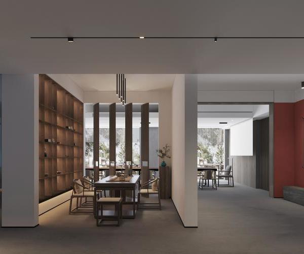
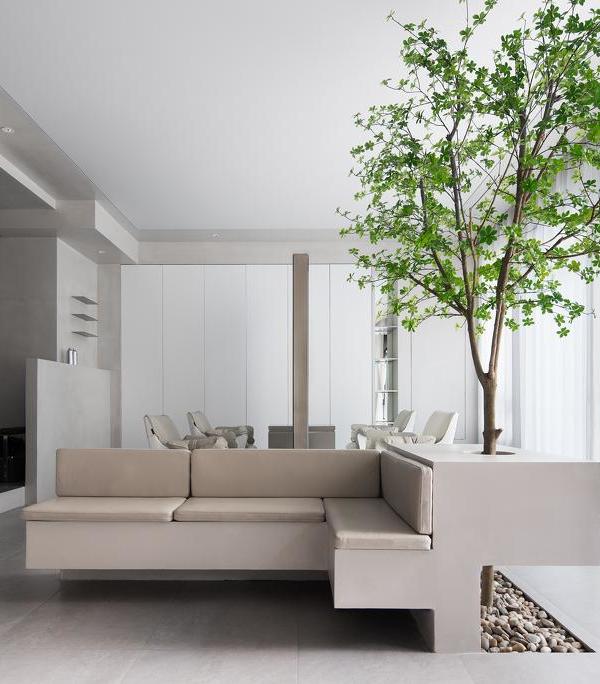
展厅位于南京金盛家居五楼,周围林立着各种木制品定制品牌。如何在一众品牌中脱颖而出,树立独一无二的视觉形象,从而吸引更多的自然客流,是设计师构思考量的重要方向。
在设想中,它是明亮的、开敞的、自由的,拒绝固化形式的解读。内部所有的产品、空间、人,在设计逻辑与材质语言的统一下成为互有关系的整体。当步入其中,产品体验和功能部件展示高度融合,行穿路过之时,方寸联合之间,给人以别具感染力的空间性格。
I wish I were a tree, keeping quiet, facing the light, safe, sensitive nerve endings, touching the flowing clouds and breeze, stealing joy. Stepping on the most humble mud, I was very down-to-earth.
In addition, every day is growing secretly. -- Rigo’s private language book.
The exhibition hall is located on the fifth floor of Nanjing Jinsheng home, surrounded by various customized brands of wood products. How to stand out among brands and establish a unique visual image, so as to attract more natural passenger flow, is an important direction for designers to consider.
In the imagination, it is bright, open and free, rejected the interpretation of solidified form. All internal products, spaces and people become a interrelated whole under the unity of design logic and material language. When stepping into it, the product experience and functional component display are highly integrated. When passing by, the square inch combination gives people an infectious space character.
1/ 外立面
FACADE
从外立面开始,
设计师将平行并置的纯白色体块错位相交,
看上去层叠起伏,
形成一种强烈的立体构成感,
与主入口黑色的内凹形态形成强烈对比,
色彩与建构的多重性仿佛正在无声地
邀请门外的人们进去一探其境。
Starting from the facade, the designer staggered and intersected the parallel and juxtaposed pure white blocks, which seemed to be stacked and undulating, forming a strong sense of three-dimensional composition, which was in strong contrast to the black concave shape of the main entrance. The multiplicity of color and construction seemed to be silently inviting people outside the door to explore its environment.
2/ 入口
ENTRANCE
主入口延续外立面的立体构成,从顶到面换以木质材料,延至 LOGO 墙和吧台后方墙体,参差木块以交错展开的姿态将主入口、LOGO 墙和结构柱串联起来,成为重要的空间枢纽。体块之间的叠加与组合不仅是富有趣味的装置艺术,也是导览空间动线的记忆线索。
The main entrance continues the three-dimensional composition of the facade, replacing wooden materials from top to surface and extending to the logo wall and the wall behind the bar. The staggered wooden blocks connect the main entrance, logo wall and structural columns in a staggered manner, becoming an important spatial hub. The superposition and combination of blocks is not only an interesting installation art, but also a memory clue to guide the moving line of space.
次入口设置为一个抬高的木质立体盒子,犹如闳约长廊,沿着两条底部灯带延绵而去,尽头是一处悬挂干支和绿苔假山的园艺元素端景,简练线条勾勒出“淡柔情于俗内”的东方姿态,并预示着即将开启的场景变换。
The secondary entrance is set as an elevated wooden three-dimensional box, just like the Hong Yue corridor, which stretches along the two bottom light belts. At the end is an end view of horticultural elements hanging trunk branches and green moss rockeries. The concise lines outline the Oriental attitude of "light tenderness in the vulgar", and indicate the scene change to be opened soon.
3/ 贯穿空间的木结构
LAMINATED WOOD
进入展厅以后,木贯穿着产品及空间的全维度,又通过温润的质感平衡着内部折叠多变的界面关系和动静起伏的空间韵律。
左侧开始进入样板展示区,沿着边口依次排布客厅区、餐厅、儿童区、书房,再到两个卧室和衣帽间,丰富的区域展示体现出尼克定制对空间推演的深刻理解。
After entering the exhibition hall, wood runs through the full dimensions of products and space, and balances the internal folding and changeable interface relationship and the dynamic and static spatial rhythm through the warm texture.
The left side starts to enter the model display area, and the living room area, dining room, children’s area and study are arranged along the edge, and then to the two bedrooms and cloakroom. The rich regional display reflects Nick’s deep understanding of space deduction.
4/ Z 型选样区
SELECTION AREA
材料选样区位于展厅中心位置,选样桌呈 Z 字形,周围的展示柜也沿着 Z 形桌排布,独特的形态塑造出显著的空间中心点,有利于强化人们对展厅的印象记忆。
The material sample selection area is located in the center of the exhibition hall. The sample selection table is Z-shaped, and the surrounding display cabinets are also arranged along the Z-shaped table. The unique shape creates a significant spatial center, which is conducive to strengthening people’s impression and memory of the exhibition hall.
5/ 洽谈室
NEGOTIATION ROOM
三个洽谈区都设置在前台后方环形动线的最后部分,其中两个呈盒体结构,一个坡屋顶,一个悬空凸出,内部形成下沉式构造,木质格栅似隔非隔似藏非藏,矩阵的排布隐约彰显力量与秩序,带给客户不同的空间体验。
The three negotiation areas are set at the last part of the ring moving line behind the front desk. Two of them are in a box structure, one is a sloping roof, the other is suspended and protruding, forming a sinking structure inside. The wooden grid seems to be separated and hidden. The arrangement of the matrix vaguely highlights the power and order, bringing customers different space experiences.
6/ 客厅
LIVING ROOM
7/ 餐厅
DINNING ROOM
8/ 书房 STUDY ROOM
9/ 卧室
BEDROOM
10/ 楼梯
STIARS
此展馆并不是产品堆叠的容器,
而是物感真实的定制生活馆。
在这里,美感与功能、品质与价值在空间中弥漫,
连交流闲谈都变成最理想的舒适体验。
This exhibition hall is not a container for product stacking, but a customized life hall with realistic feeling. Here, beauty and function, quality and value permeate the space, and even communication and gossip have become the most ideal comfortable experience.
11/ 结语
EPILOGUE
1、这套作品设计的亮点是什么?
设计师:从外立面开始,树立了一个强烈的几何型立体构成感,一直延续到主入口的空间。
Starting from the facade, a strong sense of geometric three-dimensional composition is established, which continues to the space of the main entrance.
2、简单跟我们介绍一下这个生活馆的设计逻辑。
设计师:将木作类的各种产品体验和功能部件展示高度融合,空间,产品,人,成为相互关联的整体。
The experience of various products and the display of functional components of woodwork are highly integrated, and space, products and people become an interrelated whole.
3、动线、结构、光线的设计有什么特别的地方?
设计师:平面动线上来说从主入口引入,围绕空间,环形布置了各个空间的模拟展示,一路环绕,最后抵达洽谈区,中间位置则是安排了集中样品展示和选样的区域。
On the plane moving line, it is introduced from the main entrance. Around the space, the simulation display of each space is arranged in a ring. All the way around, it finally reaches the negotiation area, and the middle position is the area where centralized sample display and sample selection are arranged.
4、您想通过这套设计,倡导什么样的设计理念和生活方式?
设计师:展馆并没有局限于产品堆叠的容器,而是在此基础上打造具有真实物感的定制生活馆。要让美感与功能、品质与价值在同一空间共同呈现出来!
The exhibition hall is not limited to the containers of product stacking, but to create a customized life hall with a real sense of things on this basis. Beauty and function, quality and value should be presented together in the same space!
12/项目概况
PROJECT OVERVIEW
△平面图
PROJECT DATA
项目名称:叠木
项目地址:尼克生活家
项目面积:600㎡
项目类型:商业空间
主案设计:锐界空间设计-胡飞
主要材质:木饰面、岩板、实木板、不锈钢、五金、玻璃、格栅、踢脚线
MATERIAL/WOOD FINISH、ROCK PLATE、SOLID WOOD、STAINIESS STEEL、HARDWARE、GLASS、GRILLE、SKIRTING LINE
ABOUT EDGE
锐界空间建筑设计由设计师胡飞创立于 2021 年,坐落于江苏南京。专注于私宅别墅、商业空间、办公空间、产品家具等设计服务。
创建锐界空间建筑设计是期望用我们对生活和细节的洞察,将情感、生活与空间相结合,为客户带来极致创新的、独一无二的空间感官体验。通过全方位量身定制的设计,投射一种新的生活方式,从而让业主更多的发现自我、愉悦自我。
在设计中坚持为每一个空间环境找到合适的材料,从功能、美学和预算等多个维度考量,追求极致的设计效果与空间体验,从“设计创意”到“施工执行”、“软装陈设”,为业主提供全方位的设计和施工落地指导服务。
AWARDS
2021 江苏设计星 冠军
2020-2021 中国设计头条年鉴榜 Top Design 100
2020 金堂奖年度杰出商业空间设计
2019 金腾奖 TOP100
2019 金堂奖年度杰出住宅空间设计
2019 我要去米兰 中国设计力青年榜 全国十强
2019 40 UNDER 40 中国(江苏)杰出设计设计青年
2018 新浪室内设计新势力榜 南京榜 TOP10 青年设计师
2018 红星美凯龙 M+创客空间南京创始会员
2018 第八届筑巢奖 年度住宅公寓类优秀奖
2017 国际空间设计大奖--Idea-Tops 艾特奖年度优秀奖
2016 第七届筑巢奖 住宅公寓类提名奖
2016 金堂奖 年度优秀别墅奖
2015 永隆星空杯 陈设设计大奖赛 住宅空间工程类 银奖
EX·CASES
Leisurely circles
逸·界
溧阳·天隽半岛
Time & Breeze
time&breeze
中海·桃源里
{{item.text_origin}}

