This black’n’white interior is a manifestation of minimalism and graphics. Precise lines, a play upon reflections and deflections, contrast of materials – the interior changes when you change your viewpoint.
In the entrance hall, a storage system is hidden behind mirror panels, and the stone pattern becomes a butterfly thanks to the mirror.
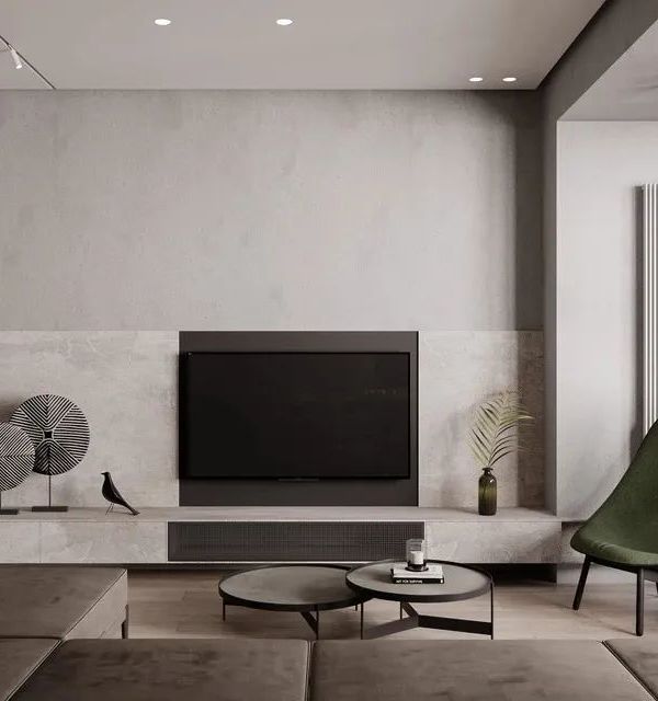
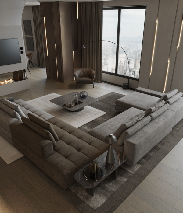
The living room is united with the kitchen and the dining room, which helped us to retain the scope of the space. The wall on the left is divided into 3 zones: behind the black glass, shelves are hidden at the top and at the bottom; the white part serves as a decorative background. The home theatre zone is an illusion! The TV-set is built-in behind the black glass, and when the TV is off, the whole wall looks like a black and white architectural composition. The private zone is separated from the living room with a glass black door that finalizes the image of the living room.
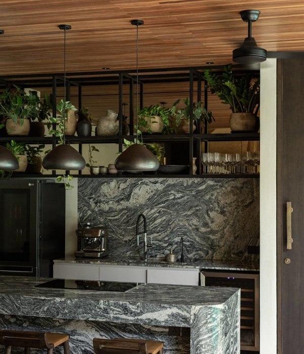
The kitchen is sensibly divided from the living room with the help of the bar zone. The front surfaces made of hpl-plastics make a great contrast with the natural black marble.
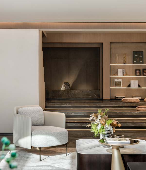
The private zone consists of two bedrooms, a bathroom, and a study. Panoramic windows with a city view welcome to sit in a cozy armchair having a cup of coffee.
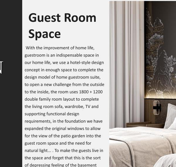
In the main bedroom, the bed, the bedside tables, and the leather panels on the wall are made according to outlines of the project designers. The wardrobe is placed behind the tinted mirror.
In the study, the wall behind the worktable is decorated with stones with built-in light profiles.
Much attention was given to the lighting layouts: their diversity allows changing the mood of the interior and setting functional customizing (cinema, guests, evening, etc.).
{{item.text_origin}}


