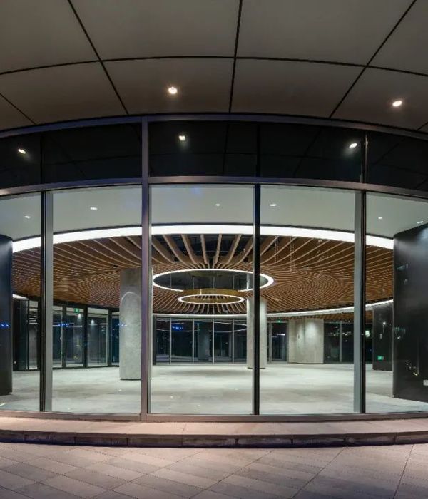
Greenbox Architecture has designed the new offices and headquarters of global manufacturing company Reckitt Benckiser in Sydney, Australia.
In late 2017, Reckitt Benckiser, a global manufacturer and leader in home, health and hygiene brands, confirmed their move to the brand-new Sydney CBD headquarters. Greenbox were thrilled with the opportunity to design their new office and in collaboration with project managers AECOM and FDC Construction, began to bring this project to life.
Originally located in West Ryde where teams were split across multiple levels in multiple buildings, the low density and luxury of space generated a disjointed environment for the company and its staff. Moving to the prime Sydney CBD location of World Square keeps Reckitt Benckiser ahead of competitors while providing convenience for their clients and staff.
The brief was to create more connectivity, cohesiveness and interactive communication across teams, promoting inclusivity and equality beyond just a break out area.
While there was a desire to default to the past, Greenbox, through an extensive briefing process with both local teams and international facilities teams, established a superior alternative to allow a mix of spaces that truly suited the business objectives, team requirements, whilst future-proofing the facility for future uncertainties.
There was also a desire for a localised design solution and theme, while still adhering to the global RB brand and identity. RB supported the freedom of creative license in the approach by Greenbox to encourage a unique design the local team could identify with.
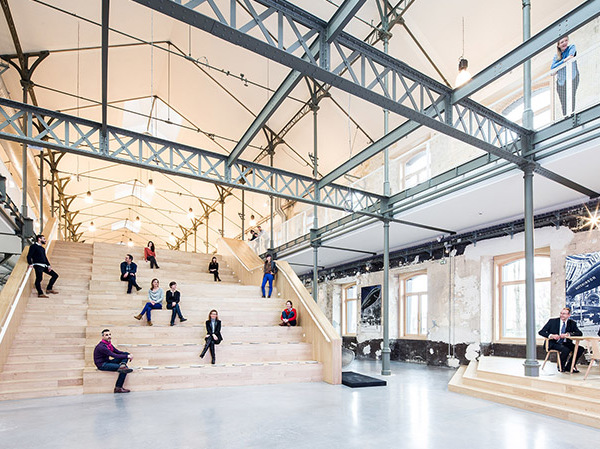
With over 3,600sqm to work with, the project team elected to place the break out room on the lower floor along with the central kitchen area, with an emphasis around the stairs to adopt an agile approach and encourage exercise and communication within the spaces where different departments could spend time together.
The design of their ceilings demonstrated a creative approach with attention to detail. The break out room features an open ceiling with exposed services in black to reduce visual clutter and generate a sense of space. While the ceilings in the reception and meeting room areas are equally innovative consisting of a three-dimensional interpretation of their logo. Spaces were softened by using timber and greenery, with punches of colour around the core, forming a vivid backdrop to the open office area.
Light and space are emphasized at every turn. The staircase features a frameless glass balustrade for transparency and to maximize visual connectivity. The lighting varies from playful cork pendant light features to ceiling lighting in the form of custom linear extrusions. Black walls with edging contrast with curved glass meeting rooms. A conference room features product display shelving to trial visual merchandising.
Herringbone timber floors provided by Havwoods contribute a sophisticated, clean finish. Polished concrete flooring provides a sense of wayfinding encircling the open office space and leading to the main break out area.
A feature dried moss wall in the reception is an appealing feature that ties together several, design elements, and provides a final touch to the entry experience. The overall design contributes to an innovative finish, meeting the brief to improve interaction and connectivity.
Design: Greenbox Architecture
Project Managers: AECOM
Builders: FDC
Photographer: Danial Nash
10 Images | expand for additional detail
{{item.text_origin}}

