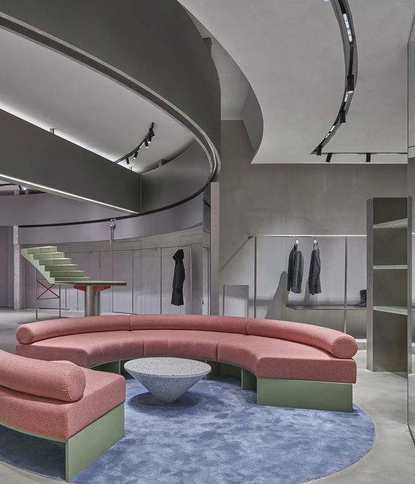
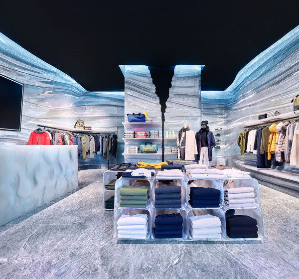
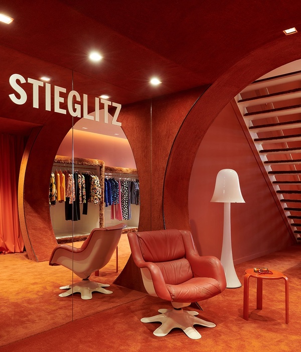
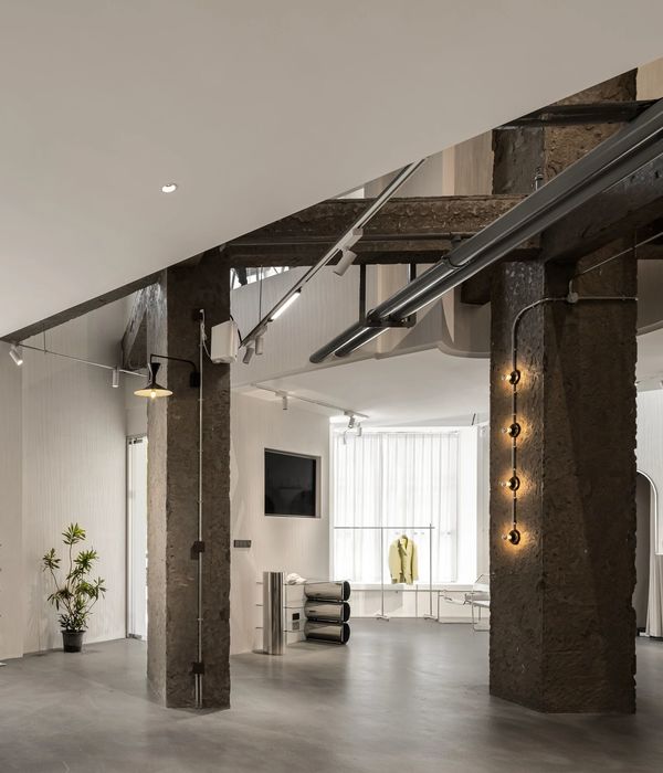
Brand stores serve as an interface between the company and the customer, as much a place for trade as it is an assertion of the brand image. As such, the design of such retail spaces becomes a crucial component of the brand’s perception as a whole, lending a gravitas to the operation often absent from other stores.
Located in a commercial complex along a major highway – the display store for The Window Factory is a great example of the incorporation of this gravitas. Showcasing aluminium and UPVC windows, this retail space in Ahmedabad is conceptualized as an Experience Centre, consisting of several zones demarcated through visually permeable divisions.
During the planning stages, the existing built envelope presented a significant challenge – the floorspace occupying 3,320 sq.ft. was long and narrow, with the only windows located on either ends, severely limiting the ingress of natural light. Within this linear space needed to be accommodated a reception, an engaging exhibition space, a conference hall, the main office cabin as well as an admin area, in addition to the pantry and storage area.
Acknowledging the requirement for spatial variety and interconnectedness, the exhibition space consists of two galleries. Towards the front is Gallery 01, which houses the general range of products offered by TWF. Beyond the Gallery 01 - accessed by a sliding door - is Gallery 02 featuring pricier products, and is only accessible to customers upon invitation. The configuration of the Gallery 02 is such that it appears to have a room within a room, and is warmly lit to create the illusion of sunlight seeping in through the featured windows.
It was important that visual coherence be maintained to provide display without taking away from the aesthetic appeal of the space. To achieve this, a 9” by 9” black metallic grid was used in conjunction with black flooring and walls, to tie the space together by providing a much-needed constant amid the mass of materials. The use of nondescript black flooring and grid also minimized visual noise in the space, allowing the visitor to focus better on the windows on display.
The design consciously shuns continuous straight lines, both in the frames of the openings in the metallic grid and in the edges of the displayed facades. Additionally, in the absence of straight edges, the frames of the windows become the longest and most prominent straight lines within the space. This helps highlight the windows greatly.
In keeping with the theme, materials like ACP sheets, aluminium facades and casings are displayed by means of various design interventions. In the reception, this manifests as being cladded on the walls to create a ‘cave’ that leads towards the maze of windows within. Maintaining consistency, other areas within the store use a similar material palette of metal and wood. The result is a warm-toned, naturally lit space in the dual tones of wood and metal.
It was crucial, in line with the client’s ethos, that this space emerge as not just another retail space, but embody the explorative nature of the TWF brand. The resultant design allows the visitor to immerse themselves in a dynamic spatial experience and discover for themselves the wide applicability of TWF’s products.
{{item.text_origin}}

