奥地利尼克办公楼——轻量结构与复杂设计的完美结合
Austrian Nick office building
设计方:BRAMBERGER architects
位置:奥地利 格拉茨
分类:办公建筑
内容:实景照片
图片:9张

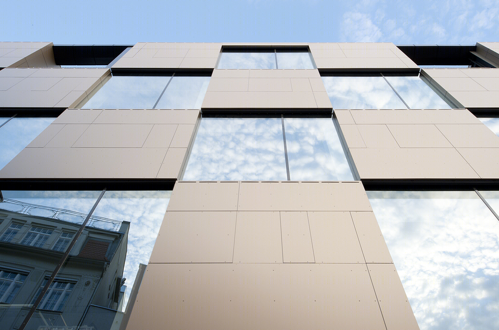
尼克办公楼是穆尔河旁小广场上的一座独立建筑,它的外形就像一堆金色的正方体。尼克办公楼的设计对技术、规划和资金做了复杂又细致的考虑。建筑第一个要克服的问题是怎样使楼层比以前两层的储藏室高2.5倍,但重量又不会将地底下二十世纪八十年代的停车场压垮。设计师用轻量结构和复杂的地下网格分散器解决了这个问题。地下网格分散器将钢结构大梁上的压力分散以支撑地下停车场。在二十世纪八十年代前,停车场没修建,小广场也没有被重新设计,小广场一带的穆尔河畔是四世纪时的船坞。当Nikolaiplatz的建筑风格过时后,小广场的基址就没变过了。新建筑是完全按基址大小设计的,并准确的对异化的城市环境做出了反应。一方面,尼克办公楼成为了附近建筑的分界线,令一方面,尼克办公楼成为了雕刻一样的存在。办公楼为钢架结构,条理分明,辅以玻璃,很好的缓和了密集城区和宽阔绿野之间的不协调。在闪亮的金色下显得简洁又安静。看起来矮胖的办公楼内也被有效利用。整个建筑坚固、实用又吸引人,同时也达到了美观的标准。
译者:蝈蝈
The freestanding office building created for a top branding agency, NIK stands at the centre of a small, green square on the banks of the river Mur. Its form is sculptural in its simplicity: a stack of golden cubes. At the same time, the NIK is the culmination of a complex and meticulous design process responding to the site’s serious technical obstacles and intricate planning and financial considerations.
The chief problem to overcome was how to increase the number of floors by 2.5 (a double-storey storage shed previously stood on the site), while keeping the new construction light enough to rest on the 1980s underground parking garage beneath. This was achieved by designing a consistently lightweight construction and also by using a complex distributor grid underneath, which invisibly spreads the concentrated loads of the steel frame girders over the garage’s supports.
Before the arrival of the car park and its 1980s redesign, the square next to the Mur river course was home to a boathouse dating back four centuries. While Nikolaiplatz’s architectural styles and usage changed over time, the plot’s dimensions remained constant. The new building is sized to fill this site to the last few centimetres, and also reacts precisely to its heterogeneous urban situation. On one side—towards Entenplatz—the NIK becomes a boundary of space that fits in with surrounding buildings, while on the other—facing Nikolaiplatz and the riverbank—it forms an independent sculptural entity.
The steel-framed structure with clear vertical alignments and plenty of glass mediates between a high-density urban environment and an open green space. Calm and reduced, yet coated with a playful sheen of gold, the chunky facade blocks are also put to good use on the inside as shelves and archives. The result is a construction that is solid, practical and inviting but at the same time manages to be aesthetically and literally light.
奥地利尼克办公楼外部局部实景图
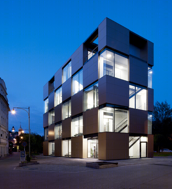
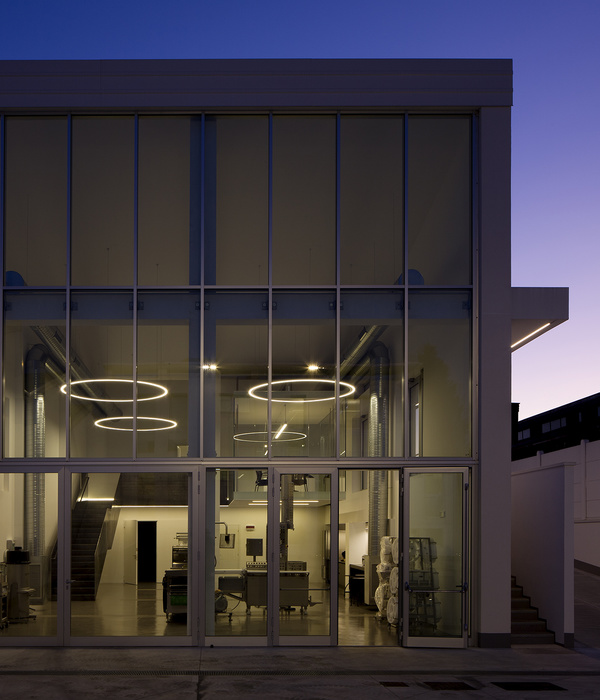
奥地利尼克办公楼外部夜景实景图
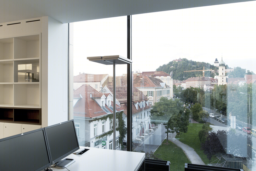
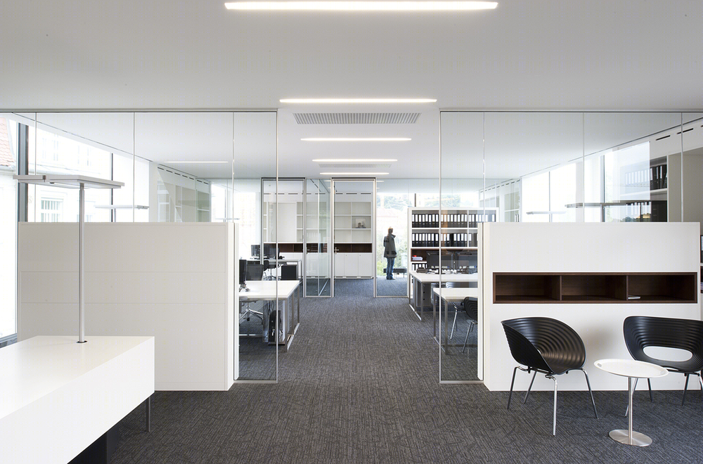
奥地利尼克办公楼内部实景图
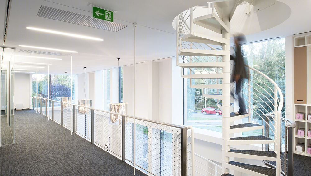
奥地利尼克办公楼内部过道实景图
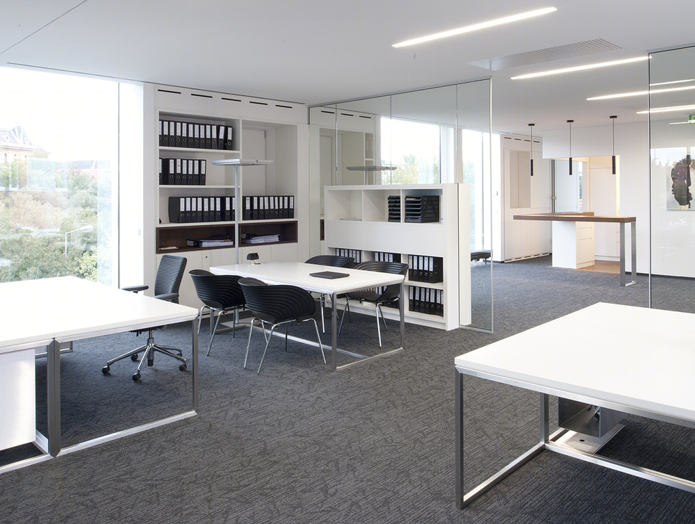
奥地利尼克办公楼内部办公区实景图
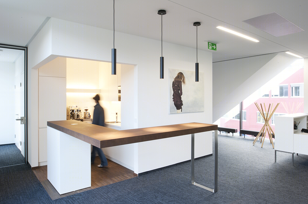
奥地利尼克办公楼内部局部实景图
