Top Impression Bakery, Central Park

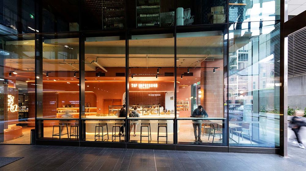
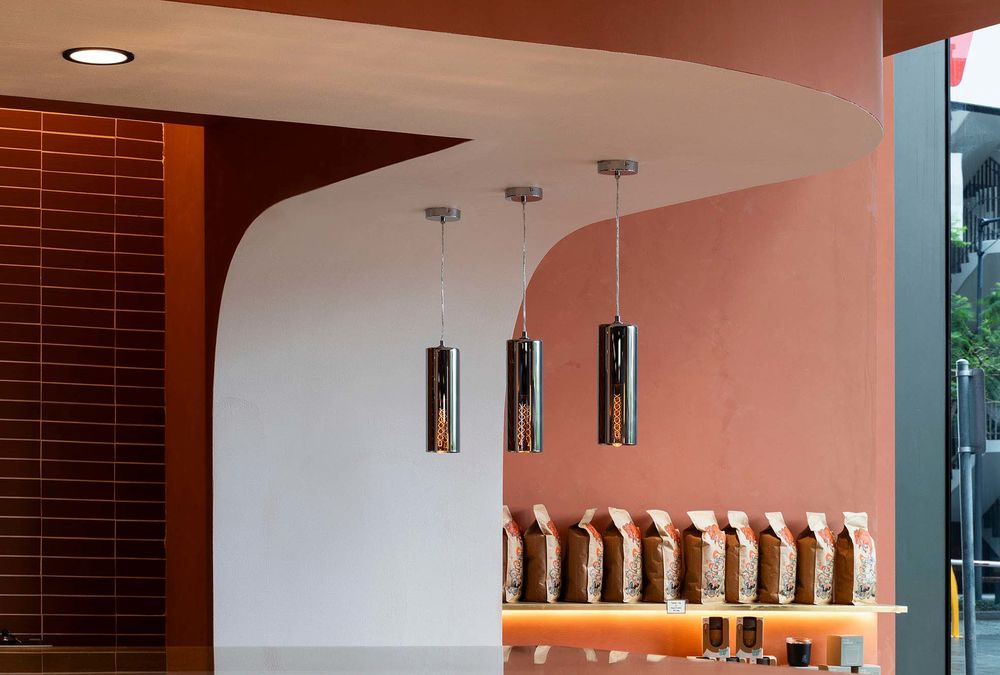
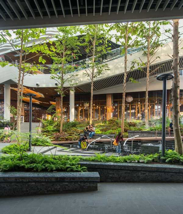
Located in the unique Central Park neighbourhood, known for its harmony with the natural environment, Top Impression Bakery has seamlessly aligned its vision with its surroundings. Drawing inspiration from their giraffe mascot, the interior design concept encapsulates the giraffe’s intuitive and adventurous nature, resulting in a harmonious, warm, and emotive ambience.
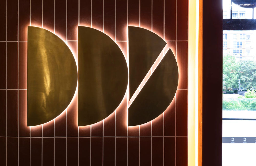
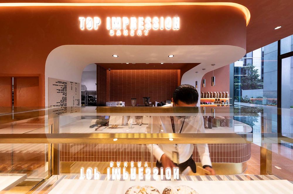
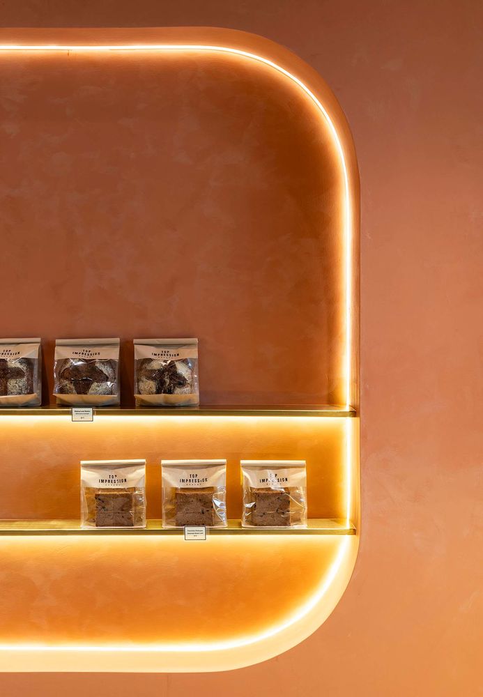
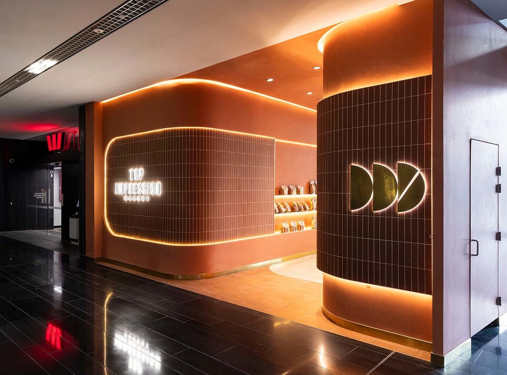
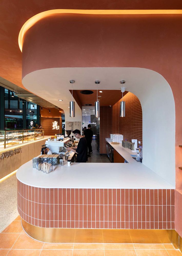
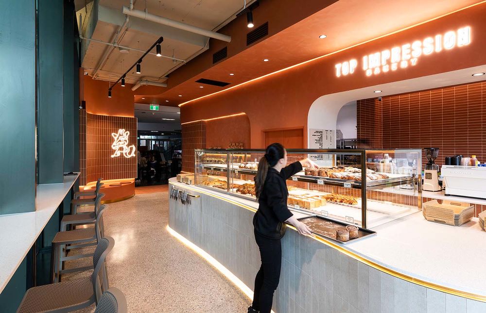
To integrate a strong branding concept, the bakery incorporated a cinnamon colour palette, derived from their pastry ingredients. A key consideration was the store’s flow, designed to accommodate dual entrances from both the mall and the street, ensuring it attracts customers from both directions. A distinctive touch was added by featuring the brand’s signature croiss-section pattern on the entrance wall. Additionally, warm white LED lighting was used throughout the store to enhance the welcoming and warm atmosphere.
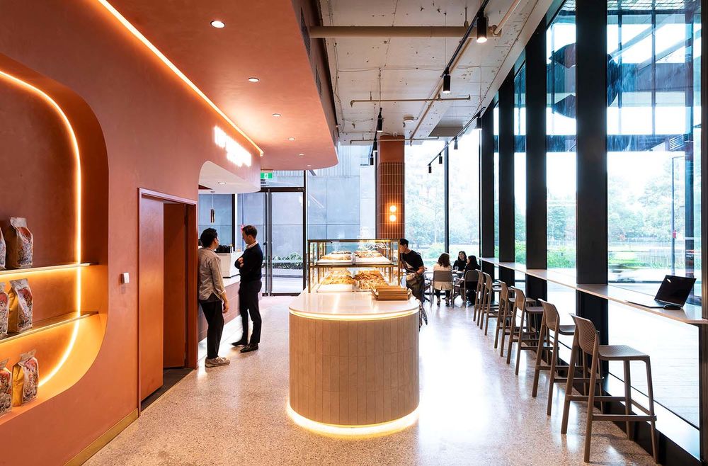
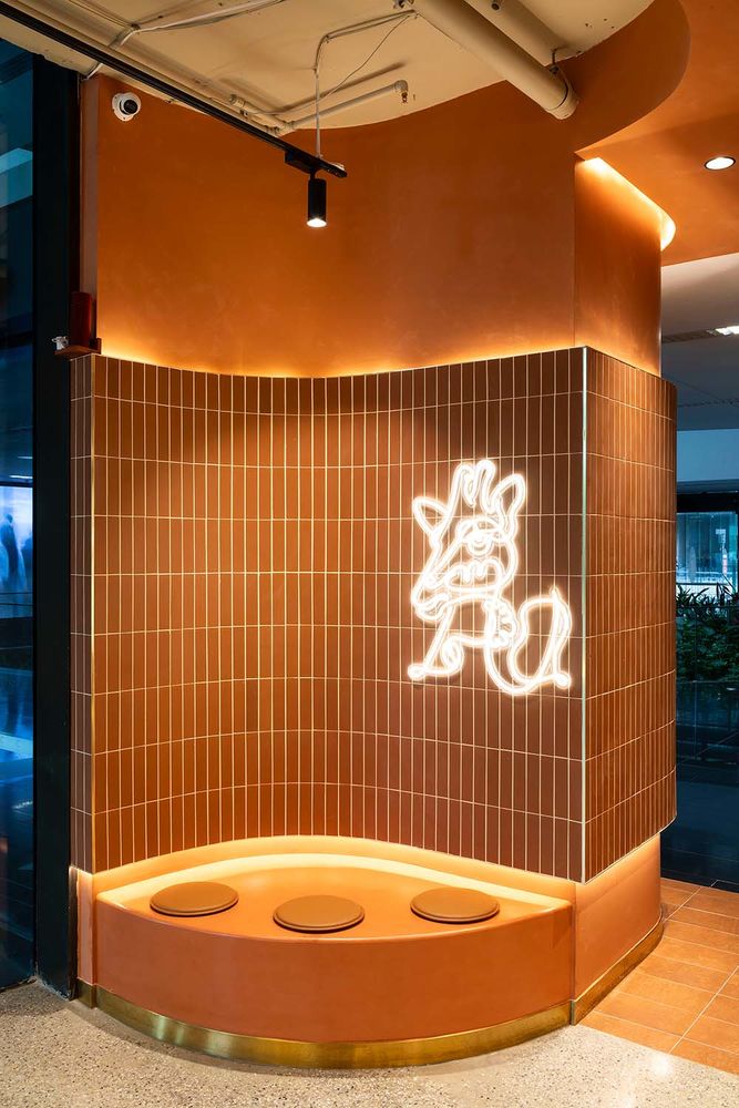
The primary challenge was to design a layout that caters to the self-serve operation and multiple entry points. A strategically placed island display at the centre allows customers to easily browse and select their pastries, leading them to a checkout counter. Another challenge was achieving perfect curves that embody the brand’s essence while appearing effortless. A cosy seating area was created, highlighted by an LED light featuring the brand’s mascot, cleverly concealing services behind a curved corner.
Photo by :
Andrew Worssam
Certifier by :
Incert
Shopfitter by :
Hi5 SHopfitting
Interior Designer by :
Vie Studio
